Struggling to choose the perfect living room colors? Discover the best living room color combinations that create a stunning, cohesive space.
Your living room is more than just a place to sit — it's where life happens.
Whether you’re curling up with a book, hosting friends, or just unwinding after a long day, the right colors can completely transform how your space feels.
But picking the perfect color scheme? That’s where things get tricky.
I know how overwhelming it can be to choose between soft neutrals, bold statement shades, or airy, light tones. What looks great in a paint sample might feel totally different once it’s on your walls.
That’s why I’ve put together this guide to the best living room color combinations.
Whether you want something timeless and classic or fresh and modern, I’ve got you covered. Let’s find the perfect color palette to bring your space to life!

How to Choose a Living Room Color Combination
Before you grab a paintbrush, here are a few things I always consider when selecting a color scheme for a living room:
- Decide on the mood. Do you want your space to feel cozy and warm? Or do you prefer a fresh and open feel? Maybe classic and timeless? Your color choices should match the feeling you want in your space.
- Think about lighting. Natural light makes colors look brighter. Artificial light changes how shades appear throughout the day. I’ve learned this the hard way—always test your paint in different lighting!
- Look beyond the walls. Your trim, ceiling, and accent colors all matter. When you choose a thoughtful mix, your space feels polished and put together.
Now, let’s explore the best color combinations for your living room!
The Best Living Room Color Combinations
Here are eight stunning color pairings to help you find the perfect look for your space.
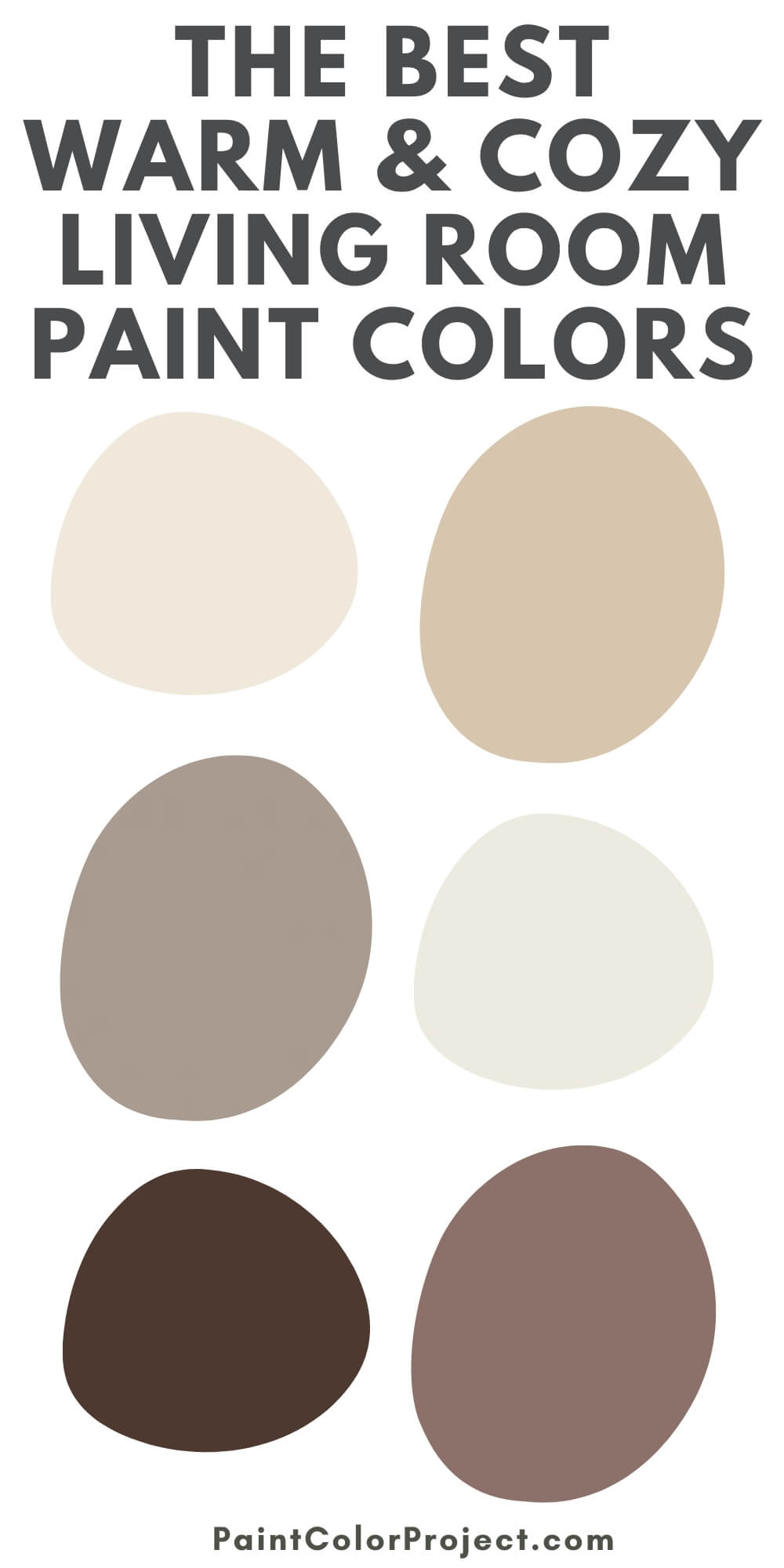
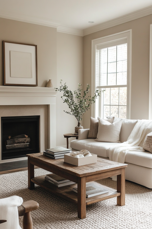
1. Neutral & Cozy
I love this one. It’s warm, inviting, and never goes out of style.
✔️ Wall Color: Warm greige or soft beige
✔️ Trim Color: Crisp white or warm cream
✔️ Accent Colors: Soft taupe, warm caramel, muted sage green
✔️ Why it works: This palette makes a space feel welcoming and effortless. It pairs beautifully with wood, linen, and woven textures.
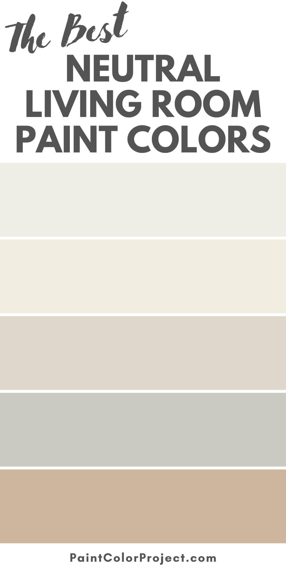
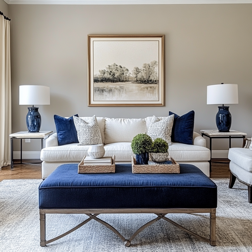
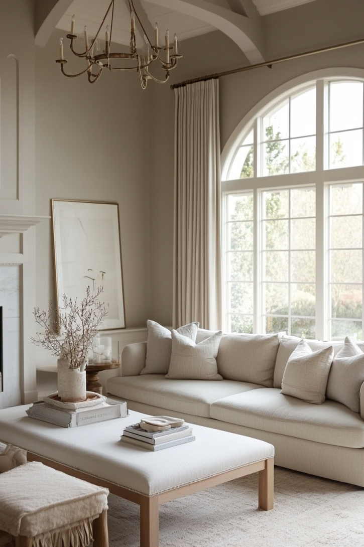
2. Classic & Timeless
If you want a look that lasts, this is it.
✔️ Wall Color: Soft warm white or greige
- Sherwin Williams Alabaster
- Benjamin Moore Swiss Coffee
- Behr Palais White
✔️ Trim Color: Bright white or a slightly darker greige for subtle contrast
✔️ Accent Colors: Navy blue, deep green, brass or black metals
✔️ Why it works: A neutral base with classic accent colors keeps this palette elegant and timeless.
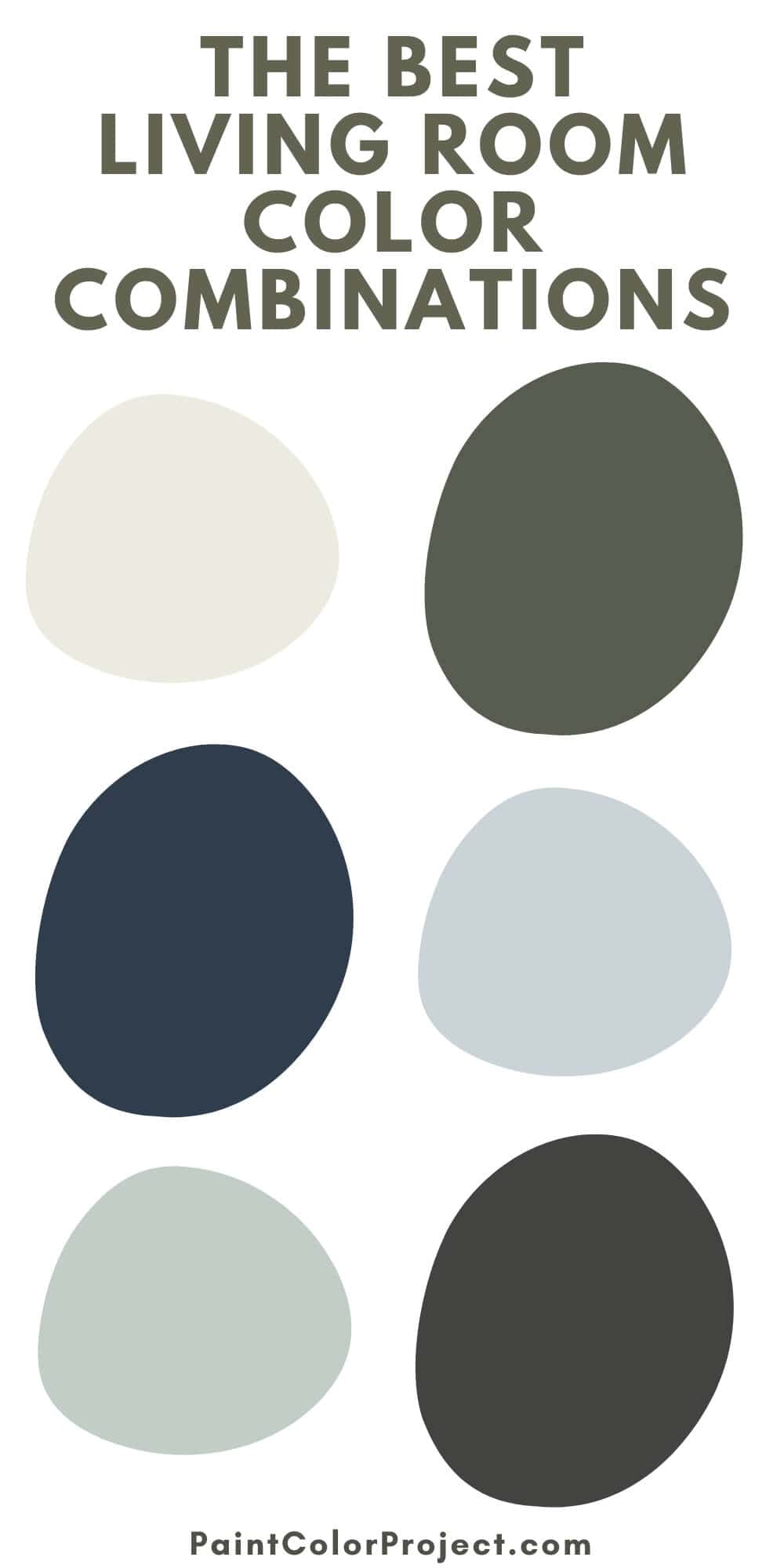
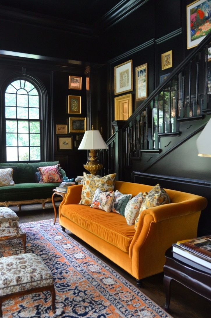
3. Bold & Dramatic
Want to make a statement? This one’s for you.
✔️ Wall Color: Deep navy or charcoal gray
✔️ Trim Color: Crisp white or deep black for contrast
✔️ Accent Colors: Mustard yellow, burnt orange, deep emerald green
✔️ Why it works: High contrast adds depth and drama. But it still feels balanced, especially when paired with wood and metallic accents.
4. Fresh & Airy
This is one of my favorites for small spaces.
✔️ Wall Color: Soft gray-blue or pale misty green
- Sherwin Williams Sea Salt
- Benjamin Moore Palladian Blue
- Behr Light Drizzle
✔️ Trim Color: Bright white for a crisp, clean look
✔️ Accent Colors: Soft blues, whites, light wood tones
✔️ Why it works: This color combo keeps a room feeling light and breezy. It’s perfect for smaller or lower-light living rooms.
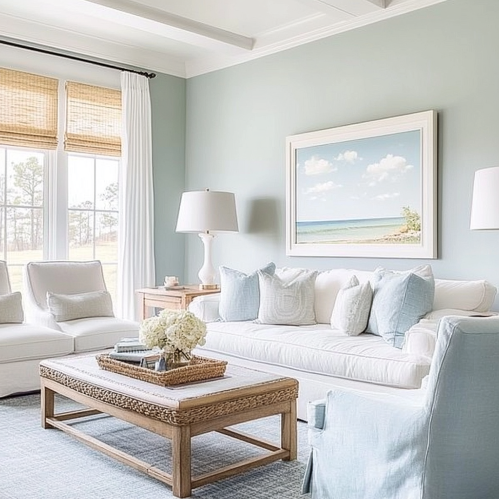
5. Beachy & Coastal
If you love the ocean, this one’s for you.
✔️ Wall Color: Soft blue or airy blue-green
- Sherwin Williams Rainwashed
- Benjamin Moore Wythe Blue
- Behr Breezeway
✔️ Trim Color: Crisp white or warm off-white
✔️ Accent Colors: Sandy beige, driftwood gray, seafoam green
✔️ Why it works: These colors bring in a relaxed, beachy vibe. They pair beautifully with wood and linen textures.

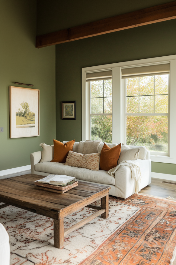
6. Earthy & Natural
I love how grounding this palette feels.
✔️ Wall Color: Deep olive or muted sage green
- Sherwin Williams Pewter Green
- Benjamin Moore Vintage Vogue
- Behr Vine Leaf
✔️ Trim Color: Soft off-white or light warm gray
✔️ Accent Colors: Warm terracotta, beige, deep brown
✔️ Why it works: Earthy greens mixed with warm neutrals create a cozy, natural feel.
7. Soft & Sophisticated
A muted, elegant palette with a touch of contrast.
✔️ Wall Color: Muted greige or warm taupe
- Sherwin Williams Repose Gray
- Benjamin Moore Thunder
- Behr Graceful Gray
✔️ Trim Color: Crisp white or soft cream
✔️ Accent Colors: Brushed brass, dusty lavender, soft olive green
✔️ Why it works: It’s polished yet comfortable. A perfect mix of soft neutrals with subtle pops of color.
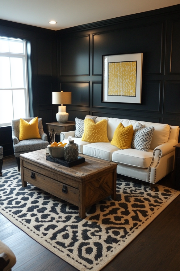
8. Dark & Moody with a Pop
Want something bold? Try this.
✔️ Wall Color: Deep navy or charcoal gray
✔️ Trim Color: Black or dark green for an ultra-moody effect
✔️ Accent Colors: Mustard yellow, burnt orange, deep emerald green
✔️ Why it works: A dark base makes a bold statement. Pops of color keep it from feeling too heavy.
How to Coordinate Your Living Room Color with Other Rooms
Your living room doesn’t exist in isolation. If you want a home that feels connected, here’s how to coordinate colors with adjacent spaces:
- Stick to a color palette. Choose 3-5 shades that complement each other and use them throughout your home for a seamless look.
- Use transitional colors. Hallways or open spaces can serve as a neutral bridge between bolder rooms.
- Repeat accent colors. If your living room has navy blue accents, add hints of navy in the kitchen or dining room for flow.
- Vary intensity. A deep green living room can be balanced with a softer sage green in an adjoining space.
Other Ways to Bring Color into Your Living Room
Not ready to paint your walls? No problem! Here’s what I do when I want to add color without a big commitment:
✔️ Swap out throw pillows, rugs, and artwork. It’s the easiest way to refresh your space.
✔️ Try painting the ceiling the same color as the walls. It creates a modern, seamless look.
✔️ Layer different textures—wood, velvet, woven fabrics. This makes your color scheme feel intentional and rich.
Even small updates can make a big difference. So, which color combination speaks to you? I’d love to know!
Need More Help?
Picking the perfect paint color can feel overwhelming, but I’ve got you covered! The No-Fail Paint Color Jumpstart Guide walks you through the process of choosing the best color combinations for your home—without second-guessing or endless sample swatches.
Inside, you'll learn:
✔️ How to confidently pick a color that works in your space
✔️ The biggest mistakes to avoid when choosing paint
✔️ A simple, step-by-step process to make the right decision the first time
Ready to find your perfect paint color? Grab The No-Fail Paint Color Jumpstart Guide!
Still unsure which paint color is right for your space?
Choosing paint doesn’t have to be stressful! My free Paint Color Planning Quick Start Guide walks you through the exact steps to confidently choose the perfect color — without the overwhelm, second-guessing, or endless swatch testing.
👉 Click here to download the free guide!
DIYing Your Paint Job? Start Here.
Choosing a paint color is only half the equation — the tools you use matter just as much. I’ve rounded up the painting supplies we rely on for clean lines, smooth finishes, and less frustration overall.

My Paint Color Formula course walks you through the painless process of expertly testing paint swatches to ensure you have the perfect color for your home.
The best way to sample paint? Samplize!
Get peel-and-stick removable and reusable paint samples here!
Thanks for reading!

Morgan is passionate about home decor and paint colors. She has been sharing DIY home decor tips since 2012 at CharlestonCrafted.com. From there, she learned to love paint colors, and the Paint Color Project was born in 2022!