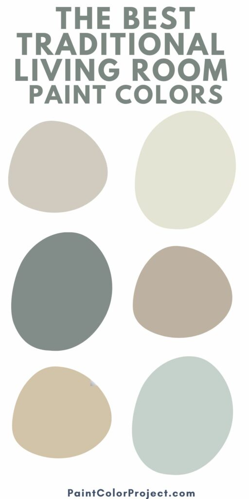
Picking the perfect paint colors for your living room? Here are the best traditional paint colors for living rooms!
Picking paint colors is a big decision! There are an almost unlimited number of paint color choices, it can be so hard to narrow it down.
It's easy to get swept up in trends and pick a trending paint color. However, if you prefer a timeless look that will never go out of style, you might prefer to stick to a classic paint color.
Painting your living room walls is one of the bigger commitments. After all, this is probably the room that most guests in your home will see. You want to pick the perfect living room wall color!
What colors are classy and timeless?
Traditional paint colors are usually muted and fairly neutral, though there are some colors in the mix.
Here are some of the top colors that are considered traditional:
- Beige
- Taupe
- Light gray
- White
- Ivory/cream
- Navy blue
- Brown
- Dark green (hunter green)
- Blush pink
- Maroon
- Light blue
How to pick a paint color
When in doubt, it's easiest to go with a neutral color for your living space walls. You can then bring in more bright colors via your accent color schemes. You can even mix up the accent colors seasonally!
In rooms without a lot of natural light, you can add warmth with a light, bright, warm neutral color.
For rooms that are naturally already bright, you can make the space feel cozier with a color with a bit more depth to it - more of a tan or cream compared to a stark white, for example.
The best Sherwin Williams traditional paint colors for living rooms
Here are some of my favorite timeless living room paint colors by Sherwin Williams.
Silver Strand

Silver strand is a light gray color with green undertones. It is a cool color and the undertones make it perfect for soothing, spa-like vibes.
Click here to get my complete Silver Strand paint color review.
Click here to get a peel and stick sample of Silver Strand.
Agreeable Grey

Agreeable Gray is a warm toned gray/beige color with both pink and yellow undertones.
Click here for my complete Agreeable Gray color review.
Click here to get a peel and stick sample of Agreeable Gray
Accessible Beige
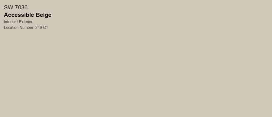
Accessible Beige is a warm tan-beige color with significant gray undertones. The undertones are warm.
It does NOT have pink undertones. The main colors you will see are yellow undertones and slight green undertones.
Click here to read my complete Accessible Beige review.
Click here to get a peel and stick sample of Accessible Beige
Repose Grey
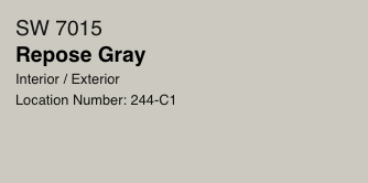
Repose Gray is a fantastic neutral paint color. So many people love Repose Gray and use it as a whole home wall color!
This is a great option for a warm gray wall that actually works well with warm or cool accent colors. So, unlike some other greige paint colors that don't play well with cool toned fixtures (tile, cabinets, etc) Repose Gray can actually pull it off!
Click here for my complete Repose Gray paint color review.
Click here to get a peel and stick sample of Repose Gray
Sea Salt

This is a green color with gray and blue undertones. This gives it a bit of a cool tone.
The blue and gray undertones in Sea Salt make it a solidly cool toned color. However, the yellow of the green keeps it from being cold or stark in any way. It's fairly mid tone in that way!
Click here for my complete Sea Salt color review!
Click here to get a peel and stick sample of Sea Salt
Oyster Bay

Oyster Bay is a very muted mid-toned green color. This is a great option if you have a bright living room and want a bit of color on the wall, but nothing too bright or overwhelming.
Click here to get a peel and stick sample of Oyster Bay
Alabaster
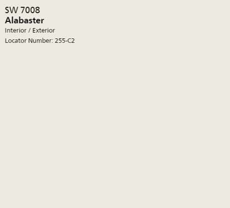
Alabaster is a warm white paint color with slight beige undertones. This versatile neutral paint color is perfect for a whole house paint color and can be paired with different accent colors in each room for a varied but cohesive look.
Click here for my complete Alabaster review.
Click here to get a peel and stick sample of Alabaster
Balanced Beige

If you like a warm toned beige, this could be a great option. It's not a light beige but more mid-toned with a bit more depth to it. If you have a very brightly lit room, it will read as a lighter color, but in darker rooms it will read darker.
Click here to get a peel and stick sample of Balanced Beige
Natural Choice

Natural Choice is a mid-toned tan color with yellow undertones. In very bright rooms, it will read as a warm, off white. In darker rooms, it looks more like a tan wall color.
Click here to get a peel and stick sample of Natural Choice
It's very important to swatch colors on your wall to make sure they look good – day and night – in your actual space before committing.
Click here to get removable peel & stick paint samples to easily swatch with!
The best Benjamin Moore traditional paint colors for living rooms
Here are some of my favorite traditional paint ideas for living rooms by Benjamin Moore paint colors.
Ballet White (OC-9)

Ballet White is an off-white with greige and beige undertones. It is creamy without being yellow and adds a nice touch of warmth to a room.
Click here to get a peel and stick sample of Ballet White
Shaker Beige (HC-45)

Shaker Beige is a shade of beige with orange and pink undertones. This is a great choice if you have existing finishes - such as flooring or cabinets - with orange wood tones as they will play each other down.
Click here to get a peel and stick sample of Shaker Beige
Revere Pewter (HC-172)
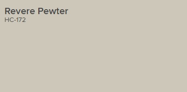
Revere Pewter is a super popular mid toned greige paint color. It is a wonderful warm paint color with just enough depth to keep it from getting washed out, without it looking dark in most rooms.
Click here for my complete Revere Pewter color review.
Click here to get a peel and stick sample of Revere Pewter
Shaker Gray (2128-60)

Unlike most of the colors on this list, Shaker Gray is actually a cool toned color. It is a mid-toned gray that pairs well with blues, icy grays, and crisp whites.
Click here to get a peel and stick sample of Shaker Gray
White Dove (OC-17)

White dove is a warm, creamy, off white paint color. It is slightly yellow, but in bright rooms will read as very white. It's a popular white color to look bright and clean without being cold or stark.
Click here to get a peel and stick sample of White Dove
Navajo White (OC-95)
Navajo White is a creamy yellow off-white paint color. This shade has a decent amount of color to it, so it won't get washed out even in a very bright room.
It's a great option if you want a light, bright room but just a touch of depth and warmth to the walls.
Click here to get a peel and stick sample of Navajo White
Palladian Blue (HC-144)

Palladian Blue is a soft, airy blue with gray undertones. It is perfect for home that lean a bit beachy or coastal and want a soft, bright aesthetic.
Click here to get a peel and stick sample of Palladian Blue
Edgecomb Gray (HC-173)
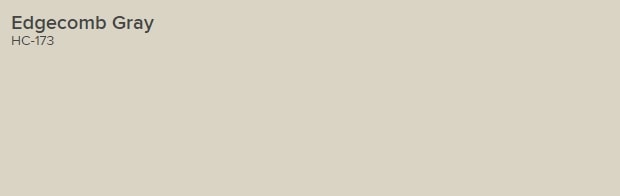
This color is often described as "tawny". It is a beige with gray undertones. It has a lot of warmth to it but doesn't really feel yellow.
While there is a slight green undertone to it, it is not significant. There is no purple undertone.
This color will look grayer in natural light and more beige in artificial lighting. Overhead lighting often casts a warm tone on colors, and brings out the beige in greige paint colors.
Click here for my complete Edgecomb Gray color review.
Click here to get a peel and stick sample of Edgecomb Gray
It's very important to swatch colors on your wall to make sure they look good – day and night – in your actual space before committing.
Click here to get removable peel & stick paint samples to easily swatch with!
What are your favorite timeless paint colors?
Still unsure which paint color is right for your space?
Choosing paint doesn’t have to be stressful! My free Paint Color Planning Quick Start Guide walks you through the exact steps to confidently choose the perfect color — without the overwhelm, second-guessing, or endless swatch testing.
👉 Click here to download the free guide!
DIYing Your Paint Job? Start Here.
Choosing a paint color is only half the equation — the tools you use matter just as much. I’ve rounded up the painting supplies we rely on for clean lines, smooth finishes, and less frustration overall.

My Paint Color Formula course walks you through the painless process of expertly testing paint swatches to ensure you have the perfect color for your home.
The best way to sample paint? Samplize!
Get peel-and-stick removable and reusable paint samples here!
Thanks for reading!

Morgan is passionate about home decor and paint colors. She has been sharing DIY home decor tips since 2012 at CharlestonCrafted.com. From there, she learned to love paint colors, and the Paint Color Project was born in 2022!