Want to pick the perfect dining room paint color? Let's talk about how to pick a paint color and see some examples in real homes!
Picking paint colors is fun but can be super overwhelming. Part of the problem is that there are nearly unlimited paint colors - seriously, so many - and paint really impacts how a space feels!
So, let's look at some popular dining room color palettes to help you narrow down your paint color selection.
What color is best for a dining room?
The best dining room color schemes are going to be paint colors that flow well with the rest of your house. Having a home where each room has a different color or theme is a bit dated.
The easiest thing to do is paint your house all one color. Here are my favorite whole house paint colors!
This is especially true if your home is open concept and you don't have a shut off formal dining room but more of a dining table nook.
If you want to provide contrast in your dining room walls, there are a few options.
First, you can paint all but one of the walls the color of the adjacent rooms and have an accent wall. This is a great way to incorporate color without having all the walls painted different.
Another option that I love is to choose a color 2-3 shades lighter OR darker than your paint color on the same color strip.
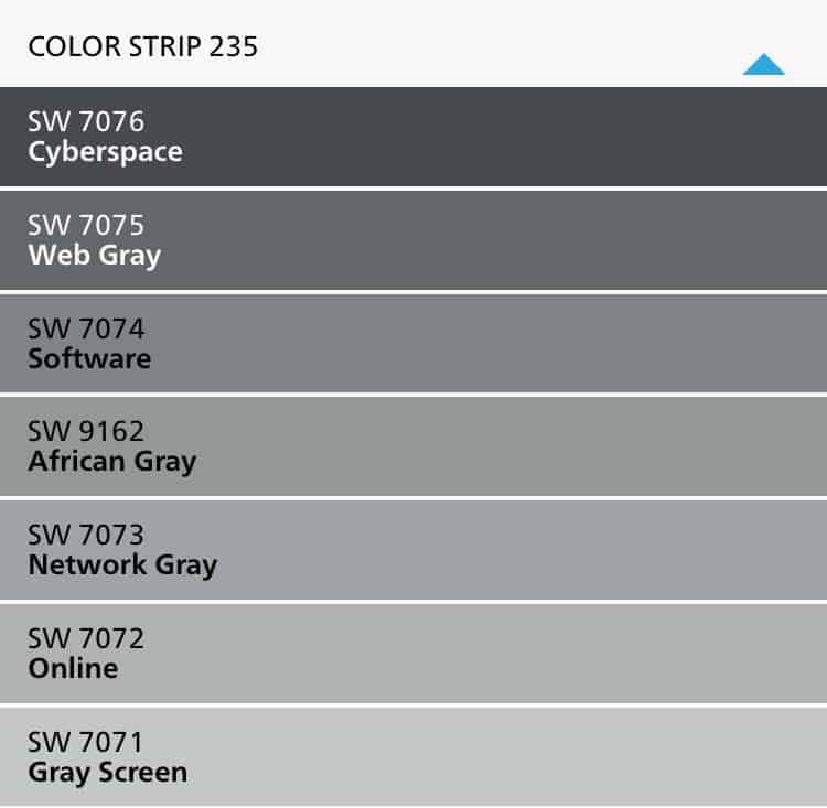
So, on the swatch above, if the rest of your space was 7072 Online (like my old house!), you could paint your dining room African Gray or Software.
These colors are designed to coordinate, making it an easy color flow. I don't suggest picking 2 colors right next to each other as they sometimes can look so similar like it's just a mis-tint.
Dining room styles
Here are some common and popular home decor styles for a dining room:
- Neutral
- Moody
- Formal
- Dramatic
- Casual
- Rustic
- Modern farmhouse
If you know you love one of these styles, go on pinterest and search the style name and "dining room" to find real life examples.
Of course, paint colors will look different in every room, depending on a lot of factors but especially your natural lighting.
I always recommend swatching colors in your actual room before committing to anything!
My Paint Color Formula ebook walks you completely through the process of picking and testing paint colors for your home.

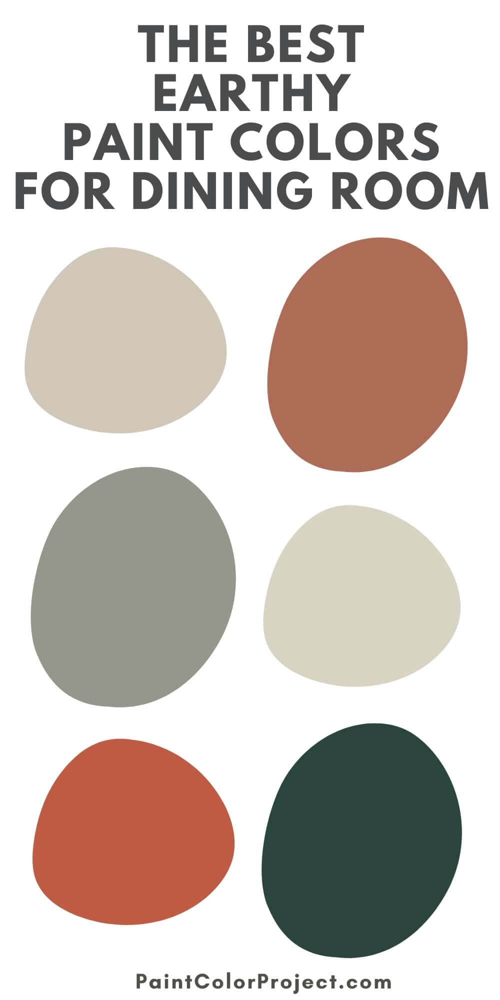
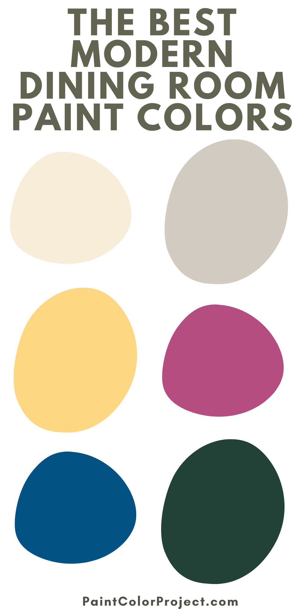
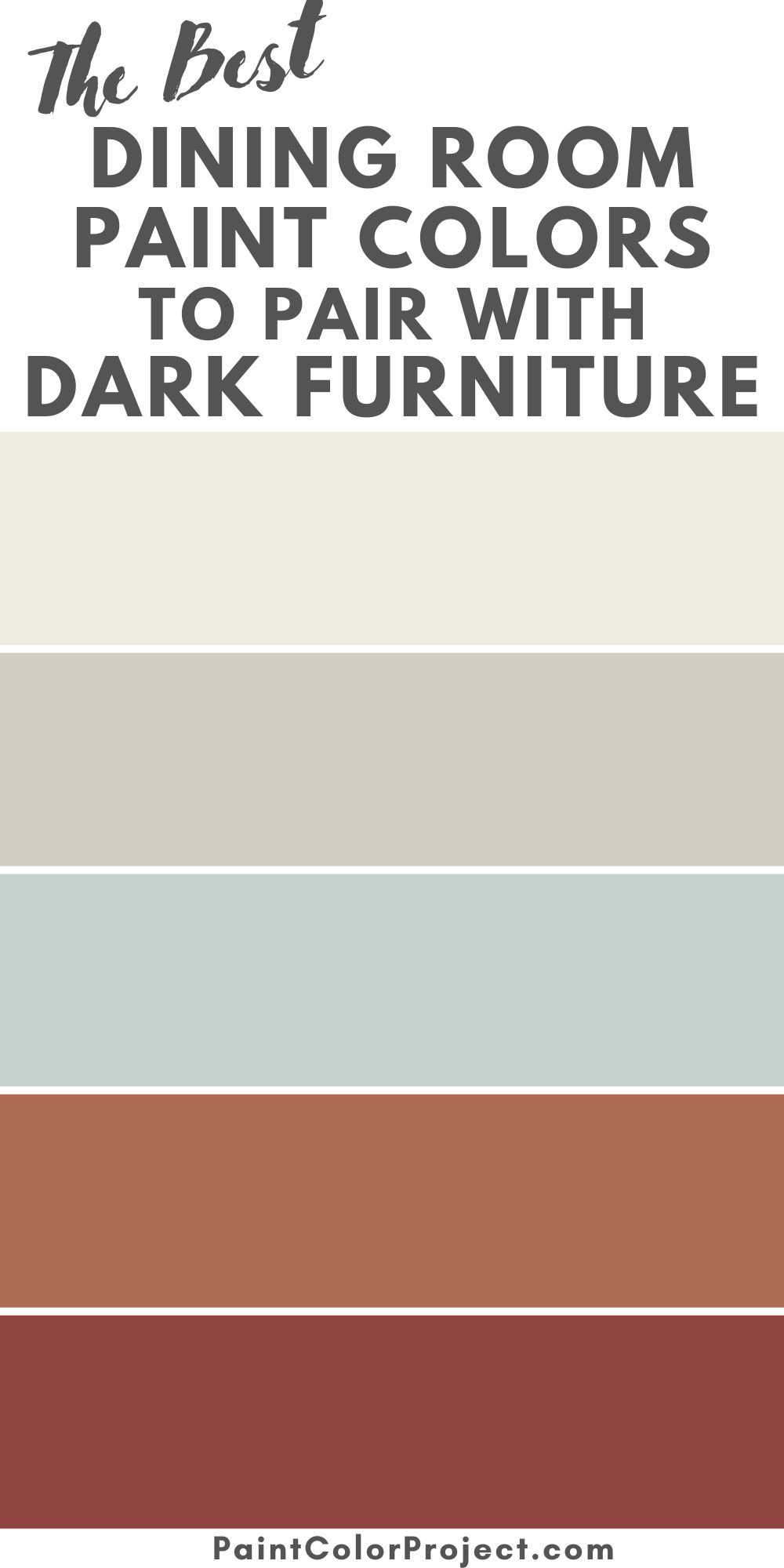
Dining room paint color ideas
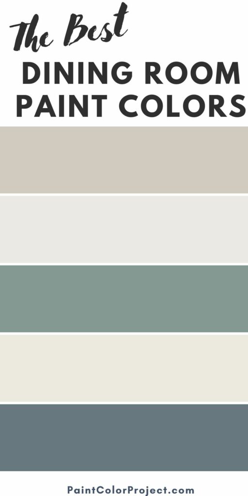
Gray paint colors for a dining room
Sherwin Williams Agreeable Gray

Agreeable gray is technically a greige and can fall into either the gray or beige color family.
Agreeable Gray does not have one specific strong undertone. It really bounces/reflects the colors around it. Reddish tones will make it look more pink, golden tones make it look more yellow.
Click here to read my complete Agreeable Gray review.
Benjamin Moore Pale Oak
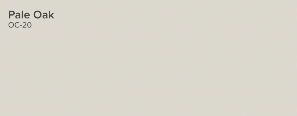
The Pale Oak paint color is in the warm neutral gray or greige paint color family. Pale Oak is a very neutral paint color, with hints of both warm and cool tones. However, due to the prevailing golden yellow undertones, it is considered a warm toned paint color.
Pale oak is more beige than gray. However, if you have very bright natural light, that can make it look off white. On the other hand, low light rooms will look more cool and gray toned. Always swatch paint in your actual room!
Click here to read my complete Pale Oak review.
Sherwin Williams Repose Gray
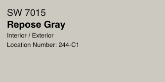
Repose Gray is in the greige color family - a mix of gray and beige. Repose Gray has more green and blue undertones. You will especially see these tones in a North facing room. North facing rooms get cool light, which tends to make color skew blue-r.
This is a great option for a warm gray wall that actually works well with warm or cool accent colors. So, unlike some other greige paint colors that don't play well with cool toned fixtures (tile, cabinets, etc) Repose Gray can actually pull it off!
Click here to read my Repose Gray color review!
Benjamin Moore Edgecomb Gray
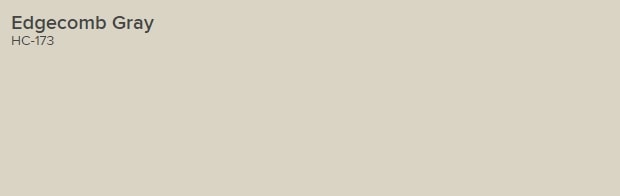
This color is often described as "tawny". It is a beige with gray undertones. It has a lot of warmth to it but doesn't really feel yellow.
While there is a slight green undertone to it, it is not significant. There is no purple undertone.
This color will look grayer in natural light and more beige in artificial lighting. Overhead lighting often casts a warm tone on colors, and brings out the beige in greige paint colors.
Click here to read my complete Edgecomb Gray review!
Sherwin Williams Grayish

Grayish has definite purple undertones. This is more of a cool gray - though it does have a bit of pink or red warming it up. It definitely reads as cool compared to a lot of the more popular greige paint colors.
This color is going to look especially cool in rooms with north facing windows or not much natural light.
A bright, southern-facing window will let in warm, yellow toned light that will warm this color up and have it appear much less cool or purple.
Click here to read my Grayish review!
White paint colors for a dining room
Sherwin Williams Alabaster SW 7008
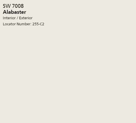
Alabaster is an ultra popular (2016 color of the year!) creamy white paint color. It is not pure white but has creamy beige undertones. It is not at all yellow.
This color is a perfect balance between warm and cool, which is a big part of what makes it so universally appealing.
Click here to get a peel & stick sample of Alabaster
Click here to read my complete Alabaster review.
Sherwin Williams Pure White SW 7005
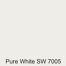
Pure White is a bright white color with a slight warmth - but no creaminess - to it. This color has a very tiny amount of yellow undertone to it which is what gives it that warmth, however it really does not read as yellow at all.
Click here to get a peel & stick sample of Pure White
Benjamin Moore White Dove
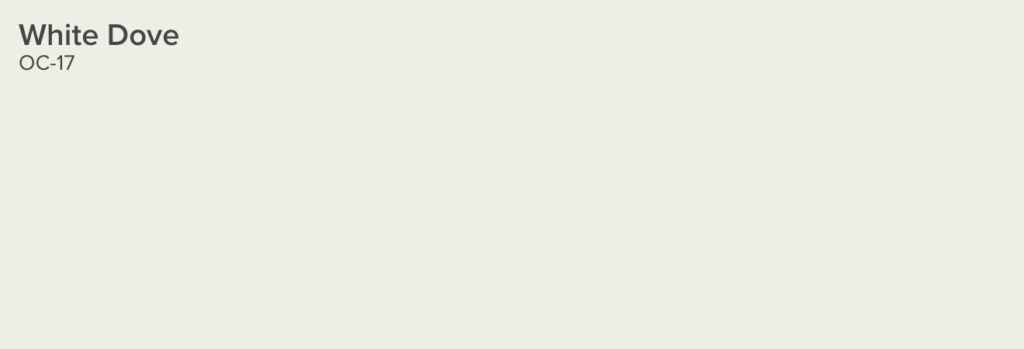
White Dove is a soft, warm white color. It has slight green undertones to it. Placed next to a white sheet of paper, it can look slightly yellow, but on its own it almost never reads that way.
This is a great neutral paint color for walls or trim! This is one of the most popular Benjamin Moore paint colors, and for a great reason!
Click here to get a peel & stick sample of White Dove
Behr Polar Bear
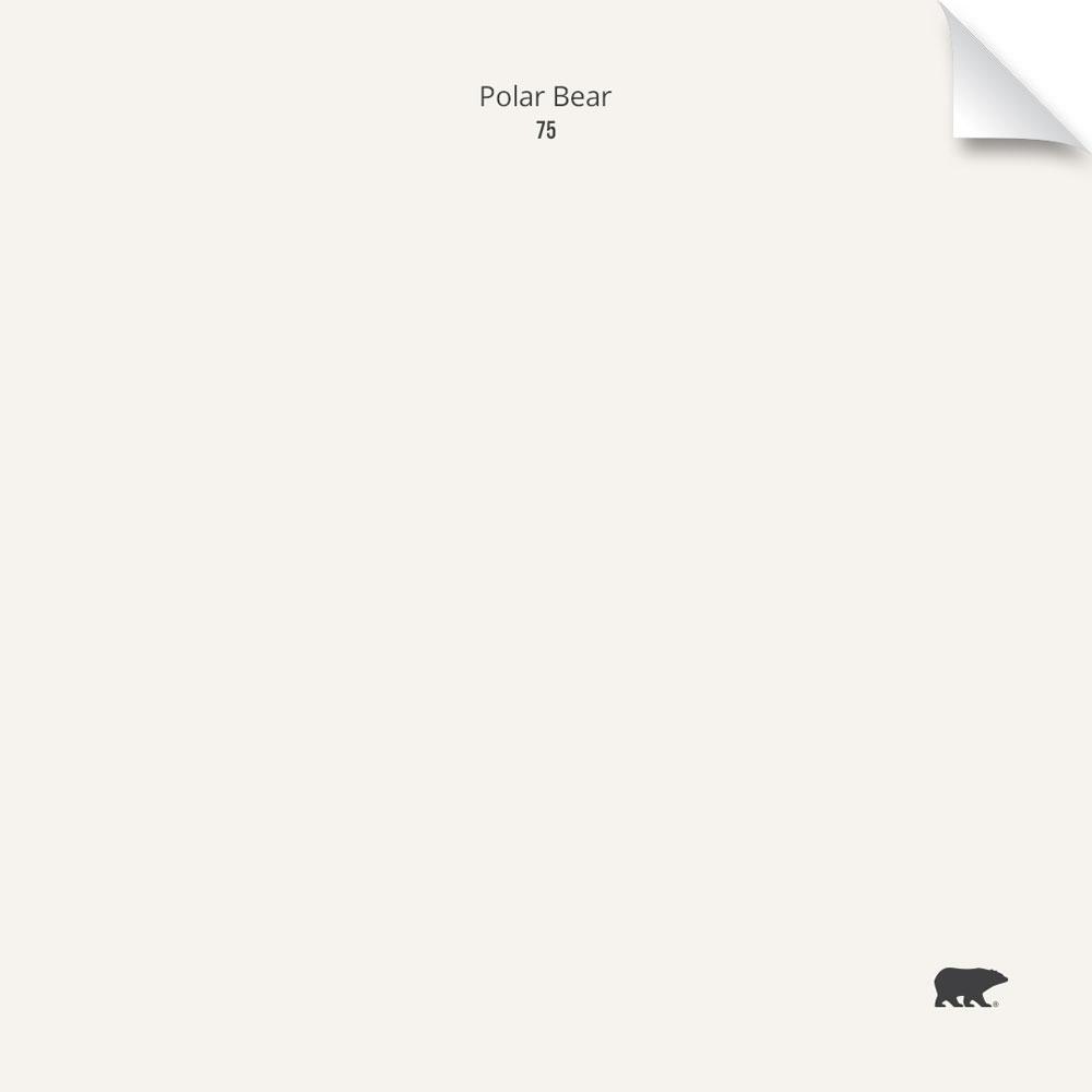
This color is very close to white dove due to its greenish undertones. However, Polar Bear is a bit brighter and therefore seems lighter. It's a great option for clean but not stark looking walls or trim.
Behr Swiss Coffee
Swiss Coffee is another ultra popular white paint color by Behr. This color is a bit creamier, with more beige undertones, and less stark white. It has a neutral base, which helps to keep it from looking yellow. It is a slightly off white but does not read tan at all.
Sherwin Williams Aesthetic White SW7035

Aesthetic white is really less of a white and more of a light greige paint color. It has a lot of beige and a little gray to it. North-facing windows will bing out the beige, while southern facing windows will let this color feel more white!
Click here to get a peel & stick sample of Aesthetic White
Benjamin Moore Chantilly Lace OC-65

Chantilly Lace is the whitest white paint color Benjamin Moore offers. It's a very bright white, with crisp clean cool tones. It's a very pure white and a favorite of many designers for that reason.
Click here to get a peel & stick sample of Chantilly Lace
Benjamin Moore Chalk White 2126-70

This is another bright, bold white with a bit of a cold undertone to it. It has slight gray undertones to it, giving it that cool, clean look.
Click here to get a peel & stick sample of Chalk White
Behr Ultra Pure White 1850
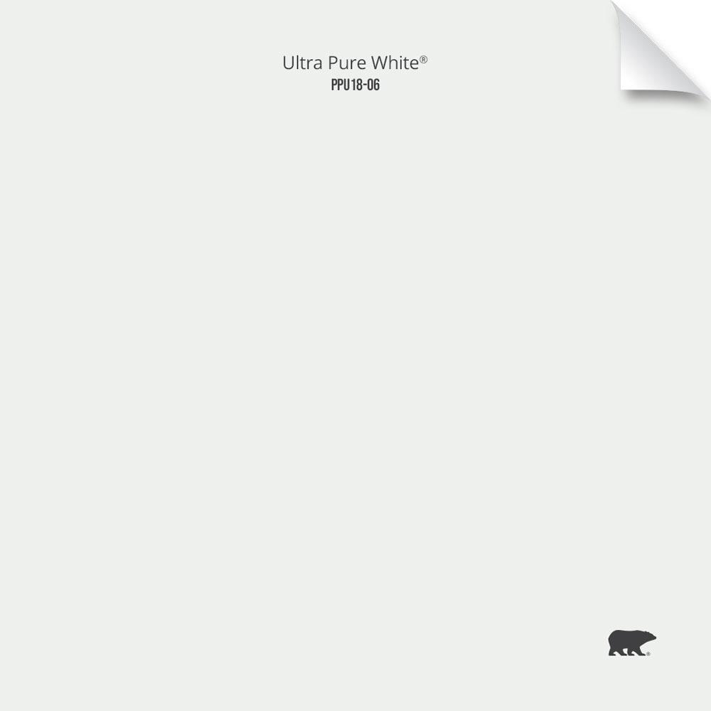
Ultra Pure White is about the whitest white paint color that there is across brands. It has a LRV of 94, which is very close to pure white (100). While there isn't much of an undertone to it, being that bright white makes it feel cool and slightly gray toned.
Benjamin Moore White Diamond

This cool white paint color has slightly blue and gray undertones to it. This is what makes it so white and combined with its brightness and crispness, it pairs really well with other cool colors.
Click here to get a peel & stick sample of White Diamond
Sherwin Williams Snowbound SW 7004

This is another crisp cool gray with a gray undertone. It looks pretty pure white until you put it next to other whites, at which point you really see the gray undertones!
Click here to get a peel & stick sample of Snowbound
Blue paint colors for a dining room
Windy Sky by Benjamin Moore (1639)
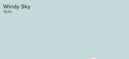
Windy sky is a gorgeous, bright and cheerful blue gray paint color. To me, it feels like aqua, all grown up and sophisticated. It feels like a sunny, cloudless day and would really make your home feel warm and inviting.
Upward by Sherwin Williams (SW 6239)
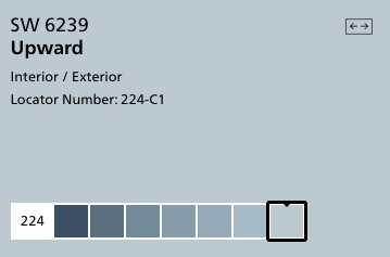
Upward is a clear and pure blue color. It doesn't get muddy tones from the gray undertones but feels less bright because of them. It is a really cheerful color and would work well on walls in many rooms.
Click here to get a 12"x12" peel and stick sample of Sherwin Williams Upward!
Gentle Gray by Benjamin Moore (1626)
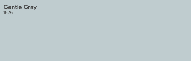
This soft blue-gray is the color of a gentle early morning fog. It is very versatile and pairs well with a wide variety of accent colors.
Click here to get a 12"x12" peel and stick sample of Benjamin Moore Gentle Gray!
Water's Edge by Benjamin Moore (1635)

Water's Edge has an almost teal undertone. It is a medium darkness and would be beautiful on your walls but would also be stunning for painting a piece of furniture. The teal tones give it a very coastal feel.
Click here to get a 12"x12" peel and stick sample of Benjamin Moore Water's Edge!
Distance by Sherwin Williams (SW 6243)
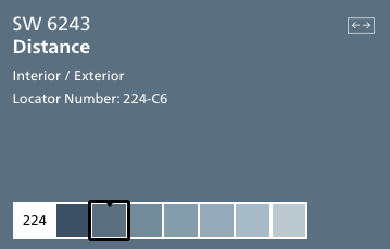
Distance is a shade of blue that makes me think of my favorite pair of broken in denim. It feels warm, welcoming, and inviting.
It's got that perfectly worn look, thanks to the gray undertones. Pair it with metallics to glam it up or keep it rustic with wood tones - it really can work in so many ways.
Click here to get a 12"x12" peel and stick sample of Sherwin Williams Distance!
Providence Blue by Benjamin Moore (1636)
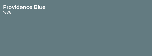
Providence Blue is a mid-toned blue-green color with muted undertones. It feels almost teal, but not quite green enough.
I think this color would be stunning in a room with a lot of intricate wall moldings. Va-va voom!
Click here to get a 12"x12" peel and stick sample of Benjamin Moore Providence Blue!
Granite Peak by Sherwin Williams (SW 6250)
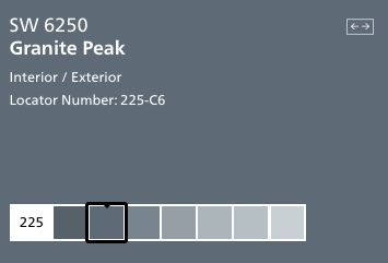
Granite Peak is a deep charcoal gray color with icy blue undertones. It reads as a really cool gray and can feel more blue depending on it's surroundings.
Click here to get a 12"x12" peel and stick sample of Sherwin Williams Granite Peak!
Hale Navy by Benjamin Moore (HC-154)
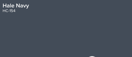
Hale Navy is a deeply saturated navy blue. Using this color will bring a ton of impact into your space!
It might not be the color for all of the walls in your home, but using it selectively can be really beautiful. The gray undertones keep this blue from looking too much like a military uniform.
Click here to get a 12"x12" peel and stick sample of Benjamin Moore Hale Navy!
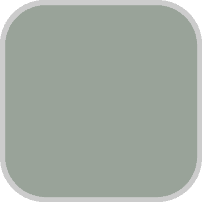
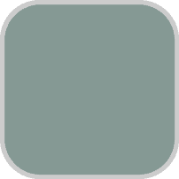
Green paint colors for a dining room
Behr Nature's Gift
This is a beautiful earthy green. It's slightly darker than light green, with both blue and gray undertones. It really transforms in different light!
Read my complete Nature's Gift review!
Behr Laurel Tree
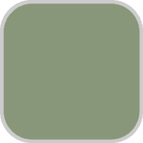
This is a sage green thats just slightly bright, but has gray undertones so it's not neon at all.
Read my complete Laurel Tree review!
Sherwin Williams Rookwood Sash Green

This is a very rich forest green. It has just a touch of blue undertones, and in cool light could look a bit teal. I love how dramatic it is on cabinets!
Sherwin Williams Pewter Green

This is the perfect earthy sage green paint color. It is gorgeous on the exterior of a home in an earthy, wooded lot!
Behr In the Moment
This is another green with a lot of blue undertones - but it is definitely green and not blue!
Sherwin Williams Retreat

This is a dusty olive green color, with a lot of gray to it so it doesn't at all feel overwhelming.
Sherwin Williams Acacia Haze

This is a dusty olive green color. Perfect for a trendy, sage green wall!
Still unsure which paint color is right for your space?
Choosing paint doesn’t have to be stressful! My free Paint Color Planning Quick Start Guide walks you through the exact steps to confidently choose the perfect color — without the overwhelm, second-guessing, or endless swatch testing.
👉 Click here to download the free guide!
DIYing Your Paint Job? Start Here.
Choosing a paint color is only half the equation — the tools you use matter just as much. I’ve rounded up the painting supplies we rely on for clean lines, smooth finishes, and less frustration overall.

My Paint Color Formula course walks you through the painless process of expertly testing paint swatches to ensure you have the perfect color for your home.
The best way to sample paint? Samplize!
Get peel-and-stick removable and reusable paint samples here!
Thanks for reading!

Morgan is passionate about home decor and paint colors. She has been sharing DIY home decor tips since 2012 at CharlestonCrafted.com. From there, she learned to love paint colors, and the Paint Color Project was born in 2022!