If you’re searching for a warm beige paint color that feels cozy but still pulled together, Sherwin Williams Wickerwork is definitely worth a look.
Warm, cozy neutrals are back, and I love it! Taupes, tans, beiges, soft browns … they’re everywhere, and for good reason.
These shades feel polished and sophisticated, but they’re also welcoming, like a warm hug when you walk into a room.
I find that beiges like Wickerwork work beautifully as a statement — think a front door, built-in shelves, or a charming powder room.
But you can easily use it on a bigger scale too. A full living room? So timeless and peaceful.
This is one of those colors you can do a lot with, depending on how you use it and what you pair it with.
So, let’s get into it! Here’s everything you need to know about the warm and inviting vibe of Sherwin Williams Wickerwork.
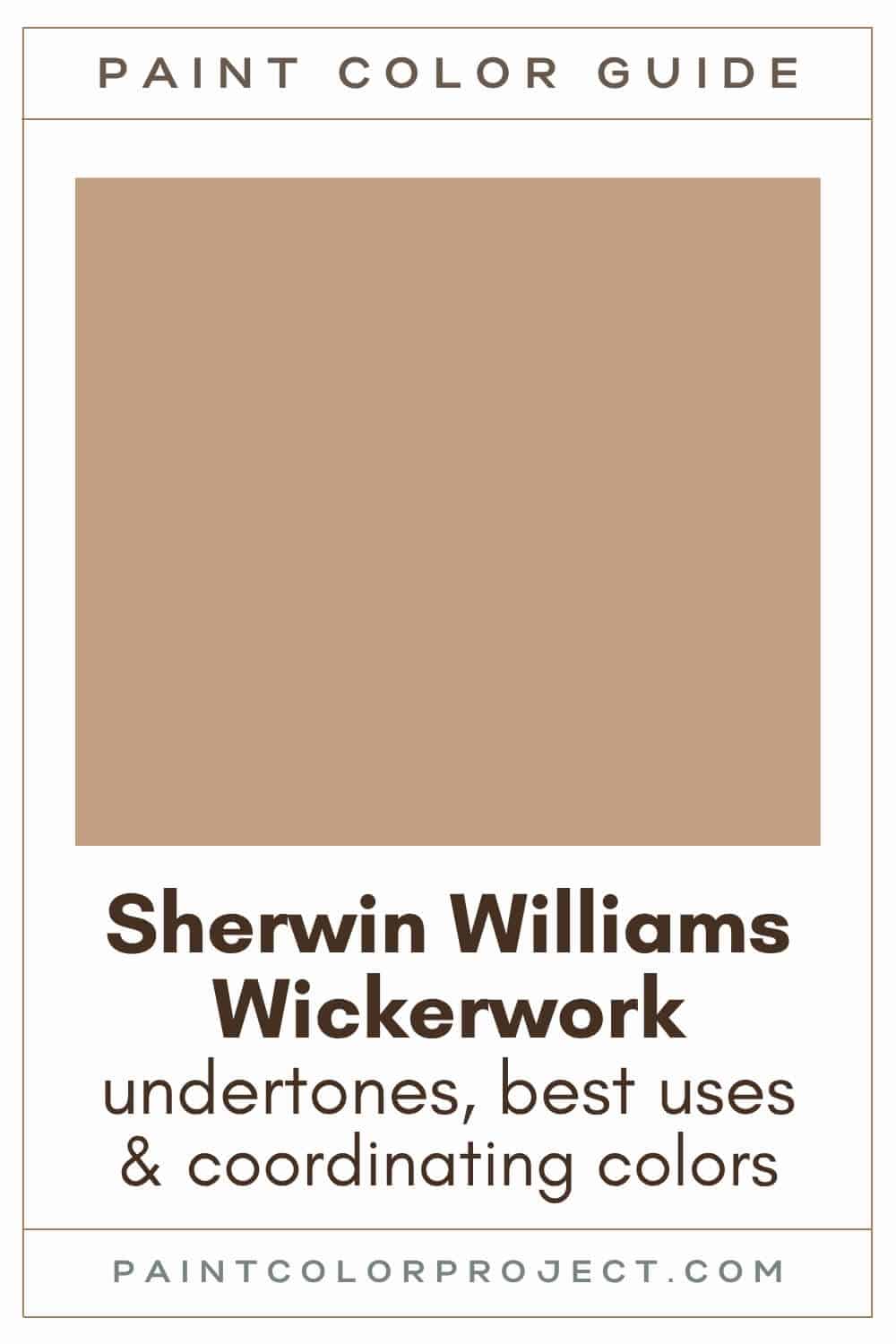
Wickerwork, Sherwin Williams, SW 0010
Wickerwork is a warm beige, almost taupe. It's a great neutral that adds coziness and comfort to a space.
Click here to get a peel and stick sample of Wickerwork
Color Family
Wickerwork is found in the orange family.
Light Reflectance Value
37
Light Reflectance Value tells you how much light a color reflects on a scale from 0 to 100, with 0 being black and 100 being pure white.
With an LRV of 37, Wickerwork sits right in the medium range. It has enough depth to feel rich, but it will not drag a room down or feel muddy.
RGB Colors
R: 193 G: 158 B: 128
RGB shows how much red, green, and blue are mixed to create the color. Looking at these numbers, it makes sense why Wickerwork reads warm and earthy instead of cool.
Hex Code
#C19E80

Undertones
Wickerwork has warm golden orange undertones.
In a south-facing room with lots of sunlight, you’ll see Wickerwork's warm, cozy undertones really come through.
In a north-facing room with cooler light, Wickerwork can lean a little more neutral and a tad darker.
This is one of those colors I always recommend testing on your walls. Seeing it in your lighting, both day and night, makes all the difference before committing.
Click here to get removable peel & stick paint samples to easily swatch with!
Best Uses
Wickerwork is incredibly versatile! You can use almost anywhere, which is why I like it so much.
If you want a cozy focal point, try it on an accent wall. It adds warmth and depth without taking over the room.
Wickerwork also works beautifully on:
- Doors
- Shutters
- Built-ins
- Bedrooms
- Bathrooms
- Living rooms
Similar Colors
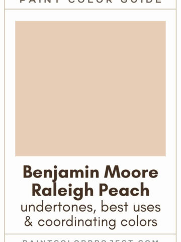
- Sherwin Williams Oak Barrel
- Benjamin Moore Cafe Royal
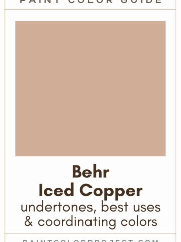
- Behr Milano
- Sherwin Williams Farro
- Benjamin Moore Dark Buff
- Behr Granola
- Sherwin Williams Canoe
Click here to get a peel and stick sample of Wickerwork
🤯 Too many color choices?
Download my free Paint Color Planning Quick Start Guide — it’s the exact method I use to help readers choose a color that works the first time.
📥 Grab it here!
Coordinating Colors
Wickerwork pairs pretty well with warm colors: browns, tans, greiges, grays, soft oranges, golden yellows, and corals.
I also love it paired with soft blues or muted greens for balance. If you want more contrast, deeper reds can look really striking next to it too.
Creamy whites:
- Dover White
- Creamy
- Shell White
- Ivory Lace
- Westhighland White
Cool blues:
- Debonair
- Blustery Sky
- Morning at Sea
- Meditative
- Whirlpool
Dark neutrals:
- Urbane Bronze
- Thunder Gray
- Prelude
- Black Fox
- Enduring Bronze
Trim Colors
Due to its warmth, Wickerwork pairs best with soft or creamy whites for trim.
You can also pair Wickerwork with a bright white that has soft undertones, such as Creamy.
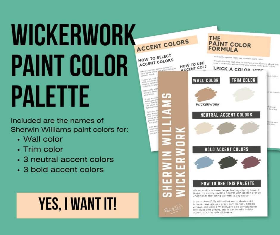
Wickerwork Paint Color Palette
Want to use this paint color in your home? Instantly upgrade your home's aesthetic with our exclusive paint color palette. Unlock the perfect trim color and six stunning accent colors, a combination of neutrals and bold hues for an instantly harmonious space!
Get your perfect paint color palette by clicking here!
Click here to get a peel and stick sample of Wickerwork
FAQs
Here are some common frequently asked questions about Wickerwork.
Is Sherwin Williams Wickerwork warm or cool?
Sherwin Williams Wickerwork is a warm neutral beige.
Where should I use Sherwin Williams Wickerwork?
Wickerwork works well in so many spaces! Use it for living rooms, doors, shutters, built-ins, bedrooms, bathrooms, or even your home's exterior!
Because it's neutral but never boring, you can use it with so many different decor styles and still achieve that polished, pulled-together look you're after.
Does Sherwin Williams Wickerwork look orange?
Sherwin Williams Wickerwork is in the orange color family, but it does not appear orange. The warm golden undertones do show up more noticeably in bright, south-facing rooms where they give the space a cozy, welcoming glow.
In north-facing rooms, I've noticed it calms down quite a lot and looks more neutral and slightly darker. This shift is why I always recommend you test it on your actual wall in different lights before going all-in.
What colors go with Sherwin Williams Wickerwork?
Wickerwork pairs nicely with warm colors: browns, tans, greiges, grays, soft oranges, golden yellows, and corals. It also looks great with soft blues and greens, as well as bolder colors such as reds.
To start, try swatching Wickerwork with Dover White (a warm white), Debonair (a cool blue) or Urbane Bronze (dark neutral).


What's the difference between Sherwin Williams Wickerwork and Oak Barrel?
These two look very similar at first glance. I get why people mix them up. Wickerwork is a touch darker with an LRV of 37. Oak Barrel comes in slightly lighter at 39.
Wickerwork leans a bit more red and feels more saturated. Oak Barrel is softer and more muted. Seeing them side by side in your own lighting really helps the difference stand out.

What's the difference between Sherwin Williams Wickerwork and Accessible Beige?
While Wickerwork and Accessible Beige are both warm neutrals, they are pretty different colors!
Wickerwork is darker (LRV 37), more orange, and more saturated. Accessible Beige is noticeably lighter (LRV 58), more yellow and more gray, and softer / more muted.

Before you go...
So, you've found the perfect paint color, but here's the thing — there's another big decision you have to make: picking the right paint sheen.
Seriously, the level of glossiness can totally change how your color looks on the walls and how long the paint lasts!
Check out our complete guide to understanding paint sheens.
Still unsure which paint color is right for your space?
Choosing paint doesn’t have to be stressful! My free Paint Color Planning Quick Start Guide walks you through the exact steps to confidently choose the perfect color — without the overwhelm, second-guessing, or endless swatch testing.
👉 Click here to download the free guide!
DIYing Your Paint Job? Start Here.
Choosing a paint color is only half the equation — the tools you use matter just as much. I’ve rounded up the painting supplies we rely on for clean lines, smooth finishes, and less frustration overall.

My Paint Color Formula course walks you through the painless process of expertly testing paint swatches to ensure you have the perfect color for your home.
The best way to sample paint? Samplize!
Get peel-and-stick removable and reusable paint samples here!
Thanks for reading!

Meg Hemmelgarn is a freelance writer and home decor + DIY blogger who loves to talk about paint colors. She and her husband are currently renovating their third fixer upper. You can see their projects on her blog, Green With Decor.