Looking for the perfect warm white or cream paint color? Let's talk about Sherwin Williams Creamy, its undertones, coordinating colors, and best uses!
One of the most common requests that people have when decorating their home is for a room to feel light and bright.
Naturally, when this topic comes up, it often leads us to white paint colors.
The problem with white paint colors is that sometimes they can feel stark or cold.
That is why I almost always suggest a warm, white or a slightly off white paint color.
If your room gets a lot of bright light, then an off-white will usually look white to your eye, but not feel stark or cold.
Sherwin Williams Creamy is a great option for creamy off-white paint color. Let's dive into it and see if it might be the perfect paint color for your home.
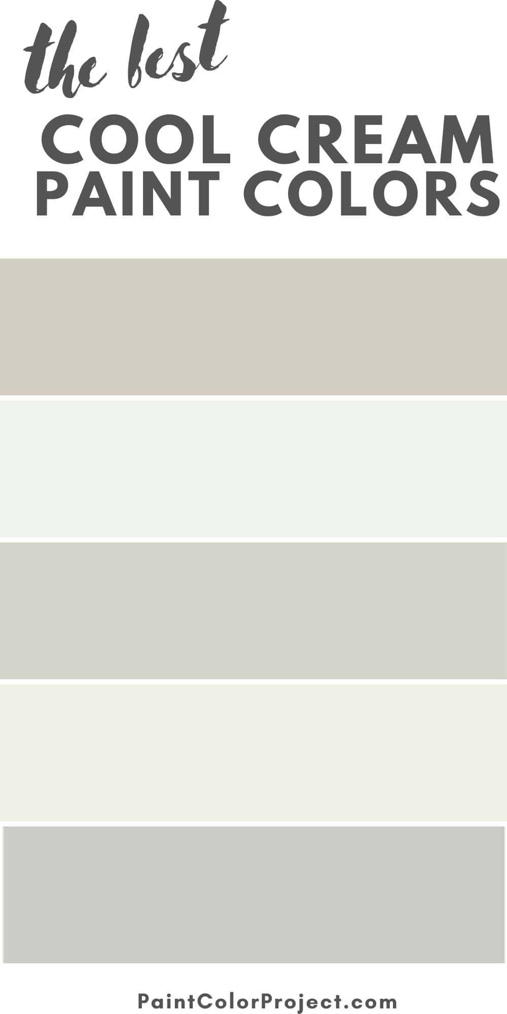
See all of my favorite cream paint colors here!
Sherwin Williams Creamy SW7012
Creamy is a neutral, slightly warm off white paint color. It's a great option for a light, bright, cozy feeling space.
Color Family
Creamy is in the cream or off-white color family.
Light Reflectance Value
81
Light Reflective Value is the measurement of how much light a color bounces around. This is on a scale of 0 to 100 with 0 being pure black and 100 being pure white.
LRVs between 73-82 are considered to be off white paint colors. At 81, Creamy is a very light off white - pretty close to actual white.
In a bright room, this color will read as pretty close to white. In a darker room, it will look creamier.
RGB Colors
R: 239 G: 232 B: 219
RGB describes the amount of each color - red, green, and blue - present in a color. This is on a scale of 0 to 255 for each color. This is basically the color mix to make the color!
Hex Code
#EFE8DB

Undertones
Creamy has slightly warm undertones. That's what makes it creamy and not like a light gray.
Remember that warm lighting - warm light bulbs or direct south facing sunlight - will make this color look MORE warm and even a touch golden/beige.
In cool light - such as north-facing rooms or LED light bulbs - it will look more neutral and more like a "true white".
Additionally, in dark rooms, it will look more off-white or creamy. In bright light, it will look lighter and more white!
It's very important to swatch colors on your wall to make sure they look good – day and night – in your actual space before committing.
Click here to get removable peel & stick paint samples to easily swatch with!
Best uses
Creamy is light, bright, and neutral enough that it works well as a whole house paint color. It's also great for living rooms, bedrooms, or even your kitchen.
Creamy can work on an exterior, just be sure to swatch it day and night - the color might change significantly in different lighting situations.
Similar Colors
- SW Shoji White
- BM Ballet White
- BM Stoneware
- Behr Mourning Dove
- Behr Glacier White
- Valspar Antique White
Coordinating Colors
Creamy is neutral enough that it can work with nearly any other paint color. It will look warmer paired with cool colors and cooler paired with warm colors!
The only color that I would avoid putting this with is yellows. The slight yellow undertones in creamy can make for A Lot Of Yellow if paired with other yellows.
My picks for accent colors would include:
Warm Greiges:
- SW Gossamer Veil
- SW Twilight Gray
- SW Mink
- SW Shiitake
See all of my favorite warm grays!
Navy Blues:
- SW Naval
- SW Anchors Aweigh
- SW Charcoal Blue
See all of my favorite navy paint colors!
Light Greens:
- SW Quietude
- SW Sea Salt
- SW Halcyon Green
See all of my favorite light green paint colors!
Trim Colors
My pick for an off white paint color is always to paint the trim the same color as the walls, just in a glossier finish.
So, for example I'd do my walls Creamy in an eggshell finish and my trim Creamy in a semi-gloss finish!
This gives a soft, tone on tone look, but still provides contrast via the different sheens.
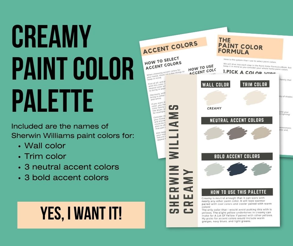
Sherwin Williams Creamy Paint Color Palette
Click here or the image below to get our premium Sherwin Williams Creamy whole home color palette!
Sherwin Williams Creamy FAQs
Here are some common questions about SW Creamy paint color!
What undertones does SW creamy have?
Creamy has warm yellow undertones. It is not super yellow - but it will look yellower in warm lighting.
Can I use SW Creamy on cabinets?
Creamy can work on cabinets in some situations, but if you want white cabinets, I personally would prefer more of a true white.
Does Sherwin Williams creamy look pink?
Creamy reads as more yellow than pink. It is most likely to look pink if you have red or pink accents in your space that would reflect/bounce off the walls.
What is the best creamy white by Sherwin Williams?
Creamy is a great option for a creamy off white paint color.
Is creamy or Dover white more yellow?
Dover white is more yellow compared to Creamy.
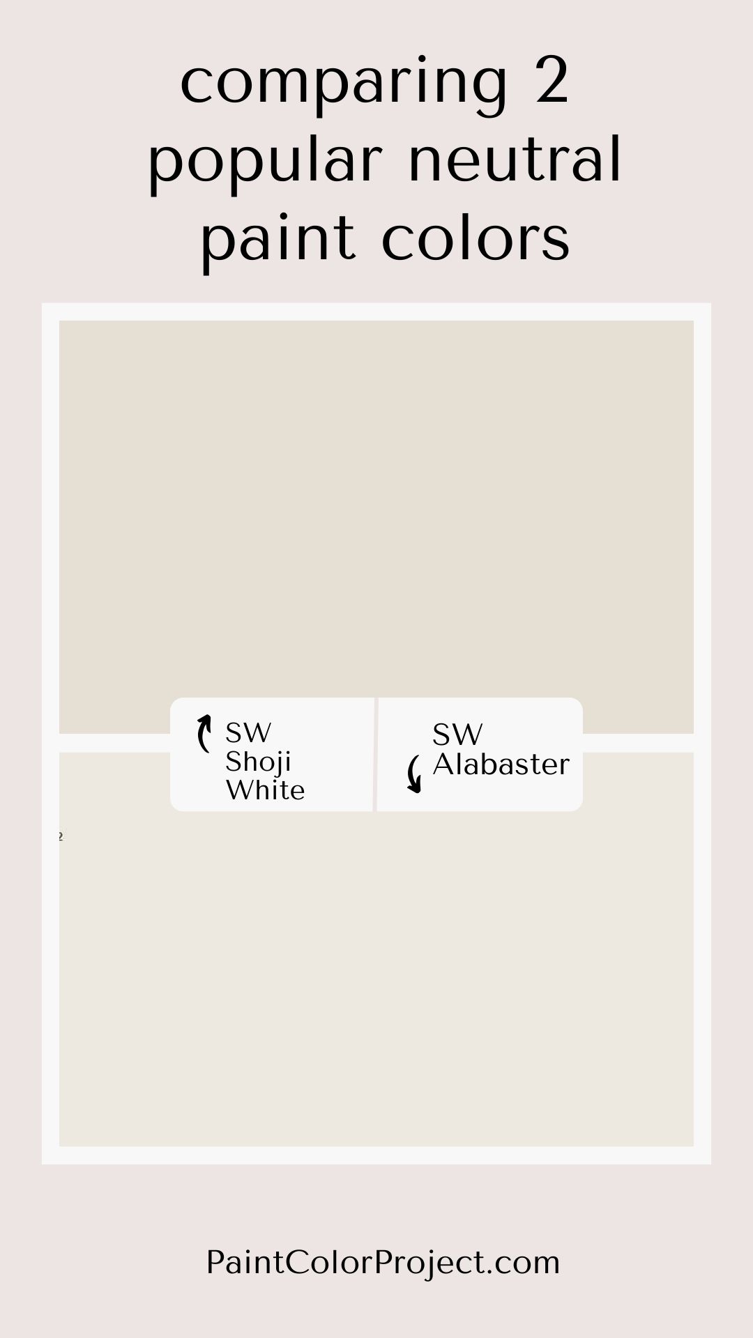
What is the difference between creamy and alabaster?
Alabaster is a bit more neutral, with more gray undertones compared to Creamy's yellow undertones.
Is SW creamy a warm color?
Yes, Creamy is a warm off white paint color with warm yellow undertones.
Does sw creamy go with agreeable gray?
Agreeable Gray and Creamy are not my favorite combination. They are similar but not the same and I feel like the undertones just clash together!
What is the difference between Sherwin Williams creamy and Dover white?
Creamy is a good bit less yellow and more neutral compared to Dover White.
Alabaster vs Creamy
These are both warm toned colors with beige undertones. However, when you put the colors next to each other, you will clearly see that Alabaster has a lot more gray to it compared to Creamy.
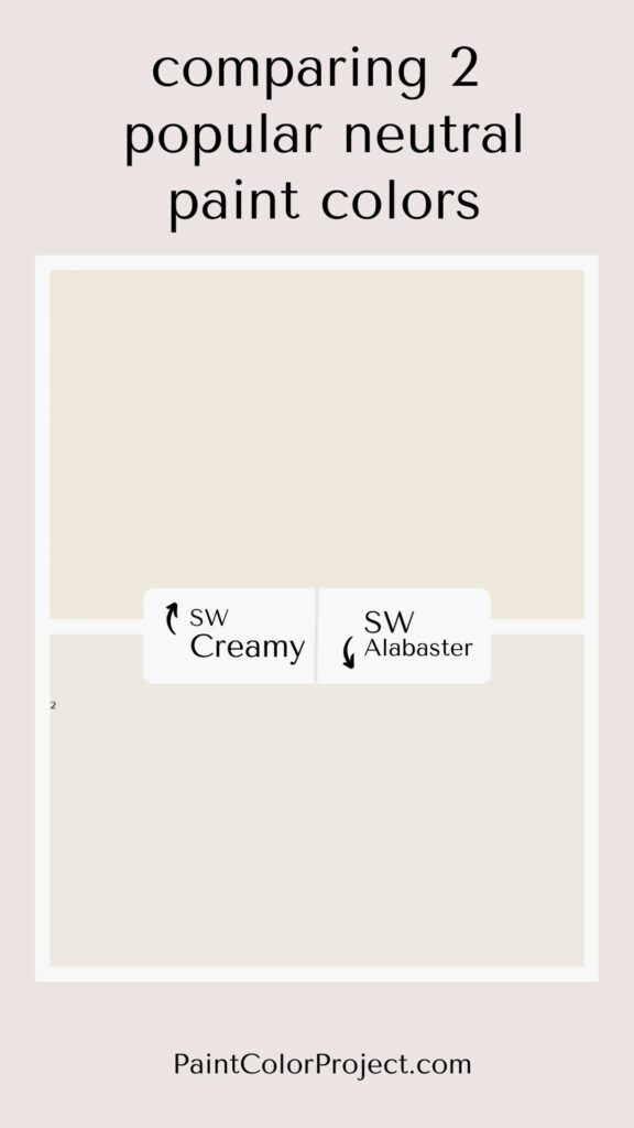
Click here for my complete color comparison of Alabaster vs Creamy!
What is the difference between Sherwin Williams Greek Villa and creamy?
Overall, Creamy is more of a warm white/off white and Greek Villa is more of a very very light greige paint color.
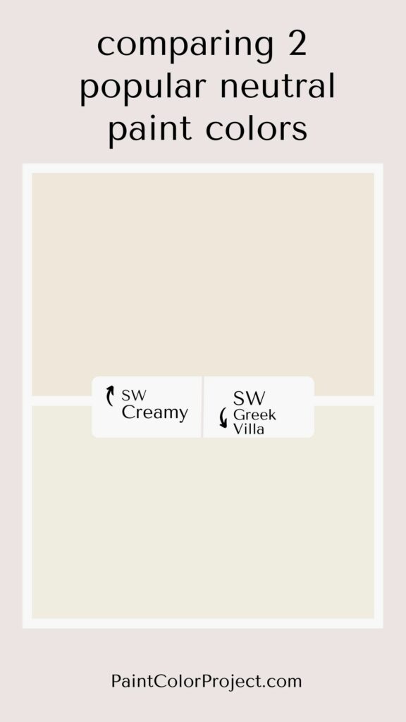
Click here for my complete Creamy vs Greek Villa comparison!
Any more questions about Sherwin Williams Creamy?
Still unsure which paint color is right for your space?
Choosing paint doesn’t have to be stressful! My free Paint Color Planning Quick Start Guide walks you through the exact steps to confidently choose the perfect color — without the overwhelm, second-guessing, or endless swatch testing.
👉 Click here to download the free guide!
DIYing Your Paint Job? Start Here.
Choosing a paint color is only half the equation — the tools you use matter just as much. I’ve rounded up the painting supplies we rely on for clean lines, smooth finishes, and less frustration overall.

My Paint Color Formula course walks you through the painless process of expertly testing paint swatches to ensure you have the perfect color for your home.
The best way to sample paint? Samplize!
Get peel-and-stick removable and reusable paint samples here!
Thanks for reading!

Morgan is passionate about home decor and paint colors. She has been sharing DIY home decor tips since 2012 at CharlestonCrafted.com. From there, she learned to love paint colors, and the Paint Color Project was born in 2022!