Looking for the perfect cool toned neutral paint color to use in your home? Check out this list of the best cool cream paint colors and factors to help you decide if this is the perfect shade for your space!
Picking the perfect paint color for your home can be such an overwhelming process. Even if you narrow it down to the idea that you want a light neutral paint color, there are just so many options!
One of the most popular neutral paint color options is a cream paint color.
Cream is a great choice for creating a calming and sophisticated atmosphere in your home.
Plus, a neutral is great because you can mix up the accent colors as trends change or even seasonally and give your space a whole new look without having to repaint the walls.
I love that cream paint is versatile and works for a ton of different design aesthetics and styles.
Today I want to talk about cool toned cream paint colors. These are cream paint colors that read just a little bit gray and slightly icy in their undertones.
Let's talk about when it's a good time to use a cool cream paint color, and some of our favorite shades!
Understanding Cool Cream Paint Colors
Cool cream paint colors refer to a specific category of neutral shades that are predominantly creamy or off-white but have cool undertones. These undertones are what differentiate cool creams from warm creams.
Cool creams, with their blue, green, or purple undertones, tend to create a calming and serene atmosphere. They work well in rooms where you want to establish a sense of tranquility, such as bedrooms or bathrooms.
Warm cream shades, on the other hand, have undertones of yellow, orange, or red. These warm undertones add a sense of coziness and energy to a room. Warm creams are ideal for spaces where you want to create a welcoming and comfortable ambiance, like living rooms or kitchens.
There is, also, a fine line between a cool cream paint color and a light gray paint color. Cool cream colors will still have a touch of that warmth that makes them feel creamy, while grays will be more exclusively cool.
I know, it's a lot!
Lighting Matters
The undertones in cool cream shades react differently to various lighting conditions. In natural daylight, cool creams might appear crisper and cleaner.
In artificial or warm lighting, these shades maintain their coolness but can create a softer, more netural look.
Factors to Consider When Choosing Cool Cream Paint Colors
No matter what shade of paint you want to use in your home, you need to consider the room's lighting, size, and existing decor elements before committing to a specific color.
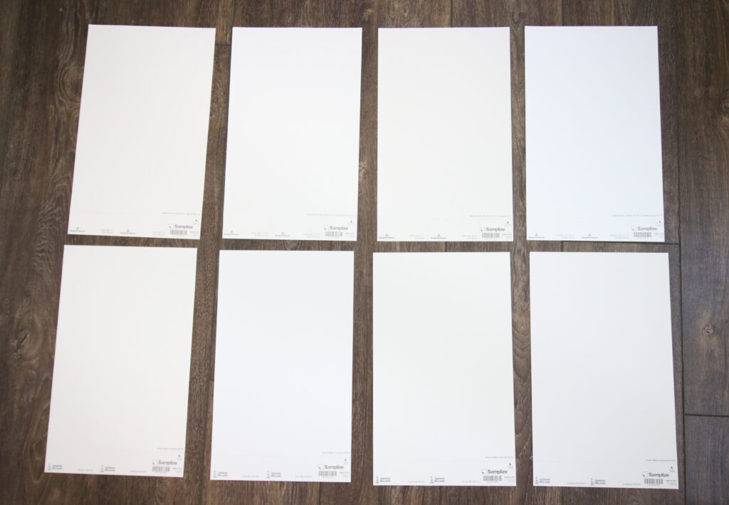
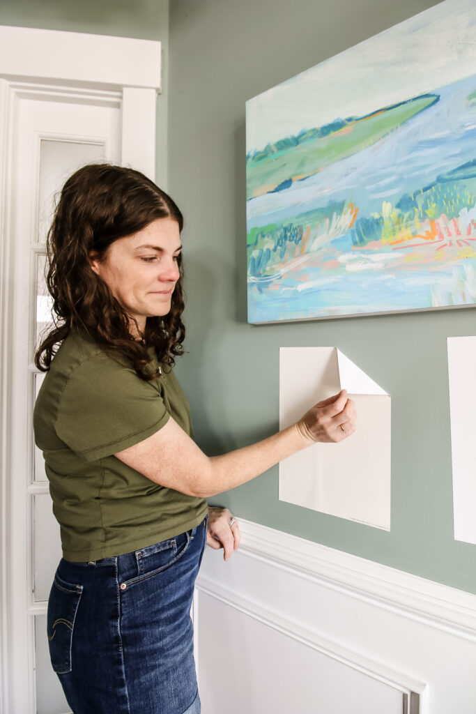
It's very important to swatch colors on your wall to make sure they look good – day and night – in your actual space before committing.
Click here to get removable peel & stick paint samples to easily swatch with!
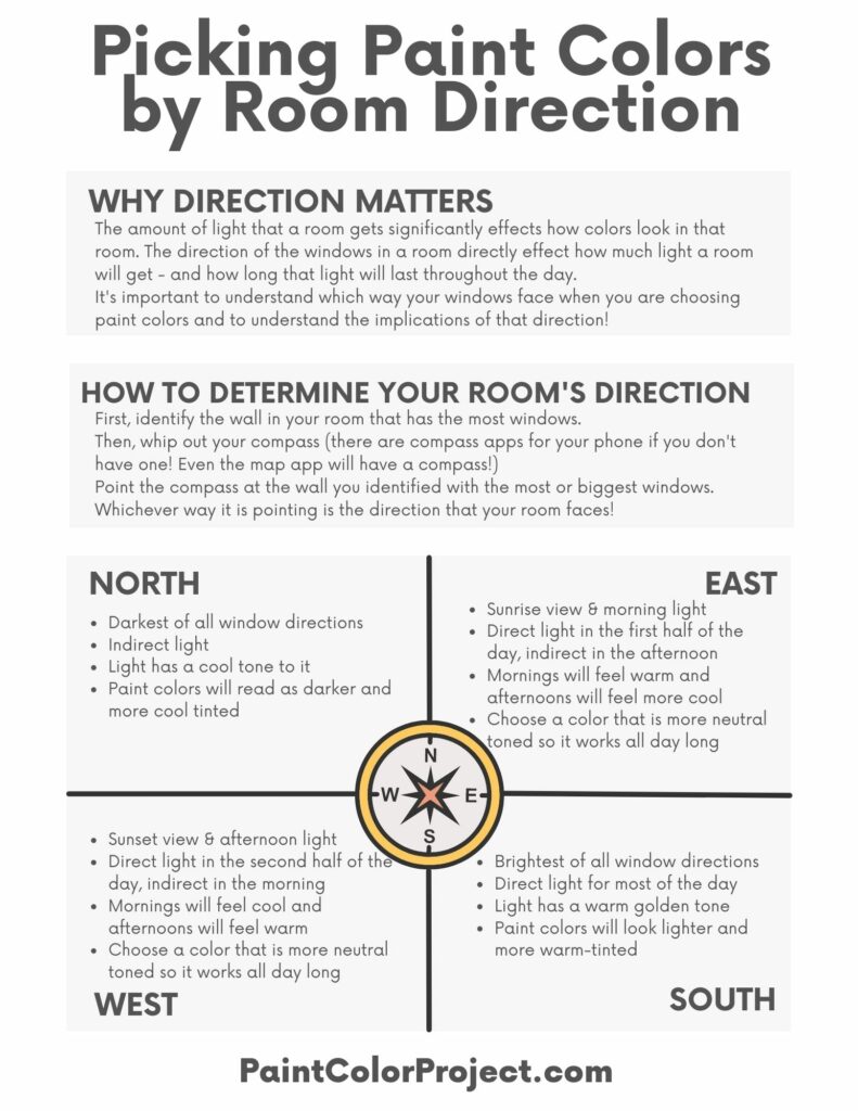
Natural Light
Natural light plays a significant role in how paint colors, especially cool cream shades, appear in a room. When choosing a cool cream paint color, consider the direction and intensity of natural light entering the space:
North-Facing Rooms
Rooms facing north generally receive cool, bluish light throughout the day. Cool cream shades with subtle blue or green undertones will feel even bluer in this cooler light. Warmer toned colors will be toned-down and feel closer to neutral.
South-Facing Rooms
South-facing rooms receive warm, golden sunlight. Cool cream shades in these rooms might appear more balanced, as the warm sunlight can neutralize the cool undertones, preventing them from feeling overly warm.
East and West-Facing Rooms
These rooms experience a mix of warm and cool light throughout the day. Consider how the cool cream shade interacts with both types of light. Rooms facing east might benefit from cream colors with a touch of green, as it complements the morning sunlight.
West-facing rooms, on the other hand, might look great with cream shades featuring subtle purple undertones, harmonizing with the warm afternoon light.
- The best paint colors for north facing rooms
- The best paint colors for south facing rooms
- The best paint colors for east facing rooms
- The best paint colors for west facing rooms
Get my FREE Paint Colors by Room Direction Printable!
This handy cheat sheet will help you remember the lighting in each room depending on the direction the windows face, as well as what that means for paint colors!
Join the (free!) PaintColorProject+ community to access this exclusive freebie! Once you join, you can right click & save the palette image!
Room Size
The size of the room directly influences how a cool cream paint color will feel within the space:
Small Rooms
In smaller rooms, opt for lighter shades of cool cream. Lighter colors tend to reflect more light, making the room feel more expansive and open.
Choosing a cool cream with a slightly higher LRV (Light Reflectance Value) can make a small room appear larger and airier.
Large Rooms
Larger rooms can accommodate slightly deeper or muted cool cream shades without feeling overwhelming. These shades can add depth and sophistication to the room, especially if there's plenty of natural light.
Consider pairing the cool cream with darker accents or furnishings to create a balanced and visually appealing contrast.
Existing Decor Elements
Consider the existing decor elements in the room when choosing a cool cream paint color. Paint comes in almost infinite shades, but sofas do not. Pick your fixtures first and then match a paint to them!
Furniture and Upholstery
Take into account the color of your furniture and upholstery. If you have predominantly cool-toned furniture, choosing a cool cream with matching undertones can create a cohesive look.
Flooring and Trim
Consider the color of your flooring and trim. Cool cream shades can pair well with various types of flooring, including light or dark wood, tiles, or carpets.
Ensure that the undertones in the flooring complement the chosen cool cream shade, creating a harmonious flow from the walls to the floor.
Artwork and Accessories
If you have colorful artwork or vibrant accessories in the room, a neutral cool cream can serve as an excellent backdrop, allowing these elements to stand out.
Consider the dominant colors in your artwork and choose a cool cream that enhances, rather than competes with, the colors in your decor pieces.
By carefully considering these factors—natural light, room size, and existing decor elements—you can choose the perfect cool cream paint color that enhances the ambiance of your space, creating a cohesive and inviting atmosphere.
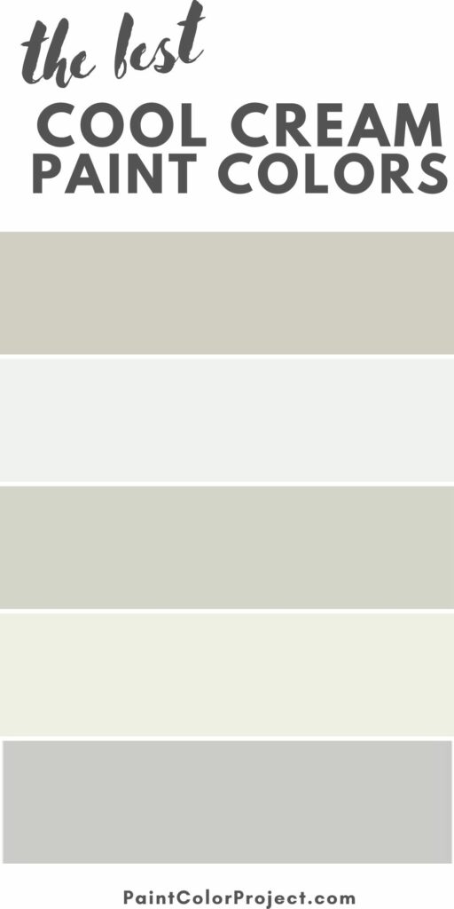
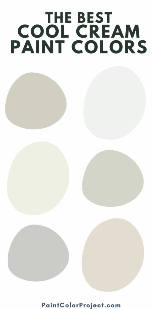
Best Cool Cream Paint Colors
Here is a a curated list of the best cool cream paint colors from popular paint brands!
Winter Snow - Benjamin Moore

Winter Snow is a very light off-white paint color with cool gray undertones. It is super light and bright, but it can feel a bit gray if your space is dark or has north-facing windows!
Click here to get a peel & stick sample of Winter Snow
Gray Owl - Benjamin Moore

Gray Owl is a light, cool gray. It's a bit darker than your average cream color, and will feel even darker in a low-light space. But, in a brightly lit room, it will feel cool, clean, and creamy!
Click here to get a peel & stick sample of Gray Owl!
White Dove - Benjamin Moore

White Dove is technically an off white paint color with very neutral but creamy undertones.
It is on the verge between warm toned and cool toned, but the slight gray undertones can make it feel cool - in the right lighting.
Click here to get a peel & stick sample of White Dove
Collingwood - Benjamin Moore

Collingwood is a light gray with slightly cool undertones. It's a great option for a bright room with lots of natural light!
Click here to get a peel & stick sample of Collingwood.
Classic Gray - Benjamin Moore

Classic Gray is an off-white to light gray paint color that is usually considered warm. But, it has slight purple undertones.
This means it can read as cool in certain lighting - and definitely looks creamy most of the time!
Click here to get a peel & stick sample of Classic Gray
Stonington Gray - Benjamin Moore

Stonington Gray is slightly darker and more gray than a lot of these other options. If you want a bit more color depth, it could be a great option to swatch!
Click here to get a peel & stick sample of Stonington Gray
Egret White - Sherwin Williams

Egret White is a warm neutral white paint color. It has ever so slight purple or pink undertones. In a bright, well lit room, it is very clean and neutral.
Click here to get a peel & stick sample of Egret White
Aesthetic White - Sherwin Williams

Aesthetic White is a light, bright, greige paint color. It can feel a bit warm - but has heavy gray undertones that you will especially see in cooler lighting!
Click here to get a peel & stick sample of Aesthetic White
Before you go...
Now that you have the perfect paint color, it's time to pick the paint sheen! Be sure to check out our guide to paint sheens to pick the perfect type of paint for your space!
Still unsure which paint color is right for your space?
Choosing paint doesn’t have to be stressful! My free Paint Color Planning Quick Start Guide walks you through the exact steps to confidently choose the perfect color — without the overwhelm, second-guessing, or endless swatch testing.
👉 Click here to download the free guide!
DIYing Your Paint Job? Start Here.
Choosing a paint color is only half the equation — the tools you use matter just as much. I’ve rounded up the painting supplies we rely on for clean lines, smooth finishes, and less frustration overall.

My Paint Color Formula course walks you through the painless process of expertly testing paint swatches to ensure you have the perfect color for your home.
The best way to sample paint? Samplize!
Get peel-and-stick removable and reusable paint samples here!
Thanks for reading!

Morgan is passionate about home decor and paint colors. She has been sharing DIY home decor tips since 2012 at CharlestonCrafted.com. From there, she learned to love paint colors, and the Paint Color Project was born in 2022!