Looking for the perfect paint color for your powder room? Here's my favorite half bathroom paint color ideas + what to look for when picking a color for your space!
I love painting the whole main area of a home one continuous color. But, what about a bathroom off the main living room?
I think that half bathrooms are a great place to use color and let that color shine!
I know that small bathroom paint ideas can be tricky. Small rooms in general can feel closed in and dark if you pick the wrong shade.
What is the most popular powder room paint color?
The most popular option for a powder room is going to be a neutral bathroom color. This could be white, gray, or beige. Probably a light toned color.
Choose something that coordinates with the undertones in your existing flooring and hard finishes like tile that won't be changing!
What is the best paint color for a half bathroom?
The easiest color to paint a powder room is going to be white. A white bathroom can feel spa-like, clean, and inviting. You can choose to keep it neutral or add pops of color in the decor.
Be sure you test whites to find the perfect color - there really is a lot of variance in white!
Be sure to check out my guide to small bathroom paint colors!
Do I need special paint for bathroom walls?
Traditionally, it is said you should use semi-gloss paint in a bathroom. I do NOT agree with this.
Semi-gloss shows off so many dings and imperfections in the walls. I hate it!
Use a flat or eggshell paint instead.
Modern paints are designed to withstand a certain normal level of moisture.
Especially in a half bathroom, with no steamy shower, regular paint is absolutely fine.
Read my guide to paint sheens here!
Do I need to match my powder room paint color to my living room?
Matching your half bathroom to the rest of your main living area is a great way to have a cohesive home. Plus, if you are painting yourself, you can buy more paint - like a 5 gallon bucket - for a better price per gallon than buying different single gallons.
You can always opt to do a bold color in a half bathroom, though! It's often a great place to do something bold.
Our current half bath is the same color as our downstairs.
In our last house, we painted the half bathroom the same color as the kitchen island - which was also the color of the tile in the kitchen and the front door! It was our main accent color.
You really can't go wrong either way!
Paint vs. Wallpaper for a powder room
A lot of interior designers hang wallpaper in half bathrooms. There are a few reasons to do this.
First, it's a small space with a door. So it is a way to have a hidden surprise for guests.
The size of the space (small) makes it cheaper than wallpapering a big room.
Plus, it's a great way to get a small taste of wallpaper without having a huge bold statement of wall papering a big room!
Wallpaper or paint, you can't go wrong!
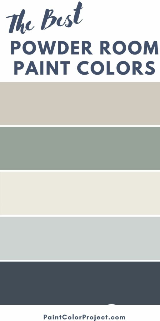
The best powder room paint colors
Here are some popular powder room colors!
Sherwin Williams Agreeable Gray

Agreeable Gray is a universally loved greige paint color. It is extremely neutral and inoffensive.
This is a great option if you want neutral walls to perhaps have a colored cabinet or let art really shine.
Read my full review of agreeable gray.
Sherwin Williams Alabaster
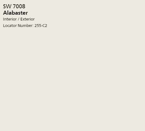
Alabaster is an extremely popular warm white paint color. It is one of the most popular white paint colors that there is.
The warm undertones help to keep this color from feeling stark or cold. Perfect for a fresh, bright powder room!
See all of my favorite warm white paint colors!
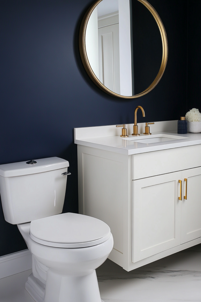
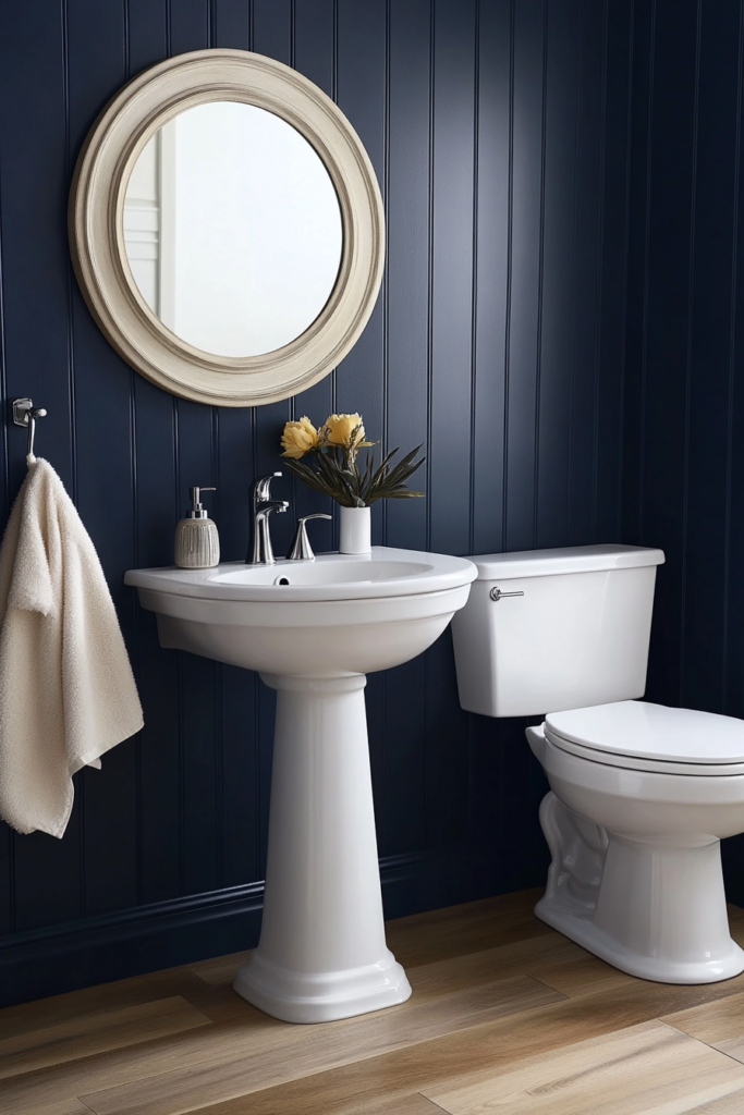
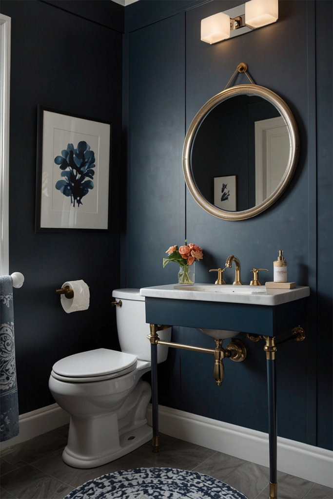
Benjamin Moore Hale Navy

On a totally different note, navy is a popular direction to go in for a half bath. It's bold, but you can really get away with it in the small space.
Navy is classic and can feel traditional, preppy, or even coastal. This is the ultimate navy that works in a ton of spaces.
See all of my favorite navy paint colors!
Behr Nature's Gift

If you love a boho look, consider painting your walls green. I am biased to this color as we use it all over my home, but I think that it is the perfect muted green that still packs a punch!
Sherwin Williams Misty
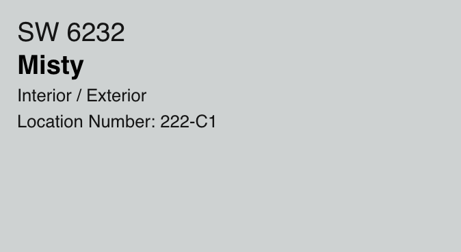
Misty is a light and airy blue-gray color. It is the very essence of spa-like!
This color works best with cool toned colors and fixtures such as tile! Just something to keep in mind.
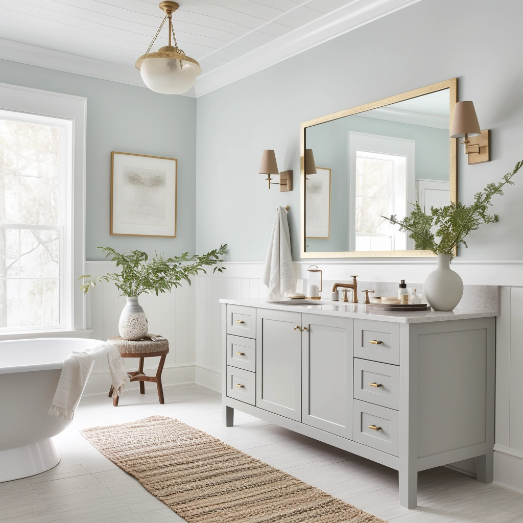
Read my full review of Misty here!
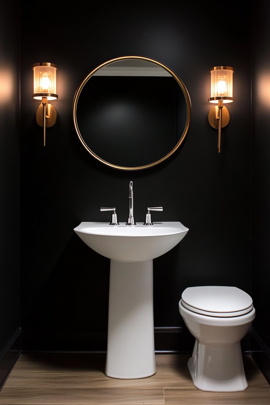
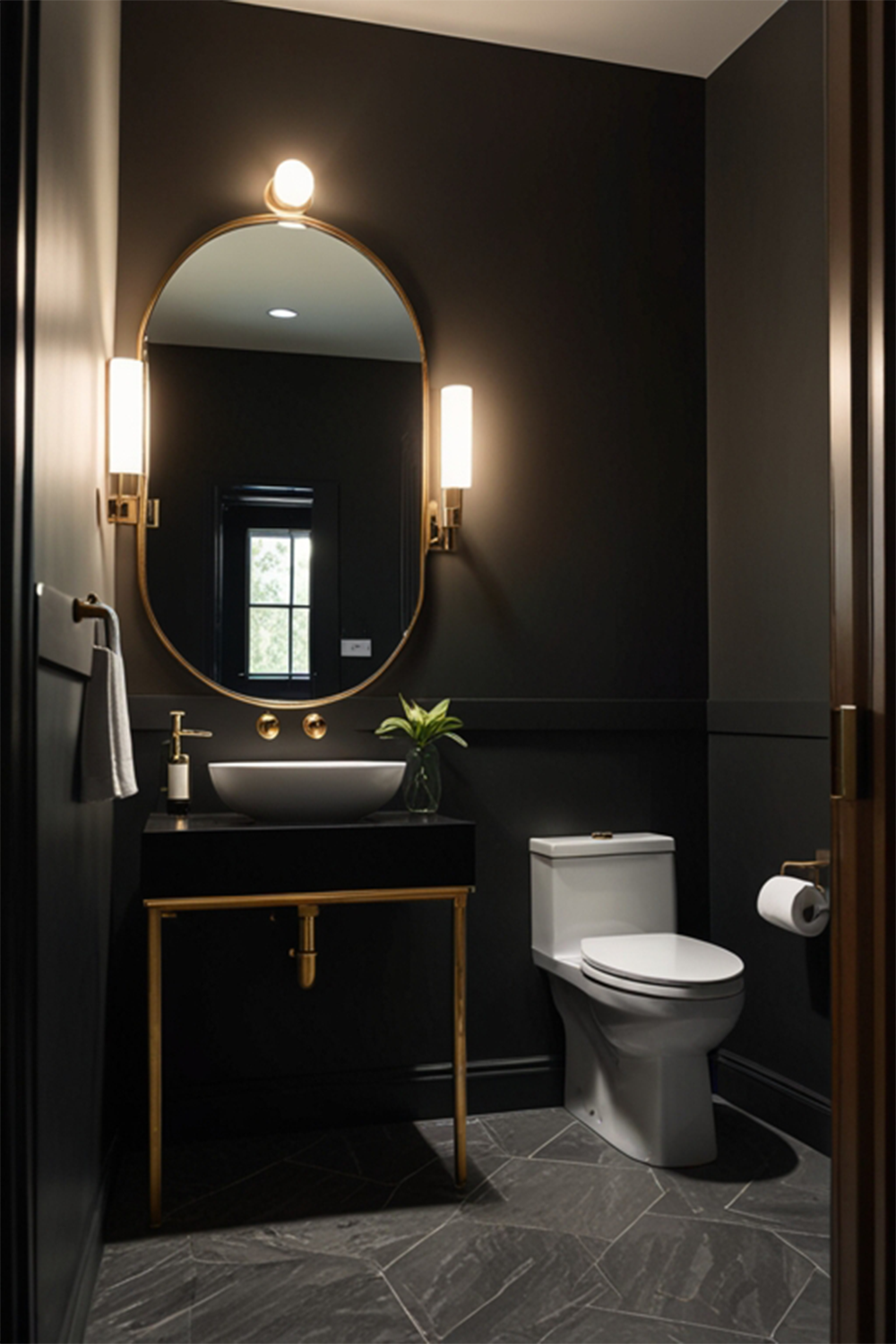
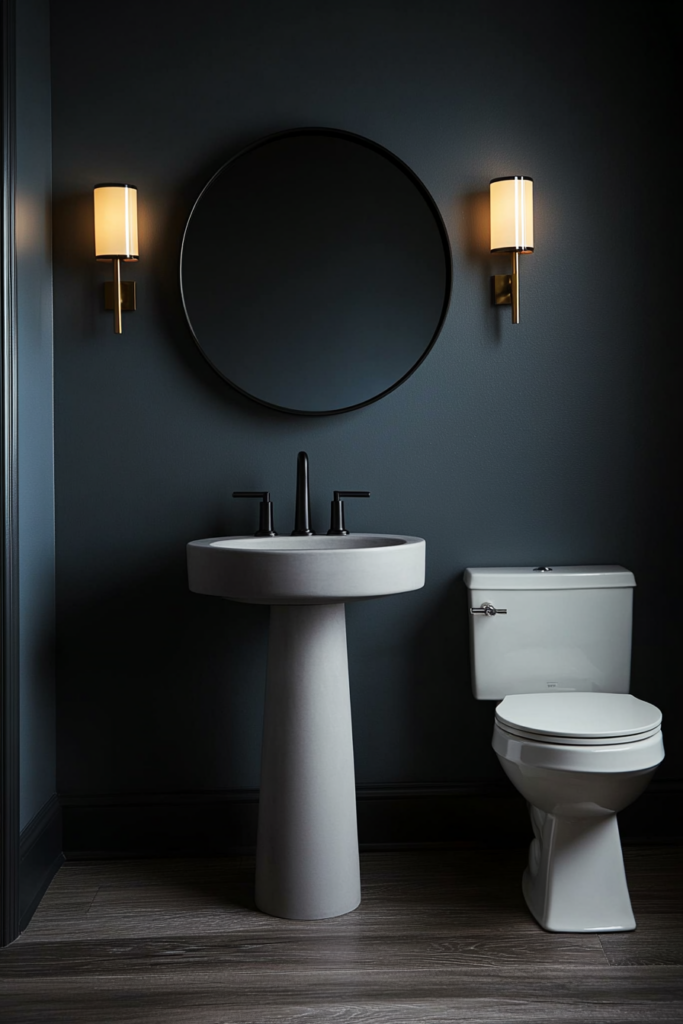
Sherwin Williams Tricorn Black

Tricorn black is bold but super popular for a black paint color. I know that a black room could be scary but hear me out.
Black walls can look ultra modern. You can pair them with any color accents and it feels like a statement.
What better place to go bold than in a half bath!
Read my complete Tricorn Black color review here!
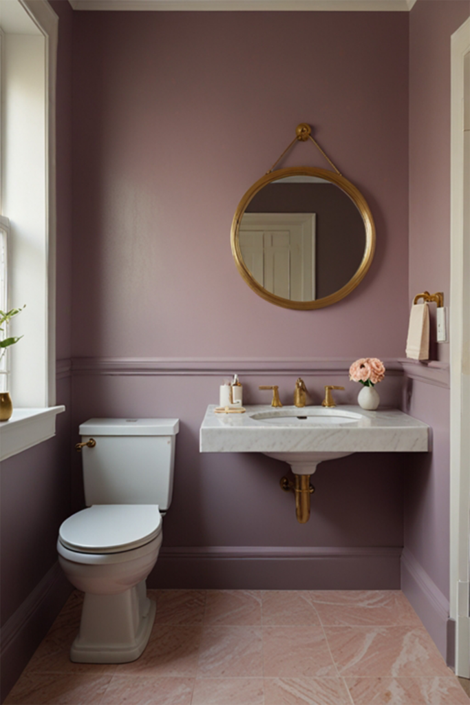
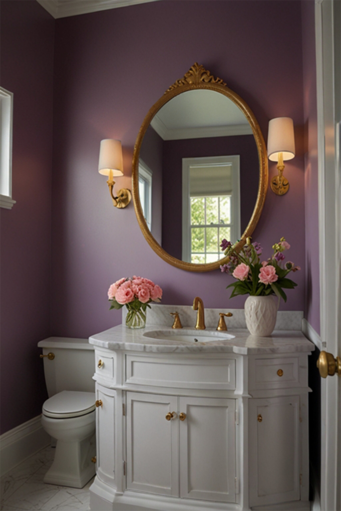
Orleans Violet by Benjamin Moore

This is a great blush pink that trends slightly violet. That's because it has blue/purple undertones, giving it a bit of a cooler tone.
It looks pretty pink until you put it next to one of the more coral options above, then it looks purple! This is a great option on the line of pink and purple. It's also got muted tones so it doesn't feel too bright whatsoever.
Water's Edge by Benjamin Moore

Water's Edge has an almost teal undertone. It is a medium darkness and would be beautiful on your walls in a half bathroom. The teal tones give it a very coastal feel but it still feels modern and not at all overly bright or neon.
Click here to get a 12"x12" peel and stick sample of Benjamin Moore Water's Edge!
Whispering Spring by Benjamin Moore (2136-70)
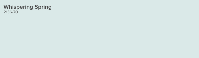
Whispering Spring is a very light and icy blue, but is surprisingly saturated considering it's tone. In otherwise, it's really light but still really blue - and clinging onto those gray undertones so it doesn't feel pastel at all.
This is another great light, bright spa-like bathroom paint color!
Click here to get a 12"x12" peel and stick sample of Benjamin Moore Whispering Spring!
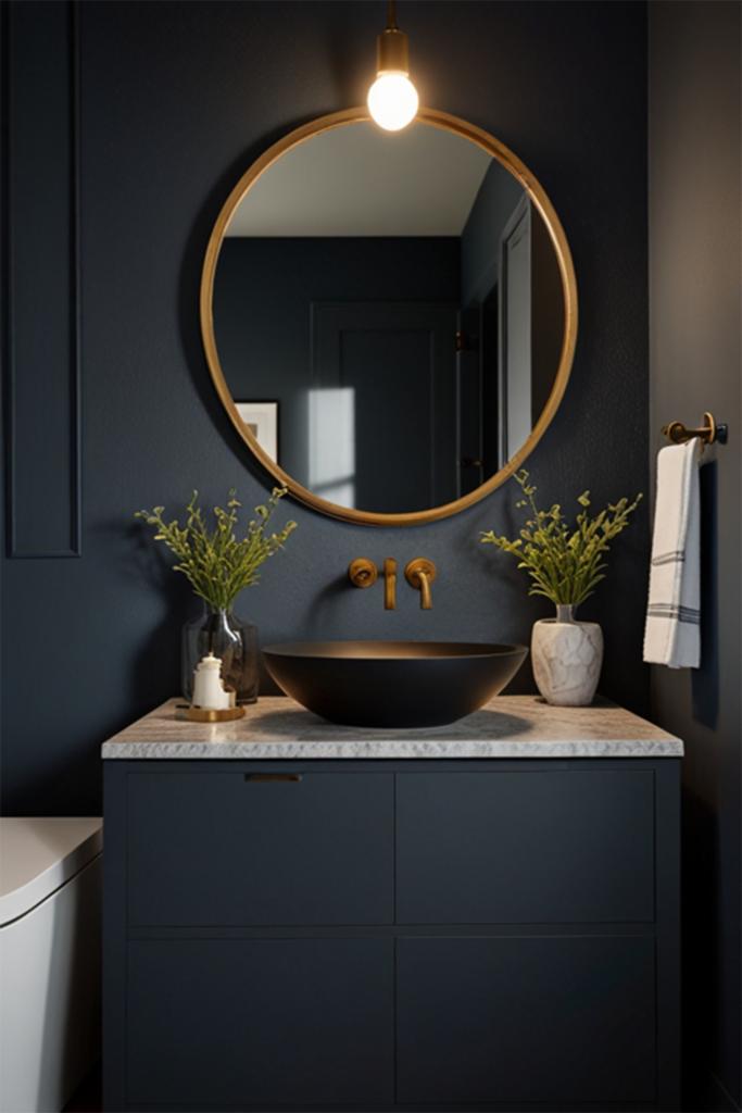
Granite Peak by Sherwin Williams (SW 6250)
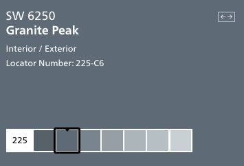
Granite Peak is a deep charcoal gray color with icy blue undertones. It reads as a really cool gray and can feel more blue depending on it's surroundings.
It's deep but not quite navy, and perfect if you want to experiment with a dark color that's not too dark!
Click here to get a 12"x12" peel and stick sample of Sherwin Williams Granite Peak!
What's your best powder room paint idea?
Still unsure which paint color is right for your space?
Choosing paint doesn’t have to be stressful! My free Paint Color Planning Quick Start Guide walks you through the exact steps to confidently choose the perfect color — without the overwhelm, second-guessing, or endless swatch testing.
👉 Click here to download the free guide!
DIYing Your Paint Job? Start Here.
Choosing a paint color is only half the equation — the tools you use matter just as much. I’ve rounded up the painting supplies we rely on for clean lines, smooth finishes, and less frustration overall.

My Paint Color Formula course walks you through the painless process of expertly testing paint swatches to ensure you have the perfect color for your home.
The best way to sample paint? Samplize!
Get peel-and-stick removable and reusable paint samples here!
Thanks for reading!

Morgan is passionate about home decor and paint colors. She has been sharing DIY home decor tips since 2012 at CharlestonCrafted.com. From there, she learned to love paint colors, and the Paint Color Project was born in 2022!