Looking for a soft, light blue paint color that feels fresh and airy? Let's discuss Sherwin Williams Upward and why it might be the perfect fit for your home!
There’s something so calming about breezy blues. They bring a peaceful, optimistic vibe to any space, making it feel like a breath of fresh air.
If you’re looking to create a room that’s soothing and inviting, light blues are always a great choice.
I’ve found that light blues, like Upward, work beautifully with a variety of decor styles.
Whether your style leans traditional, modern, coastal, or even farmhouse, this color blends right in while adding its own charm.
So, let’s look at one of the most popular blue shades of the year—Upward—and see if it’s the perfect touch of tranquility your home needs!
Upward, Sherwin Williams, SW 6239
Upward is a bright, optimistic blue that feels as clear and pure as a perfect cloudless sky. It brings a sense of freshness and positivity into any space.
Upward was named the Sherwin Williams 2024 Color of the Year.
Click here to get a peel and stick sample of Upward
Color Family
Upward belongs to the blue family, bringing that classic, serene vibe into your home.
Light Reflectance Value
57
Light Reflective Value (LRV) tells you how much light a color reflects back into a room. It’s measured on a scale from 0 to 100, where 0 is pure black and 100 is pure white.
The Light Reflectance Value (LRV) of 57 means Upward sits right in the light-to-medium range.
It has enough brightness to keep a room feeling airy, but with just enough depth to add some character.
Upward will look a bit darker in rooms without much natural light and a bit lighter in rooms with lots of natural light.
RGB Colors
R: 191 G: 201 B: 208
Upward’s combination of red, green, and blue creates the perfect blue for a calm, inviting space.
Hex Code
#BFC9D0

Undertones
Upward has soft gray undertones that add a calming touch without dulling the color. These undertones keep it balanced, so it doesn’t feel too bright or overwhelming.
Thanks to the gray, Upward avoids looking like a typical baby blue. It’s got a bit more sophistication to it, and in certain lights, you might even catch a hint of violet sneaking through.
In south-facing rooms with lots of natural light, you’ll notice it looks more blue and vibrant.
But in north-facing rooms with less natural light, Upward leans more gray, giving it a cooler, more serene vibe.
From my experience, lighting can really change how a color looks, so it’s always a good idea to swatch it first. Test it on your walls and see how it transforms throughout the day and night before making your decision.
Click here to grab some peel-and-stick samples to make swatching easier!
Best Uses
Upward is a versatile color that works beautifully in so many spaces.
It’s a great choice for:
- Small living rooms
- Bedrooms
- Dining rooms
- Home offices
- Bathrooms
- Furniture
Similar Colors
- Benjamin Moore Iced Slate
- Behr Icicles
- Sherwin Williams Icy
- Benjamin Moore Instinct
- Sherwin Williams Lakeside
- Benjamin Moore Sunrise
- Benjamin Moore Gentle Gray
Click here to get a peel and stick sample of Upward
Coordinating Colors
Upward pairs beautifully with neutrals like beige, white, gray, brown, and black. It adds a calming balance to any space.
For a bolder look, try pairing it with blues, violets, or light greens.
Dark blues:
- Gale Force
- Sea Serpent
- Mount Etna
- Anchors Aweigh
- In the Navy
Beiges:
- Natural Linen
- Malabar
- Natural Tan
- Sandbar
- Dumpling
Light violets:
- Quicksilver
- Icicle
- Rarified Air
- Opalescent
- Silver Peony
Trim Colors
Upward pairs well with bright whites for trim.
- Benjamin Moore Simply White
- Sherwin Williams Extra White
- Behr Ultra Pure White
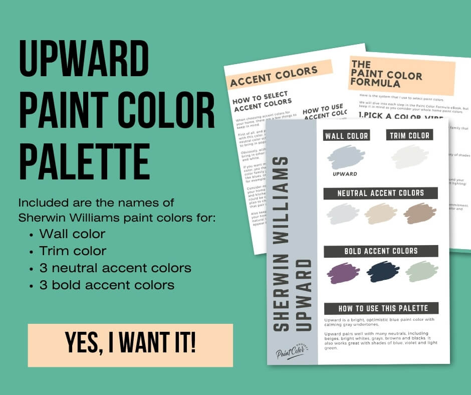
Upward Paint Color Palette
Want to use this paint color in your home? Instantly upgrade your home's aesthetic with our exclusive paint color palette. Unlock the perfect trim color and six stunning accent colors, a combination of neutrals and bold hues for an instantly harmonious space!
Get your perfect paint color palette by clicking here!
Click here to get a peel and stick sample of Upward
FAQs
Here are some common frequently asked questions about Upward.
Is Sherwin Williams Upward gray or blue?
Upward is definitely a blue paint color with soft gray undertones. The gray helps give it a more calming, balanced feel without taking away from its beautiful blue tone.
Does Sherwin Williams Upward look violet?
Upward can have a slight violet tint in certain lighting, but it never looks outright violet. The blue with gray undertones is what stands out most, with just a subtle hint of violet that adds a bit more depth.
It’s always a good idea to swatch it in your space to see how the light affects it.
Is Sherwin Williams Upward a good choice for a home exterior?
Upward can be tricky for exteriors. Outdoors, colors tend to look more washed out under all that natural light, and while Upward shines indoors, it might feel too light on an exterior.
If you love the color inside but want something similar for the outside, I’d suggest trying a deeper blue or even a blue-leaning gray for more impact. And of course, swatch it first to see how it plays with the outdoor light!
What is the Sherwin Williams 2024 Color of the Year?
Sherwin Williams named Upward as their 2024 Color of the Year. It’s a calming, peaceful shade of blue with just the right amount of gray to keep it grounded.
What’s the difference: Sherwin Williams Upward vs Benjamin Moore Iced Slate?
Upward is more of a blue with gray undertones, while Iced Slate from Benjamin Moore leans a little more toward blue-gray. So, Upward tends to look slightly bluer than Iced Slate.
Upward has an LRV of 57, and Iced Slate is just a touch lighter with an LRV of 58. Be sure to swatch both colors to see which one works best in your lighting.

Is Sherwin Williams Upward warm or cool?
Upward is a cool paint color. It’s got just enough blue and gray to give it a cool, calming vibe without feeling too chilly.
What’s the difference: Sherwin Williams Upward vs Sea Salt?
Upward is a blue, while Sea Salt is more of a green with blue undertones. Sea Salt also has a higher LRV at 63 compared to Upward’s 57, so it’s lighter and more muted, while Upward is deeper and more vibrant.
Swatching them both in your room will help you decide which one fits your style.

What colors go with Sherwin Williams Upward?
Sherwin Williams recommends pairing Upward with Icicle (a light violet), Extra White (a bright white), or Natural Linen (a warm beige).
Upward also looks great with grays, browns, blacks, dark blues, and light greens, giving you plenty of options to create a balanced and stylish look.


Before you go...
So, you've found the perfect paint color, but here's the thing - there's another big decision you have to make: picking the right paint sheen. Seriously, the level of glossiness can totally change how your color looks on the walls and how long the paint lasts!
Check out our complete guide to understanding paint sheens.
Still unsure which paint color is right for your space?
Choosing paint doesn’t have to be stressful! My free Paint Color Planning Quick Start Guide walks you through the exact steps to confidently choose the perfect color — without the overwhelm, second-guessing, or endless swatch testing.
👉 Click here to download the free guide!

My Paint Color Formula course walks you through the painless process of expertly testing paint swatches to ensure you have the perfect color for your home.
The best way to sample paint? Samplize!
Get peel-and-stick removable and reusable paint samples here!
Thanks for reading!

Meg Hemmelgarn is a freelance writer and home decor + DIY blogger who loves to talk about paint colors. She and her husband are currently renovating their third fixer upper. You can see their projects on her blog, Green With Decor.