In search of the perfect off white paint color for your home? Let’s talk about Sherwin William’s Pearly White.
Whether you're a pro interior designer or just embarking on your first home renovation, choosing the perfect paint color can be daunting.
There's an entire universe of hues, shades, and tints to choose from.
Even if you narrow it down as far as an off-white paint color - there are still so many options!
Today we are going to dive into the details of Sherwin Williams' Pearly White - a paint color that is as elegant as it sounds.
Sherwin Williams Pearly White SW7009
Pearly White is described as a light and graceful color, adding a touch of iridescent charm to any room.
This is a luminous of this paint color with the magical ability to transform your space with an airy yet warm feel.
Color Family
Sherwin Williams' Pearly White belongs to the off-white color family and manifests elegance and tranquility, embracing spaces with its refined warmth and sophistication.
Light Reflection Value
77
Light Reflective Value is the measurement of how much light a color bounces around. It is on a scale of 0 to 100, with 0 being pure black and 100 being pure white.
Sherwin Williams' Pearly White, with an LRV of 77, is quite light.
It's closer to the maximum end of the scale, indicating that it can reflect a substantial amount of light. Therefore, this color can create a bright, open feel in any space, enhancing natural and artificial light sources.
RGB Colors
R: 232 G:227 B:217
RGB describes the amount of each color - red, green, and blue - present in a color. It is on a scale of 0 to 255 for each color. This is basically the color mix to make the color!
Hex Code
#E8E3D9

Undertones
Sherwin Williams' Pearly White is more than just a classic white. It has a gray undertone, adding a layer of cool sophistication.
This delicate touch of gray gives Pearly White a soothing, calm vibe, making it a versatile color that pairs well with a broad spectrum of hues.
The gray undertone provides a subtle depth, distinguishing it from stark whites and making it an inviting and restful color choice.
Pearly White can have hints of both green and pink undertones to it, making it sometimes read cool and sometimes read warmer.
It's very important to swatch colors on your wall to make sure they look good – day and night – in your actual space before committing.
Click here to get removable peel & stick paint samples to easily swatch with!
Its cool undertones make Pearly White a perfect partner for darker shades. It helps amplify and draw attention to these bolder hues while providing just enough contrast.
With its gray undertone, Pearly White is a balance of light and depth, warmth and coolness, making it a unique and delightful addition to any color palette.
Best Use
The versatility of Sherwin Williams' Pearly White means that it works in a ton of different spaces.
- Kitchen Walls
- Home office
- Hallways
- Home Exterior
- Dining room
- Furniture
- Bathroom
- Bedroom
Similar Colors
- BM Sea Pearl
- BM Soft Chamois
- Sherwin Williams White Duck
- Behr Barely Brown
- Farrow & Ball Strong White
- Valspar Quail Egg
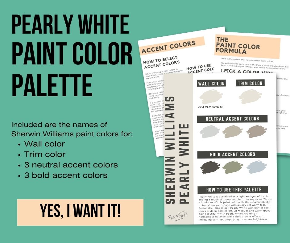
Coordinating Colors
Pearly White is neutral enough that it works with a ton of other color palettes.
Personally, I like to pair Pearly White with lighter cool tones or deep dark colors.
Light blues and warm grays pair beautifully with Pearly White, creating a harmonious balance, while dark browns offer an intriguing contrast, amplifying its serene brightness.
With Pearly White's gentle coolness, it's prudent to avoid overly warm tones that may clash with it's undertones. I would not pair it with anything yellow or orange in undertone!
Have a look at some of my favorite ones.
Grays
Light Blues
Dark Browns
Trim Colors
As an off-white paint color, I actually like to use Pearly White on both the walls and trim. This gives a soft tone-on-tone look.
Just go with an eggshell finish on the walls and a semi gloss finish on the trim!
Sherwin Williams Pearly White Color Palette
Want to use this paint color in your home? Instantly upgrade your home's aesthetic with our exclusive paint color palette. Unlock the perfect trim color and six stunning accent colors, a combination of neutrals and bold hues for an instantly harmonious space!
Get your perfect paint color palette by clicking here!
FAQs about Pearly White
Here are some Frequently asked questions about Pearly White.
What finish should I use with Pearly White?
I always suggest using an eggshell finish on the walls and a semi-gloss finish on trim.
Does Pearly White work well in different lighting conditions?
Yes, one of the benefits of Pearly White is its adaptability to different lighting conditions. While the color may appear brighter in a well-lit room during the day, it also maintains its soothing and serene qualities under artificial light.
It's very important to swatch colors on your wall to make sure they look good – day and night – in your actual space before committing.
Click here to get removable peel & stick paint samples to easily swatch with!
How does Pearly White influence the perception of space in open floor plans?
In open floor plans, Pearly White can enhance the perception of spaciousness due to its high LRV. It also provides a consistent, cohesive look throughout the area, making different zones feel connected yet distinct.
What are some unconventional uses for Pearly White in interior design?
Besides walls and ceilings, Pearly White can be used creatively in many ways. It can refresh old furniture, highlight architectural details, or even be used for painted floors for a unique, light-filled space.
Can Pearly White be used effectively in color blocking or two-tone wall designs?
Definitely! Pearly White's versatility allows it to be paired effectively with a wide range of colors in color-blocking or two-tone designs.
Its subtleness can balance bolder colors, while its cool undertone complements colors within the cool spectrum.
Can Pearly White work in various architectural styles, such as Victorian, Craftsman, or Mid-century Modern?
Yes, Pearly White's timeless appeal makes it versatile enough to fit within a vast range of architectural styles.
Its cool gray undertone and bright quality can help modernize traditional styles and add a touch of sophistication to contemporary designs.
How does Pearly White appear in different textures, such as matte versus gloss finishes?
The appearance of Pearly White can change subtly depending on the finish.
A matte finish might make the color appear slightly softer and less reflective, emphasizing its calming effect.
In contrast, a gloss finish can make Pearly White look brighter and more vibrant due to increased light reflection.
Still unsure which paint color is right for your space?
Choosing paint doesn’t have to be stressful! My free Paint Color Planning Quick Start Guide walks you through the exact steps to confidently choose the perfect color — without the overwhelm, second-guessing, or endless swatch testing.
👉 Click here to download the free guide!
DIYing Your Paint Job? Start Here.
Choosing a paint color is only half the equation — the tools you use matter just as much. I’ve rounded up the painting supplies we rely on for clean lines, smooth finishes, and less frustration overall.

My Paint Color Formula course walks you through the painless process of expertly testing paint swatches to ensure you have the perfect color for your home.
The best way to sample paint? Samplize!
Get peel-and-stick removable and reusable paint samples here!
Thanks for reading!

Morgan is passionate about home decor and paint colors. She has been sharing DIY home decor tips since 2012 at CharlestonCrafted.com. From there, she learned to love paint colors, and the Paint Color Project was born in 2022!