If you’re searching for a soft, muted chocolate paint color that feels rich but still livable, you'll find this review of Sherwin Williams Chocolate Powder helpful.
Dark, warm colors like this can completely change the mood of a room. They make a space feel grounded, a little dramatic, but still super cozy.
There's something about chocolate browns that just works when you want depth without going too bold.
Chocolate Powder by Sherwin Williams sits in that sweet spot. It’s neutral enough to mix easily with other colors, but it still has personality.
Let’s dig into the details and see if this paint might be the right fit for your home.
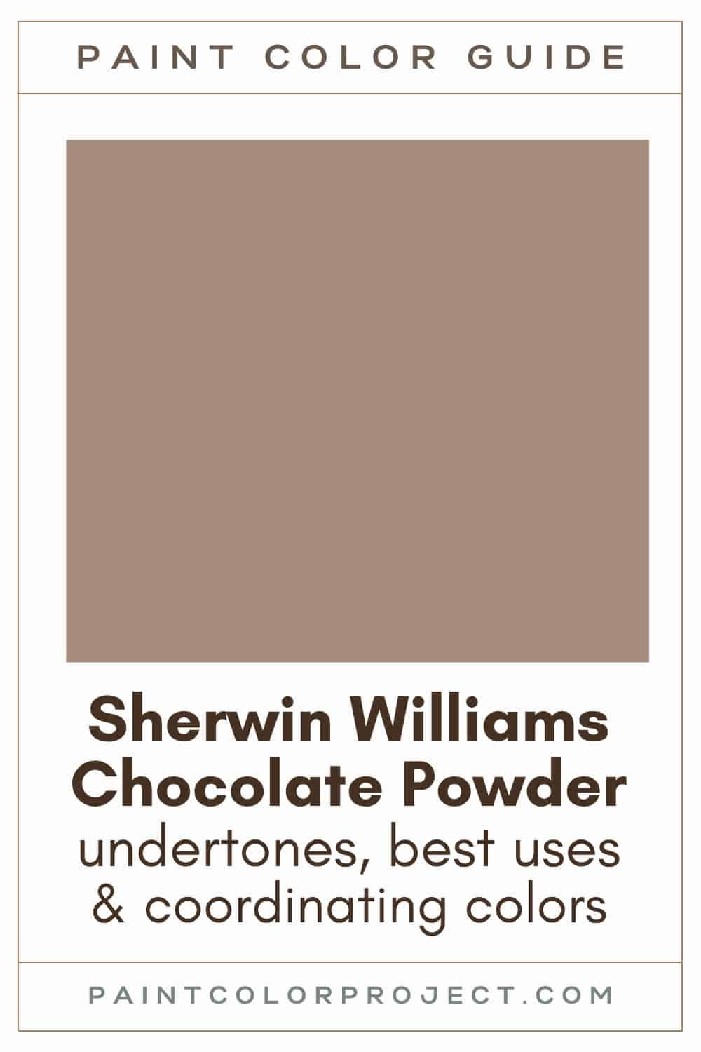
Chocolate Powder, Sherwin Williams, SW 9082
Chocolate Powder is a beautiful muted chocolate brown with clear red undertones. It adds warmth and a little bit of elegance to any room.
Click here to get a peel and stick sample of Chocolate Powder
Color Family
Chocolate Powder is in the red family.
Light Reflectance Value
28
LRV tells you how much light a paint color reflects, using a scale from 0 (pure black) to 100 (pure white). With a value of 28, Chocolate Powder sits on the darker end of the medium range.
It has enough richness to make a statement but isn’t too dark to use confidently. It’ll look deeper in rooms with less natural light and appear a bit softer in brighter spaces.
RGB Colors
R: 165 G: 140 B: 123
These values show how much of each primary color is mixed in. Think of it like the paint’s DNA — this combo gives Chocolate Powder its muted, earthy tone.
Hex Code
#A58C7B

Undertones
Chocolate Powder is a soft, chocolatey brown with strong red undertones. It has that warm, cozy feel, but like most paint colors, it can shift a bit depending on the light.
In a south-facing room with lots of sunshine, it looks warmer, richer, and even a little lighter. It really comes to life in bright spaces.
In a north-facing room with less natural light, it can look a bit darker. It still feels warm, but sometimes it leans a little more neutral or even slightly cool. Not in a bad way — it just tones down a bit.
I always tell people (and do this myself) to swatch the color before committing. The same paint can look totally different from one wall to the next depending on the time of day and the lighting.
Best Uses
Chocolate Powder is one of those colors that feels neutral, but still brings something extra. I love it in spaces where you want warmth and a bit of depth without going too dark.
Here are a few spots where it really shines:
- Living rooms
- Bedrooms
- Dining rooms
- Dens or home offices
- Furniture
Chocolate Powder is great for any space that you want to elevate and let feel a bit special.
Similar Colors
- Sherwin Williams Dry Dock
- Benjamin Moore Woodacres
- Behr Beach Cabana
- Sherwin Williams Nearly Brown
- Benjamin Moore Hiking Trail
- Behr Rodeo Tan
- Sherwin Williams Cocoa Whip
Click here to get a peel and stick sample of Chocolate Powder
🤯 Too many color choices?
Download my free Paint Color Planning Quick Start Guide — it’s the exact method I use to help readers choose a color that works the first time.
📥 Grab it here!
Coordinating Colors
One of the nice things about Chocolate Powder is how flexible it is. It plays well with a lot of other shades, especially warm neutrals and earth tones. You can keep things soft with creamy whites, or go bolder with rich browns.
If you want to bring in some color, it also looks beautiful next to earthy greens or cool, calming blues.
Here are some great pairings to try:
Deep browns:
- Rockweed
- Black Bean
- Raisin
- Bitter Chocolate
- Turkish Coffee
Earthy greens:
- Rookwood Dark Green
- Evergreen Fog
- Verde Marron
- Clary Sage
- Dried Thyme
Cool blues:
- Debonair
- Blustery Sky
- Morning at Sea
- Meditative
- Whirlpool
Trim Colors
Since Chocolate Powder leans warm, it looks best with whites that have a bit of softness or warmth to them. Crisp, cool whites can feel a little too harsh next to it.
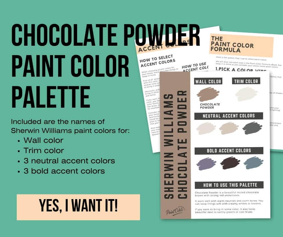
Chocolate Powder Paint Color Palette
Want to use this paint color in your home? Instantly upgrade your home's aesthetic with our exclusive paint color palette. Unlock the perfect trim color and six stunning accent colors, a combination of neutrals and bold hues for an instantly harmonious space!
Get your perfect paint color palette by clicking here!
Click here to get a peel and stick sample of Chocolate Powder
FAQs
Here are some common frequently asked questions about Chocolate Powder.
What color is Chocolate Powder paint?
Sherwin Williams Chocolate Powder is a muted chocolate brown with strong red undertones. Even though it’s technically in the red color family, it looks like a rich, earthy brown once it’s on the wall.
What color trim goes with SW Chocolate Powder?
Because Chocolate Powder leans warm, it pairs beautifully with creamy or soft white trim colors. Think Sherwin Williams Alabaster, Benjamin Moore White Dove, or Behr Cameo White.
These whites don’t compete with the richness of the brown — they soften and balance it. I’ve used Alabaster with similar tones, and it always creates a calm, pulled-together look. Definitely swatch your trim next to the wall color before deciding.
Is Sherwin Williams Chocolate Powder too dark?
Chocolate Powder has a Light Reflectance Value (LRV) of 28, so it's a medium-dark paint color. It’s not super dark, but it does have some depth, which makes it feel warm and grounding.
In bright rooms, it can feel softer and more open. In low-light areas, it leans richer and a bit moodier. If you’re on the fence, take a look at lighter options like Likeable Sand or Bona Fide Beige.


Is SW Chocolate Powder red?
Yes, Chocolate Powder is part of the red color family. But don’t expect it to look red on your walls.
What you’ll actually see is a muted chocolate brown paint color with a subtle reddish warmth underneath.
What's the difference: SW Chocolate Powder vs Cocoa Whip?
Chocolate Powder and Cocoa Whip may sound like twins, but they’re not quite the same. Both have an LRV of 28, so they’re equally deep in tone.
The key difference lies in their undertones. Chocolate Powder belongs to the red family, while Cocoa Whip is part of the orange family. That makes Chocolate Powder slightly richer and Cocoa Whip a bit softer and more muted.

Before you go...
So, you've found the perfect paint color, but here's the thing — there's another big decision you have to make: picking the right paint sheen. Seriously, the level of glossiness can totally change how your color looks on the walls and how long the paint lasts!
Check out our complete guide to understanding paint sheens.
Still unsure which paint color is right for your space?
Choosing paint doesn’t have to be stressful! My free Paint Color Planning Quick Start Guide walks you through the exact steps to confidently choose the perfect color — without the overwhelm, second-guessing, or endless swatch testing.
👉 Click here to download the free guide!

My Paint Color Formula course walks you through the painless process of expertly testing paint swatches to ensure you have the perfect color for your home.
The best way to sample paint? Samplize!
Get peel-and-stick removable and reusable paint samples here!
Thanks for reading!

Meg Hemmelgarn is a freelance writer and home decor + DIY blogger who loves to talk about paint colors. She and her husband are currently renovating their third fixer upper. You can see their projects on her blog, Green With Decor.