Thinking of adding a romantic flair to your bedroom? Here are the best romantic bedroom paint colors that promise a cozy and passionate retreat!
The bedroom is the most romantic area in the home, a sanctuary where intimacy and connection flourish.
Choosing the right bedroom color can significantly enhance its romantic ambiance, creating a backdrop that evokes passion, warmth, and security.
There are countless colors that give off a romantic vibe, but only a select few truly work in the bedroom.
This list offers some of the most romantic bedroom paint colors you can find today, along with expert tips and advice on how to use them and the colors they’re best paired with.
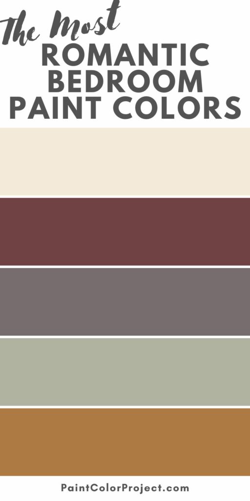
Most Romantic Bedroom Paint Colors
Here are the most romantic paint colors to choose from for your bedroom makeover.
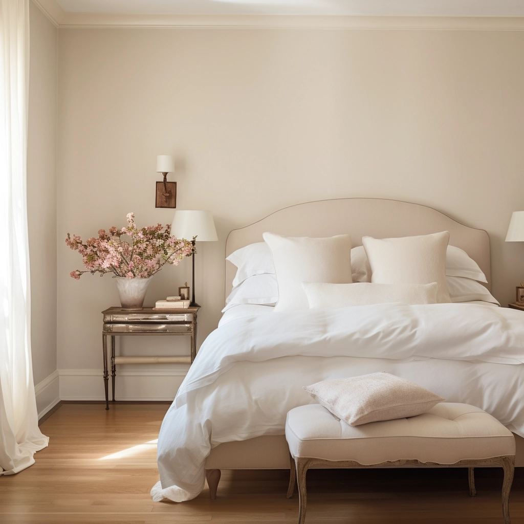
Linen White, Benjamin Moore
Linen White is a soft, creamy white with warm yellow undertones, which conjures feelings of comfort and intimacy.
With an LRV (Light Reflectance Value) of 82, this paint color makes a space feel open and airy.
It works beautifully with neutral palettes, so you can easily make a cohesive bedroom atmosphere without the need for extensive redecoration.

To maximize the impact of Linen White, incorporate natural materials such as wooden furniture, woven textiles, and rattan into your decor.
The same is said with subtle pastels like gentle grays, pale blues, or muted greens, which can be introduced through beddings, decorative accents, or area rugs.
These colors add depth to the room while maintaining a soothing and romantic aesthetic.
Rumors, Behr
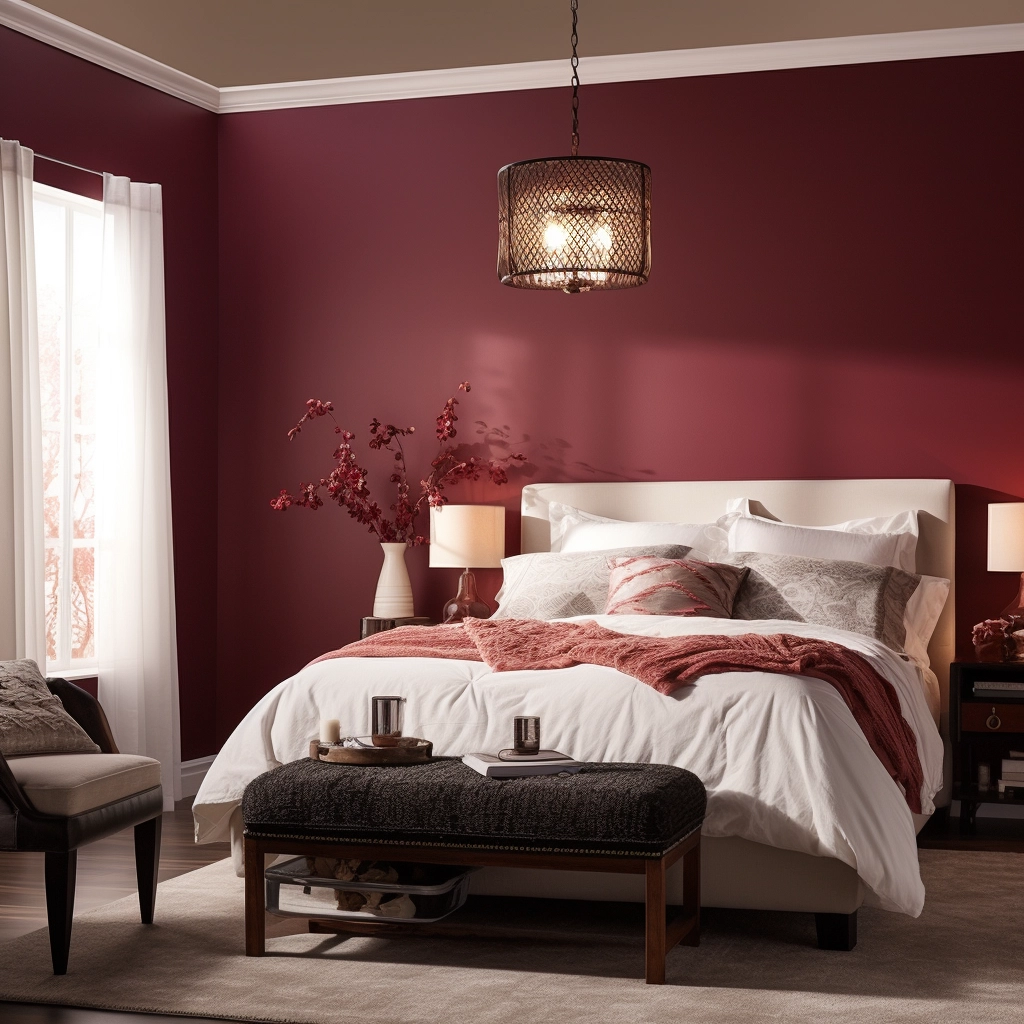
Rumors is a gorgeous burgundy with a heavy, saturated hue.
It’s dark, sultry, and passionate, a color associated with love and desire.
Its deep and saturated nature adds a layer of intensity and drama to a space, creating an intimate atmosphere that fosters a romantic ambiance.

Rumors has an LRV of 8, so it’s best used as an accent wall rather than a main backdrop. Too much of this color can make a space feel uncomfortably dark and snug.
To counteract the intense darkness, pair it with lighter and neutral tones like crisp whites, soft creams, or muted grays in the form of velvet bed linens, throw pillows, and decorative items.
Against the deep burgundy backdrop, consider incorporating gold or metallic accents to add glamor and elegance to the room.
Intimate White, Sherwin Williams
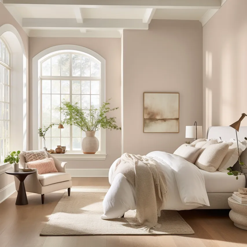
Intimate White is a charming dusty pink that exudes warmth, delicacy, and romance.
This soft and muted hue brings a subtle touch of color into a room, allowing you to seamlessly incorporate it into both modern and traditional bedroom aesthetics.

With an LRV of 77, Intimate White fades into the background but adds a welcoming warmth to a room without the off-putting brightness of low-value pinks, which is why many describe it as the “perfect pink.”
Intimate White works best with neutral tones like whites, creams, and soft grays, but it also looks stunning with darker tones like forest green, charcoal gray, wine red, or plum.
Darker hues create a sense of richness in a room, while light hues maintain a sense of airiness and balance.
Kasbah, Benjamin Moore
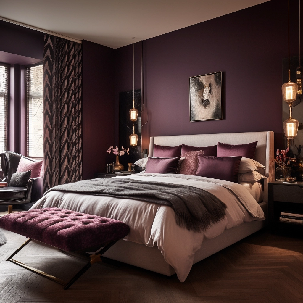
Kasbah by Benjamin Moore is a muted purple with notes of mocha and plum.
The mocha undertones introduce warmth, while the plum brings a touch of richness and elegance.
Together, these elements produce a color that’s both calming and visually intriguing.
Kasbah’s deep and enchanting nature makes it a good choice for those looking to infuse an air of quiet sophistication and allure into their bedroom.
It’s an excellent alternative to plain red or vibrant purple, which can appear too intense or bold.

When using Kasbah in the bedroom, complement it with off-whites, soft creams, and muted greens.
You can also decorate the room in different shades of purple and plum to create a monochromatic theme.
Kasbah has an LRV of 17, so it falls on the darker end of the color spectrum.
If you choose to use it as your primary backdrop rather than an accent color, make sure you have adequate lighting to prevent the space from feeling overly dim and confined.
Soft, warm-toned bulbs can counterbalance the darker hue of Kasbah, and instead promote a cozy atmosphere.
Saybrook Sage, Benjamin Moore
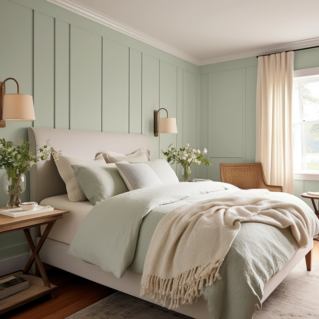
Saybrook Sage is a soothing and versatile green-gray hue that brings a touch of nature to the bedroom.
It pairs well with both warm and cool tones, giving you the flexibility to complement it with whatever color you desire.
Darker greens and muted yellows can enhance the natural and romantic vibe of Saybrook Sage, creating a harmonious and inviting bedroom atmosphere.

Meanwhile, neutral accents and natural textures create a balanced and timeless color palette, providing versatility for decor changes over time.
Saybrook Sage has an LRV of 45, so it’s not too dark or too light.
It won’t wash out a space or come across as too dark under normal light conditions.
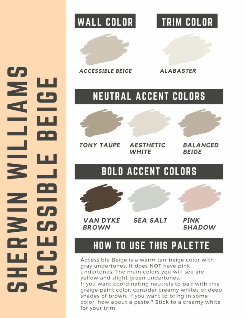
Accessible Beige, Sherwin Williams
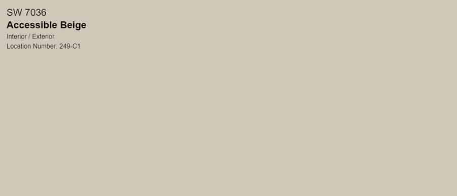
Accessible Beige is one of Sherwin Williams’s most popular shades of beige—and for good reason.
With an LRV of 58, it strikes a balance between being a mid-toned color that isn't too light or too dark.
It’s a warm and cozy color that appears gold-ish in west-facing rooms and greige in north-facing rooms.
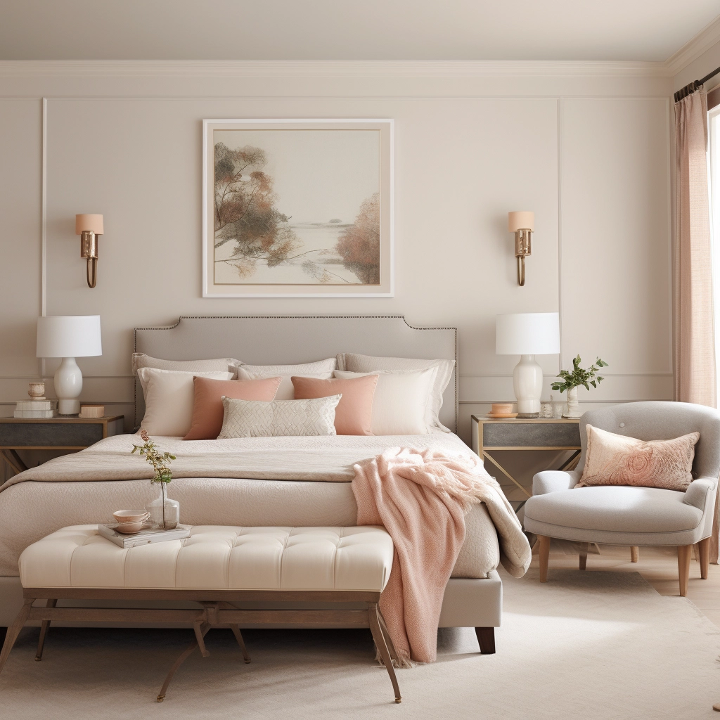
What I love most about Accessible Beige is that it has a wide plethora of color options to pair it with.
For a monochromatic palette, you can pair it with shades similar to Sherwin Williams’ Balanced Beige, Tony Taupe, and Virtual Taupe.
For a contrasting color palette, it looks gorgeous with varying shades of rust, sage green, cream, and gray.
Sherwin Williams Accessible Beige color palette
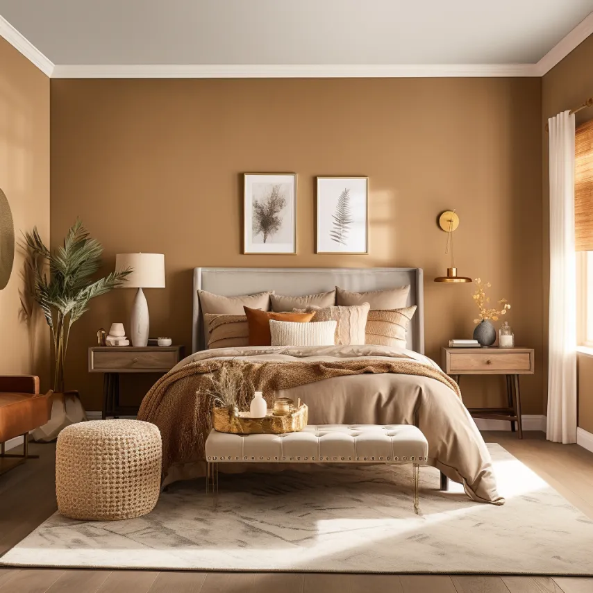
Caramel Sauce, Behr
Caramel Sauce is a warm and inviting shade that beautifully captures the rich and golden tones of caramel.
This sugary-gold hue brings a touch of sweetness and sophistication to a bedroom, evoking the warmth associated with its namesake.
Studies in color psychology have shown that warm, earthy tones like caramel are often associated with feelings of security, comfort, and relaxation.
And since it’s often paired with chocolate in desserts, it may form an ambiance that may evoke feelings of pleasure and arousal.

When using Caramel Sauce as a backdrop, pair it with soft whites, creams, or deep chocolate accents to enhance the overall aesthetic.
Textures such as warm wood furnishings, plush bedding, and soft textiles can further elevate the cozy and inviting atmosphere of the space.
Metallic accents in gold or brass can also complement the warm tones of Caramel Sauce.
Caramel Sauce, with its LRV of 23, works best with warm-toned lighting.
Incorporate lighting fixtures that emit a warm and cozy glow, such as bedside lamps with amber or cream-colored shades.
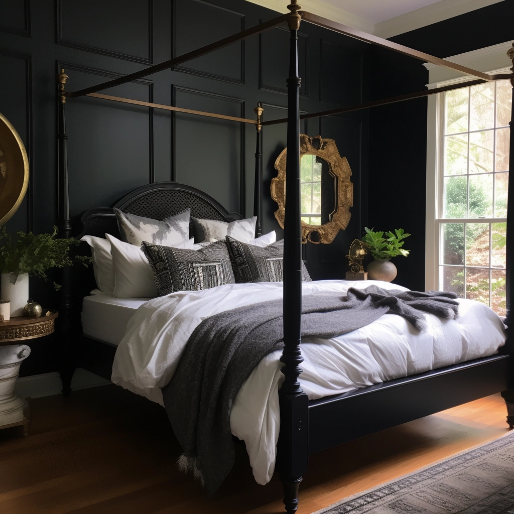
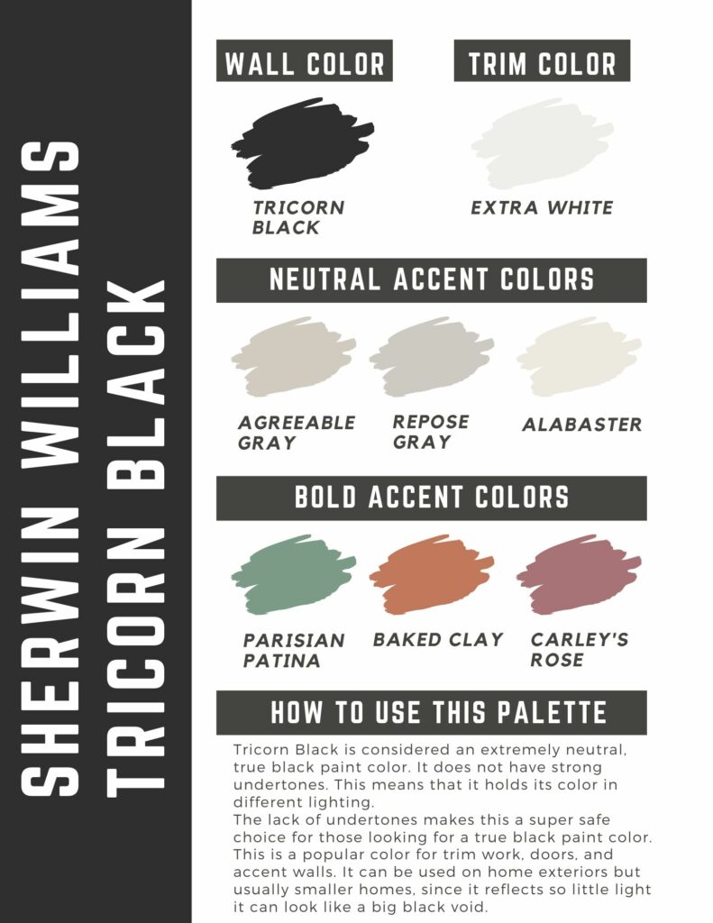
Tricorn Black, Sherwin Williams
Black is an unapologetically sexy color that symbolizes elegance, wealth, and power.
In a bedroom setting, it creates a dramatic atmosphere that transforms a space into a luxurious and intimate retreat.
Associated with mystery and intrigue, Tricorn Black is a suitable choice for those who want to add a touch of glamor to their personal space.
With an LRV of 3, Sherwin Williams’s Tricorn Black is best used as a feature wall.

By painting one side of the wall black, you can add depth and drama to the room without overwhelming the space.
Instead, it serves as a bold backdrop for other elements in the room to stand out.
I’d advise against using black if your bedroom is a bit on the smaller side, as it can make it feel claustrophobic and dull.
But if your bedroom is spacious, black can be a great option. Just make sure it counterbalances it with lighter tones.
Neutral or light-color bedding, furnishings, and curtains, as well as white trim and molding, add visual interest to a room and prevent it from feeling too heavy.
Tricorn Black color palette
Cavern Clay, Sherwin Williams
The right shade has the potential to create a stimulating and energetic atmosphere in an intimate bedroom setting.
For example, softer and muted shades of orange, such as coral, peach, or terracotta, can infuse a space with warmth without being too overwhelming.
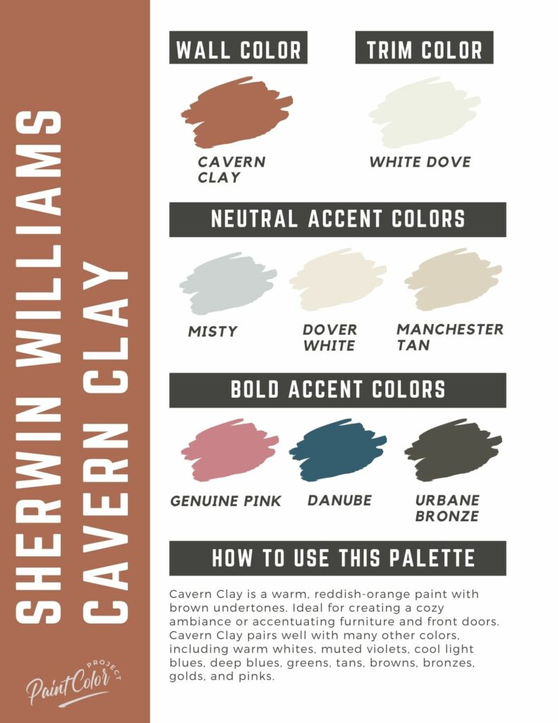
Cavern Clay by Sherwin Williams is one such color; it’s a robust, reddish-orange with brown undertones, a warm terracotta that exudes coziness and familiarity.

The best way to use Cavern Clay is to balance it with neutral tones, wooden furniture, and subdued decor accents.
Opt for a few well-chosen decor pieces in complementary colors, such as live greens, cream, reds, and browns.
Muted violets work nicely, too. Colors like Slate Violet, Quest Gray, and Beguiling Mauve by Sherwin Williams can be used as accents to tie the room together.
Cavern Clay has an LRV of 20, so it’s pretty dark. Make sure to add lots of light into the room to brighten up the space.
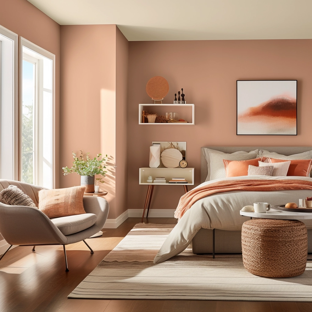
Sherwin Williams Cavern Clay color palette
Before you go…
There you have it—nine of the most romantic bedroom paint colors you can get your hands on!
As you can see, you don’t have to limit yourself to boring reds and hot pinks.
Exploring a diverse palette of romantic hues allows you to create a bedroom that perfectly captures the mood and atmosphere you want, without compromising on style and individuality.
If you need further assistance in selecting your ideal romantic bedroom paint color, download my free paint planning worksheet. This worksheet offers tips, tricks, and expert advice so you can start your paint project with confidence.
Still unsure which paint color is right for your space?
Choosing paint doesn’t have to be stressful! My free Paint Color Planning Quick Start Guide walks you through the exact steps to confidently choose the perfect color — without the overwhelm, second-guessing, or endless swatch testing.
👉 Click here to download the free guide!

My Paint Color Formula course walks you through the painless process of expertly testing paint swatches to ensure you have the perfect color for your home.
The best way to sample paint? Samplize!
Get peel-and-stick removable and reusable paint samples here!
Thanks for reading!
Morgan is passionate about home decor and paint colors. She has been sharing DIY home decor tips since 2012 at CharlestonCrafted.com. From there, she learned to love paint colors, and the Paint Color Project was born in 2022!

