Thinking of transforming your bedroom into a peaceful sanctuary? Discover our top calming bedroom paint colors for that serene, dreamy feel you're longing for!
Have you ever found yourself tossing and turning on your bed one too many times, unable to relax after a long day of work?
Your bedroom wall color might be to blame. That’s right: your wall color can significantly affect your mood and how well you sleep.
When creating a calming and inviting bedroom, understanding color psychology is essential.
Certain colors evoke feelings of relaxation and calm, while others have the opposite effect.
This article lists some of the most calming bedroom paint colors you can use today, along with recommended shades and expert advice to help you choose the ideal hues for your sanctuary.
Most Calming Bedroom Paint Colors
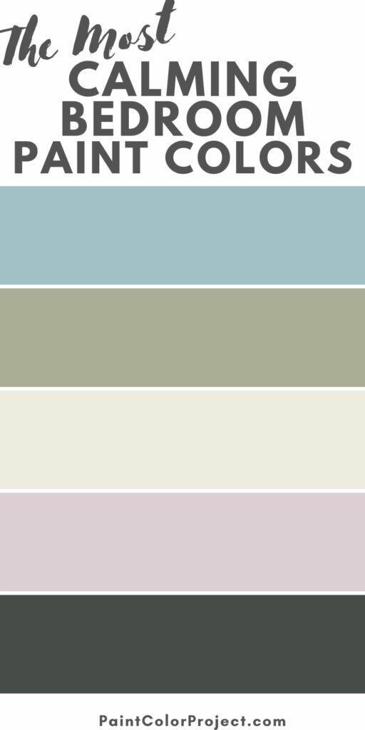
The most calming bedroom paint colors are:
- Light blue
- Sage green
- Warm white
- Lavender
- Brown
- Charcoal
- Gray
Let’s take a look at each of these color families.
Light Blue
Blue is often associated with calm waters and clear cloudless skies, making it the go-to choice for those looking to infuse a sense of tranquility into their surroundings.
When used as a bedroom paint color, blue—particularly a light, cool blue—contributes to a restful environment.
According to Color Psychology, blue has the ability to reduce heart rate and slow down breathing, thus promoting relaxation and improving sleep quality.
This is the reason why pediatrics, meditation areas, and spa interiors frequently feature soothing shades of blue.
Cool blue is best paired alongside darker and bolder hues, such as navy blue, charcoal gray, forest green, or burgundy.
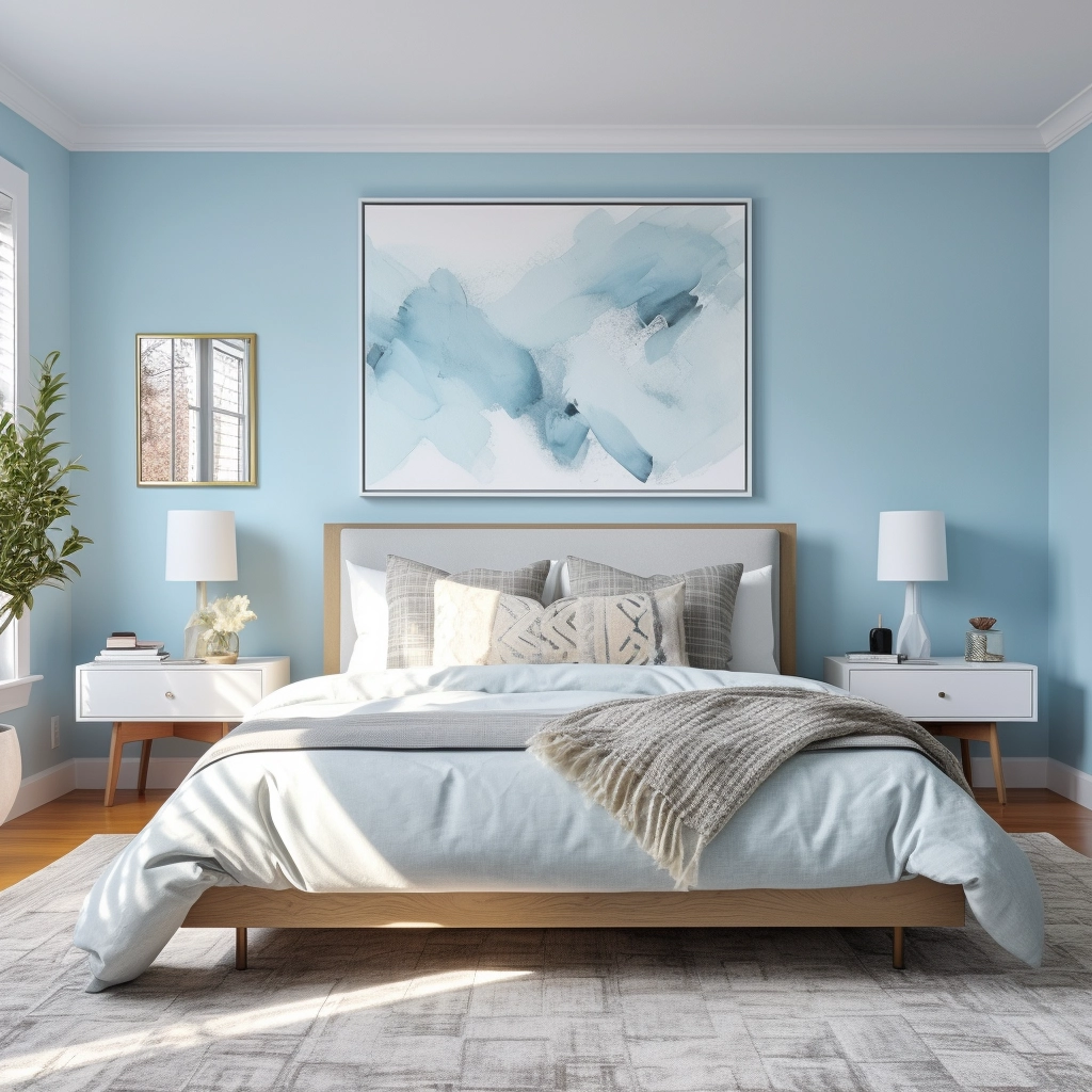
- French Moire, Sherwin-Williams: A gorgeous cornflower blue that effortlessly captures the essence of timeless elegance.
- Breath of Fresh Air, Benjamin Moore: Reminiscent of a calm and clear sky, this paint color by Benjamin Moore creates a soft, dream-like quality to any space. It pairs beautifully with white flooring and trimming.
- Windmill Wings, Benjamin Moore: A bright, icy shade of blue comparable to periwinkle. It pairs well with neutral tones, whites, and light grays, creating a balanced and soothing color palette.
Sage Green
Sage green is a calming shade of silver-green that draws inspiration from the culinary herb of the same name.
Its soft and serene presence makes it an excellent choice for cottage-core, bohemian, and nature-inspired bedrooms.
This color looks good with warm and cool tones, making it a versatile choice for various decorating styles.
However, it works especially well with bright, vivid colors like gold and purple to emphasize its bold quality.
You can also pair it with muted colors, like rose quartz, light gray, and pale yellow, to create a soft, contemporary vibe to a bedroom space.
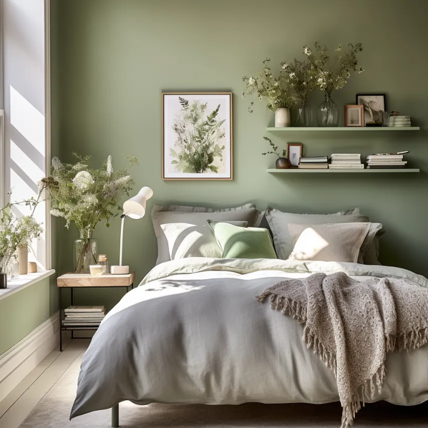
- Cypress Green, Benjamin Moore: A sage green with a pale olive tone. It’s a great choice for those looking for a darker and earthier shade of this color.
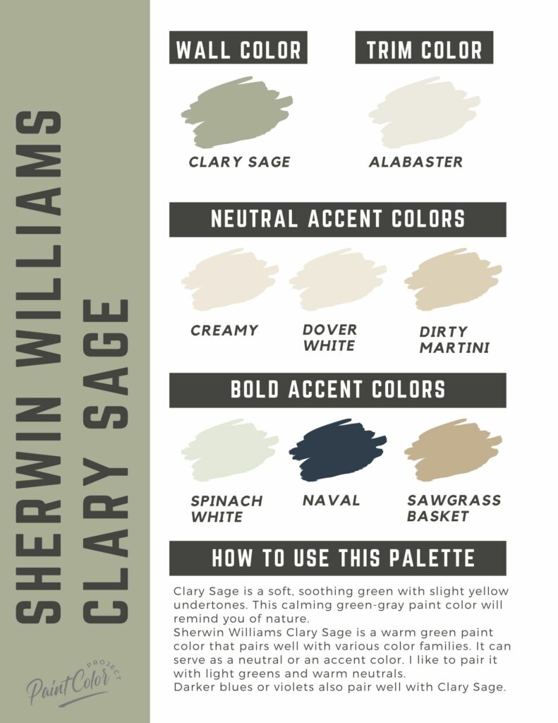
- Clary Sage, Sherwin Williams: A soft, herbal green with blue-green undertones. Depending on the lighting, it can appear taupe-ish green or gray-green.
- Sage Green, Behr: A dark shade of sage with subtle brown and green undertones.
Sherwin Williams Clary Sage color palette
Join the (free!) PaintColorProject+ community to access this exclusive color palette! Once you join, you can right click & save the palette image!
Warm White
White, celebrated for its simplicity and purity, is a popular choice for creating a calming bedroom environment.
White walls work with nearly every color palette, making it a foolproof choice that effortlessly adapts to various bedroom aesthetics.
You can use cream white for a soft and warm ambiance, or opt for an ivory white to achieve a clean and modern look.
The secret to using white as a calming bedroom color is to choose an off-color warm white.
Unlike the bright, clinical backdrop of cool white, warm white creates a more inviting and soothing atmosphere, reminiscent of soft candlelight or the warmth of sunlight streaming through a window.
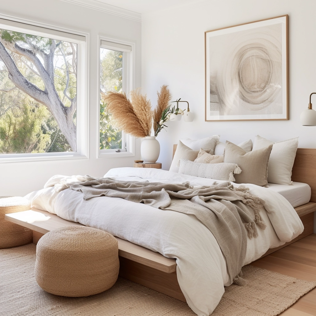
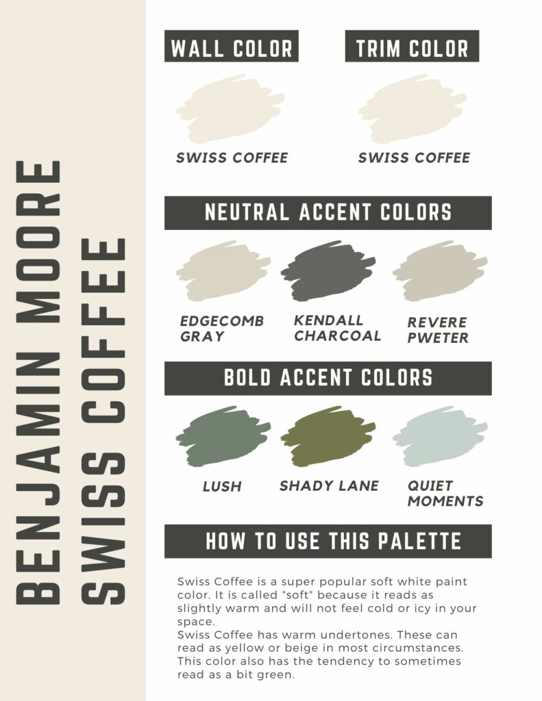
- Swiss Coffee, Benjamin Moore: A sophisticated, off-white creamy color that adds a welcoming softness and elegance to a space. It’s crisp yet comforting, with just enough brightness to illuminate a room without making it feel too clinical.
- Steamed Milk, Sherwin Williams: As the name suggests, this paint color is a warm, bright white with peachy undertones. It’s a lighter alternative to beige.
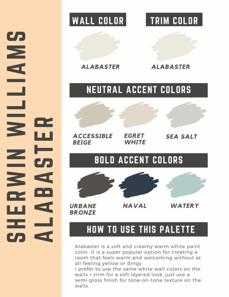
- Alabaster, Sherwin Williams: A classic warm white with faint undertones of cream, giving it a soft and inviting feel. It works especially well with taupe and beige accents and furniture, both of which emphasize the room’s warmth without adding too much color.
Benjamin Moore Swiss Coffee color palette
Join the (free!) PaintColorProject+ community to access this exclusive color palette! Once you join, you can right click & save the palette image!
Sherwin Williams Alabaster color palette
Join the (free!) PaintColorProject+ community to access this exclusive color palette! Once you join, you can right click & save the palette image!
Soulful Lavender
When used thoughtfully, lavender introduces a sense of whimsy, sophistication, and serenity to a bedroom.
It’s a playful alternative to pale blue and pink, and works well with colors with a similar palette.
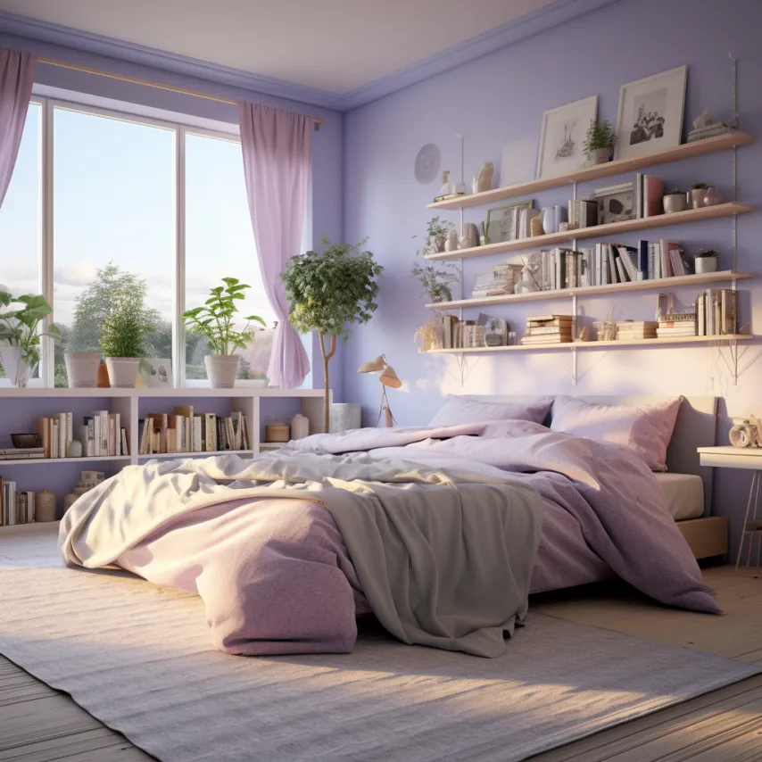
- New Age 1444, Benjamin Moore: An ethereal pale lavender with a hint of gray. It adds a soothing vibe to a bedroom without overpowering other colors, making it a fitting choice for a subtle backdrop. Pair it with neutral shades like white, beige, and gray.
- Lavender Cloud, Behr: A vibrant, mid-tone lavender that works best as an accent color rather than a wall color. It works beautifully with complementary colors in the blue family, like turquoise, teal, and cerulean. You can also go monochrome and pair it with paler shades of lavender.
- Wallflowers, Sherwin Williams: A soft lavender-pink that effortlessly combines tranquility with a playful charm, creating a soothing yet lively atmosphere in a space. It can be paired with neutral tones for a sophisticated look or bolder hues like burgundy, navy blue, and mustard yellow for a more eclectic and vibrant space.
Earthy Brown
Brown comes in many forms: gray-brown, beige brown, chocolate, chestnut, umber—the list goes on.
Regardless of the shade, one thing’s undeniable: it’s a warm and comforting color that keeps us quite literally grounded.
It’s strongly associated with nature and earth, invoking a sense of stability.
Cooler-toned browns, like gray-brown and taupe, pair well with neutral colors and can be used to create a sleek and minimalistic look.
Warm browns, on the other hand, bring a sense of richness and depth to a space, especially when paired with complementary colors like gold and olive green.
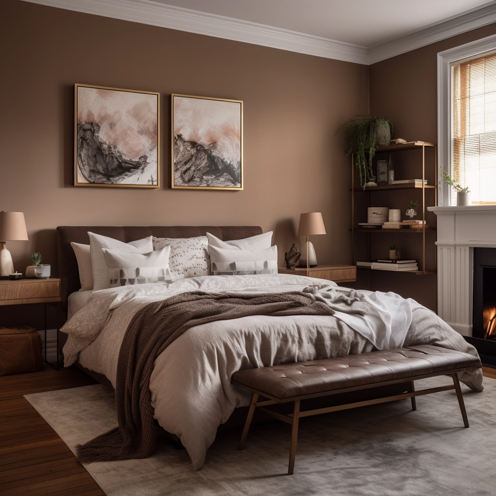
- Downing Earth, Sherwin Williams: A mid-tone brown that embodies warmth and earthy richness. For a classic and timeless look, pair it with cream, beige, and soft blues. If you’re aiming for a more modern aesthetic, complement it with cool grays and crisp whites.
- Whipped Mocha, Benjamin Moore: A sandy brown with rosy undertones. It looks stunning with creamy trims and dark accents, as both colors add depth and visual interest to a space.
- Sable, Sherwin Williams: A rich, chocolate brown that exudes warmth and sophistication, making it an excellent choice when you’re going for a “dark academia” aesthetic. Pair it with neutrals and earth tones to bring out its richness. Options include black, white, olive green, and cream.
Serene Charcoal
Charcoal can add a sense of intimacy and drama to a space, making it feel cozy and inviting—but only when paired with the right colors.
The dark hue makes it a somewhat challenging color to work with, as it can either create a captivating and relaxing atmosphere or a somber and overly closed one.
Here’s a well-kept secret to point you in the right direction: charcoal works best with warm cognac leather, light woods, shiny brass accents, and bold patterns.
Reflective surfaces, such as mirrors and metallic finishes, prevent the room from feeling too enclosed, while strategic lighting—both natural and artificial—ensures that a space remains visually dynamic.
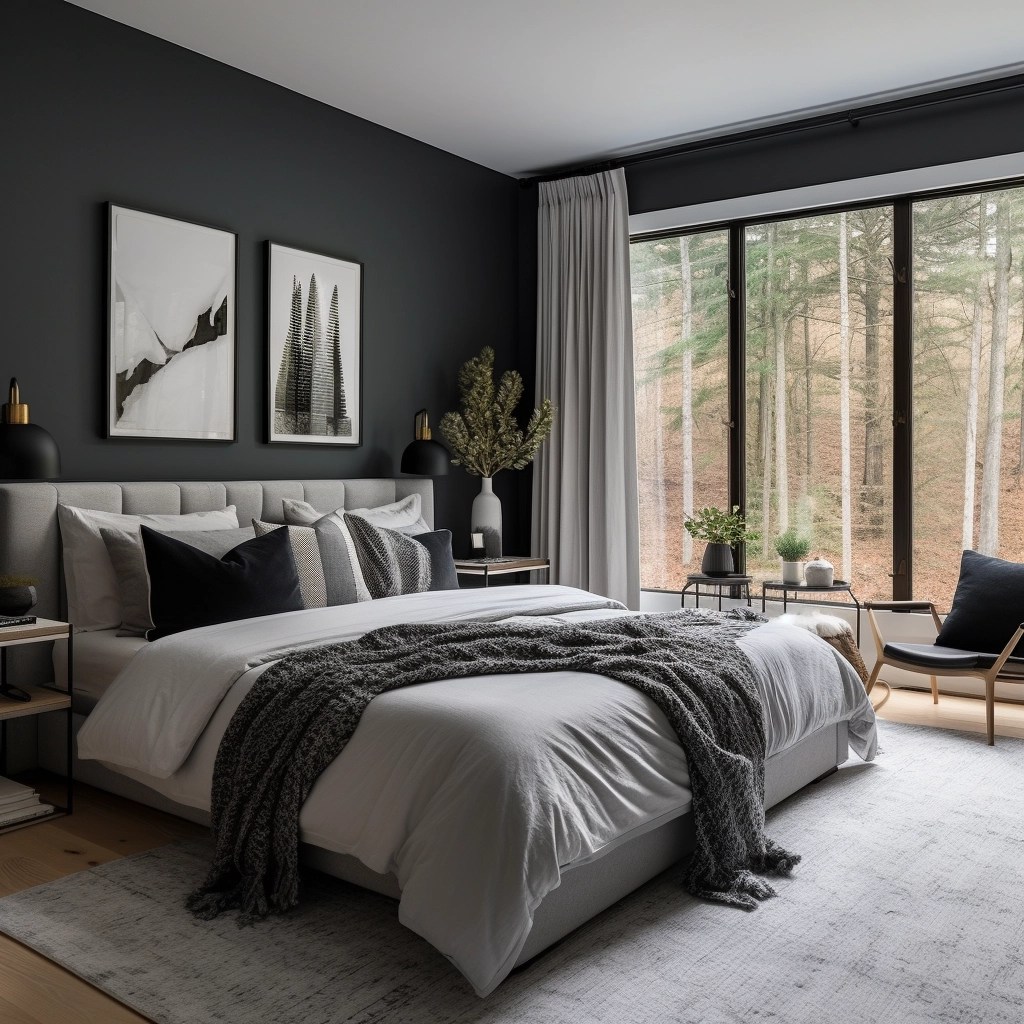
- Rock Bottom, Sherwin Williams: A dark charcoal with mossy green undertones, adding an earthy atmosphere to a room. To bring out the green, pair it with warm whites and neutrals with a green undertone.
- Graphic Charcoal, Behr: A bold, dark charcoal with blue undertones. It looks especially striking next to matte black metals, light wood tones, and warm earth tones.
- Poppy Seed, Behr: A dark charcoal with deep blue undertones, Poppy Seed brings an element of sophistication and moodiness to a space. Soft grays, crisp whites, and muted blues enhance the depth and luxury of this color.
Soothing Gray
Do you feel a sense of calm when you look at cloudy skies, or the gentle ebb and flow of ocean waves?
If you answered “yes,” you may want to paint your room gray.
Gray is a versatile and neutral shade that works with dozens of colors and design styles, from minimalist to contemporary.
Interior designers adore this color for its chameleon-like hue. It’s praised for its ability to blend seamlessly into the background and let accent colors shine.
When using gray as a backdrop, make sure the color matches the room’s undertones.
This means that if your room is mostly warm, opt for a warm gray with undertones of beige, taupe, or yellow.
If your room has cooler undertones, search for a gray with hints of blue and green.
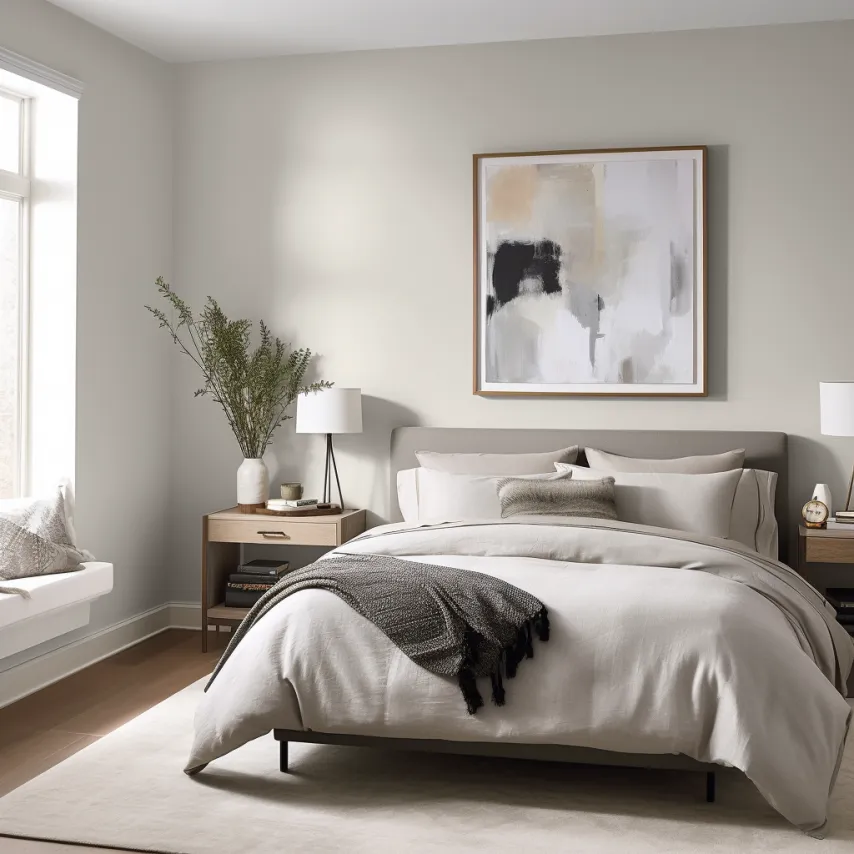
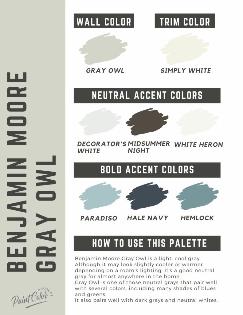
- Gray Owl, Benjamin Moore: A true gray that perfectly balances warm and cool. It shines best with monochrome palettes of creams and grays.
- Silver Chain, Benjamin Moore: A light and airy cool gray that brings a touch of modern sophistication to a room.
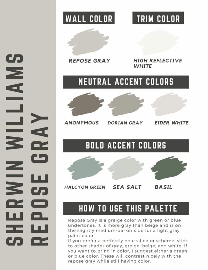
- Repose Gray, Sherwin Williams: A classic gray that pairs well with both warm and cool accent colors. It complements cooler hues like blues and purples just as well as early tones like browns and greens.
Benjamin Moore Gray Owl color palette
Join the (free!) PaintColorProject+ community to access this exclusive color palette! Once you join, you can right click & save the palette image!
Sherwin Williams Repose Gray color palette
Join the (free!) PaintColorProject+ community to access this exclusive color palette! Once you join, you can right click & save the palette image!
Before you go…
I hope this post on the most calming bedroom paint colors gave you the needed inspiration for your next bedroom project!
To transform your space with confidence, I encourage you to sign up for my free paint color planning guide, where you’ll discover expert tips and practical advice to make your vision a reality.
The guide will show you how to work with what you’ve got, when to match and when to complement, and many others.
Still unsure which paint color is right for your space?
Choosing paint doesn’t have to be stressful! My free Paint Color Planning Quick Start Guide walks you through the exact steps to confidently choose the perfect color — without the overwhelm, second-guessing, or endless swatch testing.
👉 Click here to download the free guide!

My Paint Color Formula course walks you through the painless process of expertly testing paint swatches to ensure you have the perfect color for your home.
The best way to sample paint? Samplize!
Get peel-and-stick removable and reusable paint samples here!
Thanks for reading!
Still unsure which paint color is right for your space?
Choosing paint doesn’t have to be stressful! My free Paint Color Planning Quick Start Guide walks you through the exact steps to confidently choose the perfect color — without the overwhelm, second-guessing, or endless swatch testing.
👉 Click here to download the free guide!

My Paint Color Formula course walks you through the painless process of expertly testing paint swatches to ensure you have the perfect color for your home.
The best way to sample paint? Samplize!
Get peel-and-stick removable and reusable paint samples here!
Thanks for reading!

Morgan is passionate about home decor and paint colors. She has been sharing DIY home decor tips since 2012 at CharlestonCrafted.com. From there, she learned to love paint colors, and the Paint Color Project was born in 2022!

