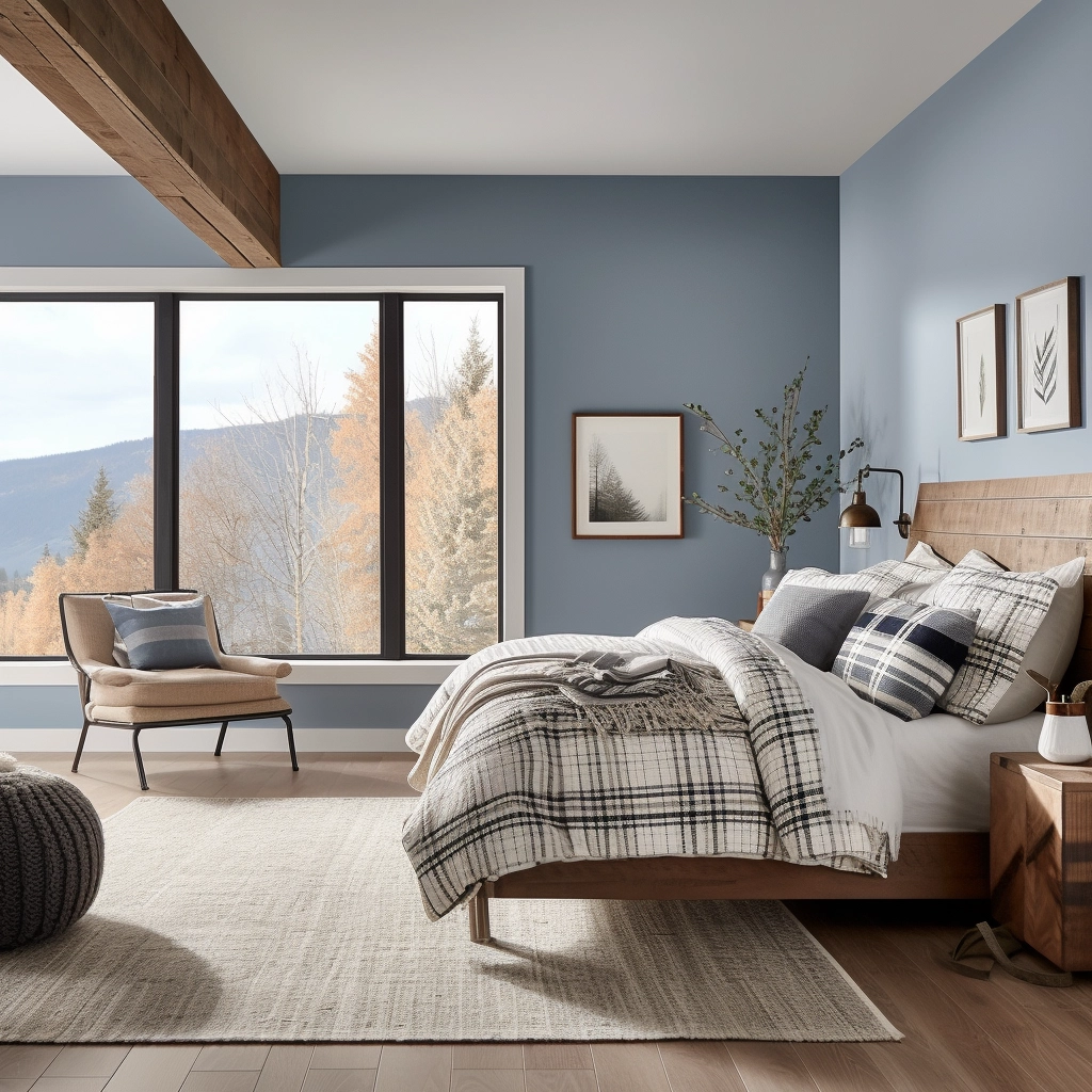
Want to find the best blue paint color for your bedroom? Let's compare the most popular blue bedroom paint colors to see what is right for you!
Want to paint your bedroom? Paint is a cheap and easy way to completely transform the feel of a space.
But, it can be so tough to commit to a paint color!
If you landed here, I bet you are considering blue for your bedroom. It's a great choice! Let's talk about why and take a look at some of my favorite shades.
Is blue a good color for a bedroom?
According to color psychology, blue is calming. That makes it perfect for the bedroom! Blue is also universally liked, and coordinates with a lot of other colors and materials. It's an excellent choice!
See all of my favorite bedroom paint colors here!
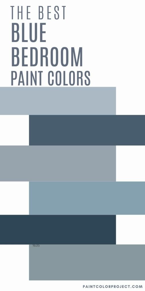
Best blue paint colors for bedrooms
Wondering which blue color is best for the bedroom? My favorite blue bedroom paint colors fall into two categories: light blue and navy blue.
Let's check out the best shades of blue for the bedroom!
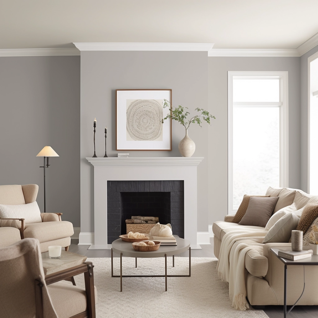
Best light blue paint colors for the bedroom
Light blue paint colors are soothing and easy to decorate with. Here are my favorite light blue paint colors for bedrooms!
Windy Sky by Benjamin Moore (1639)
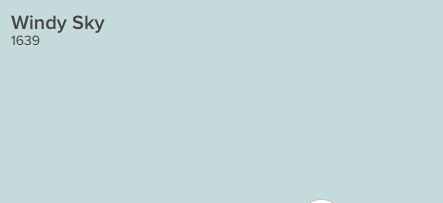
Windy sky is a gorgeous, bright and cheerful blue gray paint color. To me, it feels like aqua, all grown up and sophisticated. It feels like a sunny, cloudless day and would really make your home feel warm and inviting.
Click here to get a 12"x12" peel and stick sample of Benjamin Moore Windy Sky!
Iceberg by Benjamin Moore (2122-50)

Iceberg is a very light blue with strong gray undertones. It is almost a baby blue - but muted up with all that gray so there is nothing pastel about it at all. Iceberg is neutral enough to cover every wall in your entire home and still look interesting.
Click here to get a 12"x12" peel and stick sample of Benjamin Moore Iceberg!
Brittany Blue by Benjamin Moore (1633)
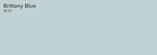
Brittany blue is a light, crisp, cool blue gray color. It has icey undertones but is decidedly blue. It is almost a sky blue, but with those gray tones that keep it from looking too UNC-Chapel Hill.
Click here to get a 12"x12" peel and stick sample of Benjamin Moore Brittany Blue!
Icy by Sherwin Williams (SW6534)
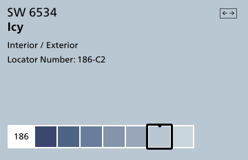
Icy is a very blue color with gray undertones. It is close to a sky blue color and one of the truest blues on this list. Pair it with creamy colors instead of whites or grays to keep it from looking too blue.
Read my full review of SW Icy here!
Click here to get a 12"x12" peel and stick sample of Sherwin Williams Icy!
Lake Placid by Benjamin Moore (827)

Lake Placid is a bright, purple-y blue color. It is cool and icy while still maintaining a lot of blue pigment. It is a great modern take on baby blue.
Click here to get a 12"x12" peel and stick sample of Benjamin Moore Lake Placid!
Upward by Sherwin Williams (SW 6239)
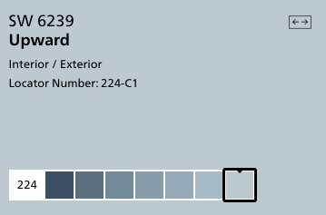
Upward is a clear and pure blue color. It doesn't get muddy tones from the gray undertones but feels less bright because of them. It is a really cheerful color and would work well on walls in many rooms.
Click here to get a 12"x12" peel and stick sample of Sherwin Williams Upward!
Whispering Spring by Benjamin Moore (2136-70)

Whispering Spring is a very light and icy blue, but is surprisingly saturated considering it's tone. In otherwise, it's really light but still really blue - and clinging onto those gray undertones so it doesn't feel pastel at all.
Click here to get a 12"x12" peel and stick sample of Benjamin Moore Whispering Spring!
North Star by Sherwin Williams (SW 6246)
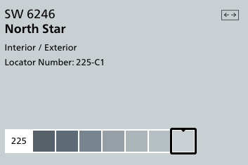
North Star is a cool, crisp blue-grey color. It has an icy appearance and pairs very nicely with a more charcoal gray.
Click here to get a 12"x12" peel and stick sample of Sherwin Williams North Star!
Manor Blue by Benjamin Moore (1627)
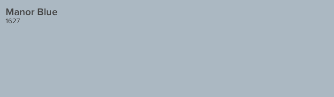
Manor Blue is a mid-tone blue gray with violet undertones. It is a true blue shade, but definitely has gray undertones which give it a moody feeling.
Click here to get a 12"x12" peel and stick sample of Benjamin Moore Manor Blue!
Windy Blue by Sherwin Williams (SW 6240)
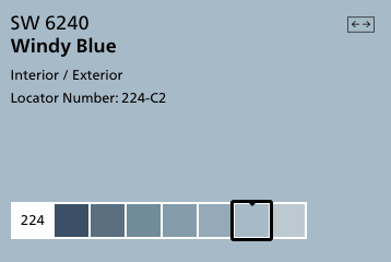
Windy Blue is a light but richly toned blue gray color. It has enough pigment that it really reads as blue, but the tone is muddied enough that it doesn't feel overwhelming at all. This color is stunning in person!
Click here to get a 12"x12" peel and stick sample of Sherwin Williams Windy Blue!
Gentle Gray by Benjamin Moore (1626)
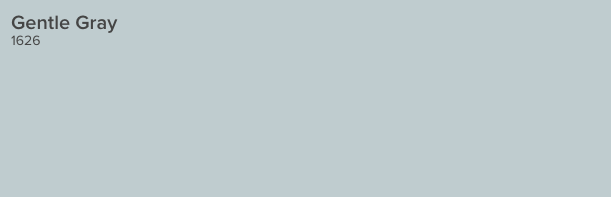
This soft blue-gray is the color of a gentle early morning fog. It is very versatile and pairs well with a wide variety of accent colors.
Click here to get a 12"x12" peel and stick sample of Benjamin Moore Gentle Gray!
Best navy blue paint colors for the bedroom
Navy blue walls are not for the faint of heart. But, they can feel dramatic, modern, masculine, or even cozy with the right accents! Here are my favorite dark blue paint colors for bedrooms.
Naval by Sherwin Williams (SW6244)
Undertones: gray
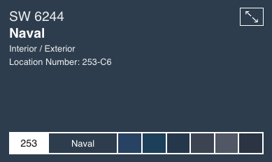
This shade is a total classic - but it is also on trend. It was Sherwin Williams' paint color of the year for 2020.
It is reminiscent of a night sky and is very deep blue. The blue itself is a bit muted so it doesn't read as overly blue, but has gray undertones.
This shade feels rich and luxurious, almost like velvet on the walls. It looks especially beautiful on walls with detailed moldings - paint the walls, molding and all for the best results.
This shade works well in traditional or nautical home styles.
Click here to get a 12"x12" peel and stick sample of Naval.
Newburyport Blue by Benjamin Moore (HC-155)

Undertones: gray, purple
This shade of blue has a lot more blue in it and can almost read ever so slightly purple in artificial light. It is very rich and cozy.
I love how it looks on the exterior of a home - all of that natural light makes it read like a deep, expensive pair of denim blue jeans.
Click here to get a 12"x12" peel and stick sample of Newburyport Blue.
Hague Blue by Farrow & Ball (No. 30)
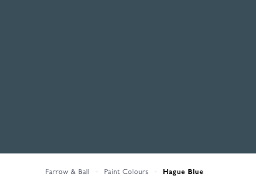
Undertones: green, gray
This shade of navy has a lot of deep green undertones, making it look like the color of the deepest part of the sea. It is almost a very dark, blue-teal shade.
It is very dramatic and almost looks historical. I love how it looks paired with darker wood tones and light crisp white accents.
Click here to get a 12"x12" peel and stick sample of Hague Blue.
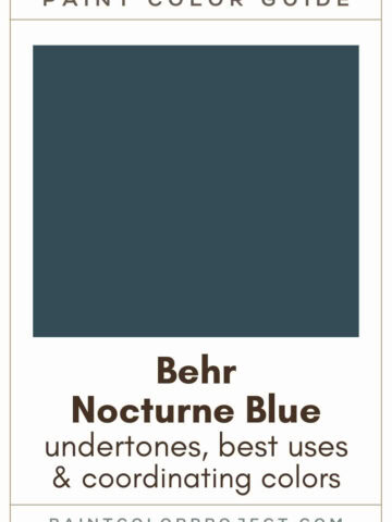
Midnight Blue by Behr (N480-7)
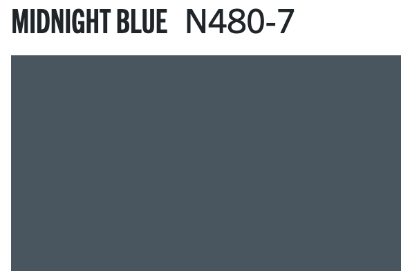
Undertones: gray
Midnight blue is a super gray navy blue paint color. It is very muted - tons of gray undertones - which makes it read very neutral.
If you are afraid of a color looking too primary blue, this is a really safe bet for a deep toned neutral navy.
Gentleman's Gray by Benjamin Moore (2062-20)

Undertones: teal, green
Officially, this blue is inspired by classic navy tailored suits and peacoats. It is formal and masculine by design. With definite teal/green undertones, it's a great option for many spaces.
To me, Gentleman’s Gray is really an odd name for this color because it’s not nearly as gray as it is a deep teal. However, the gentleman’s bit is right on key – this would be gorgeous in a study, library, or man cave paired with masculine accessories.
Click here to get a 12"x12" peel and stick sample of Gentleman's Gray.
Old Navy - Benjamin Moore (2063-10)

Undertones: true blue, slight deep purple
This is a very traditional shade of navy. It is highly pigmented and reads as very blue while still being dark and deep in tone.
It is very saturated with true blue but can read as almost purple in the wrong artificial light. This is a great choice for bold navy and white stripes!
Click here to get a 12"x12" peel and stick sample of Old Navy.
Dark Night by Sherwin Williams (SW 6237)
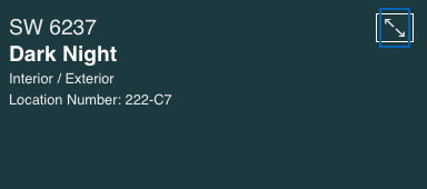
Undertones: teal, green
Dark Night is a very deep teal color. It has a lot of green undertones and is really a mix between rich emerald green and navy blue. I think it is really stunning and interesting.
For this color, pick a room with really good natural light so that the true color can really shine. It's very moody and I think it would make a great color for a kitchen island cabinet!
Click here to get a 12"x12" peel and stick sample of Dark Night.
Hale Navy by Benjamin Moore (HC-154)

Undertones: gray
Hale Navy is probably one of the most popular navy blue paint colors! It is deeply saturated with slight gray undertones to help mute it just enough.
Hale Navy is a deeply saturated navy blue. Using this color will bring a ton of impact into your space! It might not be the color for all of the walls in your home, but using it selectively can be really beautiful. The gray undertones keep this blue from looking too much like a military uniform.
Click here to get a 12"x12" peel and stick sample of Hale Navy.
Salty Dog by Sherwin Williams (SW-9177)

Undertones: teal
If you are looking for a deep blue color that is highly pigmented, this is a great option for you. There is nothing muted about Salty Dog - it is blue and it is proud of it!
The color does read as slightly teal due to the green undertones, so keep that in mind. This is great for a bold pop of deep color on a spot like a front door or piece of furniture!
Click here to get a 12"x12" peel and stick sample of Salty Dog.
Charcoal Blue by Sherwin Williams (SW 2739)
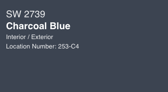
Undertones: gray
Charcoal blue is a really good name for this paint color - it is a cross between a deep charcoal gray and a navy blue. It is a great choice if you cannot decide between painting something dark gray and navy!
Click here to get a 12"x12" peel and stick sample of Charcoal Blue.
Van Deusen Blue by Benjamin Moore (HC 156)

Undertones: gray
This is a slightly lighter shade that still reads as very navy blue. It is labelled a historical color and has slightly muted, gray undertones.
In some light, this color can read as a very dark navy, while in others it is more of a medium toned blue. This is a great option if you don't want to commit to anything too dark, but be sure to test it in your home at various times of day to verify how it will read in your space.
Click here to get a 12"x12" peel and stick sample of Van Deusen Blue.
Club Navy by Ralph Lauren (RLTH228)
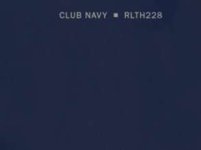
Undertones: purple
This navy blue is preppy and classic. It is highly pigmented - nothing muted about it. It is very very blue but it could read almost purple in certain light. A great option if you love color.
Newburg Green by Benjamin Moore (HC-158)

Undertones: green, gray
This is a beautiful muted dark teal color. It is more blue than green, but still has a lot of green in it. It reads as a very rich jewel tone. The gray undertones help to keep it from feeling too colorful or saturated.
Click here to get a 12"x12" peel and stick sample of Newburg Green.
Deep Royal by Benjamin Moore (2061-10)

Undertones: gray
This is a very dark navy blue. It is a true blue and definitely reads as blue on a wall. It has a little bit of gray undertones, but is not super muted - if you use this color, there will be no mistaking that your paint is blue.
Click here to get a 12"x12" peel and stick sample of Deep Royal.
Evening Sky by Benjamin Moore (833)

Undertones: purple, gray
This shade of navy blue paint definitely has purple undertones to it. It can read like a lighter shade of navy, especially in bright natural light.
This is a great option if you want a highly pigmented navy blue paint color that is not super duper dark.
Click here to get a 12"x12" peel and stick sample of Evening Sky.
Mysterious by Benjamin Moore (AF-565)

Undertones: gray
Mysterious is a navy blue color, but it is very closely related to a charcoal gray. The color is very rich, but also muted. The less light this color gets, the more gray it will look.
Click here to get a 12"x12" peel and stick sample of Mysterious.
Stormy Sky by Benjamin Moore (1616)

Undertones: gray
OK - so I know that this paint swatch looks entirely gray, but hear me out. This is a navy blue color. It's very very gray, but when you get it on your walls in the light, you can see the blue.
It might really be a gray with a lot of blue undertones. But regardless, if you want a charcoal-navy blue paint color, that's not too blue, this is an excellent bet.
Click here to get a 12"x12" peel and stick sample of Stormy Sky.
What is your favorite blue paint colors for bedrooms?
Still unsure which paint color is right for your space?
Choosing paint doesn’t have to be stressful! My free Paint Color Planning Quick Start Guide walks you through the exact steps to confidently choose the perfect color — without the overwhelm, second-guessing, or endless swatch testing.
👉 Click here to download the free guide!
DIYing Your Paint Job? Start Here.
Choosing a paint color is only half the equation — the tools you use matter just as much. I’ve rounded up the painting supplies we rely on for clean lines, smooth finishes, and less frustration overall.

My Paint Color Formula course walks you through the painless process of expertly testing paint swatches to ensure you have the perfect color for your home.
The best way to sample paint? Samplize!
Get peel-and-stick removable and reusable paint samples here!
Thanks for reading!

Morgan is passionate about home decor and paint colors. She has been sharing DIY home decor tips since 2012 at CharlestonCrafted.com. From there, she learned to love paint colors, and the Paint Color Project was born in 2022!