Are you trying to decide the best paint colors for windowless rooms in your home? Read and discover the top hues to boost low-light space aesthetics.
Picking a room’s paint color is a struggle for many. It’s double the struggle for dim spaces with little natural light source.
And while most would opt for pale and white shades to enhance the dark room, these colors aren’t the only choice you have!
Today, I’ll share the best paint ideas to revitalize a windowless space. Stick around and find the perfect shade for you.
7 Paint Colors for Windowless Rooms
Color is a potent design tool that affects your perception and mood. So, you don’t want to waste that paint job on a bland shade choice.
Without further ado, here are seven color ideas to boost your windowless room’s appearance:
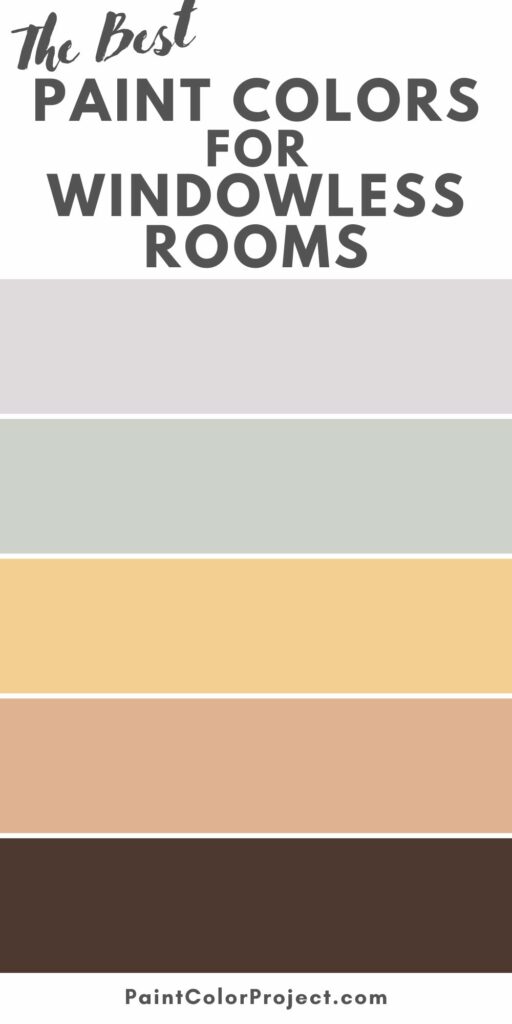
Cool Gray
I know what you’re thinking. Why should you choose a gray color for a windowless room? Won’t it make the gloomy space more dismal?
Contrary to what you might think, gray’s neutral look makes a fabulous paint color for dimly lit rooms.
It’s a safe pick for its versatility and mixes well as a backdrop for colorful decorations.
Despite its seemingly grim name, gray creates a tranquil and calm atmosphere for a room lacking natural light.
Here’s a tip: When picking a gray shade to suit your room, test the color in different lighting situations.
For instance, you can use paper with the same color you want and move it around the space.
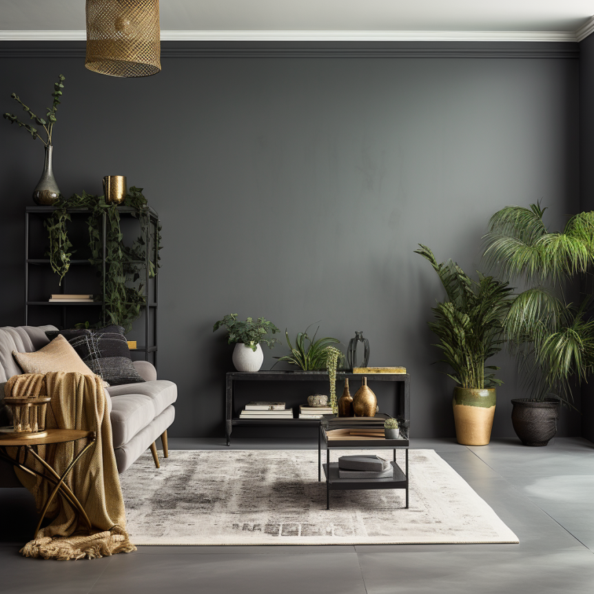
Here are a few popular gray colors to choose from:
- Sherwin Williams - Repose Gray (SW 7015)
- Benjamin Moore - Amherst Gray (HC-167)
- Sherwin Williams - Argos (SW 7065)
- Behr Paint - Silver Bullet (N520-2)

Relaxing Green
If you’re not keen on gray colors for your space, perhaps one taken from nature would hit the nail.
And let me tell you, green creates wonders in dark spaces by adding warmth and depth.
Green brings life and vibrancy to an otherwise gloomy room. Many prefer this natural color for its scientifically proven calming and relaxing effect.
If you’re eyeing green, choose lighter variations for their soothing effect or darker greens to bring a feeling of coziness to your area.
Have a look at these excellent green shades you can choose from:
- Sherwin Williams - Evergreen Fog (SW 9130)
- Benjamin Moore - Lime Green (2026-10)
- Behr Paint - Brookview (M400-4)
- Sherwin Williams - Courtyard (SW 6440)

Light Blue
Another nature-inspired hue that could brighten up your dreary space is light blue.
Shades of blue, specifically lighter ones, are a perfect choice to usher in light and energy.
There’s a clean and serene appearance of light blue that many find attractive. It’s easy on the eyes, reminiscent of the calming colors of the sea, sky, and happy days.
Here’s a fact most people don’t know:
Blue interiors can make a small room appear larger. It goes well with plenty of shades, which gives you a great deal of freedom to personalize.
Check out these light blue dyes and take your pick:
- Benjamin Moore - Breath of Fresh Air (806)
- Sherwin Williams - Sea Salt (SW 6204)
- Behr Paint - Prelude - (740E-3)
- Benjamin Moore - Graceful Sea (767)

Gentle Lavender
Is your room facing north? A touch of lavender could be the solution you’re looking for.
It infuses warmth and friendliness, which are much-needed ingredients for a windowless corner.
The popularity of lavender and purple colors has surged these past years, from Taylor Swift’s hit “Lavender Haze” in 2022 to being crowned Color of the Year by WGSN in 2023. And it seems many are joining this color trend.
Lavender’s sophisticated look can provide a gentle glow to a room lacking sunlight. It offers a fantastic balance of warmth and coolness to any interior.
Are you considering purple? I suggest you explore these fabulous lavender paints:
- Behr Paint - Lavender Wash (MQ4-30)
- Benjamin Moore - Lavender Mist (2070-60)
- Behr Paint - Soft Iris Lavender (640A-1)
- Sherwin Williams - Lite Lavender (SW 6554)

Warm Gold
If you’re looking for warmth to fill your dingy space, gold and yellow tints are what you need.
Trust me, it’s like having a personal sun in your room.
Yellow and gold colors don’t absorb light like darker shades. Instead, a sun-colored wall will reflect even the most subtle sunlight, engorging the area with cheery brightness.
Yellowish colors are especially effective in brightening up north-facing areas in your home. They make any space more inviting and friendly!
Care to try the yellow magic? Here are a few options you might like:
- Benjamin Moore - Cotton Tail (2155-70)
- Behr Paint - Yellow Gold (360D-6)
- Sherwin Williams - Sun Salutation (SW 9664)
- Benjamin Moore - Heirloom Gold (255)

Quirky Orange
Some will likely think of orange as an odd choice here. But I’m not talking about the standard orange or neon orange we often see in safety clothes.
Instead, I’m pointing more to the warmer, orangey shades of apricot, tangerine, and pumpkin.
Like gold or yellow, these orange variations can evoke warmth, enthusiasm, and comfort.
Orange can highlight dark wood details and brown and light accents in a room, offering a sleek aesthetic to an otherwise depressing space.
If you’re exploring orange as your next room color, consider these hues:
- Sherwin Williams - Soft Apricot (SW 6352)
- Benjamin Moore - Orange Nectar (2013-20)
- Sherwin Williams - Armagnac (SW 6354)
- Behr Paint - Bergamot Orange (P220-6)

Rich Brown
If it’s dark, why choose dark colors? Well, as the famous quote goes, “If you can’t beat them, join them.”
The rich, earthly tone of brown colors makes an excellent choice for a cozy shelter. Paired with natural wooded decors, tones of brown create a calming atmosphere, much like being swaddled in a cocoon.
That said, there are plenty of chocolate colors with bright undertones. Pair it with light decorations and ornaments, and the rich backdrop of brown offers an appealing contrast!
Ready to explore dark hues for your windowless space? Think of these brown paint colors:
- Sherwin Williams - Turkish Coffee (SW 6076)
- Behr Paint - Golden Sand (364)
- Sherwin Williams - Porpoise (SW 7047)
- Benjamin Moore - Brown (2099-10)

FAQs
What color paint makes a room brighter?
Light colors generally make any room brighter. For example, shades like off-whites, pastels, neutrals, and pales can give a room the illusion of spaciousness.
But there are plenty of considerations before you roll the paint roller. Think about the lighting situation, decorations, furniture, and your preferences.
What is the best color for a room with natural light?
Rooms facing south or north typically receive steady sunlight throughout the day. It means you’ll want a color that looks good in bright environments.
If you want to highlight the airy atmosphere, pick pale paints that complement natural light, such as creams, crisp whites, or pale grays.
Brown, blue, yellow, and green also provide balance and consistent style.
What color paint reflects the most light?
Natural white reflects the most sunlight in the color spectrum.
It doesn’t absorb light or heat, reflecting everything outwards, making it a great paint choice for varying scenarios.
Before you go
There you have it! Those are the 7 best paint colors for windowless rooms in 2024.
Whether you prefer the luxurious charm of gray, the refreshing vibes of blue and green, or the quirkiness of yellow, you’re sure to revamp your gloomy space!
Still unsure which paint color is right for your space?
Choosing paint doesn’t have to be stressful! My free Paint Color Planning Quick Start Guide walks you through the exact steps to confidently choose the perfect color — without the overwhelm, second-guessing, or endless swatch testing.
👉 Click here to download the free guide!

My Paint Color Formula course walks you through the painless process of expertly testing paint swatches to ensure you have the perfect color for your home.
The best way to sample paint? Samplize!
Get peel-and-stick removable and reusable paint samples here!
Thanks for reading!

Morgan is passionate about home decor and paint colors. She has been sharing DIY home decor tips since 2012 at CharlestonCrafted.com. From there, she learned to love paint colors, and the Paint Color Project was born in 2022!