Does your room feel dark and dingy? Paint can help! Here are the best paint colors to brighten a room!
Not every room in your home is as big or bright as you perhaps want it to be, which might make you nervous, especially when choosing the right paint and decor.
It’s not always easy to find what it takes to make these spaces brighter.
But we’re confident that we can help you make the changes to get your space feeling light and bright.
So, we gathered the best paint colors to brighten a room, so your gloomy and tiny rooms can be transformed into brighter, lighter spaces you’ll love.
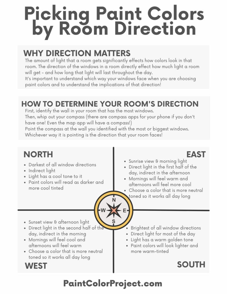
What color paint makes a room look bigger and brighter?
Every room has it's own specific lighting, direction that the windows face, and set elements such as flooring and furniture that effect how the space feels.
The brightness of a room can also depend heavily on the actual size of the room, as well as on the lighting it receives.
Depending on which direction the windows face and whether it receives a portion of natural light, or only depends on artificial lighting, the way your color will appear on your walls may vary.
So, it’s important to understand why your room appears darker to be able to choose the appropriate paint or modify its layout.
- The best paint colors for north facing rooms
- The best paint colors for south facing rooms
- The best paint colors for east facing rooms
- The best paint colors for west facing rooms
Get my FREE Paint Colors by Room Direction Printable!
This handy cheat sheet will help you remember the lighting in each room depending on the direction the windows face, as well as what that means for paint colors!
Join the (free!) PaintColorProject+ community to access this exclusive freebie! Once you join, you can right click & save the palette image!
Once you have the answer to that question, it’s time to think about the vibe you wish to set.
This is directly related to the shade you choose and doesn’t only apply to tight spaces.
If you’re thinking about conveying a light and airy feeling, it’s best to stick with soft and bright colors to make your area look casual and cozy.
But if you’re all about infusing a pop of color and giving your space a dramatic effect, then adding an accent with a vibrant hue will be what you need.
Now that you’ve determined the vibe let’s dig deeper into what colors make your room brighter and ultimately bigger.
Take a look at the shade options we have listed below to find the one that suits your vision.
Paint colors to brighten a room
Here are my favorite colors to paint a dark room, with specific paint colors for each!
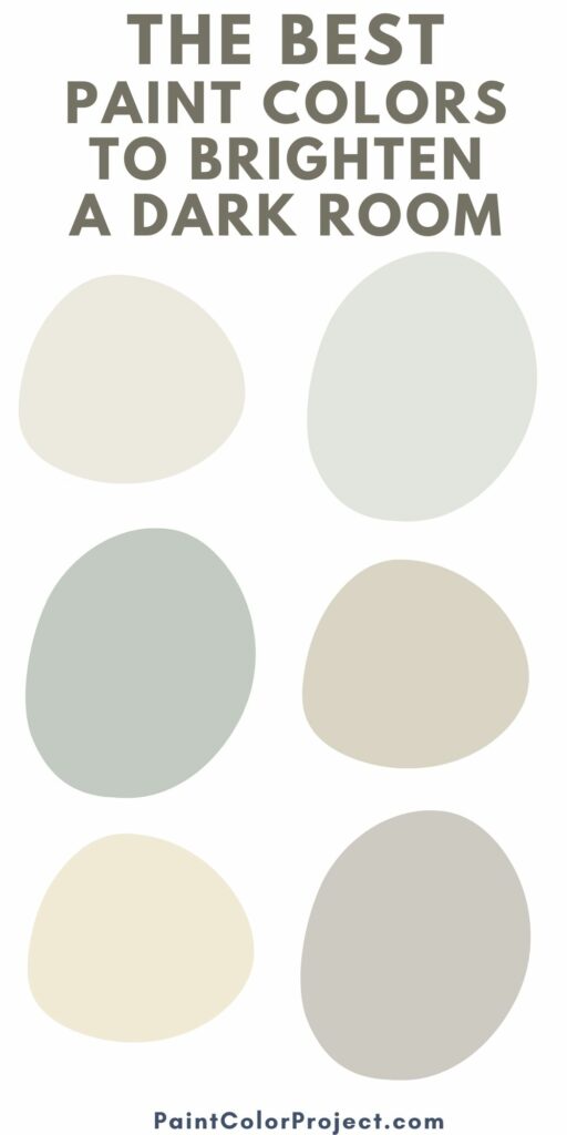
White
We think it’s important to mention that going for a stark white shade shouldn’t be your choice – and it is not something you’ll find below.
Namely, painting your already small room all white will only make it feel flat and plain, which is definitely not something we’re looking for today.
Luckily, we have prepared quite some alternatives to white that will give “soul” to your space. Here’s what we recommend!
Sherwin Williams Alabaster
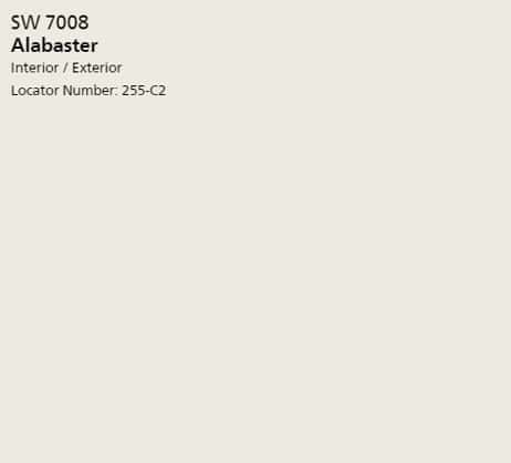
Alabaster is a beautiful alternative to white, with a touch of creaminess to it. This makes it a warm light color choice that will certainly make your dim spaces look brighter.
Also, it goes well with almost all other shades and decor elements, making it a great universal option.
Check out my complete Alabaster paint color review.
Click here to get a peel & stick sample of Alabaster
Benjamin Moore Simply White
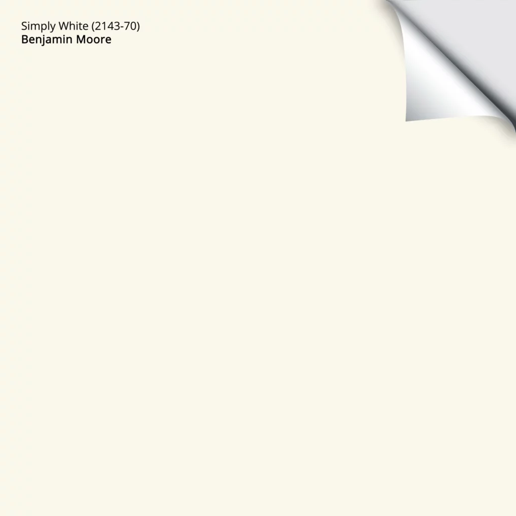
Simply White is closer to basic white, but it has enough warmth to prevent your wall from appearing too stark and plain.
This one is also a good pick if you want to skip painting your trims flat white, adding a proper amount of openness and clarity to your place.
Click here to get a peel & stick sample of Simply White
Benjamin Moore Navajo White

BM’s Navajo White is perfectly neutral with slight yellow tones. These subtones are definitely most visible under artificial lighting, making your area warm and welcoming.
These warm tones feel cozy and will serve to brighten up your dark and dull room.
Click here to get a peel & stick sample of Navajo White
Neutrals
If you’re wondering what neutral colors make your room brighter, consider the following options:
Sherwin Williams Repose Gray
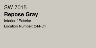
Switching to neutrals, Repose Gray is an incredibly popular color, and for a good reason.
It works well in any type of place, helping to bring out every other detail you’ve decided to incorporate into it without closing it down.
Although on the warmer side, it’s still a beautiful neutral shade that reads gray.
Check out my complete Repose Gray color review!
Click here to get a peel & stick sample of Repose Gray
Sherwin Williams Colonnade Gray

Colonnade Gray is definitely one of the best paint colors to brighten a room, thanks to its versatile warmth.
It makes an especially good pick in naturally dark rooms, helping you open up the space to the point where it looks bigger and brighter than it actually is.
Click here to get a peel & stick sample of Colonnade Gray
Benjamin Moore Paper White

A beautiful blend of white and gray, Paper White is a good choice if your home favors cool accents such as grays and blues. It also works well in coastal or beach style homes.
It’s a bright modern color that tends to appear slightly gray without making the wall feel too cold and lifeless.
Click here to get a peel & stick sample of Paper White
Benjamin Moore Edgecomb Gray

Last on our list of neutral paints comes the Edgecomb Gray. This one is slightly more towards being greige than gray, meaning it has predominately beige tones.
However, they aren’t as noticeable to the point when they overpower the gray hues.
Overall, it makes a beautiful warm option to give your small and dimmer space a cozy and warm feel.
Check out my full Edgecomb Gray paint color review!
Click here to get a peel & stick sample of Edgecomb Gray.
Pastels
And if you wish to add a subtle color, then the following pastel shades would make great paint colors to brighten a room.
Sherwin Wiliams Creamy
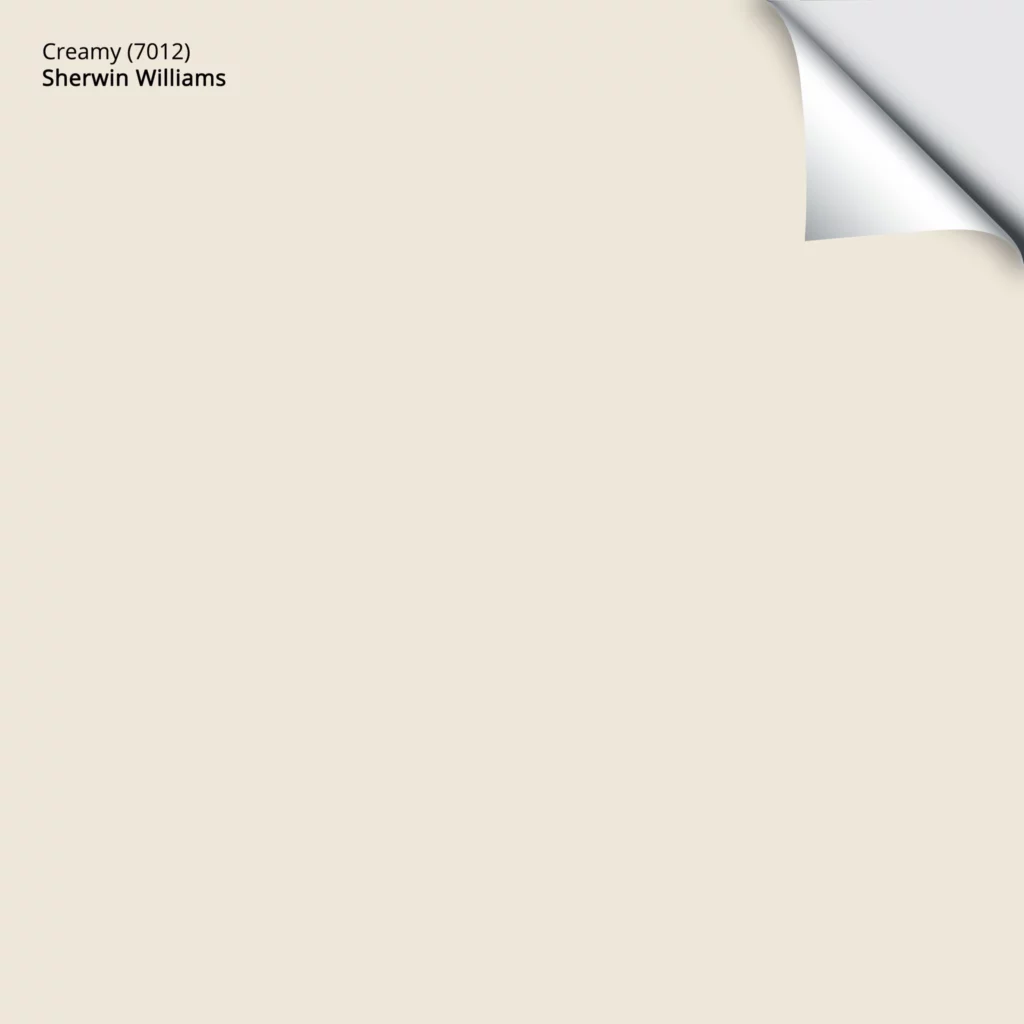
Creamy has a very beautiful and relaxing warmth to it, but without making it too yellow to the point, it’s overwhelming.
Overall, it’s a lovely shade to use if you want to open up your room and make it soothing.
Click here to get a peel & stick sample of Creamy
Check out all of my favorite cream paint colors
Benjamin Moore Silver Marlin
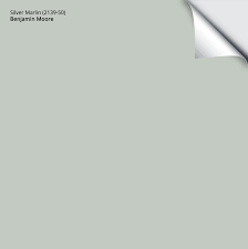
Silver Marlin is a shade with a slight green hint to its medium gray base.
The paint's remarkable quality brings a graceful vibe to the room in which it’s used. This makes it an ideal pick if you want to give your space an eye-pleasing feeling and still open it up.
Check out all of my favorite light green paint colors
Click here to get a peel & stick sample of Silver Marlin
Sherwin Williams Tidewater

Tidewater is yet another paint that will allow you to bring a hint of color to your space, but its undertones are predominantly blue this time.
Overall, it looks like a light ocean blue with subtle hints of green that will make your room feel incredibly serene.
See all of my favorite light blue colors here.
Click here to get a peel & stick sample of Tidewater
Final Thoughts
We hope that our best picks for paint colors to brighten a room will inspire you to choose the ideal one to brighten and open up your place.
Ultimately, your decision should be based on the vibe and vision you have in your mind, but we’re confident that whichever you choose, you'll be more than happy with the final result.
Also, don't forget to get our free paint color planning worksheet and use it in the process. Happy painting!
Still unsure which paint color is right for your space?
Choosing paint doesn’t have to be stressful! My free Paint Color Planning Quick Start Guide walks you through the exact steps to confidently choose the perfect color — without the overwhelm, second-guessing, or endless swatch testing.
👉 Click here to download the free guide!
DIYing Your Paint Job? Start Here.
Choosing a paint color is only half the equation — the tools you use matter just as much. I’ve rounded up the painting supplies we rely on for clean lines, smooth finishes, and less frustration overall.

My Paint Color Formula course walks you through the painless process of expertly testing paint swatches to ensure you have the perfect color for your home.
The best way to sample paint? Samplize!
Get peel-and-stick removable and reusable paint samples here!
Thanks for reading!

Morgan is passionate about home decor and paint colors. She has been sharing DIY home decor tips since 2012 at CharlestonCrafted.com. From there, she learned to love paint colors, and the Paint Color Project was born in 2022!