Looking for the perfect green paint color for your home? Let's discuss Sherwin Williams Quietude and see if it might be just what your space needs.
One color combo that never seems to go out of style is the beautiful mix of green, blue, and gray.
It’s soothing, calming, and has a certain sophistication that instantly makes a room feel more relaxed and put together.
That’s why I’m not surprised Quietude by Sherwin Williams, a soft green with blue-gray undertones, was chosen as their 2025 Color of the Year!
It brings that perfect balance of peacefulness and elegance without overpowering the space.
I love this color because it works in so many settings. It’s subtle yet still offers that gentle pop of color to brighten up any room. Plus, it pairs well with almost any other paint color, which makes it such a versatile option.
So, let’s get into the details of Quietude and see if it could be your next favorite color!
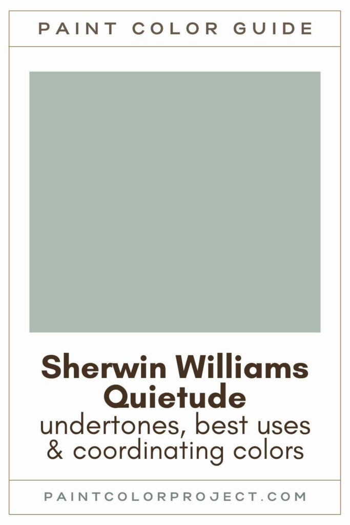
Quietude, Sherwin Williams, SW 6212
Quietude is such a peaceful, neutral green with those perfect gray-blue undertones that make it feel both calming and sophisticated.
Click here to get a peel and stick sample of Quietude
Color Family
Quietude belongs to the green family, but with its unique blend of blue and gray, it feels a little more refined than your typical green.
Light Reflectance Value
48
The Light Reflectance Value (LRV) of 48 means Quietude reflects a moderate amount of light.
On a scale from 0 (pure black) to 100 (pure white), it’s light enough to keep your room from feeling too dark, but still has enough depth to create a cozy vibe.
I’ve found that it holds up beautifully in both bright and dim spaces.
RGB Colors
R: 173 G: 187 B: 178
Quietude’s combination of red, green, and blue gives it that soft, balanced look that’s neither too cool nor too warm.
Hex Code
#ADBBB2

Undertones
Quietude has those subtle blue-gray undertones that keep it from feeling too bold or overpowering. The gray gives it a soft, balanced look that feels just right.
In south-facing rooms with lots of natural light, Quietude leans warmer and shows more of its green side. It creates such a fresh, inviting atmosphere.
But in north-facing rooms or spaces with less natural light, Quietude shifts cooler, taking on more blue-green tones. It’s a great way to add a calming, serene vibe to darker rooms.
I’ve found it really helps to swatch the color in different areas of your room. Lighting can change everything, so testing it out day and night ensures you’ll love how it looks at all times.
Click here to get easy-to-use peel-and-stick samples for swatching!
Best Uses
I absolutely love using Quietude in so many different ways. It’s perfect for bedrooms or bathrooms, giving the walls a soft, relaxing feel that instantly makes you want to unwind.
Want to create a stunning focal point? Try Quietude on your fireplace. It adds just the right amount of color to make it stand out without feeling too bold.
I also like to use mid-toned colors like Quietude for:
- Built-ins
- Kitchen cabinets
- Interior or exterior doors
- Shutters
- Accent wall
- Furniture
- Laundry room
- Den or small living room
Similar Colors
- Benjamin Moore Pleasant Valley
- Behr Quiet Teal
- Sherwin Williams Fresh Eucalyptus
- Sherwin Williams Forever Green
- Sherwin Williams Hazel
- Benjamin Moore Woodland Green
- Behr Breezeway
Click here to get a peel and stick sample of Quietude
Coordinating Colors
Quietude is one of those colors that’s easy to pair with just about anything!
It works beautifully with whites, tans, grays, greiges, browns, and blacks.
For a softer look, you can combine it with other shades of green, blue, or gray.
And if you want a bit of contrast, try pairing it with golden oranges or pale pinks.
Stone grays:
- Pavestone
- Pussywillow
- Sticks & Stones
- Pewter Tankard
- Fawn Brindle
Pastel green-blues:
- Window Pane
- Kingston
- Opaline
- Glimmer
- Fleeting Green
Mid-toned greens with some blue / gray:
- Jasper Stone
- Halcyon Green
- Marine
- Underseas
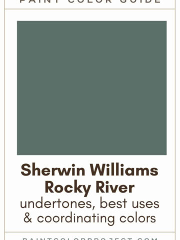
- Rocky River
Trim Colors
Quietude pairs well with soft white trim colors.
- Sherwin Williams Alabaster
- Benjamin Moore White Dove
- Behr Cameo White
Quietude Paint Color Palette
Want to use this paint color in your home? Instantly upgrade your home's aesthetic with our exclusive paint color palette. Unlock the perfect trim color and six stunning accent colors, a combination of neutrals and bold hues for an instantly harmonious space!
Get your perfect paint color palette by clicking here!
Click here to get a peel and stick sample of Quietude
FAQS
Here are some common frequently asked questions about Quietude.
What is the 2025 Sherwin Williams Color of the Year?
The 2025 Sherwin Williams Color of the Year is Quietude. It’s a calming, neutral green with blue-gray undertones, perfect for bringing a sense of peace into any room.
Is Sherwin Williams Quietude a warm or cool color?
Quietude is definitely a cool color. However, it’s slightly warmer compared to other green-gray-blue shades, which gives it a soft, inviting feel.
Does Quietude look gray?
No, Quietude doesn’t actually look gray, even though it has blue-gray undertones. It’s a green paint color that can sometimes lean toward green-blue, depending on the lighting.
The gray undertones are subtle, helping to keep the color from feeling too bold. Make sure to swatch it in your space to see how it plays with the light.
What color trim goes with Sherwin Williams Quietude?
Quietude pairs beautifully with soft whites for trim. I love using Sherwin Williams Alabaster, Benjamin Moore White Dove, or Behr Cameo White. These options create a gentle contrast that complements Quietude’s soothing vibe.
What is the color code for Sherwin Williams Quietude?
The color code for Quietude is SW 6212, and its hex code is #ADBBB2. These are handy if you’re trying to match it perfectly for your project.
What are the undertones of Sherwin Williams Quietude?
Quietude is a neutral green with blue-gray undertones. The gray tones down the intensity, making the color feel soft and calm, without being too overpowering.
Is Sherwin Williams Quietude blue or green?
Quietude is a green paint color with blue-gray undertones. In rooms with a lot of natural light, it tends to look more green. In darker rooms or spaces without much light, it might lean toward blue or even green-blue.
I always recommend swatching the color in different areas of the room to see how the light affects it throughout the day and night.
What’s the difference: Sherwin Williams Quietude vs. Sea Salt?
Quietude is darker than Sea Salt, with an LRV of 48 compared to Sea Salt’s LRV of 63. Sea Salt is also more muted, while Quietude has a bit more depth and saturation.
Swatching them both in your space will help you see the differences clearly before making a decision.

What’s the difference: Sherwin Williams Quietude vs. Benjamin Moore Woodland Green?
Both Quietude and Woodland Green are similar, but Woodland Green is slightly lighter with an LRV of 51, compared to Quietude’s LRV of 48.
Quietude leans a bit more blue, while Woodland Green stays on the greener side.
Since the differences can be subtle, swatching them in your space will help you choose the best fit.

What colors go with Sherwin Williams Quietude?
Quietude pairs well with a range of colors, including whites, tans, grays, greiges, browns, and blacks. You can also mix it with greens, blues, or grays for a more monochromatic look. If you’re in the mood for contrast, try pairing it with golden oranges or pale pinks.
Sherwin Williams suggests Pavestone (a stone gray), Jasper Stone (a mid-tone green), and Window Pane (a blue-green pastel) as great coordinating colors.


Is Sherwin Williams Quietude a good exterior color?
Quietude can be tricky for exteriors. If your house is mostly in the shade and you’re going for a beachy vibe, it could work well.
However, it might be too light for large outdoor areas and could look washed out or lean too green in certain lights.
That said, Quietude looks amazing on front doors or shutters, adding just the right touch of color. Always swatch it outside first to see how it looks against your finishes like brick or stone.
Before you go...
So, you've found the perfect paint color, but here's the thing - there's another big decision you have to make: picking the right paint sheen. Seriously, the level of glossiness can totally change how your color looks on the walls and how long the paint lasts!
Check out our complete guide to understanding paint sheens.
Still unsure which paint color is right for your space?
Choosing paint doesn’t have to be stressful! My free Paint Color Planning Quick Start Guide walks you through the exact steps to confidently choose the perfect color — without the overwhelm, second-guessing, or endless swatch testing.
👉 Click here to download the free guide!

My Paint Color Formula course walks you through the painless process of expertly testing paint swatches to ensure you have the perfect color for your home.
The best way to sample paint? Samplize!
Get peel-and-stick removable and reusable paint samples here!
Thanks for reading!

Meg Hemmelgarn is a freelance writer and home decor + DIY blogger who loves to talk about paint colors. She and her husband are currently renovating their third fixer upper. You can see their projects on her blog, Green With Decor.