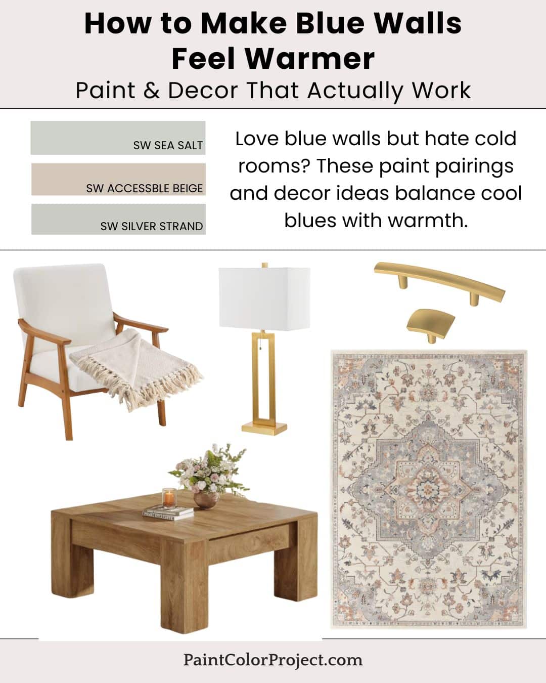
Love blue walls but hate cold rooms? These paint pairings and decor ideas balance cool blues with warmth.
Blue is an ever-popular color. It feels peaceful and relaxed, and it reminds us of nature. However, despite feeling calm, cool blues can be a bit risky. They can make a room feel chilly.
Warm accents can alter the mood, making a home feel warm and inviting.
Soft, warm paint colors can make a huge difference. Greiges feel neutral yet warm, softening the contrast of a chilly blue. Textures such as warm woods, soft textiles, and brass or gold finishes can help offset blue's cool temperature.
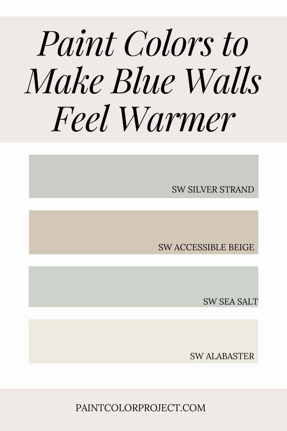
Paint Colors to Make Blue Walls Feel Warmer
- Silver Strand – soft blue
- Sea Salt – blue-green blend
- Accessible Beige – warmth
- Alabaster – trim balance
💡 Tip: These tones transition beautifully between rooms, making them perfect for an open layout or whole-home palette.
If you want to test before committing, order peel-and-stick samples so you can see each color in your real lighting. Read my Samplize review for a quick overview of how to sample the easy way.
How to Bring the Look Together
The key to a warm, comfortable home with blue tones is using warm greiges and soft blues. Layer in wood furniture, brass lighting, and soft, neutral furniture, then pick a neutral rug with a hint of blue to tie everything together.
This combination allows you to still use blue while curating an inviting, peaceful space.
For even more color ideas, check out my full guide to Coastal Neutrals That Aren’t Just Blue.
Decor Inspiration
Here are a few pieces that warm up blue walls:
- Wood coffee table
- Woven textiles, such as this accent chair or this throw blanket
- Warm metal accents, such as these lamps or these handles for built-ins or furniture
- A neutral rug
Stick with a mix of warm materials and soft paint colors for a warm, cohesive look that still features blue.
Why This Palette Works
Warm decor pieces and paint color balance against blue's coolness. Balanced undertones keep spaces feeling calm and cozy, while allowing blue to be a key part of the overall look.
Warm decor pieces and organic textures provide contrast while softening up a room, providing a welcoming feel that doesn't feel cold even when paired with blues.
Still unsure which paint color is right for your space?
Choosing paint doesn’t have to be stressful! My free Paint Color Planning Quick Start Guide walks you through the exact steps to confidently choose the perfect color — without the overwhelm, second-guessing, or endless swatch testing.
👉 Click here to download the free guide!
DIYing Your Paint Job? Start Here.
Choosing a paint color is only half the equation — the tools you use matter just as much. I’ve rounded up the painting supplies we rely on for clean lines, smooth finishes, and less frustration overall.

My Paint Color Formula course walks you through the painless process of expertly testing paint swatches to ensure you have the perfect color for your home.
The best way to sample paint? Samplize!
Get peel-and-stick removable and reusable paint samples here!
Thanks for reading!

Meg Hemmelgarn is a freelance writer and home decor + DIY blogger who loves to talk about paint colors. She and her husband are currently renovating their third fixer upper. You can see their projects on her blog, Green With Decor.