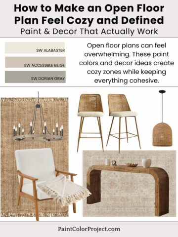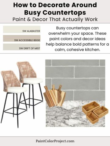
Struggling with a mix of styles and colors? These paint colors and decor ideas help your home feel cohesive without starting over.
It's natural for a home to evolve over time as trends emerge and personal preferences change. However, sometimes this can lead to every room feeling different, leaving a house feel like it's lacking cohesion.
Not to worry! Cohesion doesn't mean everything has to match, rather it means everything should flow.
Use warm neutral paint colors to tie a house together, then repeat tones, such as similar woods and finishes, to create this flow. Decor plays a big role in tying everything together.

Paint Colors How to Make a Home Feel Cohesive
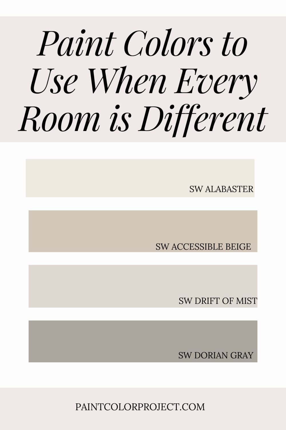
- Alabaster – consistent trim
- Accessible Beige – whole-home base
- Drift of Mist – flexible neutral
- Dorian Gray – grounding accent
💡 Tip: These tones transition beautifully between rooms, making them perfect for an open layout or whole-home palette.
If you want to test before committing, order peel-and-stick samples so you can see each color in your real lighting. Read my Samplize review for a quick overview of how to sample the easy way.
How to Bring the Look Together
The key to making a house feel cohesive even if every room is different is going back to the basics. Start with a soft, warm neutral (Accessible Beige) on the walls and a consistent color (Alabaster) for trim.
Mix in some repeating wood tones across rooms, such as a console table in the foyer, the coffee table in the living room, or the dining table in the kitchen. Pick artwork that is similar in vibes (but not the same!) to hang up in different rooms. Same with textiles across rooms, go similar but slightly different.
By repeating finishes and materials, your home will feel cohesive, not chaotic.
For even more color ideas, check out my full guide to Best Paint Colors for Homes With Mixed Wood Tones.
Decor Inspiration
Here are a few pieces that make a home feel intentionally curated and cohesive:
- Repeating wood tones, such as this console table and this coffee table
- Consistent textiles, such as this sofain the living room and this bench in the foyer
- Similar metal finishes, such as this floor lamp and these handles for kitchen cabinets or living room built-ins
- Cohesive art styles, such as this piece and this set that are both abstract with gold
Stick with a mix of consistent materials and soft colors for a soothing, elevated look that feels purposeful.
Why This Palette Works
Repeating undertones creates visual flow throughout a home. A consistent base palette, including wall color, similar textiles, wood tones, and finishes, ties different rooms together effortlessly.
Accessible Beige creates a neutral base, while Alabaster is a gorgeous trim. The depth of Dorian Gray adds enough contrast without interfering.
Similar colors and finishes throughout means your home will feel cohesive and effortless.
Still unsure which paint color is right for your space?
Choosing paint doesn’t have to be stressful! My free Paint Color Planning Quick Start Guide walks you through the exact steps to confidently choose the perfect color — without the overwhelm, second-guessing, or endless swatch testing.
👉 Click here to download the free guide!
DIYing Your Paint Job? Start Here.
Choosing a paint color is only half the equation — the tools you use matter just as much. I’ve rounded up the painting supplies we rely on for clean lines, smooth finishes, and less frustration overall.

My Paint Color Formula course walks you through the painless process of expertly testing paint swatches to ensure you have the perfect color for your home.
The best way to sample paint? Samplize!
Get peel-and-stick removable and reusable paint samples here!
Thanks for reading!

Meg Hemmelgarn is a freelance writer and home decor + DIY blogger who loves to talk about paint colors. She and her husband are currently renovating their third fixer upper. You can see their projects on her blog, Green With Decor.