Wondering How to Decorate Around Busy Granite or Quartz Countertops? Busy countertops can overwhelm your space. These paint colors and decor ideas help balance bold patterns for a calm, cohesive kitchen.
Busy countertops already bring a lot of visual movement to a room, which means they can be a challenge to decorate around.
The goal when adding in paint colors and decor is to calm the space, not compete with the countertops. Simple paint colors create balance and warmth.
Decor should feel intentional and minimal. Pick pieces that add some texture but are also useful.
Paint Colors to go with Busy Granite or Quartz Countertops
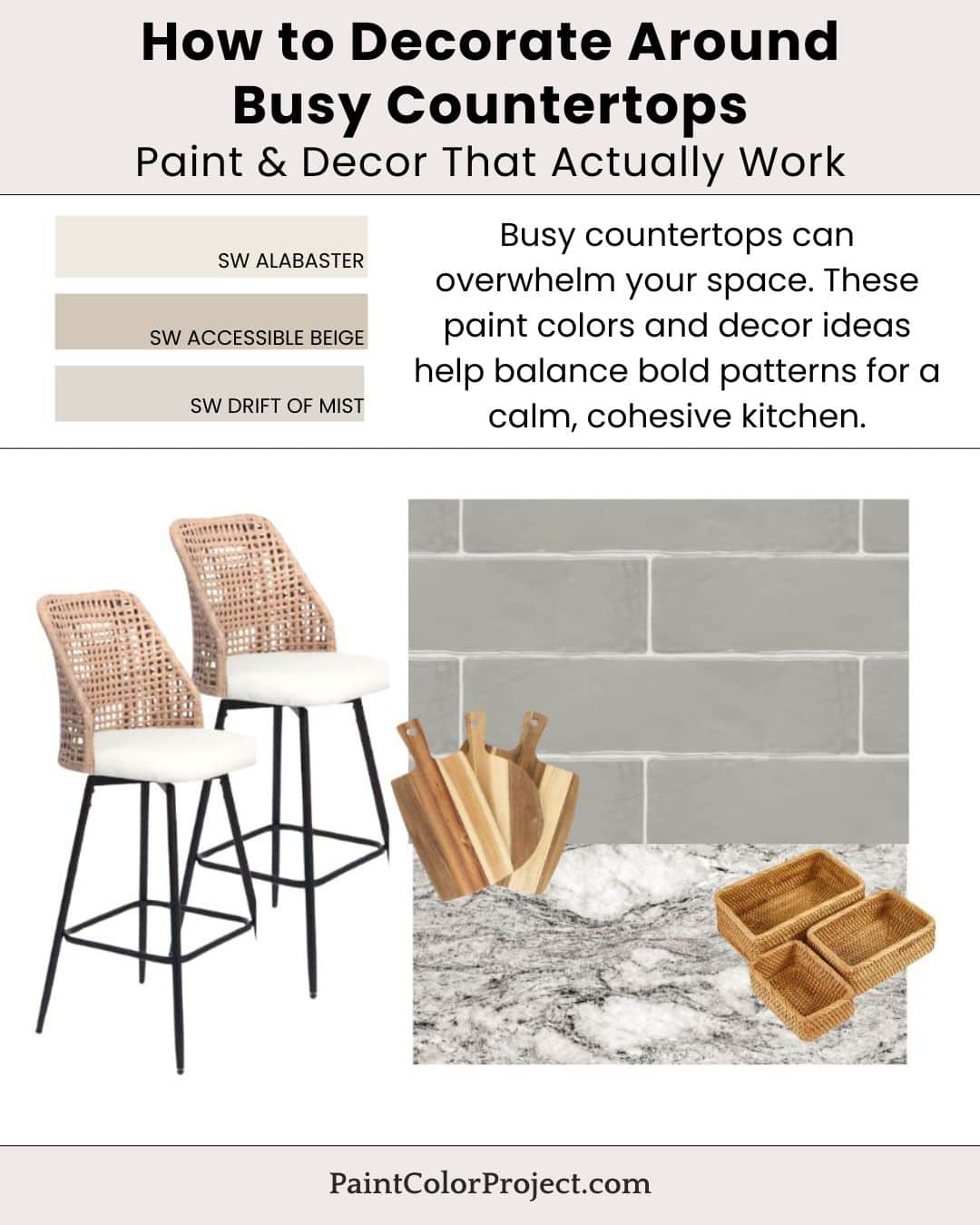
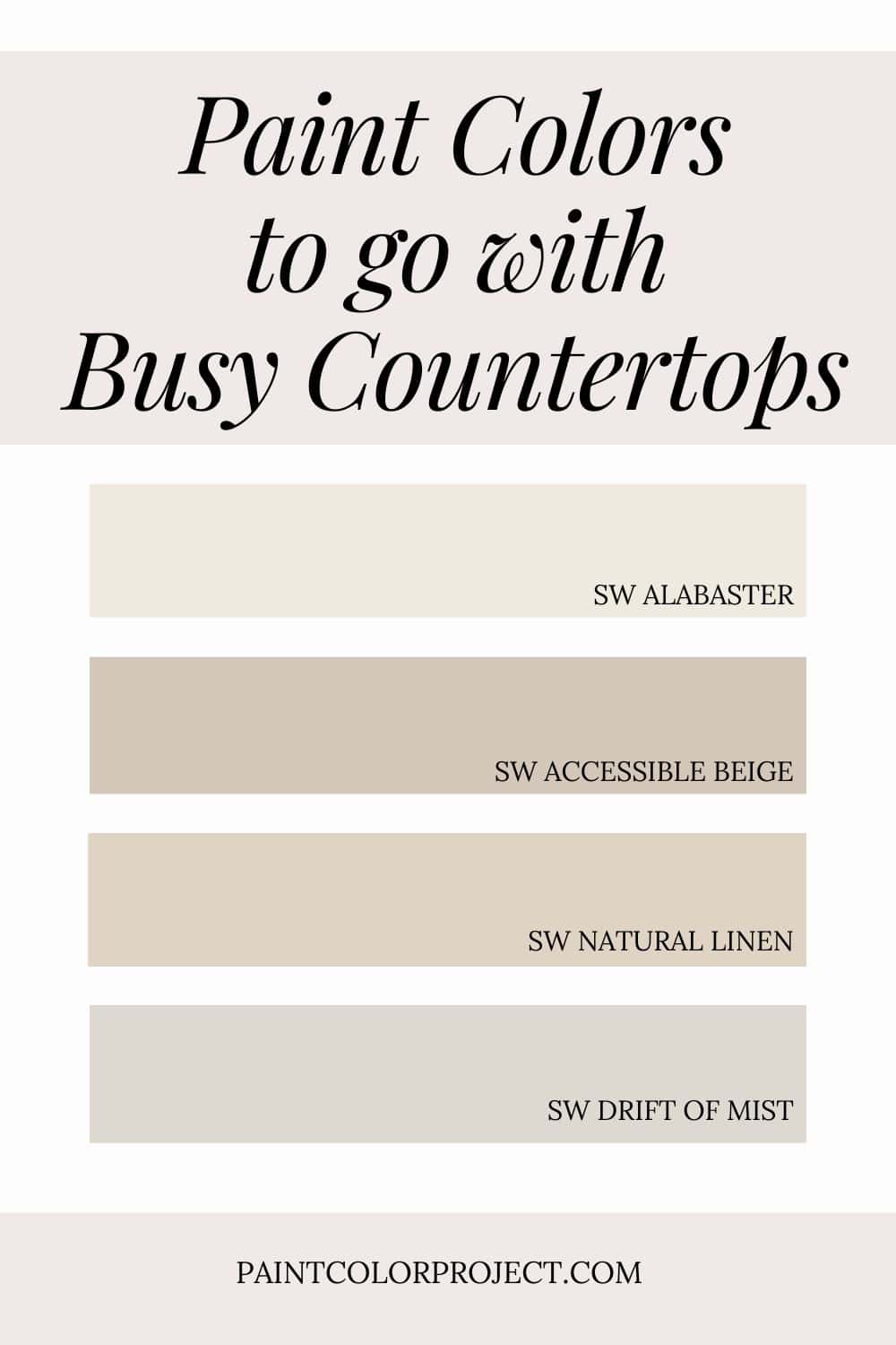
- Alabaster – soft white backdrop
- Accessible Beige – warm neutral balance
- Natural Linen – subtle warmth
- Drift of Mist – light greige softener
💡 Tip: These tones transition wonderfully between rooms, making them perfect for an open layout or whole-home palette.
If you want to test before committing, order peel-and-stick samples so you can see each color in your real lighting. Read my Samplize review for a quick overview of how to sample the easy way.
How to Bring the Look Together
The key to softening busy granite or quartz is to pair counters with neutral paint colors and simple, minimal decor.
Backsplash should be uncomplicated, and soft decor pieces should add texture without a lot of fuss. This way, you're creating a space that feels calm despite a busy countertop.
For even more color ideas, check out my full guide to How to Decorate Around Brown Granite Countertops.
Decor Inspiration
Paint alone can’t do all the work here—decor is where the magic happens. Choose light textures and tones that complement rather than compete with your countertops.
- Simple backsplash tile
- Minimal decor pieces, such as these wooden cutting boards (both decorative and functional)
- Woven stools
- Soft neutral textiles, such as these woven baskets for fruit, napkins, or mail
Stick with a mix of minimal pieces and soft colors for a calm, elevated look that still feels comfortable.
Why This Palette Works
Soft, simple colors reduce visual overwhelm. Keeping decor and wall colors neutral allows the countertops to feel intentional instead of a chaotic eyesore.
Soft, minimal decor pieces, such as woven barstools and wood cutting boards, provide slight contrast while modernizing the space without the cost of replacing the granite.
Still unsure which paint color is right for your space?
Choosing paint doesn’t have to be stressful! My free Paint Color Planning Quick Start Guide walks you through the exact steps to confidently choose the perfect color — without the overwhelm, second-guessing, or endless swatch testing.
👉 Click here to download the free guide!
DIYing Your Paint Job? Start Here.
Choosing a paint color is only half the equation — the tools you use matter just as much. I’ve rounded up the painting supplies we rely on for clean lines, smooth finishes, and less frustration overall.

My Paint Color Formula course walks you through the painless process of expertly testing paint swatches to ensure you have the perfect color for your home.
The best way to sample paint? Samplize!
Get peel-and-stick removable and reusable paint samples here!
Thanks for reading!

Meg Hemmelgarn is a freelance writer and home decor + DIY blogger who loves to talk about paint colors. She and her husband are currently renovating their third fixer upper. You can see their projects on her blog, Green With Decor.