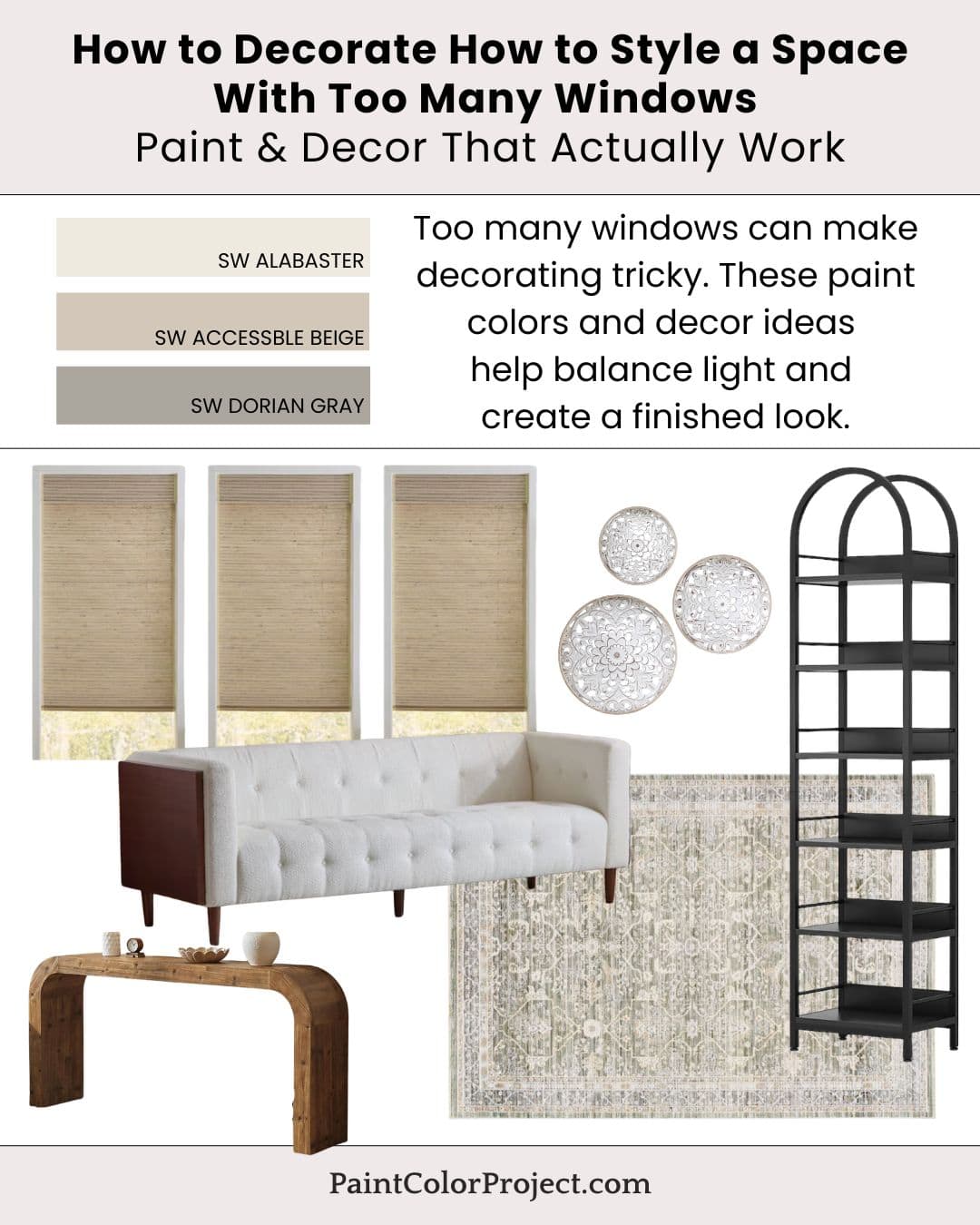
Too many windows can make decorating tricky. These paint colors and decor ideas help balance light and create a finished look.
Windows are wonderful for natural light and bringing the feeling of outside in, but too many windows can unfortunately limit wall space.
The right paint colors can help create subtle structure. A light base, a soft warmth, a contrasting accent color, these can make a big difference in how a finished space feels.
Window treatments can add balance without taking away from the outside views, and furniture pieces can anchor a room. Accent furniture can even add a bit of character.
Paint Colors for a Home With Too Many Windows
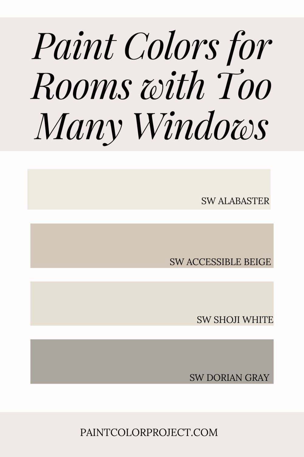
- Alabaster – light base
- Shoji White – soft warmth
- Accessible Beige – grounding tone
- Dorian Gray – contrast accents
💡 Tip: These tones transition beautifully between rooms, making them perfect for an open layout or whole-home palette.
If you want to test before committing, order peel-and-stick samples so you can see each color in your real lighting. Read my Samplize review for a quick overview of how to sample the easy way.
How to Bring the Look Together
They key to decorating around a lot of windows is to be strategic. Choose soft, warm colors that don't compete with outside views.
Add some interest through accent pieces such as a unique sofa or console table. Or use paint. Dorian Gray looks great on built-ins or interior doors to add some visual interest while still keeping the space balanced.
For even more color ideas, check out my full guide to How to Style a Room With No Natural Focal Point.
Decor Inspiration
Here are a few pieces that are perfect for a space with a lot of windows:
- Simple window treatments, such as these natural roller shades
- Statement furniture pieces, such as this rounded console table or this boucle tufted + wood sofa
- Area rugs
- Minimal wall decor, such as this circle set to break up all the straight lines or a curved slim bookshelf that both fills narrow wall space and offers storage
Stick with a mix of statement pieces and muted colors for a peaceful, sophisticated look that still feels comfortable and curated.
Why This Palette Works
Soft neutrals let natural light shine while still grounding the space. Your space will feel light and bright yet complete.
Strategic decor prevents the room from feeling unfinished. Accent pieces draw the eye, and minimal wall decor lets the natural light shine.
Still unsure which paint color is right for your space?
Choosing paint doesn’t have to be stressful! My free Paint Color Planning Quick Start Guide walks you through the exact steps to confidently choose the perfect color — without the overwhelm, second-guessing, or endless swatch testing.
👉 Click here to download the free guide!
DIYing Your Paint Job? Start Here.
Choosing a paint color is only half the equation — the tools you use matter just as much. I’ve rounded up the painting supplies we rely on for clean lines, smooth finishes, and less frustration overall.

My Paint Color Formula course walks you through the painless process of expertly testing paint swatches to ensure you have the perfect color for your home.
The best way to sample paint? Samplize!
Get peel-and-stick removable and reusable paint samples here!
Thanks for reading!

Meg Hemmelgarn is a freelance writer and home decor + DIY blogger who loves to talk about paint colors. She and her husband are currently renovating their third fixer upper. You can see their projects on her blog, Green With Decor.