Looking for the perfect green-gray paint color for your home? Let’s talk about Benjamin Moore Raindance and if it might be right for your home!
One color combo that never seems to go out of style is the calming mix of green, gray, and blue.
It’s soothing, yet has a certain elegance that instantly makes a room feel more relaxed and put together.
I love the green-gray-blue combination because it works in so many settings. It’s subtle yet still offers that gentle pop of color to brighten up any room. Plus, it pairs well with almost any other paint color, which makes it such a versatile option.
One of these colors is Raindance by Benjamin Moore. Let's talk about the details and see if this gentle hue is for you.
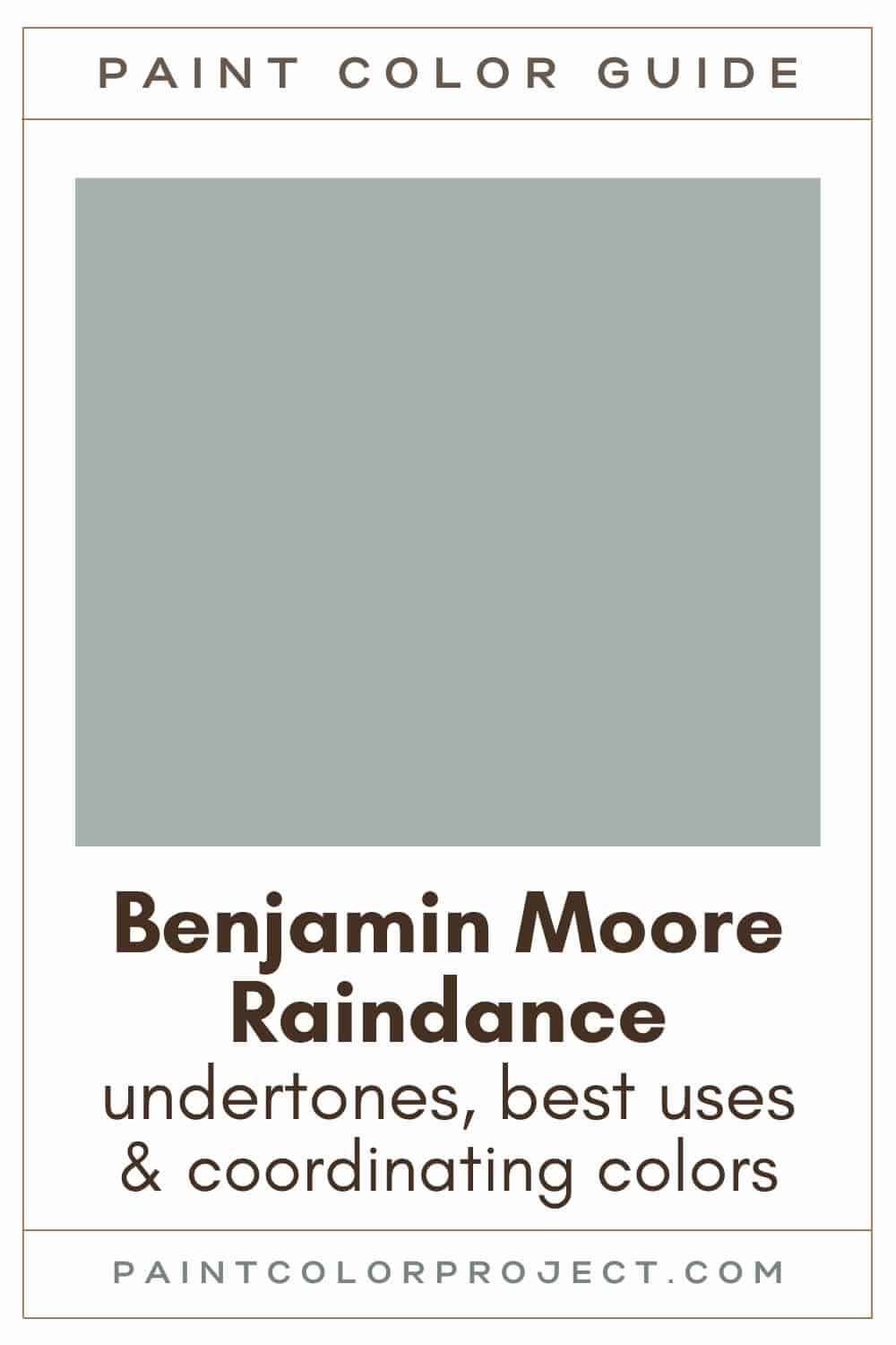
Raindance, Benjamin Moore, 1572 or CC-680
Raindance is a peaceful, neutral green with those perfect gray undertones that make it feel soft, calming, and sophisticated.
Click here to get a peel and stick sample of Raindance
Color Family
Raindance is in the neutral family.
Light Reflectance Value
43
Light Reflective Value is the measurement of how much light a color bounces around. This is on a scale of 0 to 100 with 0 being pure black and 100 being pure white.
With an LRV of 43, Raindance is light enough to keep your room from feeling too dark, but it still has enough depth to create a cozy vibe.
It holds up beautifully in both bright and dim spaces.
RGB Colors
R: 167 G: 179 B: 170
RGB describes the amount of each color - red, green, and blue - present in a color. This is on a scale of 0 to 255 for each color. This is basically the color mix to make the color!
Hex Code
#A7B3AA

Undertones
Raindance is a green with gray undertones, which give it a nice, soft look. It also has hint of blue.
In south-facing rooms with lots of natural light, Raindance leans warmer and shows more of its green side. It creates such a fresh, inviting atmosphere.
In north-facing rooms or spaces with less natural light, Raindance shifts cooler, taking on more green-blue tones. It’s a great way to add a calming, serene vibe to darker rooms.
It's very important to swatch colors on your wall to make sure they look good – day and night – in your actual space before committing.
Click here to get removable peel & stick paint samples to easily swatch with!
Best uses
I love using Raindance in so many different ways. It’s perfect for bedrooms or bathrooms, giving the walls a soft, calming feel that instantly makes you want to relax.
Want to create a stunning focal point? Try Raindance on your fireplace or built-ins. It adds just the right amount of color to make it stand out without feeling too bold.
I also like to use mid-toned colors like Raindance for:
- Built-ins
- Kitchen cabinets
- Interior or exterior doors
- Shutters
- Accent wall
- Furniture
- Laundry room
- Den or small living room
Similar Colors
- Benjamin Moore Castle Walls
- Behr Smokey Slate
- Sherwin Williams Quietude
- Benjamin Moore Misted Green
- Behr Zen
- Sherwin Williams Fresh Eucalyptus
- Benjamin Moore Iced Marble
Click here to get a peel and stick sample of Raindance
🤯 Too many color choices?
Download my free Paint Color Planning Quick Start Guide — it’s the exact method I use to help readers choose a color that works the first time.
📥 Grab it here!
Coordinating Colors
Raindance is one of those soft, neutral colors that’s easy to pair with just about anything! It works beautifully with whites, tans, beiges, grays, greiges, browns, and blacks.
For a softer look, combine it with other shades of green, blue, or gray.
If you want a bit of contrast, Raindance pairs well with golden oranges, pale pinks, or muted reds.
Warm, light neutrals:
- Spring in Aspen
- Natural Wicker
- Feather Down
- White Sand
- Ivory Porcelain
Earthy reds / oranges:
- Baked Clay
- California Redwood
- Salsa Dancing
- Iron Ore Red
- Terra Cotta Tile
Dark brown / taupes:
- Gargoyle
- Roosevelt Taupe
- Fairview Taupe
- Sparrow
- Devonshire Green
Trim Colors
Raindance pairs well with soft white trim colors.
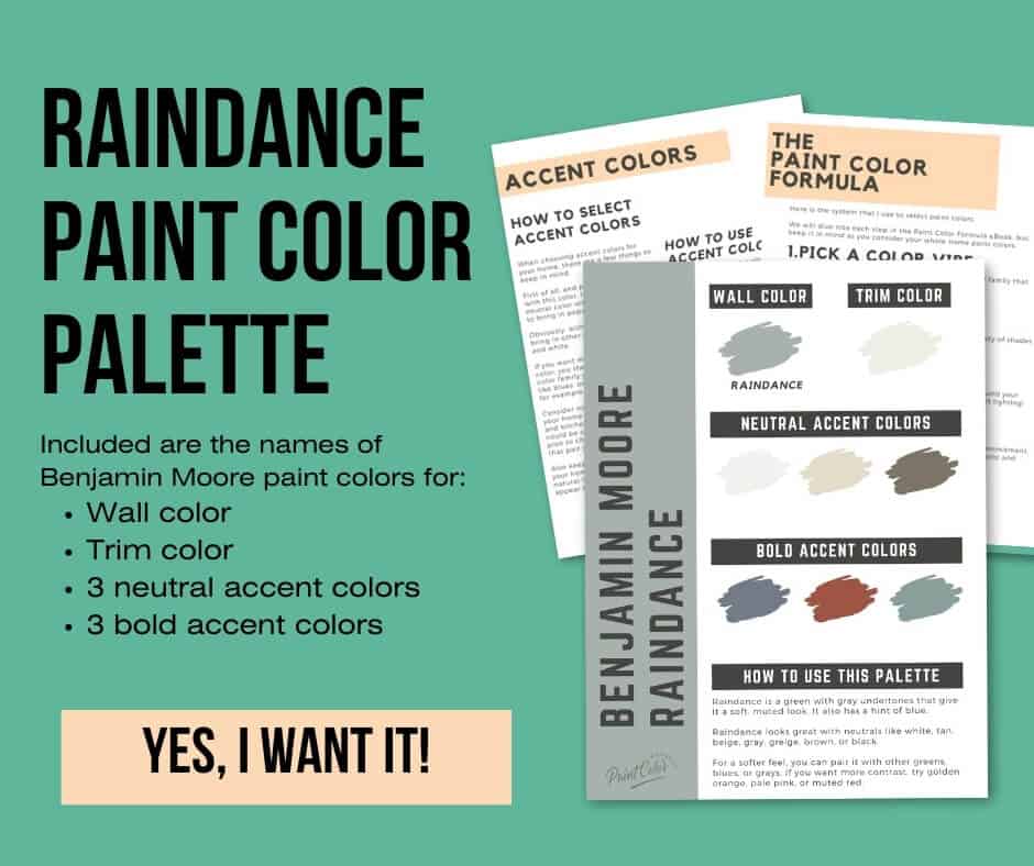
Raindance color palette
Want to use this paint color in your home? Instantly upgrade your home's aesthetic with our exclusive paint color palette. Unlock the perfect trim color and six stunning accent colors, a combination of neutrals and bold hues for an instantly harmonious space!
Get your perfect paint color palette by clicking here!
Click here to get a peel and stick sample of Raindance
FAQS
Here are some frequently asked questions about Raindance.
What are the undertones of BM Raindance?
BM Raindance is a soft green with gray undertones. It also has a hint of blue.
Raindance will appear greener in brighter rooms and more green-blue in darker rooms.
What's the difference: BM Raindance vs SW Quietude?
Raindance and Quietude are very similar; however, no two paint colors are exactly alike.
Both are a gorgeous, soft green-gray-blue mix. However, Quietude is a bit darker with an LRV of 48 compared to Raindance's LRV of 43.
Raindance leans a bit more green than Quietude does.
Quietude is very popular, as it was named Sherwin Williams's 2025 Color of the Year. However, just because it's popular doesn't mean it's the perfect choice for your space.
Swatch both colors to see the difference and decide which one suits your style best.
Is BM Raindance good for kitchen cabinets?
BM Raindance is a good choice for kitchen cabinets. Its green-gray hue provides a subtle pop of color without feeling too bold or overpowering.
Raindance also pairs well with many other colors, leaving you with plenty of options for countertops, hardware, and other finishes.
You can also consider using Raindance for just the lower cabinets or a kitchen island if you don't want to commit to a full color floor to ceiling. Give it a swatch in your kitchen and see what you think!
Does Raindance go with Silhouette?
Yes, Raindance pairs well with Silhouette, which was named Benjamin Moore's 2026 Color of the Year.
Swatch the two together in your home and see what you think! These two would pair nicely together in a foyer, living room, den, home office, or bedroom.
What color trim with BM Raindance?
Raindance is a soft green-gray, and it pairs beautifully with soft whites for trim.
Try Raindance with BM White Dove, SW Alabaster, or Behr Cameo White.
What's the difference: BM Raindance vs SW Fresh Eucalyptus?
These two are similar! However, Raindance is a bit darker and greener. Fresh Eucalyptus is a bit lighter and more saturated.
If you’re torn between the two, try swatching them side by side to see which one feels right in your space.
Before you go...
So, you've found the perfect paint color, but here's the thing - there's another big decision you have to make: picking the right paint sheen. Seriously, the level of glossiness can totally change how your color looks on the walls and how long the paint lasts!
Check out our complete guide to understanding paint sheens.
Still unsure which paint color is right for your space?
Choosing paint doesn’t have to be stressful! My free Paint Color Planning Quick Start Guide walks you through the exact steps to confidently choose the perfect color — without the overwhelm, second-guessing, or endless swatch testing.
👉 Click here to download the free guide!
DIYing Your Paint Job? Start Here.
Choosing a paint color is only half the equation — the tools you use matter just as much. I’ve rounded up the painting supplies we rely on for clean lines, smooth finishes, and less frustration overall.

My Paint Color Formula course walks you through the painless process of expertly testing paint swatches to ensure you have the perfect color for your home.
The best way to sample paint? Samplize!
Get peel-and-stick removable and reusable paint samples here!
Thanks for reading!

Meg Hemmelgarn is a freelance writer and home decor + DIY blogger who loves to talk about paint colors. She and her husband are currently renovating their third fixer upper. You can see their projects on her blog, Green With Decor.