Looking for the perfect blue gray paint color for your home? Let’s talk about Benjamin Moore Pearl and whether it might be a good fit for your space!
Muted blue gray green paint colors are so popular right now, and I can see why.
They feel calm, relaxed, and easy to live with. You get a soft touch of color, but the room can still feel flexible and neutral enough for everyday decorating.
Calming, soothing, peaceful, those are the words I think of right away with colors like this. They make a room feel pulled together without feeling cold or plain.
That’s why I wanted to give Benjamin Moore Pearl a full paint color review. If you love soft blue tones with a little gray and green mixed in, this one is worth a closer look.
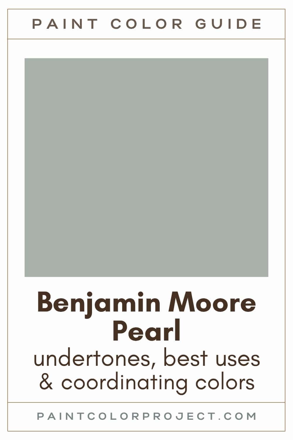
Pearl, Benjamin Moore, CW-640
Pearl is a soft shade of blue with gray and green undertones, giving it a muted, elegant feel.
Click here to get a peel and stick sample of Pearl
Color Family
Pearl is in the blue family.
Light Reflectance Value
43
Light Reflective Value is the measurement of how much light a color bounces around. This is on a scale of 0 to 100 with 0 being pure black and 100 being pure white.
With an LRV of 43, Pearl is a mid-tone paint color. It has enough depth to hold its color in bright rooms, but it is not so dark that it feels heavy.
RGB Colors
R: 167 G: 176 B: 169
RGB describes how much red, green, and blue are used to create a paint color. Each value runs from 0 to 255.
This mix gives Pearl its muted blue green look. The numbers are close together, which helps explain why the color feels soft and balanced rather than bright or sharp.
Hex Code
#A7B0A9

Undertones
Pearl is a muted blue with gray and green undertones. The gray quiets the color, so it does not feel too baby blue or overly saturated.
In rooms with lots of natural light, especially those south-facing rooms, you’ll notice Pearl leaning warmer and showing more of its green side.
On the other hand, in north-facing rooms or spaces with less natural light, the color tends to shift cooler, bringing out more of its slate blue and gray tones.
This is why I would test Pearl before painting a full room. It can change quite a bit depending on your lighting, flooring, and surrounding finishes.
Click here to get removable peel & stick paint samples to easily swatch with!
Best Uses
Pearl has more color than a true neutral, but I still think it can work across a whole home if you love soft blue tones.
It is especially nice in spaces where you want the room to feel calm but still interesting. I picture Pearl in rooms meant for relaxing, getting ready, reading, working, or winding down in the evening.
Here are some of the best uses for Pearl:
- Welcoming living rooms
- Cozy bedrooms
- Inviting bathrooms
- Productive home offices
- Chic kitchen or bathroom cabinetry
- Stylish furniture pieces
- Eye-catching doors
- Fresh home exterior
Similar Colors
- Benjamin Moore Raindance
- Behr Verdigris
- Sherwin Williams Oyster Bay
- Benjamin Moore Castle Walls
- Behr Smokey Slate
- Sherwin Williams Silvermist
- Benjamin Moore Iced Marble
Click here to get a peel and stick sample of Pearl
🤯 Too many color choices?
Download my free Paint Color Planning Quick Start Guide — it’s the exact method I use to help readers choose a color that works the first time.
📥 Grab it here!
Coordinating Colors
Pearl pairs nicely with both cool and warm tones, which makes it easier to decorate with than many blue paint colors.
I love it with grays, silvers, crisp whites, blues, and greens. It can work with reds, pinks, browns, yellows, and creamy whites too, especially if you want the room to feel layered and warm.
Mid-tone cool grays:
- Lampblack
- Rock Gray
- Englewood Cliffs
- Whale Gray
- Steel Wood
Gentle, cool whites / silvers:
- White Wisp
- Gray Lake
- Winter White
- White Violet
- White Ice
Earthy mid-tone greens:
- Lush
- Avon Green
- Pinelands
- Rosepine
- Cedar Path
Trim Colors
Pearl pairs beautifully with either bright, crisp whites or soft, creamy whites. My favorites include:
- Benjamin Moore Simply White
- Sherwin Williams Extra White
- Behr Ultra Pure White
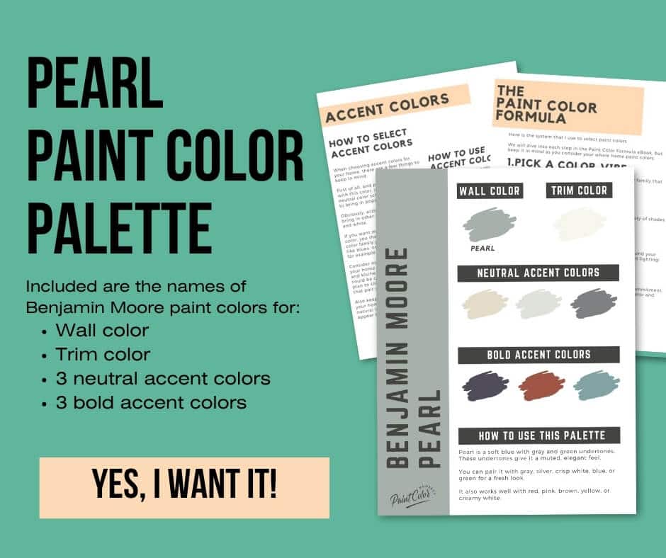
Pearl Paint Color Palette
Want to use this paint color in your home? Instantly upgrade your home's aesthetic with our exclusive paint color palette. Unlock the perfect trim color and six stunning accent colors, a combination of neutrals and bold hues for an instantly harmonious space!
Get your perfect paint color palette by clicking here!
Click here to get a peel and stick sample of Pearl
FAQs
Here are some common frequently asked questions about Pearl.
Is Ben Moore Pearl green or blue?
Benjamin Moore Pearl is a blue paint color with gray and green undertones.
In bright rooms, Pearl can read greener, especially if the space gets warm natural light. In darker rooms, I usually expect it to show more of its blue / gray side.
If you are deciding between blue and green, Pearl really sits right in that in-between space. A sample on your own wall will show you which side it brings out in your lighting.
What's the difference: BM Pearl vs SW Sea Salt?
While Pearl and Sherwin Williams Sea Salt are both soft mixes of blue, green, and gray, they bring different vibes to a space.
Pearl is darker and more blue. Sea Salt is lighter and more green.
Sea salt is one of the most popular paint colors. It's a gorgeous color, but that doesn't necessarily mean it's the right choice for you. Swatch both, review them in different lighting, and see which you prefer!

Is BM Pearl a warm color?
No, BM Pearl is not a warm color. BM Pearl is a cool blue color, but it is close to the neutral line and plays well with both warm and cool colors and finishes.
What color is Ben Moore Pearl?
Pearl is a soft shade of blue with gray and green undertones, giving it a sophisticated, muted feel.
It will lean more green in brighter spaces and more blue / gray in darker spaces.
What's the difference: BM Pearl vs SW Silvermist?
Pearl and Silvermist share many similarities! Both are blues with green and gray undertones.
Pearl is slightly darker and more blue, and Silvermist is a bit lighter and more green.
These two can look pretty close on a paint strip or screen, so put real samples next to each other in the room before you decide.

What's the difference: BM Pearl vs Raindance?
Pearl and Benjamin Moore Raindance are very similar. Their LRVs are the same (43), meaning neither is lighter or darker than the other. Both are mid-tone colors.
The biggest difference? Pearl is more blue and Raindance is more green. Both have gray undertones, which stop them from being too bold and bright.

Before you go...
So, you've found the perfect paint color, but here's the thing — there's another big decision you have to make: picking the right paint sheen.
Seriously, the level of glossiness can totally change how your color looks on the walls and how long the paint lasts!
Check out our complete guide to understanding paint sheens.
Still unsure which paint color is right for your space?
Choosing paint doesn’t have to be stressful! My free Paint Color Planning Quick Start Guide walks you through the exact steps to confidently choose the perfect color — without the overwhelm, second-guessing, or endless swatch testing.
👉 Click here to download the free guide!
DIYing Your Paint Job? Start Here.
Choosing a paint color is only half the equation — the tools you use matter just as much. I’ve rounded up the painting supplies we rely on for clean lines, smooth finishes, and less frustration overall.

My Paint Color Formula course walks you through the painless process of expertly testing paint swatches to ensure you have the perfect color for your home.
The best way to sample paint? Samplize!
Get peel-and-stick removable and reusable paint samples here!
Thanks for reading!

Meg Hemmelgarn is a freelance writer and home decor + DIY blogger who loves to talk about paint colors. She and her husband are currently renovating their third fixer upper. You can see their projects on her blog, Green With Decor.