Looking for beautiful beige bedroom paint colors? Discover our top beige shades that promise to create a warm and inviting retreat.
Beige is the unsung hero of interior design. It’s rarely a “trending” color, and most skip through it when going through a color palette.
It quietly waits in the background, ready to take the mantle when it’s needed—and never disappoints when it does.
Beige is timeless and versatile, a neutral shade that works with virtually all colors.
It exudes a calming and tranquil vibe, making it ideal for bedrooms.
Its understated elegance promotes a clutter-free and calming atmosphere, which contributes to a good night’s sleep.
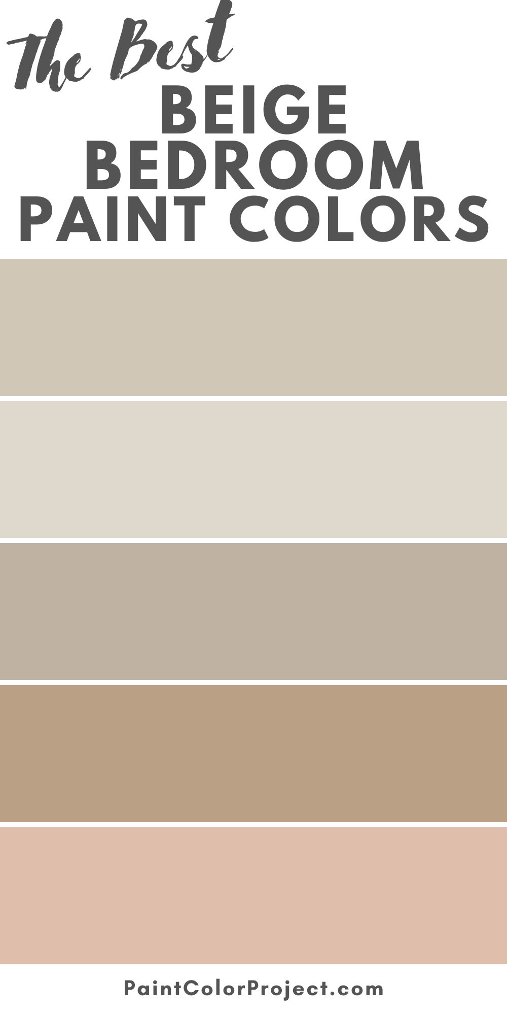
To help you choose the ideal shade for your bedroom, I’ve compiled some of the best beige bedroom paint colors you can get your hands on, along with advice on how to use them.
How Does Beige Make a Room Feel?
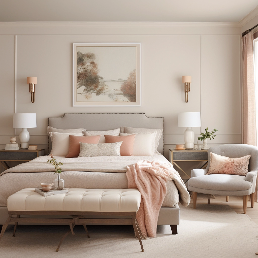
Associated with warmth and versatility, beige makes a room feel comfortable and familiar.
The neutral and calming nature of this color turns a bedroom into a space of tranquility, which is why it’s so popular as a bedroom backdrop.
Beige, particularly lighter beige, has the ability to make a bedroom space appear bigger.
Unlike darker colors, which absorb light, beige reflects and amplifies natural night, creating an open and airy atmosphere.
Is Beige Warm or Cool?
While some shades of beige may lean towards cooler tones, most hues fall on the warmer side of the color spectrum.
Beige with yellow undertones appears either peachy or golden, while those with red undertones appear rosy.
Beige with brown undertones evokes a sense of warmth and earthiness.
Top 12 Beige Bedroom Paint Colors
Here are some of the best bedroom paint colors that can transform your sleeping space into a haven of style and tranquility.
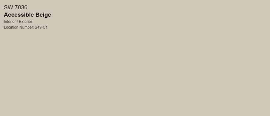
Accessible Beige, Sherwin Williams
- LRV: 58
Accessible Beige is Sherwin Williams’ staple beige paint.
It’s a warm and versatile color, with yellow and gray undertones.
With an LRV (Light Reflectance Value) of 58, it’s neither too dark nor too light, striking a perfect balance for creating a welcoming and comfortable atmosphere.
It looks a bit grayer in north-facing rooms, but it has just enough warmth to keep it from looking too cold.
In south-facing rooms, it transforms into a soft and subtle beige.
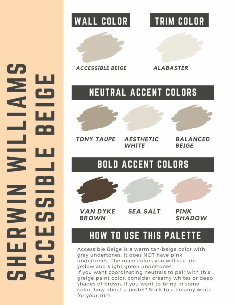
Accessible Beige pairs beautifully with low-chroma colors, such as muted sage, pale gray, and dusty rose.
High-chroma colors (i.e., highly saturated colors) can appear overly vivid when paired with Accessible Beige, resulting in a palette that appears overwhelming or lacks cohesion.
Sherwin Williams Accessible Beige color palette
Canvas Tan, Sherwin Williams
- LRV: 64
Canvas Tan is a creamy soft beige with gold-yellow undertones.
The creamy texture brightens up a space and makes it feel bigger than it actually is, making it a fitting choice for smaller bedrooms.

Complementary colors (i.e., colors that are opposite each other on the color wheel) work best with Canvas Tan.
Since it’s a true neutral, you want to infuse your bedroom with a pop of color to add interest and vibrancy.
Soft greens, warm grays, dusty blues, and creamy whites add a touch of elegance to a space without overwhelming the neutral base.
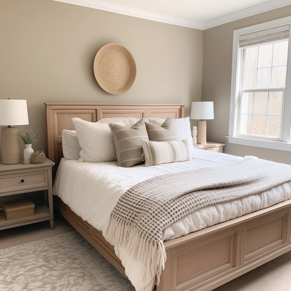
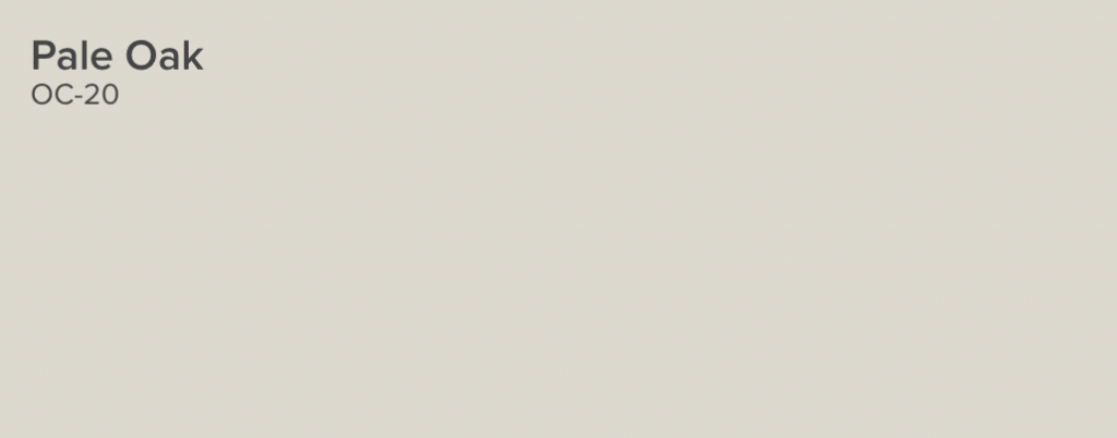
Pale Oak, Benjamin Moore
- LRV: 68
Pale Oak is a warm greige with taupe undertones, drawing inspiration from the timeless beauty of white oak.
Due to its versatile and neutral nature, it works with pretty much any color scheme.
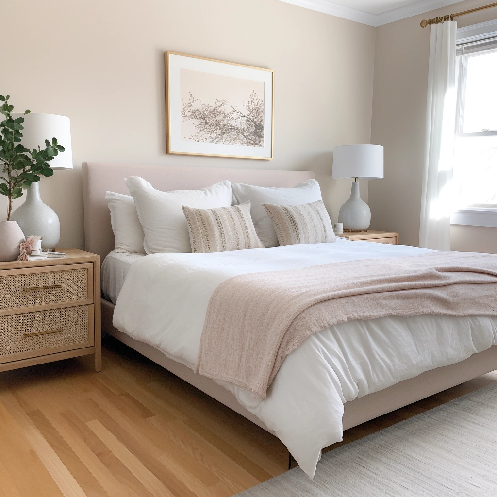
This makes it a suitable backdrop for vintage and maximalist bedrooms with lots of diverse colors and patterns.
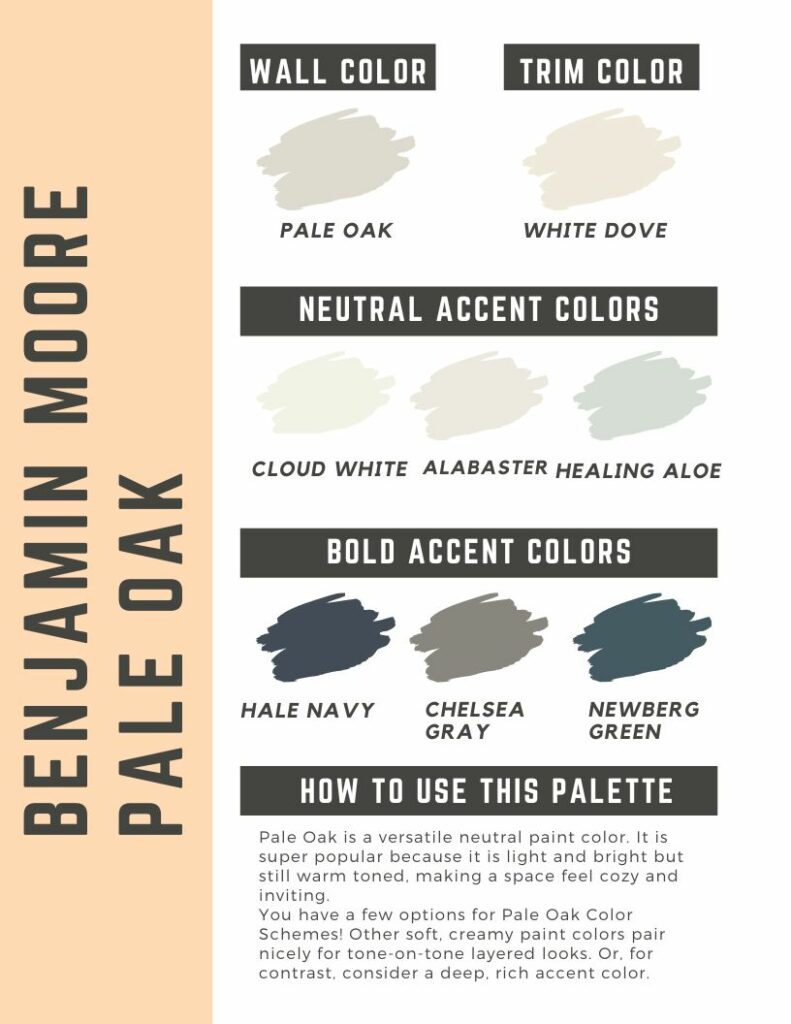
However, it looks especially good with warm wood furniture and floors, as well as creamy whites and saturated blues.
Pale Oak color palette
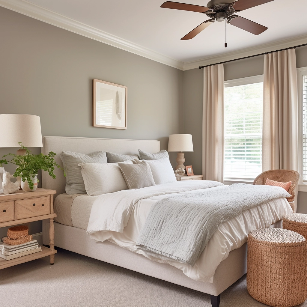
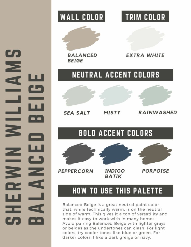
Balanced Beige, Sherwin William
- LRV: 44
As the name suggests, Balanced Beige is equal parts cool and warm, and light and dark.
It has enough color to add character to a space but not enough to be overwhelming, striking the perfect balance between subtlety and impact.
Balanced Beige works as a neutral foundation that can easily adapt to evolving design preferences.

Its undertones are predominantly gray but can appear green in certain light conditions.
This color appears cooler in north-facing light and warmer in south-facing light.
It has an LRV of 46, so it’s several shades darker than its lighter counterpart, Accessible Beige.
Balanced Beige color palette
Spanish Sand, Behr
- LRV: 64
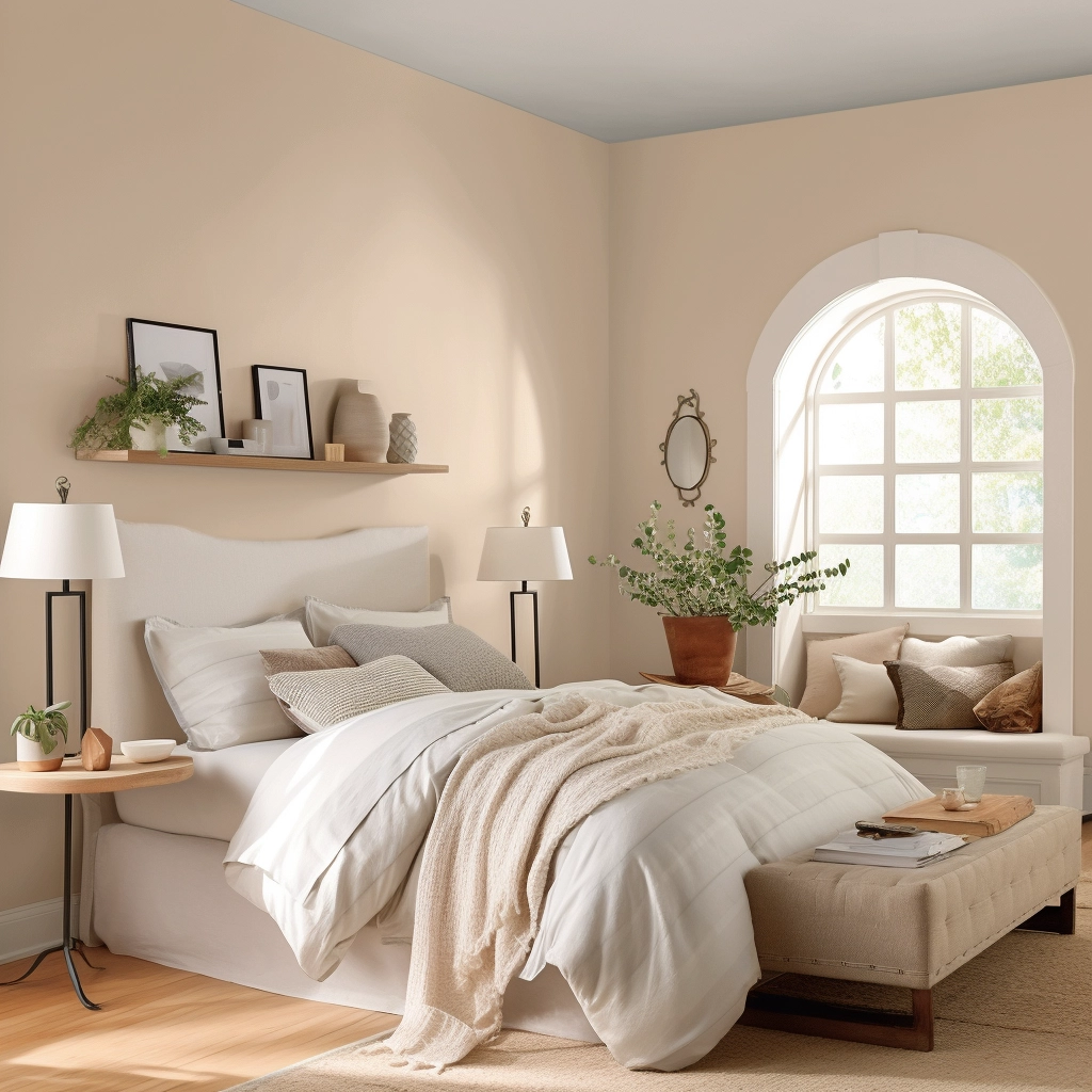
Spanish Sand is a soft greige with mid-brown and gray undertones.
The mid-brown undertones add warmth, while the gray brings in a sense of neutrality.
It pairs well with other neutral tones, such as white, light grays, and creams.

Introduce these colors in the form of throw pillows, area rugs, or beddings.
Alongside these colors, consider adding cool blues and greens to add a touch of vibrancy to your room.
Kilim Beige, Sherwin Williams
- LRV: 57
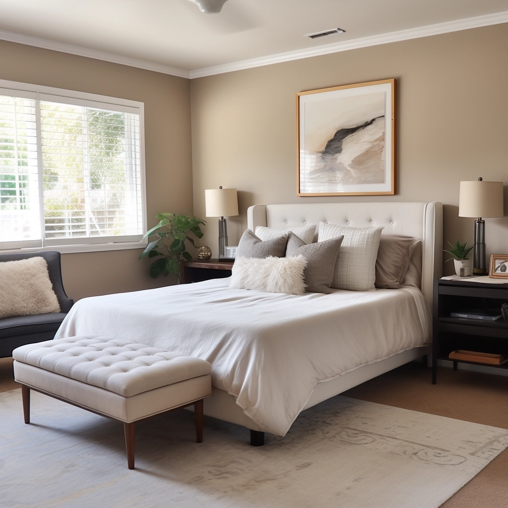
Kilim Beige is a medium-dark beige that shares the same color profile as unbleached silk.
It has orange-pink undertones, so it’s a touch warmer than your average beige.
It’s best suited in a north-facing bedroom as its warmth helps balance the cool light.

Southern-facing rooms can make this color appear overly warm—which isn’t necessarily a bad thing, especially if you’re aiming for an intimate and cozy bedroom aesthetic.
Kilim Beige works with a variety of neutral wood tones, including oak, walnut, and maple.
It also looks good with crisp whites and natural textures, so if you’re rocking a rustic or farmhouse type of bedroom decor, this color will work wonders.
Shaker Beige, Benjamin Moore
- LRV: 53
Shaker Beige is a rich shade of beige with orange undertones.

It’s a well-balanced color that adds warmth and brightness to a space, especially when used with warm, muted hues and creams.
Pair it with an off-white bedding, ivory trim, and subtle gold accessories to transform your space into a cozy retreat.
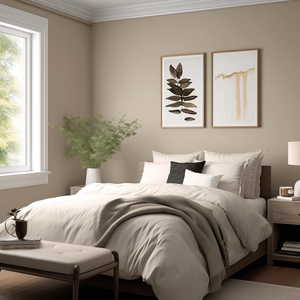
Latte, Sherwin Williams
- LRV: 38
Looking for a beige that adds personality to a bedroom? Latte is a choice worth considering.
Latte warm, creamy, and sophisticated, a darker beige reminiscent of the color used in old school homes.
It has an LRV of 38, the darkest on this list. It makes a room appear daring, bold, and intimate.

If your bedroom is on the smaller side, I recommend using this color selectively; as a trim, an accent, or a feature wall. Otherwise, it might make your space look heavy and cluttered.
Moreover, you should only use this color if your bedroom brings in lots of natural light.
Without natural light, Latte can make a room feel dingy and dull—not what you want for a bedroom!
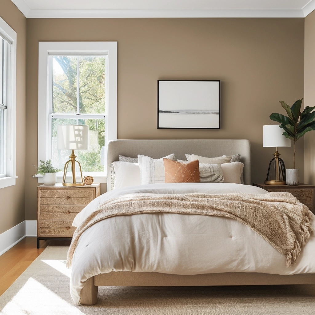
Amazing Gray, Sherwin Williams
- LRV: 47
Amazing Gray is a sophisticated and versatile color that falls in the greige category.
It’s the best of both worlds: not as warm as beige or as cool as gray, a true neutral that works with a range of interior designs.

This color has a moderate LRV of 47, meaning that it reflects a good amount of light without losing its depth.
When used as a main backdrop, complement it with crisp whites, deeper grays, and muted greens. It looks lovely with earthy tones, too.
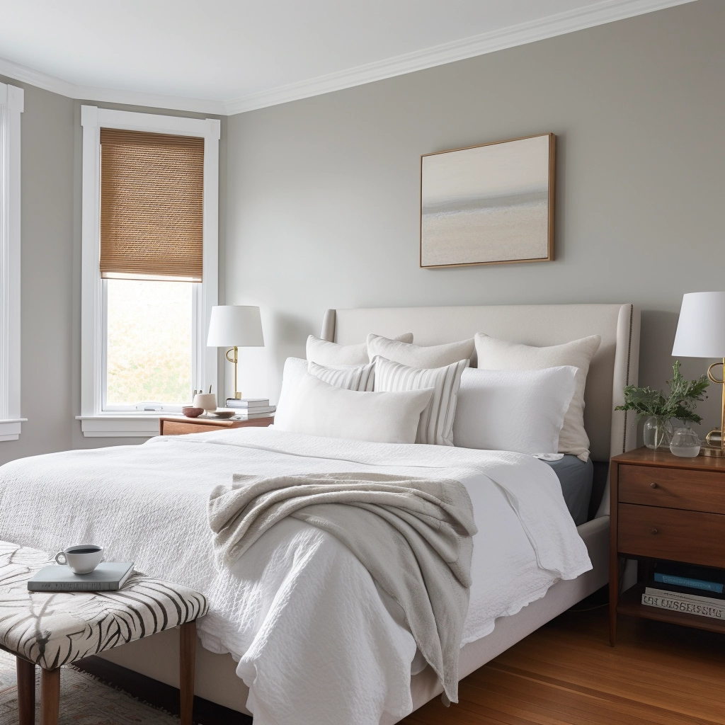
French Beige, Behr
- LRV: 59
French Beige is a muted, earthy beige with undertones that lean toward gray and warm taupe.

Dark wood bed frames, dressers, or nightstands create a lovely contrast with this color, enhancing the cozy atmosphere of a room.
To add a touch of glamor, incorporate metallic accents in the form of decorative elements (lamps, mirrors, etc.).
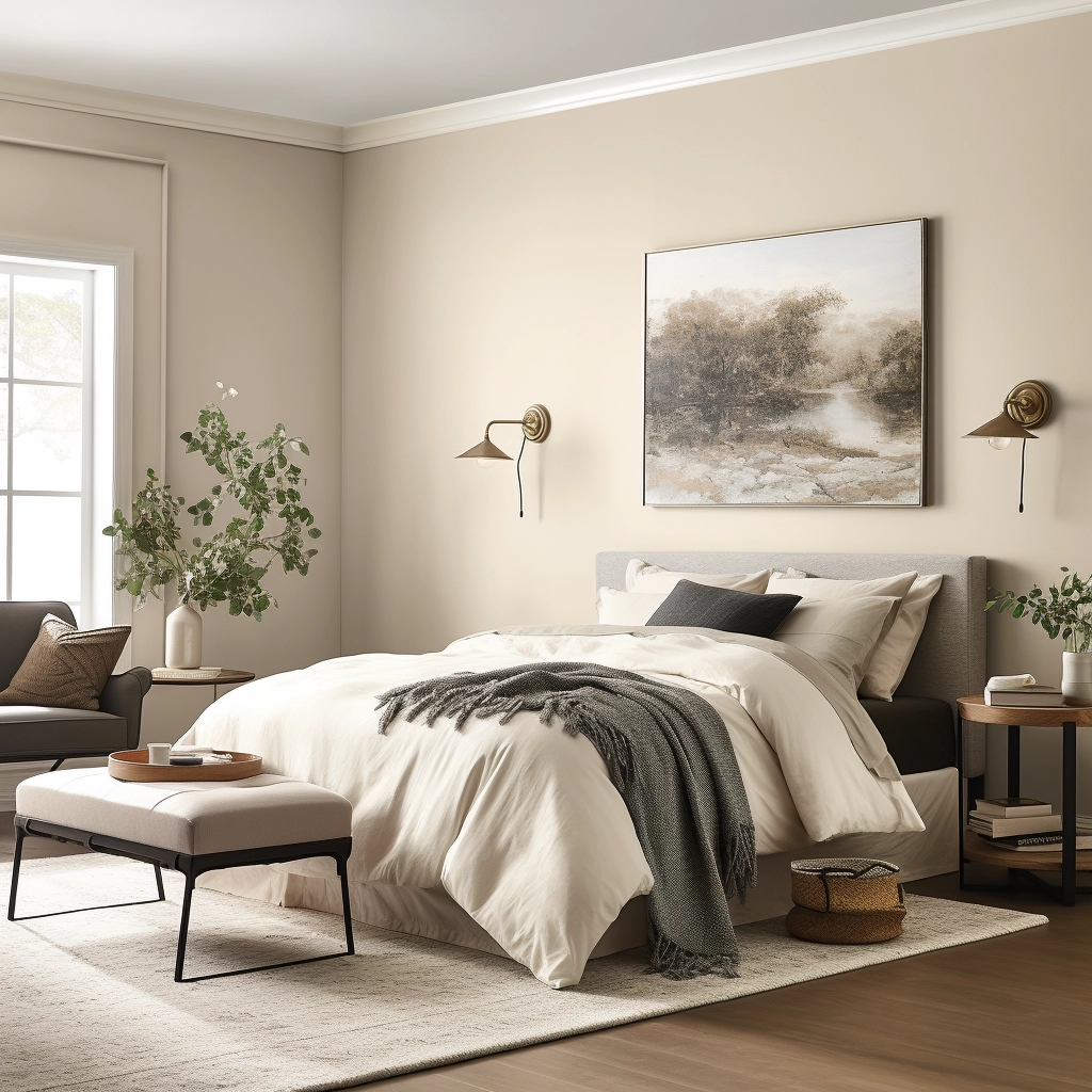
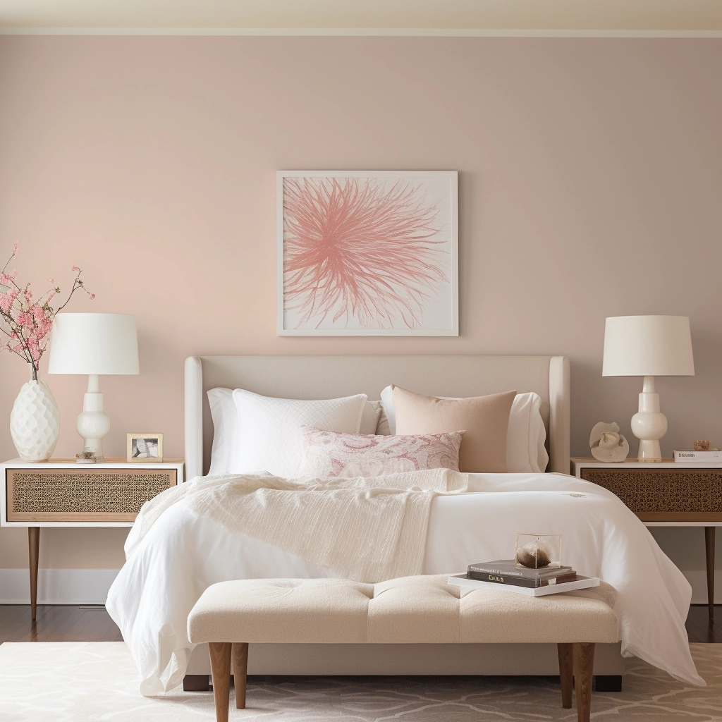
Georgetown Pink Beige, Benjamin Moore
- LRV: 55
Georgetown is a pink-beige paint that adds a touch of sophistication and romance to a bedroom.

The color’s rosy undertones appear especially prominent in warm lighting conditions, casting a soft and inviting glow throughout the room.
To bring out the best of this color, pair it with shades of cream, taupe, or burgundy.
Natural Linen, Sherwin Williams
- LRV: 70
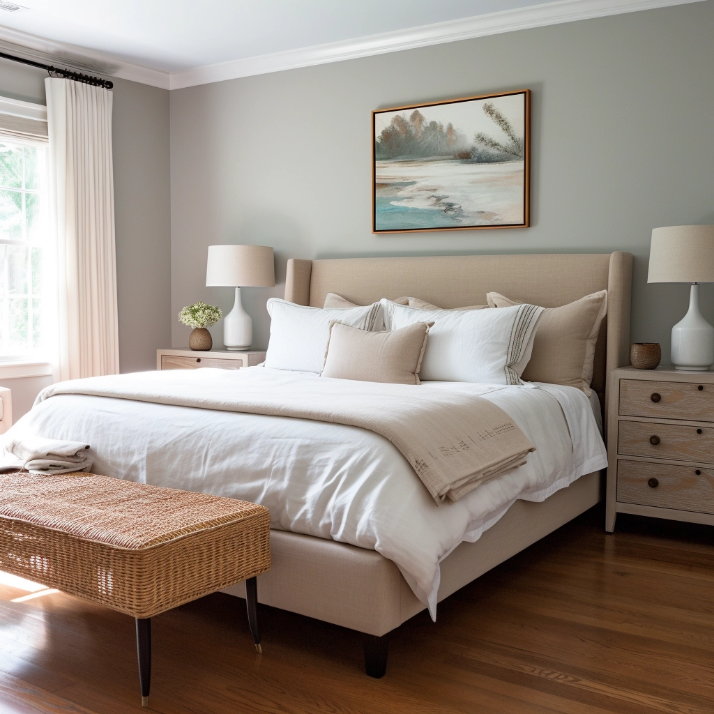
Natural Linen is a light beige paint with yellow undertones.
It’s both creamy and neutral, so it’s often used as a main color in various design schemes.

It adds a sense of airiness and openness to a space, making it especially well-suited for smaller bedrooms.
Natural Linen complements a wide range of colors, but it works best with chocolate brown, mustard yellow, rich burgundy, and soft sage.
Use these colors on your linens, pillowcases, rugs, and statement pieces to create a unified and harmonious look throughout the room.
Before you go...
I hope this post on the best beige bedroom paint colors gave you some inspiration on what paint to use for your next project.
Beige is a versatile and timeless color that works with nearly every color scheme and design theme, from modern to contemporary.
To create a cohesive look in your room, bring in natural elements like wood to enhance the earthy feel of beige.
You can also add patterned fabrics to add visual interest to your room but don’t go too overboard, as it may overwhelm the soothing nature of this color.
If you’re unsure of where to start, download my free paint planning worksheet. This worksheet offers tips, tricks, and expert advice so you can start your paint project with confidence.
Good luck!
Still unsure which paint color is right for your space?
Choosing paint doesn’t have to be stressful! My free Paint Color Planning Quick Start Guide walks you through the exact steps to confidently choose the perfect color — without the overwhelm, second-guessing, or endless swatch testing.
👉 Click here to download the free guide!

My Paint Color Formula course walks you through the painless process of expertly testing paint swatches to ensure you have the perfect color for your home.
The best way to sample paint? Samplize!
Get peel-and-stick removable and reusable paint samples here!
Thanks for reading!

Morgan is passionate about home decor and paint colors. She has been sharing DIY home decor tips since 2012 at CharlestonCrafted.com. From there, she learned to love paint colors, and the Paint Color Project was born in 2022!

