Trying to find the right beige paint color for your home? I review Sherwin Williams Practical Beige to see if it's the one for you!
Beige is one of those colors that always comes back around. When you find the right one, it makes a room feel warm, calm, and easy to live in.
But picking the right beige sounds simple… until you actually try to do it.
I’ve tested a lot of beige paint colors over time, and I can tell you this. Some turn way too yellow. Some feel dull and flat. And some just look completely different once they’re on your wall.
So I've chosen a great beige color, Sherwin Williams Practical Beige, to do a full write-up. Perhaps you might just find the perfect beige paint color for your home!
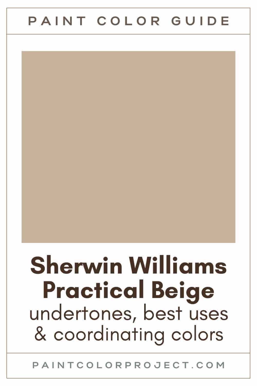
Practical Beige, Sherwin Williams, SW 6100
Practical Beige is a warm, mid-toned beige. It feels soft and comfortable right away.
Click here to get a peel and stick sample of Practical Beige
Color Family
Practical Beige sits in the orange family.
Light Reflectance Value
46
LRV measures how much light a color reflects, on a scale from 0 to 100. Zero is pure black. One hundred is pure white.
At 46, Practical Beige is right in the middle.
I personally like this range a lot. You get enough depth so the color shows up clearly, even in bright rooms. It won’t disappear in sunlight.
At the same time, it doesn’t feel heavy. In darker rooms, it still looks warm and soft instead of muddy.
RGB Colors
R: 201 G: 178 B: 156
RGB shows how much red, green, and blue are in the color.
Here, you can see the red is a bit higher. That’s what gives Practical Beige its warmth. It’s the reason the color feels inviting instead of cold.
If you’ve ever tried a beige that felt a little lifeless, this one won’t give you that problem.
Hex Code
#C9B29C

Undertones
Practical Beige has warm brown undertones.
In south-facing rooms with lots of natural light, Practical Beige looks warmer and a bit brighter.
In north-facing rooms that lack natural light, Practical Beige will look a bit less warm / more neutral and darker.
This is why I always test beige before committing. The same color can look completely different from one room to another.
Best Uses
Practical Beige is one of those easy, go-anywhere neutrals.
If it fits your style, you can use it across your whole home without it feeling repetitive. It has enough depth to stay interesting, but it’s still calm enough to live with every day.
I like it for:
- Bedrooms
- Bathrooms
- Living rooms
- Dining rooms
- Kitchens, especially with very light or very dark cabinets
Similar Colors
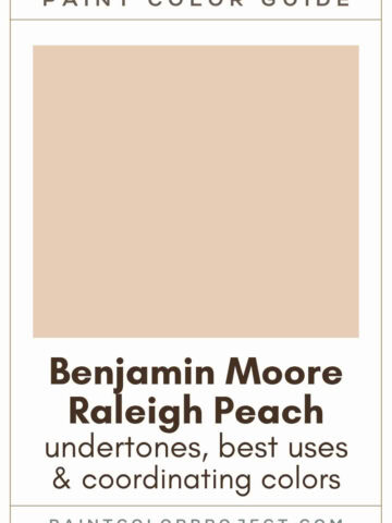
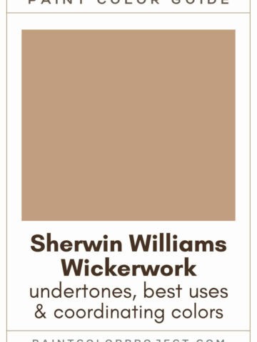
- Sherwin Williams Tawny Tan
- Benjamin Moore Nubuck
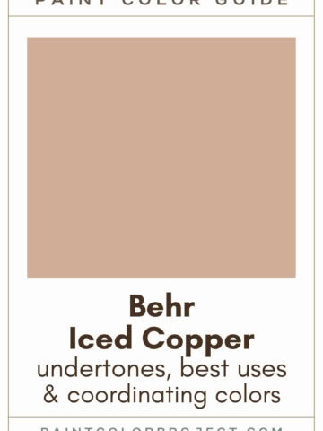
- Behr Toasted White
- Sherwin Williams Beach House
- Benjamin Moore Truffle
- Behr Mushroom Bisque
- Sherwin Williams Familiar Beige
Click here to get a peel and stick sample of Practical Beige
Overwhelmed trying to pick the right beige?
Choosing beige paint can feel impossible — too yellow, too gray, or just not quite right.
I created a simple, no-fail guide that shows you exactly which beige paint colors to choose from — plus when to use each one so you can feel confident in your decision.
🤯 Too many color choices?
Download my free Paint Color Planning Quick Start Guide — it’s the exact method I use to help readers choose a color that works the first time.
📥 Grab it here!
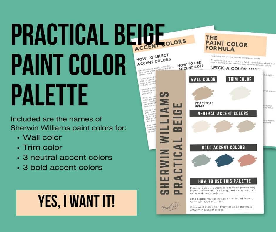
Coordinating Colors
As a warm neutral, Practical Beige pairs well with many other colors.
For a neutral feel, pair it with dark browns, warm whites, creams, or tans.
Dark browns:
- Cobble Brown
- Tea Chest
- Rookwood Brown
- Homestead Brown
- Caraïbe
Warm whites:
- Pacer White
- White Sesame
- Shoji White
- Moderate White
- Porcelain
If you want to add some color, pair Practical Beige with blues or greens.
Cool blues:
- Debonair
- Blustery Sky
- Morning at Sea
- Meditative
- Whirlpool
Trim Colors
Since Practical Beige is warm, I like to pair it with soft whites for trim.
Crisp, bright whites can feel a bit harsh next to it. Softer whites blend better and keep everything feeling cohesive.
Practical Beige Paint Color Palette
Want to use this paint color in your home? Instantly upgrade your home's aesthetic with our exclusive paint color palette. Unlock the perfect trim color and six stunning accent colors, a combination of neutrals and bold hues for an instantly harmonious space!
Get your perfect paint color palette by clicking here!
Click here to get a peel and stick sample of Practical Beige
FAQs
Here are a few questions I hear a lot about Practical Beige. If you’re deciding between a few shades, this should make things clearer.
What color is SW Practical Beige?
Practical Beige is a warm, mid-toned beige with brown undertones.
On the wall, it feels soft and steady. Not too light, not too dark. Just a really easy color to live with.
What's the difference: SW Practical Beige vs Accessible Beige?
I’ve used both, and they don’t read the same once they’re up.
Accessible Beige is lighter, more muted, and more gray; Practical Beige is noticeably darker, more saturated, and warmer.

Both are solid choices. It really comes down to how warm you want the room to feel. I always test them side by side. That’s usually when the difference clicks.
What color trim goes with SW Practical Beige?
I like to keep trim soft when I use this color.
Bright white can feel too sharp next to it. Softer whites blend much better.
Try Alabaster, White Dove, or Cameo White.


I’ve paired it with Alabaster before, and it always looks clean without feeling cold.
What's the difference: SW Practical Beige vs Balanced Beige?
These two are close, but not identical.
Practical Beige is warmer and more saturated; Balanced Beige is more neutral / greige and softer / more muted.
Both have an LRV of 46, meaning neither is lighter nor darker than the other. Both are mid-toned paint colors.
You really need to see them on the wall. The shift is subtle, but it changes the whole feel of a room.

What are the undertones SW Practical Beige?
Practical Beige has warm brown undertones.
In brighter spaces, such as south-facing rooms, Practical Beige will appear warmer and brighter. In darker spaces, such as north-facing rooms, it will appear more neutral and a tad darker.
I’ve seen it look cozy in one room and slightly more muted in another. Lighting plays a big role here.
What color is lighter than SW Practical Beige?
If you like this color but want something lighter, take a look at Sand Dollar.
It's one step up from Practical Beige on the same paint strip, so the two share many qualities, but Sand Dollar is a bit lighter and brighter.
It keeps that same warm feel, just with a little more light.

Before you go...
So, you've found the perfect paint color, but here's the thing — there's another big decision you have to make: picking the right paint sheen.
Seriously, the level of glossiness can totally change how your color looks on the walls and how long the paint lasts!
Check out our complete guide to understanding paint sheens.
Still unsure which paint color is right for your space?
Choosing paint doesn’t have to be stressful! My free Paint Color Planning Quick Start Guide walks you through the exact steps to confidently choose the perfect color — without the overwhelm, second-guessing, or endless swatch testing.
👉 Click here to download the free guide!
DIYing Your Paint Job? Start Here.
Choosing a paint color is only half the equation — the tools you use matter just as much. I’ve rounded up the painting supplies we rely on for clean lines, smooth finishes, and less frustration overall.

My Paint Color Formula course walks you through the painless process of expertly testing paint swatches to ensure you have the perfect color for your home.
The best way to sample paint? Samplize!
Get peel-and-stick removable and reusable paint samples here!
Thanks for reading!

Meg Hemmelgarn is a freelance writer and home decor + DIY blogger who loves to talk about paint colors. She and her husband are currently renovating their third fixer upper. You can see their projects on her blog, Green With Decor.