Looking for the perfect off-white paint color for your home? Let’s talk about Sherwin Williams Moderate White and if it might be right for your home!
Creamy, warm off-whites are a great choice when you're looking for a neutral color with some warmth and sophistication. These paint colors provide a neutral backdrop without feeling cold or stark.
Off-whites paint colors work well with a variety of decor styles, finishes, and other paint colors, making them a versatile choice.
However, off-whites can have a variety of undertones and levels of color depth, so it's important to dive into the details before picking one!
Let's talk about the details of Sherwin Williams Moderate White and see if it's right for your home.
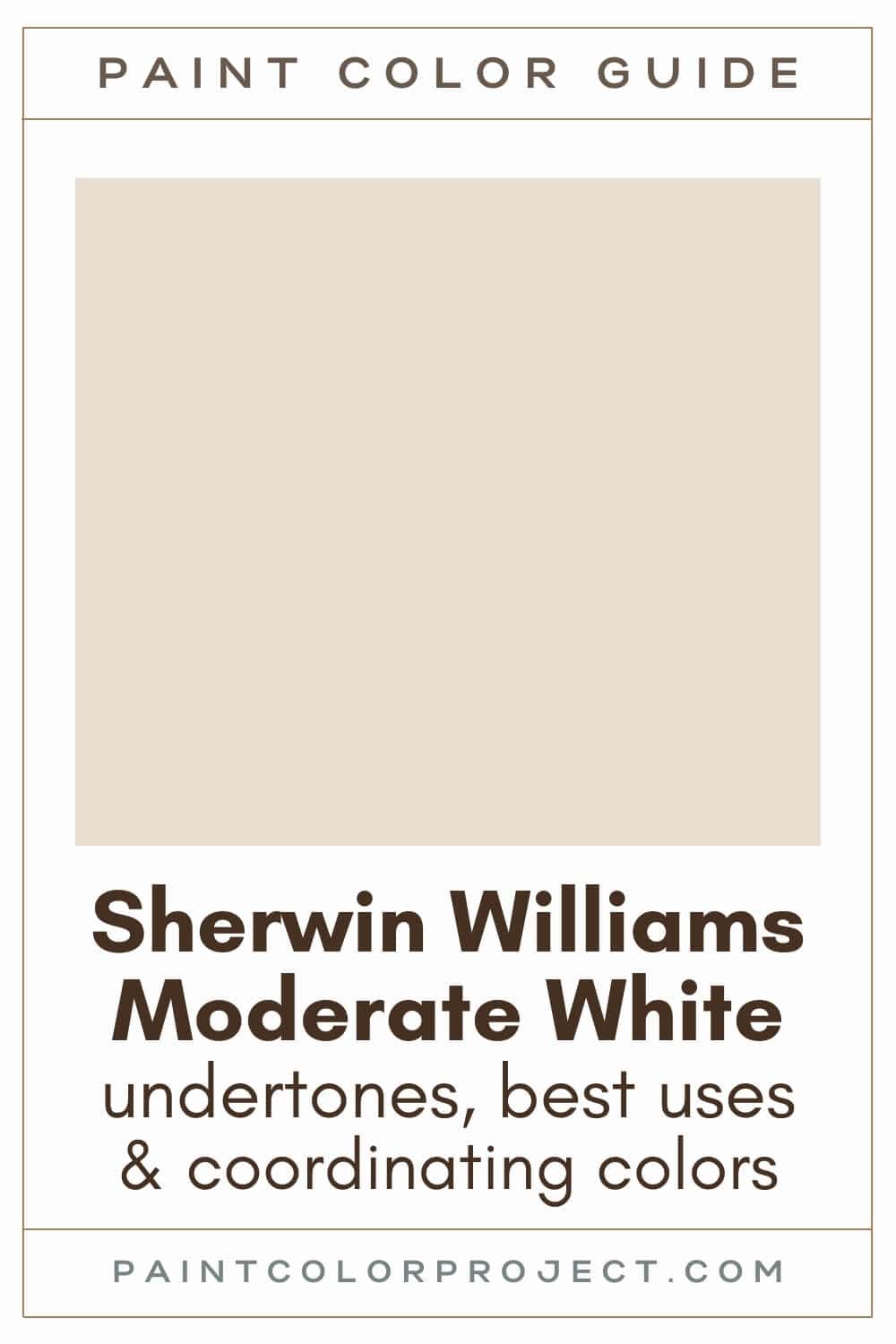
Moderate White, Sherwin Williams, SW 6140
Moderate White is a warm, creamy off-white that grounds a space. It creates a welcoming feel, ideal for gathering spaces such as kitchens or living rooms.
Click here to get a peel and stick sample of Moderate White
Color Family
Moderate White is in the white family.
Light Reflectance Value
74
Light Reflective Value is the measurement of how much light a color bounces around. This is on a scale of 0 to 100 with 0 being pure black and 100 being pure white.
With an LRV of 74, Moderate White is considered an off-white. Generally, anything with an LRV from 72-82 is considered off-white, with anything higher than 82 being true white.
Moderate White is light enough to brighten up most spaces, but it has just enough depth to keep it from feeling too washed out. It works well in both small and large rooms.
RGB Colors
R: 233 G: 222 B: 207
RGB describes the amount of each color - red, green, and blue - present in a color. This is on a scale of 0 to 255 for each color. This is basically the color mix to make the color!
Hex Code
#E9DECF

Undertones
Moderate White has a subtle pink and orange / beige undertone.
In rooms with lots of natural light, especially those south-facing rooms, Moderate White can lean more towards a warm, creamy off-white, almost beige, with its warm undertones gently coming forward.
In north-facing rooms without much natural light, Moderate White will appear slightly darker and hedge towards greige. However, it still holds onto its creamy softness, unlike many other similar colors that can lean dingy in darker spaces.
It's very important to swatch colors on your wall to make sure they look good – day and night – in your actual space before committing.
Click here to get removable peel & stick paint samples to easily swatch with!
Best uses
Moderate White is a light and bright neutral that brings warmth to any room. Its slight color depth is great for hiding scuffs and marks better than a true white.
Here are some of my favorite places to use Moderate White:
- Living rooms
- Bedrooms
- Kitchens
- Bathrooms
- Interior doors
- Cabinets
- Furniture
Similar Colors
- Sherwin Williams Divine White
- Benjamin Moore Ice Breaker
- Behr White Mocha
- Sherwin Williams Steamed Milk
- Benjamin Moore First Crush
- Behr Natural Linen
- Sherwin Williams Aged White
Click here to get a peel and stick sample of Moderate White
🤯 Too many color choices?
Download my free Paint Color Planning Quick Start Guide — it’s the exact method I use to help readers choose a color that works the first time.
📥 Grab it here!
Coordinating Colors
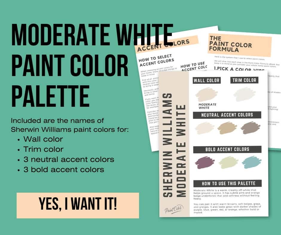
Moderate White is a versatile neutral that pairs well with a wide range of colors.
I love how Moderate White looks with warm browns, soft beiges, grays and greiges. It also pairs well with darker shades (bold or muted!) of purples, blues, greens, reds, and oranges. You can easily mix and match to suit your style.
Warm neutrals:
- Macadamia
- Quinoa
- Bittersweet Stem
- Tawny Tan
- Row House Tan
Muted purples:
- Enigma
- Soulmate
- Coquina
- Chinchilla
- Renwick Heather
Deep navys / grays:
- Mineral Gray
- Sea Mariner
- Outerspace
- Sea Serpent
- Rain Cloud
Trim Colors
Moderate White is a tricky one. Its pink-orange undertone doesn't always blend well with soft whites, which often lean yellow. Your best bet is a bright white with a warm undertone, such as Pure White.
Or, use Moderate White for both walls and trim. Just choose a different finish for a tone-on-tone contrast.
So, choose Moderate White in eggshell finish for the walls and Moderate White in semi-gloss for the trim. This gives a nice, soft finished look.
Moderate White color palette
Want to use this paint color in your home? Instantly upgrade your home's aesthetic with our exclusive paint color palette. Unlock the perfect trim color and six stunning accent colors, a combination of neutrals and bold hues for an instantly harmonious space!
Get your perfect paint color palette by clicking here!
Click here to get a peel and stick sample of Moderate White
FAQS
Here are some common frequently asked questions about Moderate White.
Does Moderate White look dingy?
While some creamy off-whites can appear dingy in darker spaces, such as north-facing rooms or interior rooms, Moderate White does not appear dingy.
Moderate White's warm orange / beige undertones help it to hold on to its creamy softness, even in darker spaces.
Give Moderate White a swatch in your home and see what you think!
What's the difference: SW Moderate White vs BM Maritime White?
These gorgeous, warm off-whites have a lot in common! However, Moderate White (LRV 74) is a bit lighter than Maritime White (LRV 72).
Moderate White is more saturated and leans more pink-orange, whereas Maritime White is more muted and leans more yellow.
If you’re torn between the two, try swatching them side by side to see which one feels right in your space.
What are the undertones of Moderate White?
Moderate White has a subtle pink and orange / beige undertone.
These undertones give Moderate White a warmth that doesn't lean yellow like many similar colors do.
Moderate White will appear warmer in brighter spaces and a bit darker in darker spaces. However, it still holds onto its creamy softness, unlike many other similar colors that can lean dingy in darker spaces.
Give it a swatch in your home and see what you think!
What colors go with SW Moderate White?
As a versatile neutral, Moderate White pairs well with a wide range of colors, including warm browns, soft beiges, grays and greiges.
It also pairs well with darker shades (bold or muted!) of purples, blues, greens, reds, and oranges.
To start, try swatching Moderate White with Macadamia (a brownish beige), Enigma (a muted purple), Mineral Gray (a deep navy gray), or Pure White (a bright white with a warm undertone).
What's the difference: SW Divine White vs Moderate White?
Divine White and Moderate White are very similar. However, no two paint colors are exactly alike.
With an LRV of 72, Moderate White is slightly darker than Divine White, which has an LRV of 74.
While both have orange undertones, Divine White leans a bit more orange than Moderate White does. Moderate White is also more saturated, whereas Divine White is slightly softer and more muted.
Always swatch colors in your space before making a decision—especially when two colors are this close!
What's the difference: SW Moderate White vs Aged White?
The biggest difference between these two similar hues is that Moderate White leans more orange and Aged Whited more yellow.
With an LRV of 72, Moderate White is also slightly darker than Aged White, which has an LRV of 74. These two are pretty equal in terms of saturation.
If you're debating between these two colors, my advice is simple: swatch them both. Paint samples on your walls, check them in different lighting, and go with the one that feels right. Chances are, you’ll love either one!
Before you go...
So, you've found the perfect paint color, but here's the thing - there's another big decision you have to make: picking the right paint sheen. Seriously, the level of glossiness can totally change how your color looks on the walls and how long the paint lasts!
Check out our complete guide to understanding paint sheens.

Meg Hemmelgarn is a freelance writer and home decor + DIY blogger who loves to talk about paint colors. She and her husband are currently renovating their third fixer upper. You can see their projects on her blog, Green With Decor.