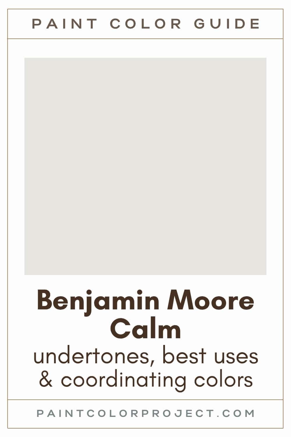
Looking for the perfect off-white paint color for your home? Let’s talk about Benjamin Moore Calm and if it might be right for your home!
If you're craving neutral but not necessarily a stark, crisp white, let's chat about soft off-whites.
These gorgeous, airy hues feel warm and inviting while still providing that neutral backdrop many of us crave. Off-whites are versatile, pairing wonderfully with other paint colors, finishes, and various decor styles.
Off-whites vary from warm to cool, with their undertones playing a huge part in how they appear on the wall.
Let's dive into the details of one such soft off-white today: Calm by Benjamin Moore.
Calm, Benjamin Moore, OC-22 or 2111-70
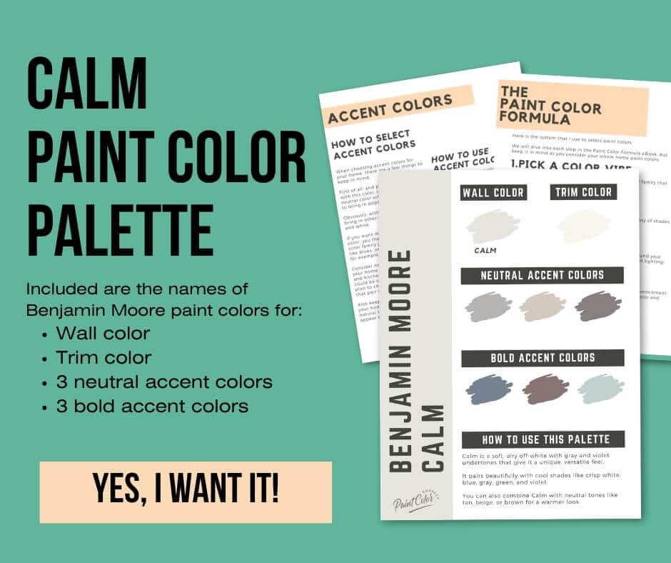
Calm is a soft, airy off-white with hints of gray and violet, giving it a unique, versatile feel.
Click here to get a peel and stick sample of Calm
Color Family
Calm is in the white family.
Light Reflectance Value
76
Light Reflective Value is the measurement of how much light a color bounces around. This is on a scale of 0 to 100 with 0 being pure black and 100 being pure white.
With an LRV of 76, Calm is an off-white paint color. It reflects a good amount of light, keeping your space bright while still adding that subtle hint of color.
I love how this shade manages to feel light and airy without losing its warmth.
RGB Colors
R: 230 G: 228 B: 223
RGB describes the amount of each color - red, green, and blue - present in a color. This is on a scale of 0 to 255 for each color. This is basically the color mix to make the color!
Hex Code
#E6E4DF

Undertones
Calm has warm gray and violet undertones.
In south-facing rooms, Calm feels warm and creamy, bringing out more of those soft tones. In these brightly lit spaces, it feels inviting and airy. You may see a hint of warm purple undertone in these spaces.
On the other hand, in north-facing rooms with less natural light, this color can appear a bit cooler / more neutral and more gray, making it feel modern and fresh.
It's very important to swatch colors on your wall to make sure they look good – day and night – in your actual space before committing.
Click here to get removable peel & stick paint samples to easily swatch with!
Best uses
Calm is a light bright neutral color with a hint of warmth to it. Its slight color depth helps to hide scuffs better than a more true white paint!
I like to use a color like Calm for:
- Living rooms
- Bedrooms
- Kitchens
- Bathrooms
- Interior doors
- Cabinets
- Furniture
Similar Colors
- Benjamin Moore Garlic Bulb
- Behr Quiet on the Set
- Sherwin Williams Snowfall
- Benjamin Moore Lacey Pearl
- Behr Cameo White
- Sherwin Williams Snowbound
- Benjamin Moore Silver Satin
Click here to get a peel and stick sample of Calm
🤯 Too many color choices?
Download my free Paint Color Planning Quick Start Guide — it’s the exact method I use to help readers choose a color that works the first time.
📥 Grab it here!
Coordinating Colors
Calm pairs beautifully with cool colors like crisp whites, blues, grays, greens, and violets.
It also looks stunning alongside neutral tones like tan, beige, or brown.
Medium blues:
- Bachelor Blue
- Normandy
- Black Pepper
- Coastline
- Spellbound
Bright, crisp whites:
- Chantilly Lace
- Ice Mist
- Snow White
- Distant Gray
- Wedding Veil
Deep browns / violets:
- Caponata
- Wenge
- Dark Basalt
- Tulsa Twilight
- Bittersweet Chocolate
Trim Colors
You have two great options for trim to pair with Calm: use a bright white trim or just use Calm itself.
A crisp white trim will give your space some contrast and a clean, fresh feel.
- Benjamin Moore Simply White
- Sherwin Williams Extra White
- Behr Ultra Pure White
For a softer look, try going with Calm for both the walls and the trim. Choose a different finish for each to create a bit of contrast. You could choose Calm in eggshell finish for the walls and Calm in semi-gloss for the trim.
Calm color palette
Want to use this paint color in your home? Instantly upgrade your home's aesthetic with our exclusive paint color palette. Unlock the perfect trim color and six stunning accent colors, a combination of neutrals and bold hues for an instantly harmonious space!
Get your perfect paint color palette by clicking here!
Click here to get a peel and stick sample of Calm
FAQS
Here are some common frequently asked questions about Calm.
What color is BM Calm?
Calm is a soft, airy off-white with hints of gray and violet. In brighter spaces, Calm will appear lighter, and in darker spaces, it will appear grayer.
Is BM Calm warm or cool?
BM Calm is a warm off-white paint color. It will appear warmer in brighter spaces and less warm / more neutral in darker spaces.
Does BM Calm look purple?
While Calm has a soft purple undertone, it does not look purple. However, in brightly lit spaces such as south-facing rooms, you may catch a hint of that warm purple undertone.
Does BM Calm look yellow?
While many soft whites and off-whites can lean or look yellow, BM Calm does not look yellow. Calm is a soft off-white with hints of gray and violet, no yellow undertone!
What color trim with BM Calm?
Benjamin Moore Calm looks great with bright whites for trim, or you can use Calm itself!
A crisp white trim will give your space some contrast and a clean, fresh feel. My favorite bright whites for trim are BM Simply White, SW Extra White, or Behr Ultra Pure White
If you want a softer look, try going with Calm for both the walls and the trim. Choose a different finish for each to create a bit of contrast. You could choose Calm in eggshell finish for the walls and Calm in semi-gloss for the trim.
What's the difference: BM Calm vs BM Garlic Bulb?
Calm and Garlic Bulb are similar soft neutrals. However, Calm is an off-white with hints of gray and Garlic Bulb is a gray.
Calm is slightly lighter, and Garlic Bulb is a tad darker.
If you’re torn between the two, try swatching them side by side to see which one feels right in your space.
Before you go...
So, you've found the perfect paint color, but here's the thing - there's another big decision you have to make: picking the right paint sheen. Seriously, the level of glossiness can totally change how your color looks on the walls and how long the paint lasts!
Check out our complete guide to understanding paint sheens.
Still unsure which paint color is right for your space?
Choosing paint doesn’t have to be stressful! My free Paint Color Planning Quick Start Guide walks you through the exact steps to confidently choose the perfect color — without the overwhelm, second-guessing, or endless swatch testing.
👉 Click here to download the free guide!
DIYing Your Paint Job? Start Here.
Choosing a paint color is only half the equation — the tools you use matter just as much. I’ve rounded up the painting supplies we rely on for clean lines, smooth finishes, and less frustration overall.

My Paint Color Formula course walks you through the painless process of expertly testing paint swatches to ensure you have the perfect color for your home.
The best way to sample paint? Samplize!
Get peel-and-stick removable and reusable paint samples here!
Thanks for reading!

Meg Hemmelgarn is a freelance writer and home decor + DIY blogger who loves to talk about paint colors. She and her husband are currently renovating their third fixer upper. You can see their projects on her blog, Green With Decor.