Looking for the perfect warm neutral paint color for your home? Let's look at Taupe of the Morning vs Agreeable Gray to see which one will fit your home best!
I love warm neutrals because they offer the best of both worlds. You get that cozy warmth, but also the versatility of a neutral backdrop.
They’re perfect if you want your space to feel inviting without overpowering the rest of your decor.
But the problem is—there are a ton of warm neutrals to choose from! Soft whites, beiges, warm grays, even greiges. It can get overwhelming!
Today, I'm comparing two popular shades: Taupe of the Morning and Agreeable Gray.
Let's take a closer look and see which one could be the winner for your home.
Read my full review of Taupe of the Morning
Read my full review of Agreeable Gray
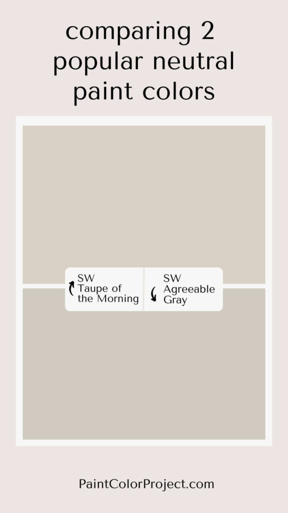
Taupe of the Morning vs Agreeable Gray
Taupe of the Morning and Agreeable Gray are both fantastic choices if you're after a warm neutral that works just about anywhere. They’re popular for a reason!
What is similar about Taupe of the Morning vs Agreeable Gray?
Both Taupe of the Morning and Agreeable Gray are what I’d call “greiges”—that lovely mix of gray and beige that gives you warmth with a bit of sophistication.
They’re light, bright, and incredibly versatile.
You could easily use either of these colors throughout your whole house. In my experience, they really help create a cohesive look, no matter the room.
What is different about Taupe of the Morning vs Agreeable Gray?
Now, let’s talk differences. Taupe of the Morning is more neutral, while Agreeable Gray leans a bit more into the gray side of things.
Taupe of the Morning is slightly darker and warmer, whereas Agreeable Gray is lighter and a bit cooler.
Taupe of the Morning is more of a true neutral with minimal undertones.
Agreeable Gray, on the other hand, can be more of a chameleon—it often picks up on the colors around it. I’ve seen it look pink in a room with a lot of reds, and even a bit yellow with golden decor.
| Taupe of the Morning | Agreeable Gray | |
| LRV | 65 | 60 |
| RGB | R: 218 G: 210 B: 198 | R: 209 G: 203 B: 193 |
| Undertones | warm neutral with minimal undertones, subtle pink and violet | warm gray with subtle pink / yellow / tan undertones |
Light Reflectance Value
Let’s talk about Light Reflectance Value, or LRV. This tells you how much light a color reflects, on a scale from 0 (pure black) to 100 (pure white).
Both Taupe of the Morning and Agreeable Gray are light mid-toned paint colors.
Taupe of the Morning has an LRV of 60, while Agreeable Gray comes in at 65.
That means Taupe of the Morning is a touch darker, but they’re both light enough to keep a room feeling airy.


Undertones
Taupe of the Morning and Agreeable Gray both lean warm, but neither has strong undertones.
Taupe of the Morning has subtle pink and violet undertones. In south-facing rooms, it can feel a bit warmer, while in north-facing spaces, it might lean cooler or even slightly dingy.
Agreeable Gray, meanwhile, is all about reflecting the colors around it. If you’ve got a lot of reds or yellows in your decor, Agreeable Gray might surprise you by looking a bit pink or golden.
Neither of these colors has that cool, icy blue undertone that some grays can have, but between the two, Taupe of the Morning is definitely warmer.
Whatever you do, make sure to swatch! Paint colors can look totally different depending on your lighting, and you want to make sure it feels right in your space, day and night.
Click here to get removable peel & stick paint samples to easily swatch with!
How Do I Decide Between These Two Colors?
Taupe of the Morning and Agreeable Gray are both popular for a reason—both are gorgeous colors!
If you want a paint color that's warm but gray, go with Agreeable Gray. If you want a warm neutral while avoiding gray, go with Taupe of the Morning.
I’d also keep lighting in mind. Taupe of the Morning can look dingy in low-light spaces, like north-facing rooms or powder rooms without windows. In those cases, Agreeable Gray might be a better fit.
And if you’ve got a lot of warm tones in your decor—think reds or golds—just remember that Agreeable Gray can pick up those undertones. If you’d rather avoid that, Taupe of the Morning is probably the safer bet.
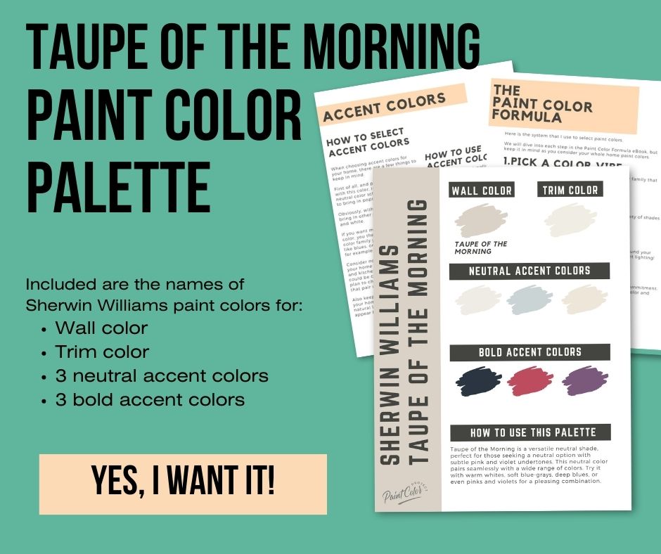
Taupe of the Morning Paint Color Palette
Want to use this paint color in your home? Instantly upgrade your home's aesthetic with our exclusive paint color palette. Unlock the perfect trim color and six stunning accent colors, a combination of neutrals and bold hues for an instantly harmonious space!
Get your perfect paint color palette by clicking here!
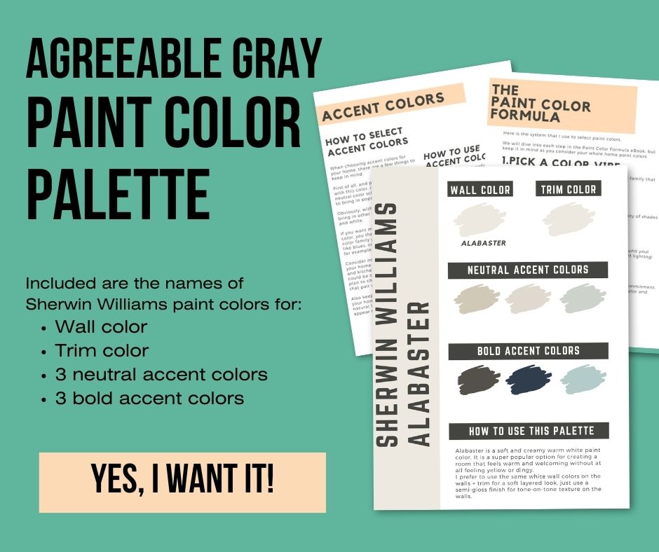
Agreeable Gray Paint Color Palette
Want to use this paint color in your home? Instantly upgrade your home's aesthetic with our exclusive paint color palette. Unlock the perfect trim color and six stunning accent colors, a combination of neutrals and bold hues for an instantly harmonious space!
Get your perfect paint color palette by clicking here!
Still unsure which paint color is right for your space?
Choosing paint doesn’t have to be stressful! My free Paint Color Planning Quick Start Guide walks you through the exact steps to confidently choose the perfect color — without the overwhelm, second-guessing, or endless swatch testing.
👉 Click here to download the free guide!

My Paint Color Formula course walks you through the painless process of expertly testing paint swatches to ensure you have the perfect color for your home.
The best way to sample paint? Samplize!
Get peel-and-stick removable and reusable paint samples here!
Thanks for reading!

Meg Hemmelgarn is a freelance writer and home decor + DIY blogger who loves to talk about paint colors. She and her husband are currently renovating their third fixer upper. You can see their projects on her blog, Green With Decor.