Looking for the perfect neutral paint color for your home? Let's talk about Sherwin Williams Gossamer Veil and if it might be the perfect color for you!
Paint colors are a big commitment. It's no wonder that so many people choose a neutral color as a base and bring in accents with art, furniture, and decor.
But even picking a neutral paint color can be tricky. There are so, so many options.
Today I want to chat about a super popular neutral paint color - Sherwin Williams Gossamer Veil - and if it might be right for your home.
Sherwin Williams Gossamer Veil SW9165
Gossamer Veil is a warm gray that is considered a greige paint color. It has a lot of beige to it, which gives it that warm look. Gossamer Veil looks especially warm and beige in warm lighting. In cool or darker lighting, the color looks deeper and more neutral (and gray).
Click here to get a peel & stick sample of Gossamer Veil.
Color Family
Gossamer Veil is in the warm gray color family.
Light Reflectance Value
62
Light Reflective Value is the measurement of how much light a color bounces around. This is on a scale of 0 to 100 with 0 being pure black and 100 being pure white.
At a 62 LRV, Gossamer Veil is a lighter gray color, but it is definitely not too light. It will hold it's color even in a very bright room and keeps from looking too washed out.
This is a really great level of LRV if you want a light color without it looking white or too dark!
RGB Colors
R:211 G:206 B:196
RGB describes the amount of each color - red, green, and blue - present in a color. This is on a scale of 0 to 255 for each color. This is basically the color mix to make the color!
Hex Code
#d3cec4
Undertones
Gossamer Veil has slight green - and sometimes purple - undertones. However, they are fairly light. This is considered a great neutral greige.
This color has warm undertones, which gives it a cozy feel. In a south facing room or room with yellowed artificial light, it's going to feel very warm.
It's very important to swatch colors on your wall to make sure they look good – day and night – in your actual space before committing.
Click here to get removable peel & stick paint samples to easily swatch with!
Best uses
This is a beautiful neutral paint color. It will work as a whole house paint color or in any room in your home. In bright rooms, the color will look lighter and warmer. In dark rooms, the color will look deeper and more neutral.
Gossamer Veil can also be great on an exterior. Remember that it will wash out quite a bit in bright outdoor light, so it will look like a much lighter shade on an exterior.
Similar Colors
- Sherwin Williams Agreeable Gray
- Sherwin Williams Grey Heron
- Sherwin Williams Winter Walk
- Benjamin Moore Bruton White
- Benjamin Moore Collingwood
- Behr Burnished Clay
- Farrow & Ball Cornforth White
Coordinating Colors
I personally like to pair Gossamer Veil with mid-toned blues, dark warm grays, and silvery greens.
Mid-toned blues:
- Delft
- Searching Blue
- Luxe Blue
- Distance
- Blustery Sky
See all of my favorite medium blue paint colors here!
Dark warm grays:
- Roycroft Pewter
- Attitude Gray
- After the Storm
- Urbane Bronze
- Black Fox
Silvery greens:
See all of my favorite green gray paint colors here.
Trim Colors
I like to pair Gossamer Veil with crisp clean white paint colors for trim and ceiling. Avoid pairing it with creamy whites which can easily clash with the creaminess of Gossamer Veil itself.
- Benjamin Moore Simply White
- Sherwin Williams Extra White
- Behr Ultra Pure White
Click here to get a peel & stick sample of Gossamer Veil.
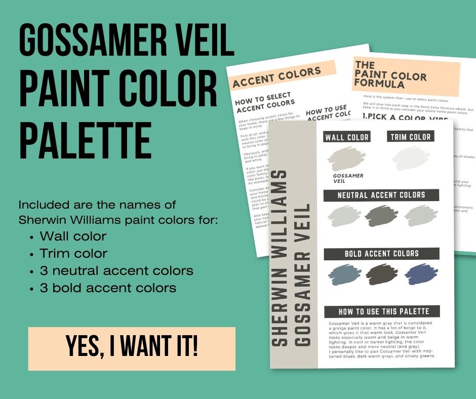
Sherwin Williams Gossamer Veil color palette
Want to use this paint color in your home? Instantly upgrade your home's aesthetic with our exclusive paint color palette. Unlock the perfect trim color and six stunning accent colors, a combination of neutrals and bold hues for an instantly harmonious space!
Get your perfect paint color palette by clicking here!
Gossamer Veil FAQs
Is gossamer veil gray or beige?
Gossamer Veil is a greige paint color, but it is mostly gray with heavy beige undertones.
What undertones does SW gossamer veil have?
Gossamer Veil has green and purple undertones, but the emphasis is on the warm neutral tan.
What is the difference between agreeable gray and gossamer veil?
Agreeable Gray is darker than Gossamer Veil and tends to read a bit more green.
Click here to get a peel & stick sample of Gossamer Veil.
Gossamer Veil vs Drift of Mist
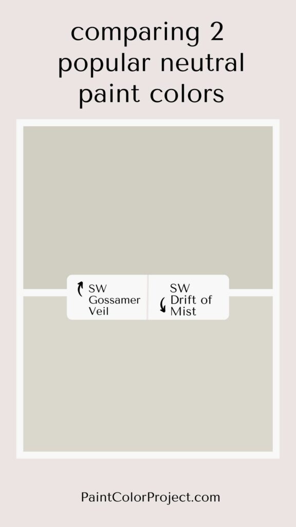
Gossamer Veil has more depth to it - is slightly darker - and is slightly warmer than Drift of Mist. If you have a very bright room but want it to have a bit of color to it, Gossamer Veil is less likely to get washed out compared to Drift of Mist.
Drift of Mist also has a lot of purple to it. If your room is north facing or has cool light, it could look purple on the walls.
Click here to read my complete Gossamer Veil vs Drift of Mist comparison!
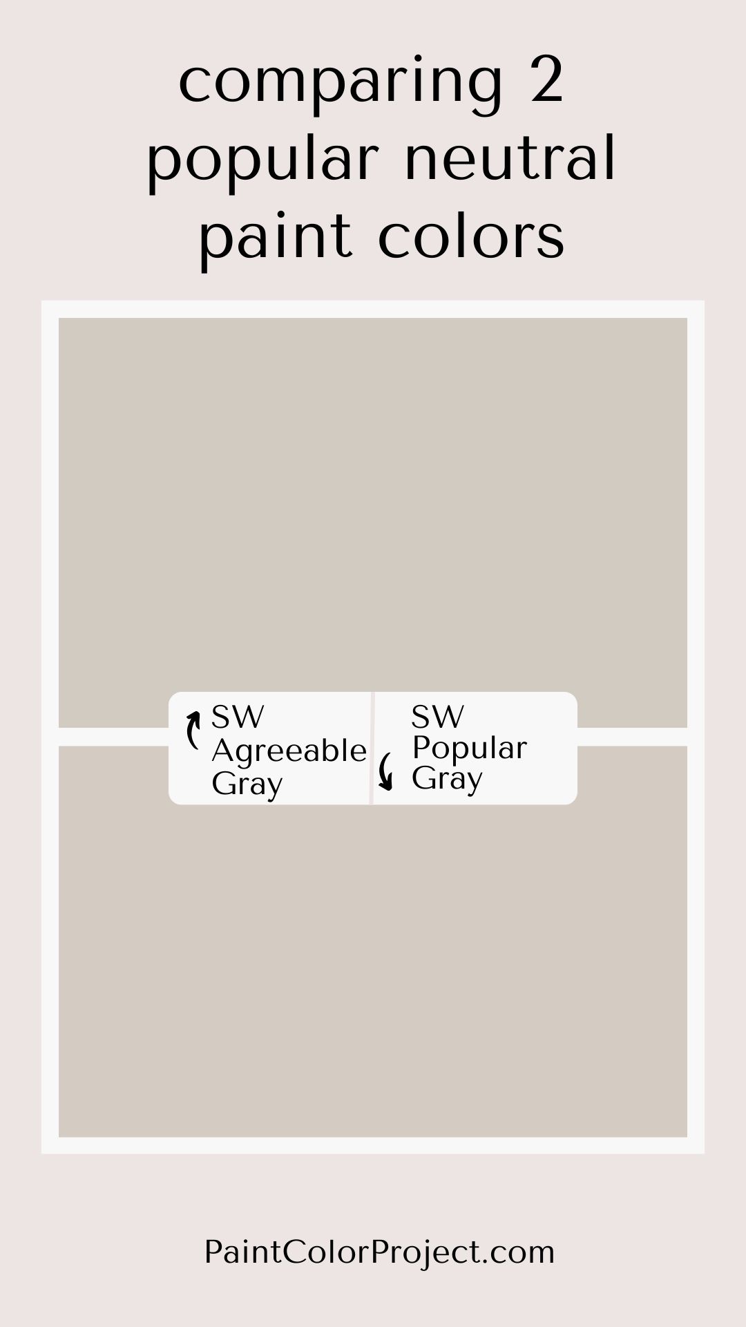
Gossamer Veil vs Agreeable Gray
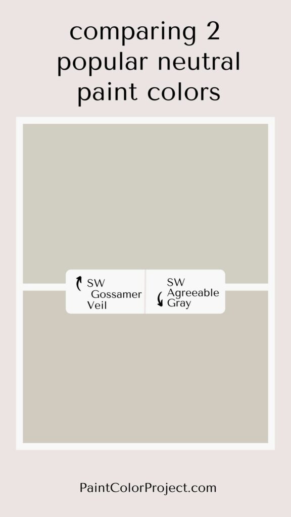
Gossamer Veil and Agreeable Gray are very similar at a glance. They have a very similar color depth (darkness) and seem to have similar undertones – until you really get them next to each other.
If you want a lighter, cleaner color, I suggest Gossamer Veil. It is more likely to look neutral in your lighting – though always look at samples in your actual space.
However, if you want something a bit warmer with a touch of pink to it, consider Agreeable Gray. It’s slightly darker, slightly warmer, and can feel cozy in a space.
Click here to read my complete Gossamer Veil vs Agreeable Gray review
Modern Gray vs Gossamer Veil
Gossamer Veil and Modern Gray are both warm, mid-toned greige paint colors by Sherwin Williams. They have the same color depth, but have very different undertones. Placing swatches or samples of these colors next to each other will immediately bring out the difference in tone!
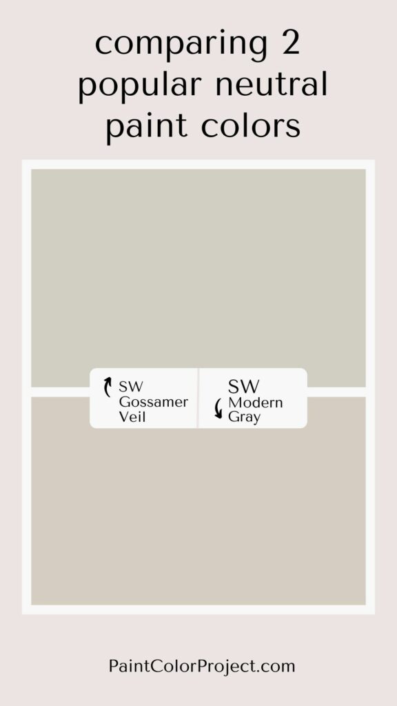
Click here to read my complete comparison of Modern Gray vs Gossamer Veil.
Gossamer Veil vs Repose Gray
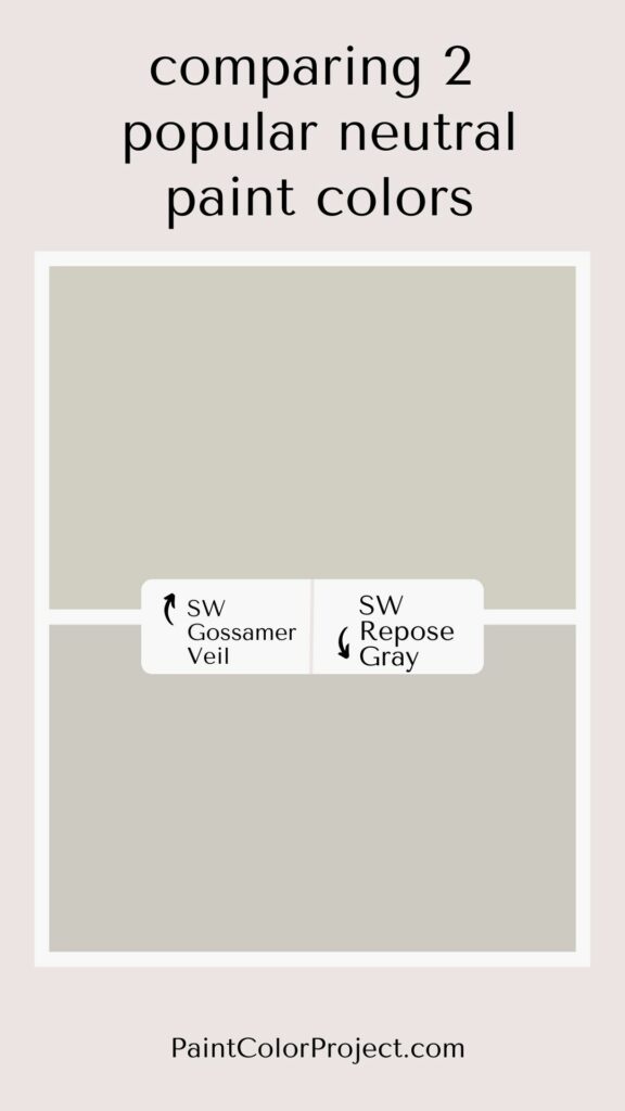
Gossamer Veil is a lighter and warmer greige compared to Repose Gray. If you are worried about a space feeling dark, Gossamer Veil is likely the better choice. If you want a warmer, cozy feel, stick to Gossamer Veil.
If your room gets a ton of warm toned natural light, then Repose Gray will feel very neutral and hold it's color better than the lighter Gossamer Veil, which is more prone to being washed out in bright light.
In cool lighting, or dark spaces, Repose Gray can really feel purple and dark or dingy, so it is not my pick in dark spaces.
Click here to read my complete Gossamer Veil vs Repose Gray comparison
Still unsure which paint color is right for your space?
Choosing paint doesn’t have to be stressful! My free Paint Color Planning Quick Start Guide walks you through the exact steps to confidently choose the perfect color — without the overwhelm, second-guessing, or endless swatch testing.
👉 Click here to download the free guide!
DIYing Your Paint Job? Start Here.
Choosing a paint color is only half the equation — the tools you use matter just as much. I’ve rounded up the painting supplies we rely on for clean lines, smooth finishes, and less frustration overall.

My Paint Color Formula course walks you through the painless process of expertly testing paint swatches to ensure you have the perfect color for your home.
The best way to sample paint? Samplize!
Get peel-and-stick removable and reusable paint samples here!
Thanks for reading!

Morgan is passionate about home decor and paint colors. She has been sharing DIY home decor tips since 2012 at CharlestonCrafted.com. From there, she learned to love paint colors, and the Paint Color Project was born in 2022!