Looking for the best medium blue paint colors? Here are my favorite blue paint colors that are not too light and not too dark!
Blue is a super popular paint color. It can feel beachy, soothing, or even colorful and eclectic.
Many people say that blue colors make you feel happy and calm. So, it's no surprise that so many peoples' favorite color is blue!
There are light blue paint colors and dark blue paint colors, but today I am going to talk about medium blue paint colors. These shades are neither light nor dark but what I call mid-toned.
These colors are perfect if you want a bit of color infused into your color palette, but don't want anything too dark or bold.
Here are my favorite medium blue paint colors!
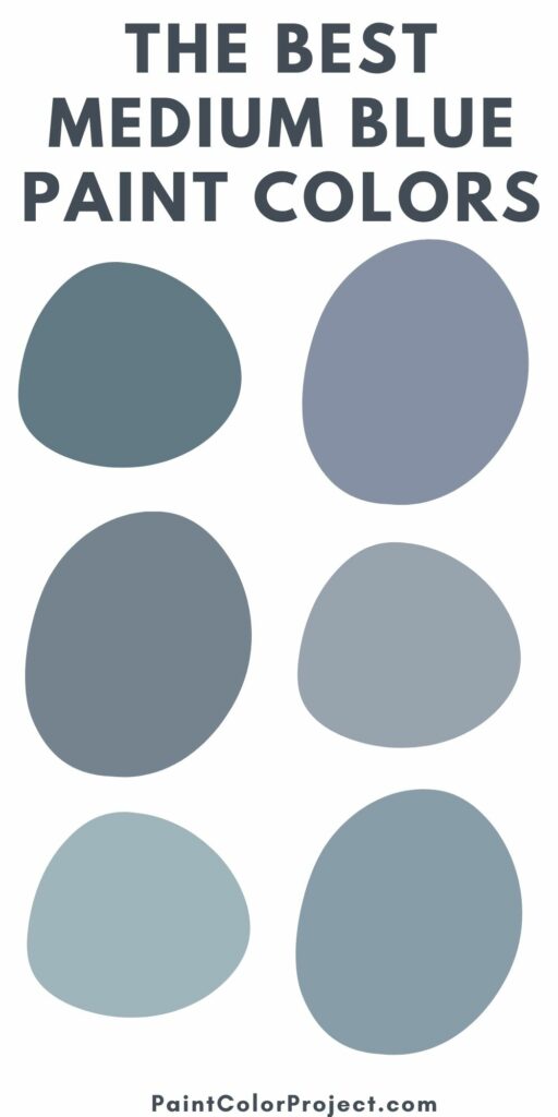
Medium Tone Blue-Gray Paint Colors
Water's Edge by Benjamin Moore (1635)

Water's Edge has an almost teal undertone. It is a medium darkness and would be beautiful on your walls but would also be stunning for painting a piece of furniture. The teal tones give it a very coastal feel.
Click here to get a 12"x12" peel and stick sample of Benjamin Moore Water's Edge!
Thundercloud by Behr (S520-5)
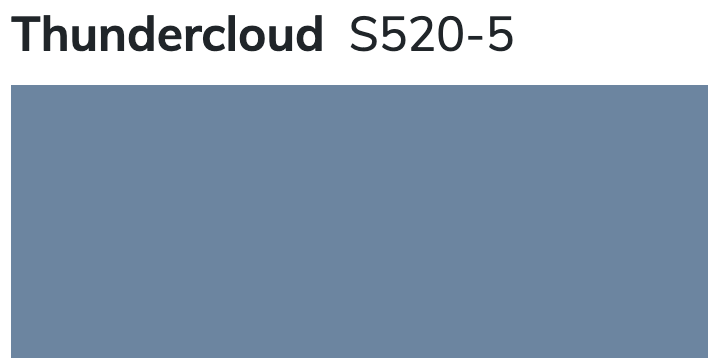
Thundercloud is a medium toned blue shade with almost periwinkle undertones. It has the potential to get bold quickly, but has just enough muddiness to it to keep it from getting out of control.
Distance by Sherwin Williams (SW 6243)
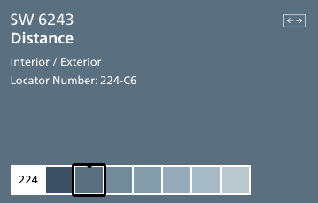
Distance is a shade of blue that makes me think of my favorite pair of broken in denim. It feels warm, welcoming, and inviting.
It's got that perfectly worn look, thanks to the gray undertones. Pair it with metallics to glam it up or keep it rustic with wood tones - it really can work in so many ways.
Click here to get a 12"x12" peel and stick sample of Sherwin Williams Distance!
Aleutian by Sherwin Williams (SW 6241)
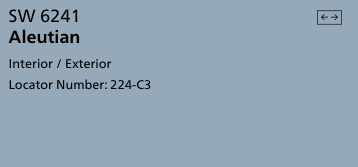
Aleutian is a creamy feeling blue shade. It's darker than a sky blue but not quite periwinkle, and the muddy undertones help it feel muted and restful.
Click here to get a 12"x12" peel and stick sample of Sherwin Williams Aleutian!
Providence Blue by Benjamin Moore (1636)

Providence Blue is a mid-toned blue-green color with muted undertones. It feels almost teal, but not quite green enough.
I think this color would be stunning in a room with a lot of intricate wall moldings. Va-va voom!
Click here to get a 12"x12" peel and stick sample of Benjamin Moore Providence Blue!
Van Courtland Blue by Benjamin Moore (HC 145)

Van Courtland blue has a mixture of green and gray undertones. It feels like the beach and would be stunning on the walls in a master bedroom. I would pair it with crisp whites to really let the color be the star.
Click here to get a 12"x12" peel and stick sample of Benjamin Moore Van Courtland Blue!
Boothbay Gray by Benjamin Moore (HC-165)

Boothbay Gray is a very muddy, gray color that is heavy on the blue undertones. It feels very clean and welcoming and would work in any space from a kitchen to a living room.
Click here to get a 12"x12" peel and stick sample of Benjamin Moore Boothbay Gray!
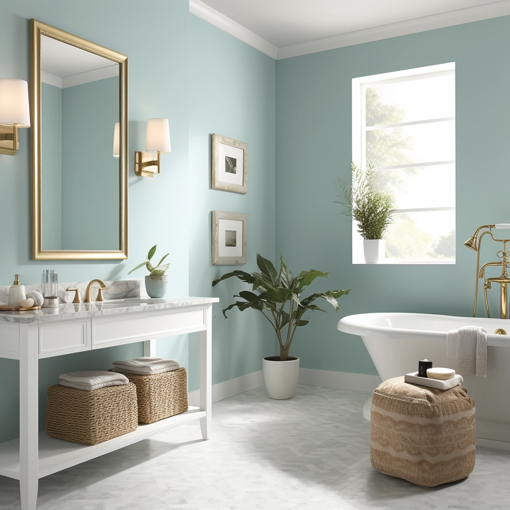
Daphne by Sherwin Williams (SW 9151)
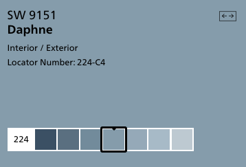
Daphne is a true blue color halfway in between sky blue and navy. It is a really nice shade to be used on anything - a wall, a piece of furniture, or even an accessory. There is so much possibility with this shade!
Click here to get a 12"x12" peel and stick sample of Benjamin Moore Daphne!
Granite Peak by Sherwin Williams (SW 6250)
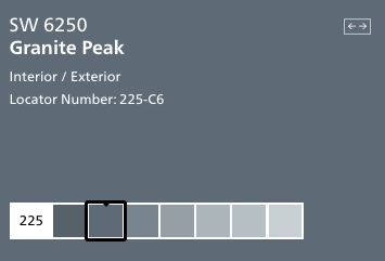
Granite Peak is a deep charcoal gray color with icy blue undertones. It reads as a really cool gray and can feel more blue depending on it's surroundings.
Click here to get a 12"x12" peel and stick sample of Sherwin Williams Granite Peak!
Bracing Blue by Sherwin Williams (SW 6242)
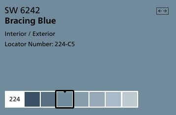
Bracing blue is so charming! It is saturated enough that it feels really welcoming and homey, but still has the gray undertones that keep it from overwhelming a space. This is a great way to bring blue into your home!
Click here to get a 12"x12" peel and stick sample of Sherwin Williams Bracing Blue!
Dockside Blue by Sherwin Williams
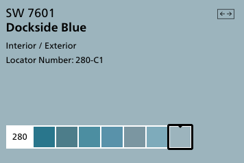
Dockside Blue is a teal color with muddy gray undertones. It is rich and full of color, while still being only medium in darkness. This color is simply gorgeous and looks bluer the more of it you use - so keep that in mind if you plan to paint a whole room.
Click here to get a 12"x12" peel and stick sample of Sherwin Williams Dockside Blue!
Flower Box by Benjamin Moore (CSP-530)

Flower Box is an almost periwinkle blue color. It has gray undertones that keep it from reading too purple. It is medium in tone.
Click here to get a 12"x12" peel and stick sample of Benjamin Moore Flower Box!
Comet by Benjamin Moore (1628)
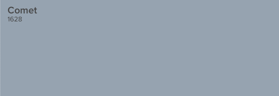
Comet is an icy, dusty shade of gray that might make you think of the solar system. It has blue and violet undertones, making it work well in a variety of types of homes.
Click here to get a 12"x12" peel and stick sample of Benjamin Moore Comet!
Bachelor Blue by Benjamin Moore (1629)

Bachelor Blue is a deep, muted blue gray color. It has an elegant feel to it. It pairs well with warm tones as well as other cool colors.
Click here to get a 12"x12" peel and stick sample of Benjamin Moore Bachelor Blue!
Stillwater by Benjamin Moore (1650)

Stillwater is a watery, teal blue color with muddy gray undertones. It is really rich and vibrant and would make a huge impact in your home.
Click here to get a 12"x12" peel and stick sample of Benjamin Moore Stillwater!
Mineral Alloy by Benjamin Moore (1622)
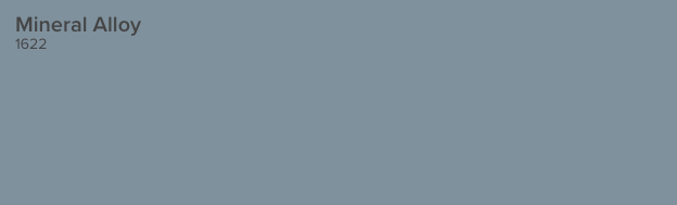
Mineral Alloy is an almost denim blue shade. It's very cheerful and happy but the gray undertones keep it a bit muted.
Click here to get a 12"x12" peel and stick sample of Benjamin Moore Mineral Alloy!
Tranquil Pond by Behr PPU15-7
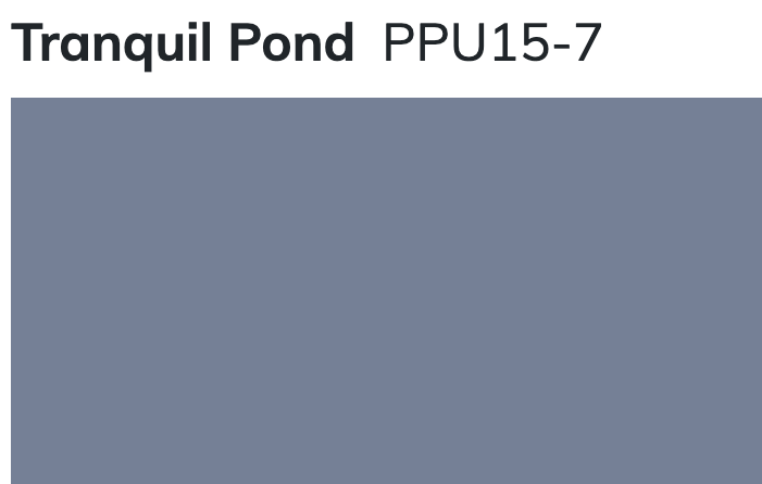
Tranquil Pond is a very purple-y blue gray color. It has a lot of red in it, which gives it that purple look. It's a very traditional color that can read as very blue if you get it on the wall, so be sure to keep that in mind.
Still unsure which paint color is right for your space?
Choosing paint doesn’t have to be stressful! My free Paint Color Planning Quick Start Guide walks you through the exact steps to confidently choose the perfect color — without the overwhelm, second-guessing, or endless swatch testing.
👉 Click here to download the free guide!
DIYing Your Paint Job? Start Here.
Choosing a paint color is only half the equation — the tools you use matter just as much. I’ve rounded up the painting supplies we rely on for clean lines, smooth finishes, and less frustration overall.

My Paint Color Formula course walks you through the painless process of expertly testing paint swatches to ensure you have the perfect color for your home.
The best way to sample paint? Samplize!
Get peel-and-stick removable and reusable paint samples here!
Thanks for reading!

Morgan is passionate about home decor and paint colors. She has been sharing DIY home decor tips since 2012 at CharlestonCrafted.com. From there, she learned to love paint colors, and the Paint Color Project was born in 2022!