Here are my favorite blue-gray paint colors! These shades are the perfect way to keep a neutral color palette while still having a little bit of color and personality in your space!
It's no secret that I love decorating with blue. Pretty much our whole house is blue or blue-ish green. But, even I admit that blue can be a lot for a wall paint color.
What is a blue-gray color?
A blue-gray paint color lies somewhere between blue and gray, obviously. However, I think that it is important that the color is more blue than gray.
The gray is used to tone down the brightness of the blue and to make it more calm.
What does it mean to have a muted paint color?
The easiest way to make any bright color work better on a walls (or all of the walls in a room) is to select a more muted shade.
You might, for example, find a color that you like on a paint fan deck and instead select a shade on that same strip but 2 shades lighter.
Another way to make a paint color more muted is to pick a color with gray undertones. This will make the color appear more "muddy" and less bold and bright.
These undertones can exist in light or dark colors, but just mean they are more neutral in tone.
Today I have rounded up my favorite blue-gray paint colors for you. The blue gives them a bright, happy shade that is very trendy right now. However, the grey undertones keep them from being too bright.
There are a ton of colors here - but I hope that seeing them next to each other helps to draw attention to the subtle differences between them.

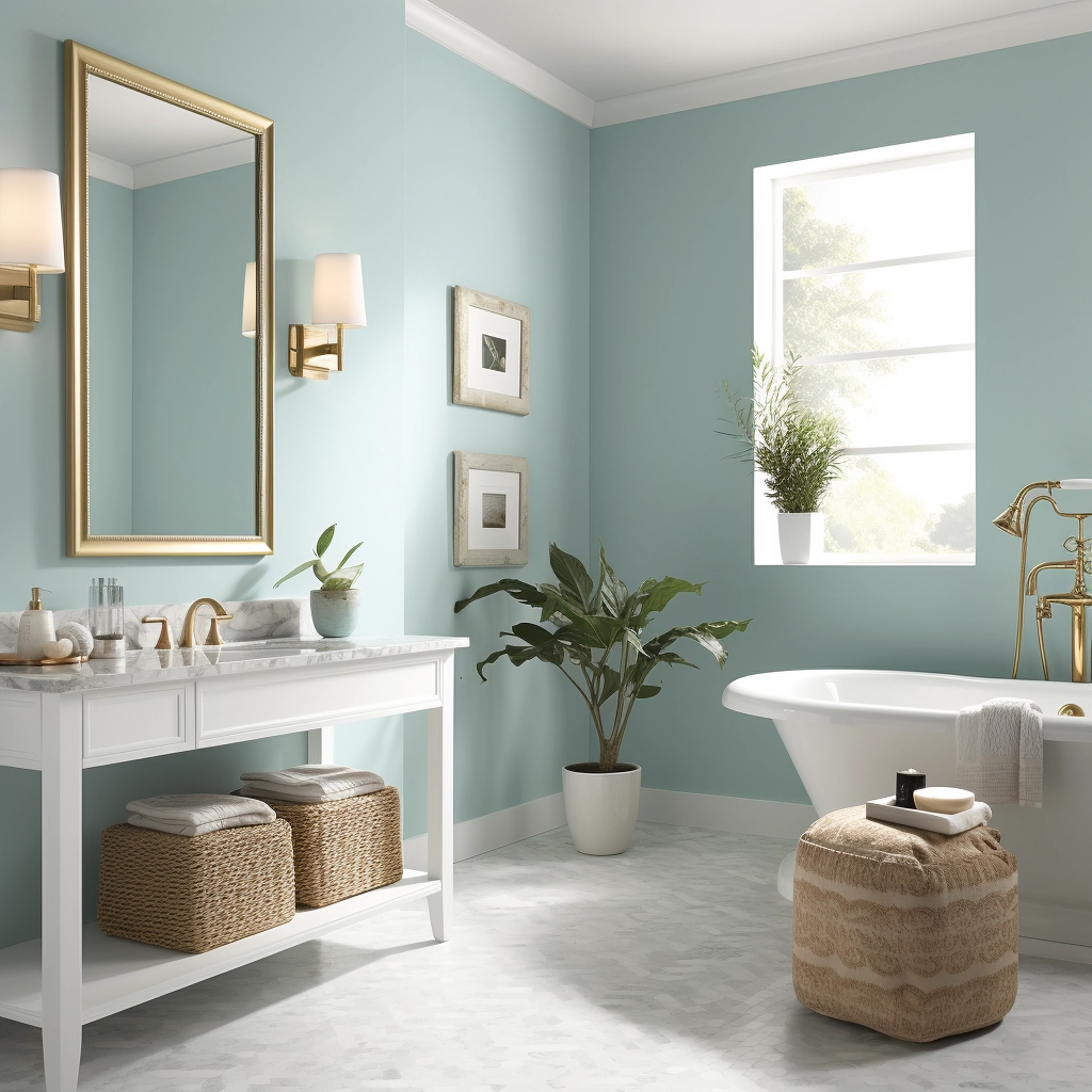
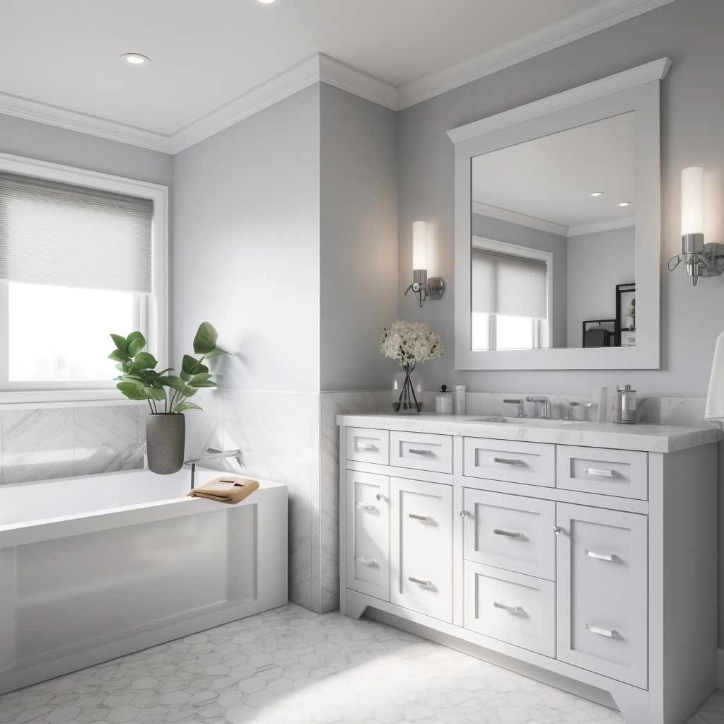
What's the best blue gray paint color for bathrooms?
In general, it's appealing to have a bathroom have a spa-like feeling. Go for a light blue gray. Look for a shade with more blue than gray! Even something with a little green can be nice.
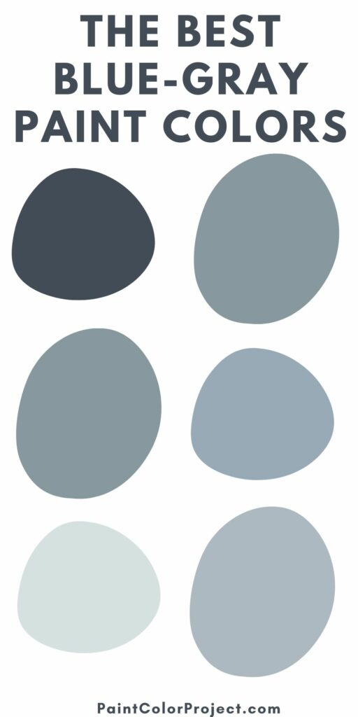
The Best Blue-Gray Paint Colors
Click here to get peel & stick samples of all of my favorite blue-gray paint colors!
Dark Blue-Gray Paint Colors
Hale Navy by Benjamin Moore (HC-154)

Hale Navy is a deeply saturated navy blue. Using this color will bring a ton of impact into your space!
It might not be the color for all of the walls in your home, but using it selectively can be really beautiful. The gray undertones keep this blue from looking too much like a military uniform.
Click here to get a 12"x12" peel and stick sample of Benjamin Moore Hale Navy!
Stained Glass by Benjamin Moore (CSP-685)

Stained Glass is really a dark teal color, but it has been muted by gray undertones. While teal can be really overwhelming to imagine on the walls, the muddiness of Stained Glass makes it really cozy and comfortable, especially in a light and bright space.
Click here to get a 12"x12" peel and stick sample of Benjamin Moore Stained Glass!
Blue Note by Benjamin Moore (2129-30)

Blue Note is a deep navy with an almost sea-like aesthetic. There feels like there are green tones deep within the muted blue. It is a pure, deep blue color, but there are definite gray undertones keeping it from feeling too blue.
Click here to get a 12"x12" peel and stick sample of Benjamin Moore Blue Note!
New Providence Navy by Benjamin Moore (1651)

In contrast, you can see the real teal and green undertones in New Providence Navy.
Click here to get a 12"x12" peel and stick sample of Benjamin Moore New Providence Navy!
Polo Blue by Benjamin Moore (2062-10)

Polo Blue is a rich, masculine, true navy color. It is very dark and moody and will make a big impact in any space. It's also a gorgeous choice for exterior siding for a home.
Click here to get a 12"x12" peel and stick sample of Benjamin Moore Polo Blue!
Gentleman's Gray by Benjamin Moore (2062-20)

Gentleman's gray is really an odd name for this color because it's not nearly as gray as it is a deep teal. However, the gentleman's bit is right on key - this would be gorgeous in a study, library, or man cave paired with masculine accessories.
Click here to get a 12"x12" peel and stick sample of Benjamin Moore Gentleman's Gray!
Medium Tone Blue-Gray Paint Colors
Water's Edge by Benjamin Moore (1635)

Water's Edge has an almost teal undertone. It is a medium darkness and would be beautiful on your walls but would also be stunning for painting a piece of furniture. The teal tones give it a very coastal feel.
Click here to get a 12"x12" peel and stick sample of Benjamin Moore Water's Edge!
Thundercloud by Behr (S520-5)
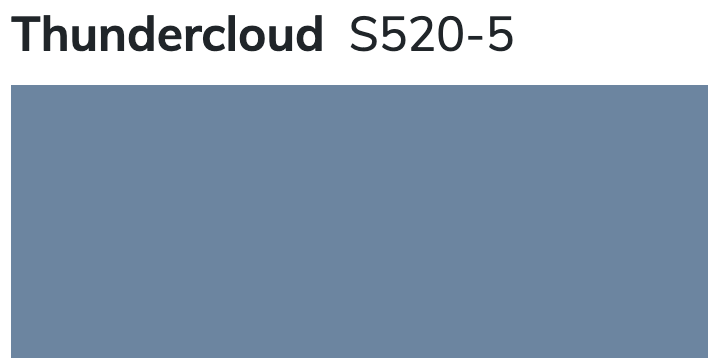
Thundercloud is a medium toned blue shade with almost periwinkle undertones. It has the potential to get bold quickly, but has just enough muddiness to it to keep it from getting out of control.
Distance by Sherwin Williams (SW 6243)
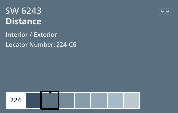
Distance is a shade of blue that makes me think of my favorite pair of broken in denim. It feels warm, welcoming, and inviting.
It's got that perfectly worn look, thanks to the gray undertones. Pair it with metallics to glam it up or keep it rustic with wood tones - it really can work in so many ways.
Click here to get a 12"x12" peel and stick sample of Sherwin Williams Distance!
Aleutian by Sherwin Williams (SW 6241)
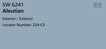
Aleutian is a creamy feeling blue shade. It's darker than a sky blue but not quite periwinkle, and the muddy undertones help it feel muted and restful.
Click here to get a 12"x12" peel and stick sample of Sherwin Williams Aleutian!
Providence Blue by Benjamin Moore (1636)

Providence Blue is a mid-toned blue-green color with muted undertones. It feels almost teal, but not quite green enough.
I think this color would be stunning in a room with a lot of intricate wall moldings. Va-va voom!
Click here to get a 12"x12" peel and stick sample of Benjamin Moore Providence Blue!
Van Courtland Blue by Benjamin Moore (HC 145)

Van Courtland blue has a mixture of green and gray undertones. It feels like the beach and would be stunning on the walls in a master bedroom. I would pair it with crisp whites to really let the color be the star.
Click here to get a 12"x12" peel and stick sample of Benjamin Moore Van Courtland Blue!
Boothbay Gray by Benjamin Moore (HC-165)
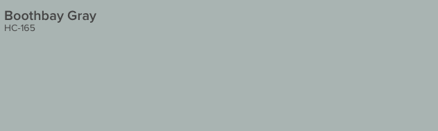
Boothbay Gray is a very muddy, gray color that is heavy on the blue undertones. It feels very clean and welcoming and would work in any space from a kitchen to a living room.
Click here to get a 12"x12" peel and stick sample of Benjamin Moore Boothbay Gray!
Daphne by Sherwin Williams (SW 9151)
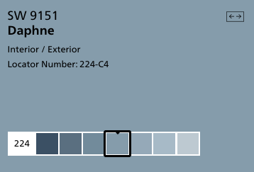
Daphne is a true blue color halfway in between sky blue and navy. It is a really nice shade to be used on anything - a wall, a piece of furniture, or even an accessory. There is so much possibility with this shade!
Click here to get a 12"x12" peel and stick sample of Benjamin Moore Daphne!
Granite Peak by Sherwin Williams (SW 6250)
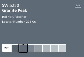
Granite Peak is a deep charcoal gray color with icy blue undertones. It reads as a really cool gray and can feel more blue depending on it's surroundings.
Click here to get a 12"x12" peel and stick sample of Sherwin Williams Granite Peak!
Bracing Blue by Sherwin Williams (SW 6242)
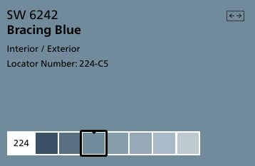
Bracing blue is so charming! It is saturated enough that it feels really welcoming and homey, but still has the gray undertones that keep it from overwhelming a space. This is a great way to bring blue into your home!
Click here to get a 12"x12" peel and stick sample of Sherwin Williams Bracing Blue!
Dockside Blue by Sherwin Williams
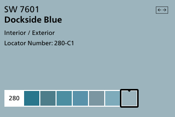
Dockside Blue is a teal color with muddy gray undertones. It is rich and full of color, while still being only medium in darkness. This color is simply gorgeous and looks bluer the more of it you use - so keep that in mind if you plan to paint a whole room.
Click here to get a 12"x12" peel and stick sample of Sherwin Williams Dockside Blue!
Flower Box by Benjamin Moore (CSP-530)

Flower Box is an almost periwinkle blue color. It has gray undertones that keep it from reading too purple. It is medium in tone.
Click here to get a 12"x12" peel and stick sample of Benjamin Moore Flower Box!
Comet by Benjamin Moore (1628)
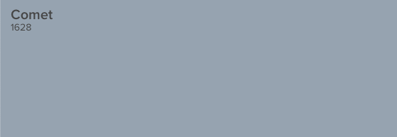
Comet is an icy, dusty shade of gray that might make you think of the solar system. It has blue and violet undertones, making it work well in a variety of types of homes.
Click here to get a 12"x12" peel and stick sample of Benjamin Moore Comet!
Bachelor Blue by Benjamin Moore (1629)

Bachelor Blue is a deep, muted blue gray color. It has an elegant feel to it. It pairs well with warm tones as well as other cool colors.
Click here to get a 12"x12" peel and stick sample of Benjamin Moore Bachelor Blue!
Stillwater by Benjamin Moore (1650)

Stillwater is a watery, teal blue color with muddy gray undertones. It is really rich and vibrant and would make a huge impact in your home.
Click here to get a 12"x12" peel and stick sample of Benjamin Moore Stillwater!
Mineral Alloy by Benjamin Moore (1622)
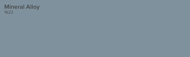
Mineral Alloy is an almost denim blue shade. It's very cheerful and happy but the gray undertones keep it a bit muted.
Click here to get a 12"x12" peel and stick sample of Benjamin Moore Mineral Alloy!
Tranquil Pond by Behr PPU15-7
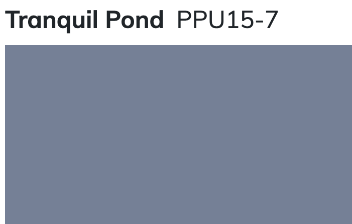
Tranquil Pond is a very purple-y blue gray color. It has a lot of red in it, which gives it that purple look. It's a very traditional color that can read as very blue if you get it on the wall, so be sure to keep that in mind.
Light Blue-Grey Paint Colors
Windy Sky by Benjamin Moore (1639)
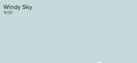
Windy sky is a gorgeous, bright and cheerful blue gray paint color. To me, it feels like aqua, all grown up and sophisticated. It feels like a sunny, cloudless day and would really make your home feel warm and inviting.
Click here to get a 12"x12" peel and stick sample of Benjamin Moore Windy Sky!
Iceberg by Benjamin Moore (2122-50)

Iceberg is a very light blue with strong gray undertones. It is almost a baby blue - but muted up with all that gray so there is nothing pastel about it at all. Iceberg is neutral enough to cover every wall in your entire home and still look interesting.
Click here to get a 12"x12" peel and stick sample of Benjamin Moore Iceberg!
Brittany Blue by Benjamin Moore (1633)
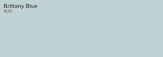
Brittany blue is a light, crisp, cool blue gray color. It has icey undertones but is decidedly blue. It is almost a sky blue, but with those gray tones that keep it from looking too bold.
Click here to get a 12"x12" peel and stick sample of Benjamin Moore Brittany Blue!
Icy by Sherwin Williams (SW6534)
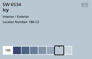
Icy is a very blue color with gray undertones. It is close to a sky blue color and one of the truest blues on this list. Pair it with creamy colors instead of whites or grays to keep it from looking too blue.
Read my full review of SW Icy here!
Click here to get a 12"x12" peel and stick sample of Sherwin Williams Icy!
Lake Placid by Benjamin Moore (827)

Lake Placid is a bright, purple-y blue color. It is cool and icy while still maintaining a lot of blue pigment. It is a great modern take on baby blue.
Click here to get a 12"x12" peel and stick sample of Benjamin Moore Lake Placid!
Upward by Sherwin Williams (SW 6239)
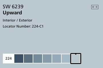
Upward is a clear and pure blue color. It doesn't get muddy tones from the gray undertones but feels less bright because of them. It is a really cheerful color and would work well on walls in many rooms.
Click here to get a 12"x12" peel and stick sample of Sherwin Williams Upward!
Whispering Spring by Benjamin Moore (2136-70)

Whispering Spring is a very light and icy blue, but is surprisingly saturated considering it's tone. In otherwise, it's really light but still really blue - and clinging onto those gray undertones so it doesn't feel pastel at all.
Click here to get a 12"x12" peel and stick sample of Benjamin Moore Whispering Spring!
North Star by Sherwin Williams (SW 6246)
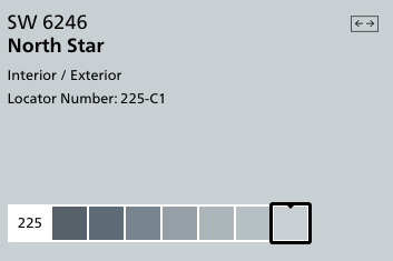
North Star is a cool, crisp blue-grey color. It has an icy appearance and pairs very nicely with a more charcoal gray.
Click here to get a 12"x12" peel and stick sample of Sherwin Williams North Star!
Manor Blue by Benjamin Moore (1627)
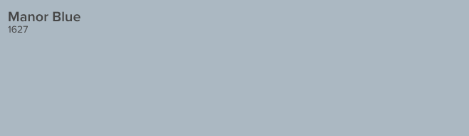
Manor Blue is a mid-tone blue gray with violet undertones. It is a true blue shade, but definitely has gray undertones which give it a moody feeling.
Click here to get a 12"x12" peel and stick sample of Benjamin Moore Manor Blue!
Windy Blue by Sherwin Williams (SW 6240)
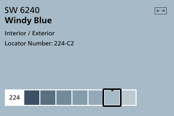
Windy Blue is a light but richly toned blue gray color. It has enough pigment that it really reads as blue, but the tone is muddied enough that it doesn't feel overwhelming at all. This color is stunning in person!
Click here to get a 12"x12" peel and stick sample of Sherwin Williams Windy Blue!
Gentle Gray by Benjamin Moore (1626)
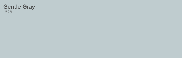
This soft blue-gray is the color of a gentle early morning fog. It is very versatile and pairs well with a wide variety of accent colors.
Click here to get a 12"x12" peel and stick sample of Benjamin Moore Gentle Gray!
Blue-Gray Paint Colors that are Mostly Gray
Online by Sherwin Williams (SW 7072)
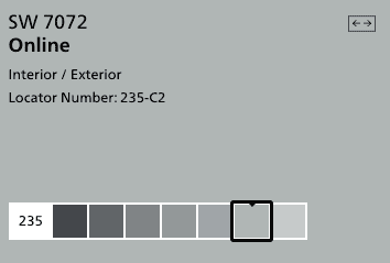
Online is a true gray with cool tones that complement blues very well. It is actually the color that I painted nearly every wall in my house.
I love that it doesn't read beige or tan at all - it is a crisp and clean gray color that plays really well agains blues of all shades.
Click here to get a 12"x12" peel and stick sample of Sherwin Williams Online!
Krypton by Sherwin Williams (SW 6247)
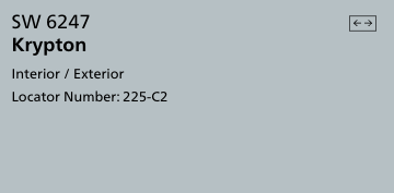
Krypton is a cool and icy blue that is heavily under-toned with gray. Pair it with bright white or charcoal for interest and contrast. This is a neutral gray that can work well with a lot of looks!
Click here to get a 12"x12" peel and stick sample of Sherwin Williams Krypton!
Tranquility by Benjamin Moore (AF-490)
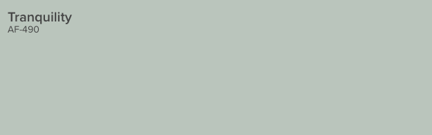
Tranquility is a calm and spa-like gray color with aqua undertones. It makes me think of a boutique hotel and would be very welcoming in your home. It is neutral enough to cover every wall.
Click here to get a 12"x12" peel and stick sample of Benjamin Moore Tranquility!
Misty by Sherwin Williams (SW 6232)
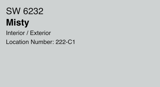
Misty is a grayish blue with a lot of green undertones - you can really see the green if you look at the darker colors on the paint strip. It is very light and bright and easy to work with.
Read my full Misty color review here!
Click here to get a 12"x12" peel and stick sample of Sherwin Williams Misty!
Rock Candy by Sherwin Williams (SW 6231)
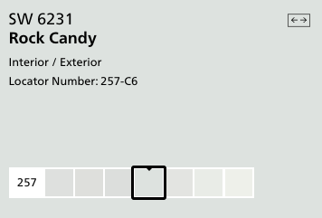
Rock Candy is a pale, almost pastel gray color. It has creamy undertones and makes you feel cool and blue but isn't really blue at all.
Click here to get a 12"x12" peel and stick sample of Sherwin Williams Rock Candy!
Sterling by Benjamin Moore (1591)
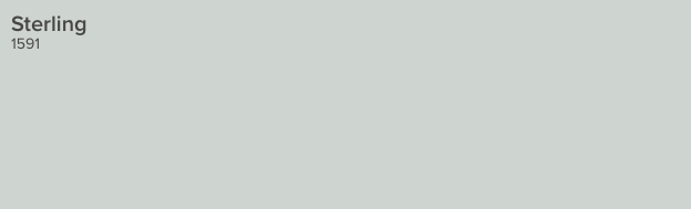
Sterling was modeled after the shade of antique silverware, and its silvery coloring is a reflection of that. The cool undertones give it great blue vibes, though!
Click here to get a 12"x12" peel and stick sample of Benjamin Moore Sterling!
Morning Fog by Sherwin Williams (SW 6255)
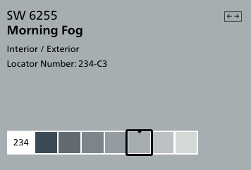
Morning Fog is a cool gray with rich color tone to it. It's very neutral - but it still feels like a vibrant color on it's own.
Click here to get a 12"x12" peel and stick sample of Sherwin Williams Morning Fog!
Click here to get peel & stick samples of all of my favorite blue-gray paint colors!
Frequently asked questions
Where should I use blue gray paint colors?
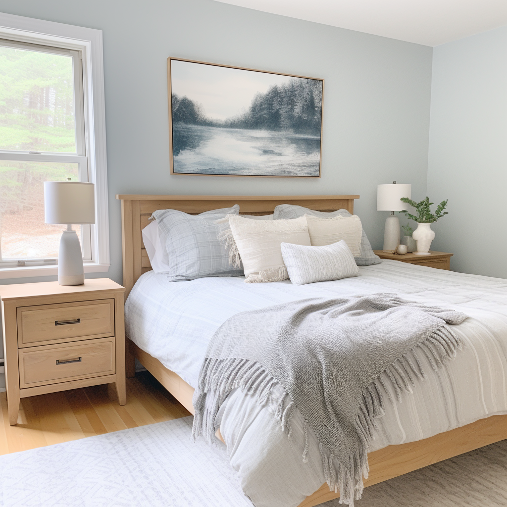
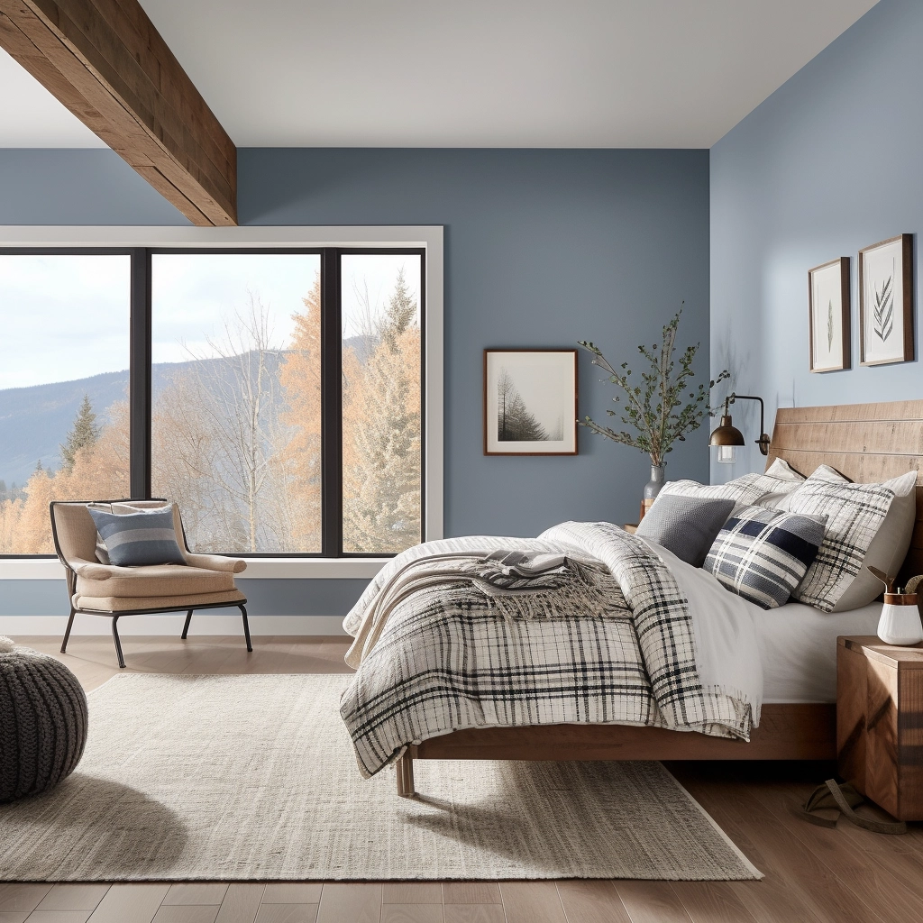
Blue-grey colors are especially popular for bedrooms because they are calming, cozy, and restful. Many of these colors are even described as "spa-like," making them perfect for your master suite!
What colors complement blue-grays?
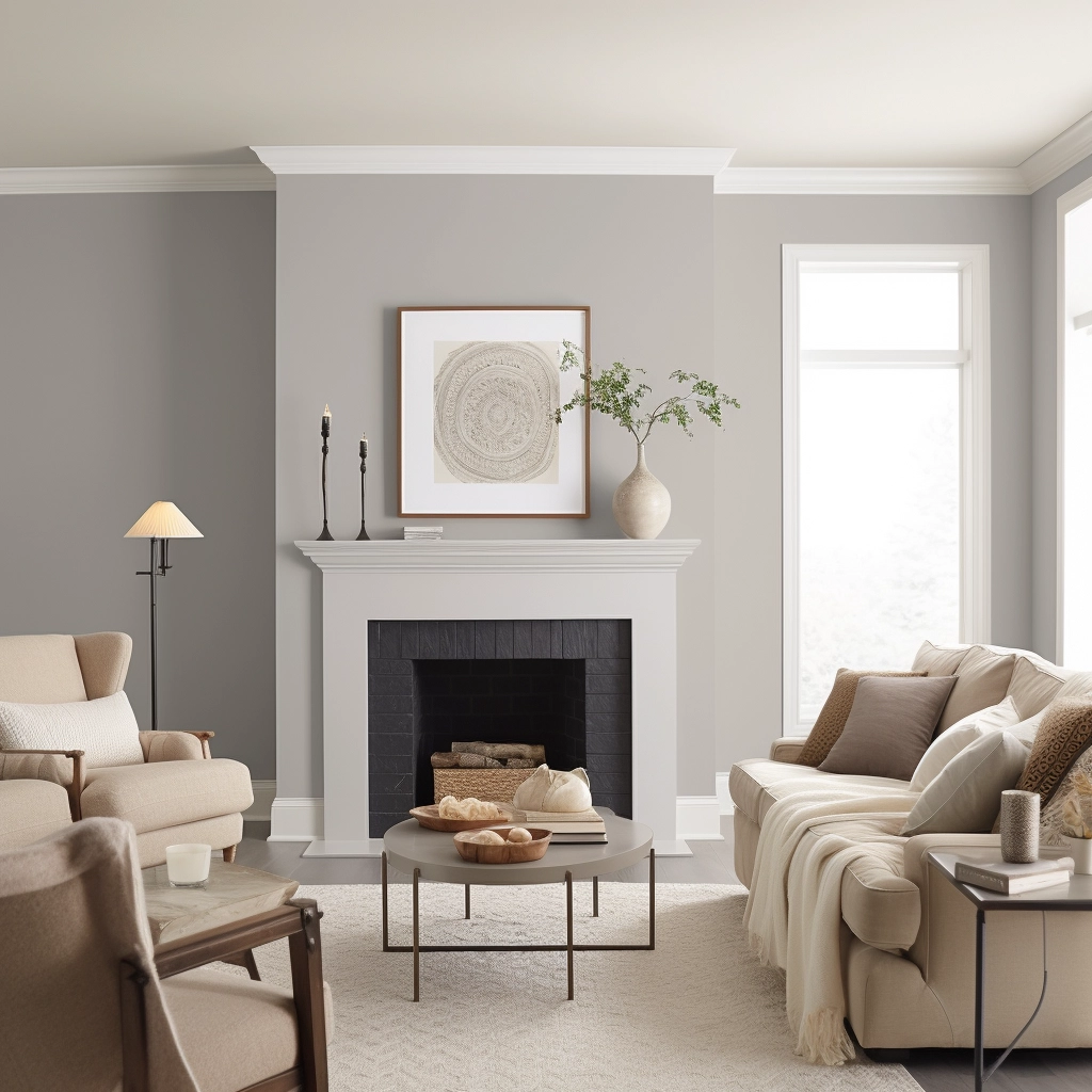
For a soothing effect, pair blue-gray paint colors with crisp whites for trim, linens, and other accessories. Creamy beiges are great for carpeting and upholstered furniture. Pops of navy and dark wood tones can help to ground the coloring.
Whatever you do, don't accessorize with too much gray. Blue-gray walls with gray flooring and gray accessories can look a bit 50 shades of gray, and not in a good way!
As you can see, there are tons of gorgeous blue-gray paint colors. You need to decide what look you are going for (how blue, how light or dark) and pick a few to get samples in to try in your home! I hope that you find the perfect shade for your home.
Overwhelmed trying to pick the right gray?
Gray paint can be tricky — one minute it looks perfect, the next it’s suddenly blue, purple, or just… off.
I created a simple, no-fail guide that shows you exactly which gray paint colors to choose from — plus when to use each one so you can feel confident in your decision.
Still unsure which paint color is right for your space?
Choosing paint doesn’t have to be stressful! My free Paint Color Planning Quick Start Guide walks you through the exact steps to confidently choose the perfect color — without the overwhelm, second-guessing, or endless swatch testing.
👉 Click here to download the free guide!
DIYing Your Paint Job? Start Here.
Choosing a paint color is only half the equation — the tools you use matter just as much. I’ve rounded up the painting supplies we rely on for clean lines, smooth finishes, and less frustration overall.

My Paint Color Formula course walks you through the painless process of expertly testing paint swatches to ensure you have the perfect color for your home.
The best way to sample paint? Samplize!
Get peel-and-stick removable and reusable paint samples here!
Thanks for reading!

Morgan is passionate about home decor and paint colors. She has been sharing DIY home decor tips since 2012 at CharlestonCrafted.com. From there, she learned to love paint colors, and the Paint Color Project was born in 2022!