Trying to find the right off-white for your home? Let’s take a closer look at Sherwin Williams Divine White and see if it’s one you’ll actually enjoy living with.
I reach for warm off-whites a lot, especially when plain white feels too sharp. They still keep a space light and fresh, but they add a bit of softness that makes everything feel more comfortable.
That’s what makes them so easy to use. Whether your style leans modern or more classic, a warm off-white can usually fit right in without much effort.
Still, not all off-whites are the same. Some lean yellow, some feel beige, and some can surprise you once they’re on the wall. It’s always worth looking a little closer before choosing.
Let’s go through Sherwin Williams Divine White.
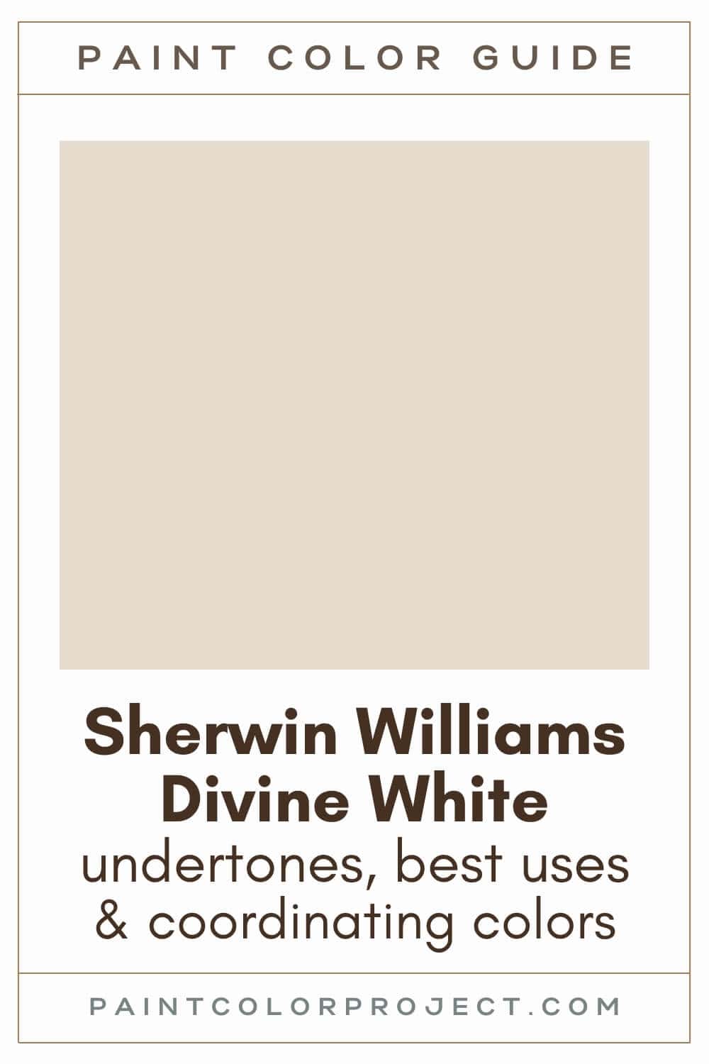
Divine White, Sherwin Williams, SW 6105
Divine White is a warm off-white that feels soft and easy. It brightens a space, but it doesn’t feel stark or flat.
Click here to get a peel and stick sample of Divine White
Color Family
Divine White is in the white family.
Light Reflectance Value
72
Light Reflectance Value tells you how much light a color reflects, on a scale from 0 to 100. Zero is black, and one hundred is pure white.
With an LRV of 72, Divine White sits right at the deeper end of the off-white range.
It reflects a good amount of light, so it helps open up a room. At the same time, it has enough depth that it doesn’t feel washed out.
I’ve used colors in this range in both small and larger rooms, and they tend to feel balanced in both.
RGB Colors
R: 230 G: 220 B: 205
RGB shows how much red, green, and blue are mixed to create the color, each on a scale from 0 to 255.
This mix leans warm, which is what gives Divine White that soft, creamy look instead of a stark white feel.
Hex Code
#E6DCCD

Undertones
Divine White has a warm beige and orange undertone.
In rooms with lots of natural light, especially those south-facing rooms, Divine White can lean more towards a warm, creamy off-white, with its beige undertones gently coming forward.
Divine White's beige undertones will not be as apparent in north-facing rooms without much natural light, but they'll still be there. Divine White can lean slightly greige in darker spaces.
That’s something I like about this color. It keeps that creamy feel, even in lower light.
I always recommend testing it on your wall first. Check it in the morning, afternoon, and at night. That’s when you really see what it’s going to do.
Click here to get removable peel & stick paint samples to easily swatch with!
Best Uses
Divine White is one of those colors that works almost anywhere.
It’s light enough to brighten a space, but it has just enough depth to hide everyday marks better than a stark white.
I’ve used similar shades in busy areas, and they tend to hold up well.
Here’s where I like using Divine White:
- Living rooms
- Bedrooms
- Kitchens
- Bathrooms
- Interior doors
- Cabinets
- Furniture
It also makes a great whole house paint color, or a color for your home's exterior.
Similar Colors
- Sherwin Williams Moderate White
- Benjamin Moore First Crush
- Behr Oyster
- Sherwin Williams White Sesame
- Benjamin Moore Ice Breaker
- Behr Predictable
- Sherwin Williams Aged White
Click here to get a peel and stick sample of Divine White
🤯 Too many color choices?
Download my free Paint Color Planning Quick Start Guide — it’s the exact method I use to help readers choose a color that works the first time.
📥 Grab it here!
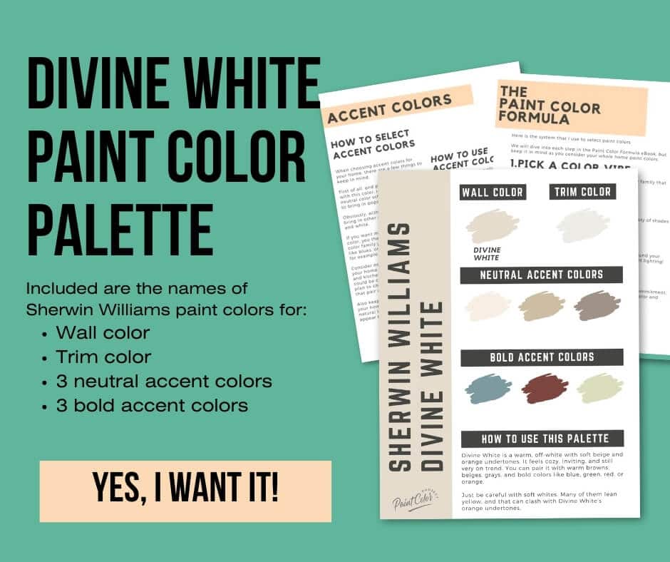
Coordinating Colors
Divine White is very flexible, but I’ve found it looks best when you lean into its warmth.
I love how it complements warm browns, soft beiges, grays, and even bold shades like blues, greens, reds, and oranges. You can easily mix and match to suit your style.
Divine White can be tricky to pair with soft whites, which often lean yellow, whereas Divine White has orange undertones (but doesn't look orange!).
Deep navys / grays:
- Mineral Gray
- Sea Mariner
- Outerspace
- Sea Serpent
- Rain Cloud
Warm mid-toned neutrals:
- Chatura Gray
- Sticks & Stones
- Keystone Gray
- Mega Greige
- Truly Taupe
Bright whites with warm undertones:
- Pure White
- Downy
- White Flour
- Marshmallow
- Cotton White
Trim Colors
Divine White can be a bit tricky on trim because of that subtle orange warmth.
Your best bet is a bright white with a warm undertone, such as Pure White.
Another option I really like is using Divine White on both walls and trim.
Just switch up the finish. For example, eggshell on the walls and semi-gloss on the trim.
Divine White Paint Color Palette
Want to use this paint color in your home? Instantly upgrade your home's aesthetic with our exclusive paint color palette. Unlock the perfect trim color and six stunning accent colors, a combination of neutrals and bold hues for an instantly harmonious space!
Get your perfect paint color palette by clicking here!
Click here to get a peel and stick sample of Divine White
FAQs
Here are some common frequently asked questions about Divine White.
What undertones are in Divine White?
Divine White has a warm base with beige and a soft orange undertone.
In rooms with lots of natural light, especially those south-facing rooms, Divine White can lean more towards a warm, creamy off-white. The beige comes through a bit more, but it still feels soft and easy on the eyes.
In north-facing rooms, it shifts slightly. The warmth tones down, and it can lean a little greige. Even then, it doesn’t go dull like some warm whites can.
What makes Divine White so popular?
Sherwin Williams Divine White, a gorgeous warm, off-white paint color, is popular for quite a few reasons!
It’s warm without being heavy, and it has enough depth to keep it from feeling flat. I think that’s why so many people like it. It works in a lot of different homes and styles without much effort.
It also pairs easily with other colors, which makes decorating around it a lot simpler.
If you’re unsure, I always say grab a sample and try it on your wall. That’s when it really clicks.
What colors go well with Divine White?
Divine White is very flexible, but I’ve found it looks best when you lean into warm tones.
It works well with warm browns, soft beiges, grays, and even deeper shades like blues or greens if you want contrast.
A good place to start is testing it with Mineral Gray (a deep navy gray), Chatura Gray (a medium greige), or Pure White (a bright white with a warm undertone).
One thing to watch for is soft whites that lean yellow. Divine White has a bit of orange in it, so those combinations can feel off. I always test a few options before deciding.


What's the difference: SW Divine White vs Alabaster?
Divine White and Alabaster are both warm whites / off-whites, but they don’t look the same once they’re on the wall.
Divine White is an off-white, creamier, more saturated, and darker (LRV 72). Alabaster is whiter, softer, and lighter (LRV 82).
Divine White's undertones lean more orange, and Alabaster's undertones lean more yellow.
Divine White makes a great wall color, whereas Alabaster is often used for both walls and trim. Testing them side by side really helps here.

What's the difference: SW Divine White vs Shoji White?
Divine White and Shoji White have many similarities, but you can see the difference once they’re up.
Both are creamy off-whites. Divine White (LRV 72) is slightly darker than Shoji White (LRV 74). Divine White is more saturated; Shoji White is softer.
Divine White's undertones lean more orange, and Shoji White leans more yellow. However, note that in general, Shoji White does not have strong undertones.
If you want something warmer and cozier, Divine White usually wins. If you want something softer and more neutral, Shoji White is worth a look.

Is Divine White good for small rooms?
Yes, it works really well in small spaces.
It’s light enough to keep the room feeling open, but it still adds warmth so it doesn’t feel plain.
I’ve seen it used in smaller rooms where it keeps things bright during the day, then feels cozy in the evening.
Like always, lighting makes a difference. In bright rooms, it will look more creamy. In darker spaces, it softens and leans a little more muted.
Still unsure which paint color is right for your space?
Choosing paint doesn’t have to be stressful! My free Paint Color Planning Quick Start Guide walks you through the exact steps to confidently choose the perfect color — without the overwhelm, second-guessing, or endless swatch testing.
👉 Click here to download the free guide!
DIYing Your Paint Job? Start Here.
Choosing a paint color is only half the equation — the tools you use matter just as much. I’ve rounded up the painting supplies we rely on for clean lines, smooth finishes, and less frustration overall.

My Paint Color Formula course walks you through the painless process of expertly testing paint swatches to ensure you have the perfect color for your home.
The best way to sample paint? Samplize!
Get peel-and-stick removable and reusable paint samples here!
Thanks for reading!

Meg Hemmelgarn is a freelance writer and home decor + DIY blogger who loves to talk about paint colors. She and her husband are currently renovating their third fixer upper. You can see their projects on her blog, Green With Decor.