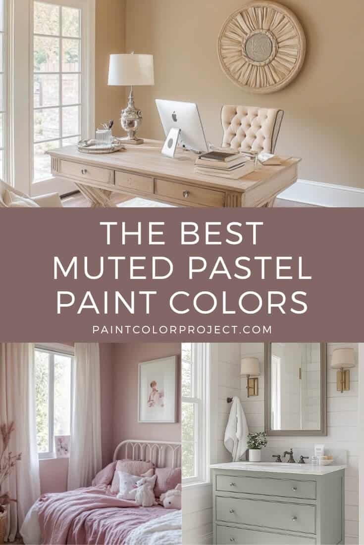
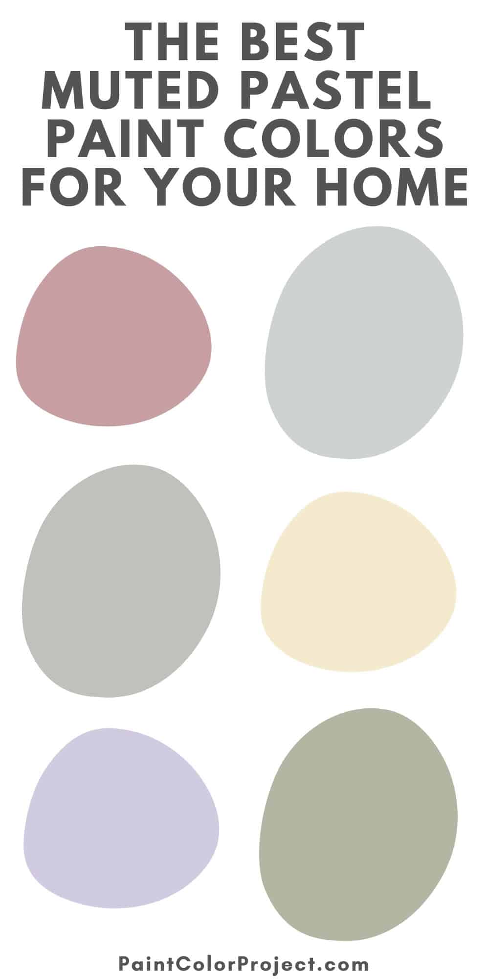
Muted pastel paint colors are perfect if you love color but still want your home to feel calm and easy. These shades from Sherwin Williams, Benjamin Moore, and Behr give you soft, pretty color without taking over the whole room.
If you love color but still want your space to feel calm and timeless, muted pastels might be your perfect match.
Think of them as pastels with a little gray or beige mixed in. That touch makes them feel more natural and grown-up instead of bright and sugary.
They work just about anywhere — bedrooms, nurseries, living rooms, bathrooms. I like them because they add a hint of color while still keeping the space fresh and timeless.
What Makes a Pastel Paint Color “Muted”?
Muted pastels are toned down versions of bright pastels. They have just a touch of gray or brown mixed in, which keeps them from feeling too sweet.
Why I love them (and why you might too):
- They feel calming instead of bold
- They’re more forgiving in different lighting
- They can grow with your style (and your kids!)
They also pair beautifully with neutrals, natural wood, or even darker, moodier shades if you want some contrast.
How to Decorate with Muted Pastels
Muted pastels look their best when you mix in texture and contrast.
A few simple ideas:
- Warm wood accents – helps the colors feel grounded and modern
- White or off-white trim – adds crisp contrast
- Cozy textiles (chunky throws, linen curtains, boucle cushions) – bring softness and depth
- Darker tones (navy, charcoal, forest green) – balance out the pastels for a more polished look
The Best Muted Pastel Paint Colors
Let’s look at some of the best options by color family!
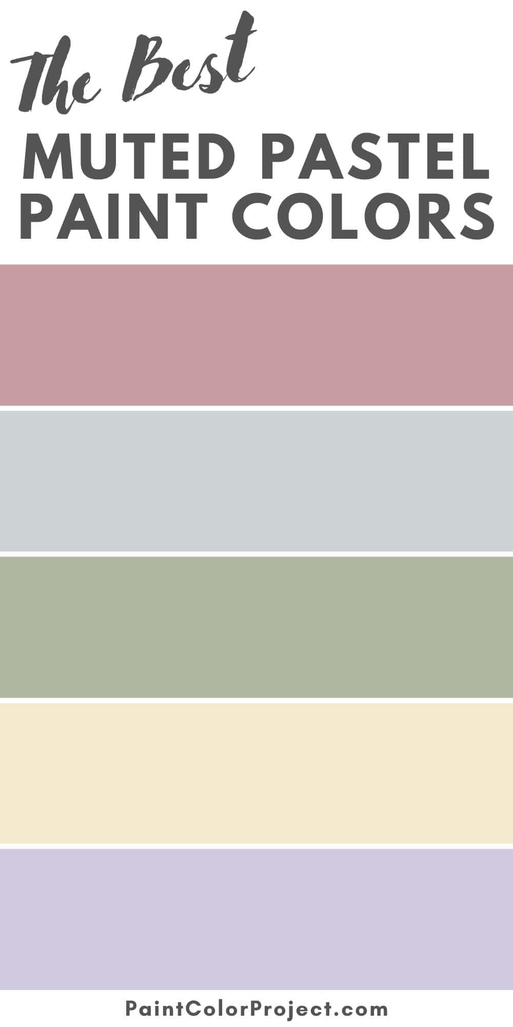
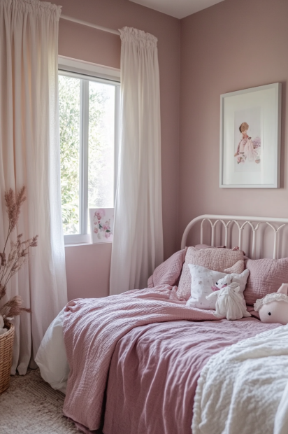
Muted Pink Paint Colors
Muted pinks bring just the right amount of softness without feeling overly sweet.
- Rose Embroidery – Sherwin Williams
A dusty pink with a bit of warmth. I love this one for bedrooms or nurseries when you want the space to feel soft but still sophisticated. - Damask Rose – Benjamin Moore
A soft rose pink that feels calm and classic. Lovely in living rooms or dining rooms.muted - Seaside Villa – Behr
A modern blush with beige mixed in to keep it grounded. Lovely in bathrooms or guest rooms where you want just a hint of color.


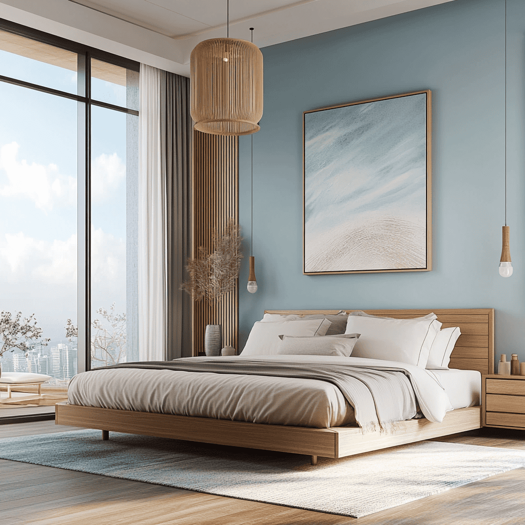
Muted Blue Paint Colors
Muted blues are calm, soft, and easy to live with. They bring in color while still feeling fresh and relaxed.
- Misty – Sherwin Williams
A super-soft blue-gray that almost acts like a neutral. Perfect for bedrooms or laundry rooms where you want a light, airy feel. - Silver Lake – Benjamin Moore
A barely-there blue with just a touch of coolness. Lovely in nurseries or home offices when you want a calm backdrop. - Light French Gray – Sherwin Williams
Despite the name, this shade leans slightly blue in most lighting. Fresh, crisp, and a great choice for keeping spaces bright.


Muted Green Paint Colors
Muted greens bring a touch of nature indoors without feeling too bold. They’re calming, versatile, and work beautifully in almost any room.
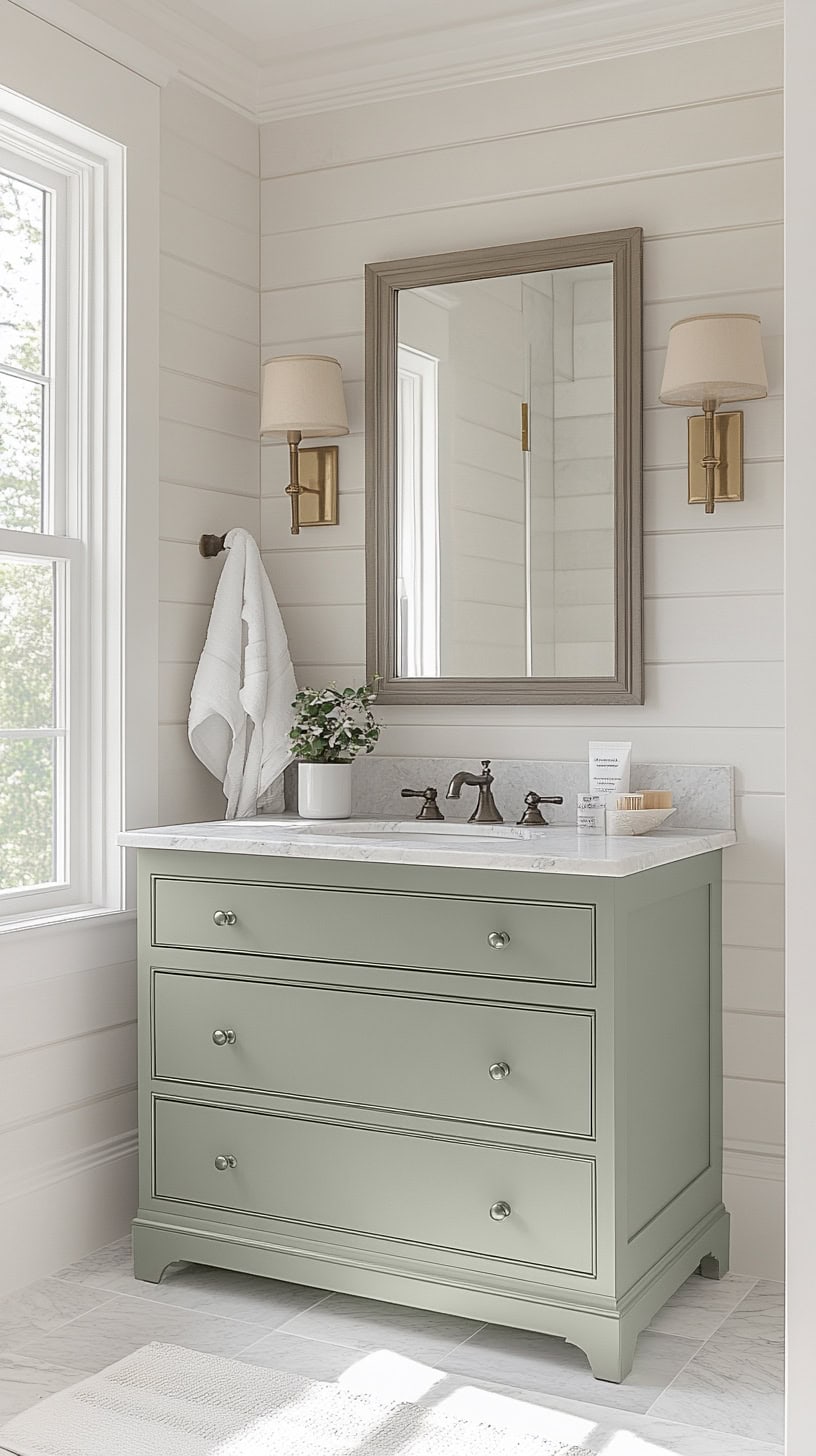
- Sea Salt – Sherwin Williams
One of the most popular soft greens, and for good reason. With its blue-gray undertones, it feels spa-like in bathrooms and bedrooms. - Saybrook Sage – Benjamin Moore
A sophisticated sage that feels traditional but still fresh. I love it in kitchens and dining rooms where you want a timeless look. - Nature’s Gift – Behr
A muted green with a soft, earthy feel. Great with natural textures like wood or linen.


Muted Lavender & Purple Paint Colors
Muted purples add a soft, dreamy vibe without feeling too bold. They work beautifully in bedrooms, nurseries, or even small accent spaces.
- Veiled Violet – Sherwin Williams
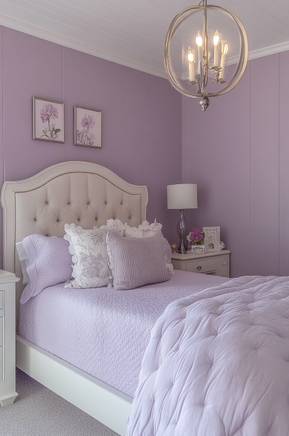
A subtle lavender with a touch of gray that keeps it feeling modern. It pairs well with both cool and warm tones. - French Lilac – Benjamin Moore
A muted purple that leans cozy and romantic. It’s soft enough to use without feeling too dramatic. - Light Mulberry – Behr
A pretty pastel purple with a calming feel. I like this one in a girl’s bedroom or a powder room.


Muted Yellow Paint Colors
Muted yellows bring warmth and cheer without feeling too bright. They’re perfect for adding a little sunshine while still keeping things calm.
- Lemon Meringue – Sherwin Williams
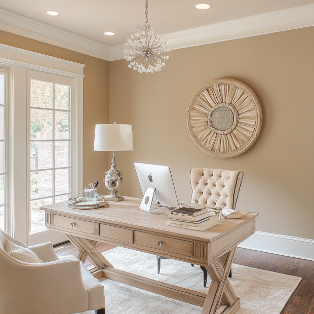
A soft, buttery yellow that feels cheerful and inviting. It’s warm but never overwhelming. - Mannequin Cream – Benjamin Moore
A creamy yellow-beige that adds gentle warmth. I like this one when you want yellow but still want the walls to feel neutral. - Corn Stalk – Behr
A grounded yellow with a sun-kissed look. It’s subtle yet uplifting, especially in kitchens or hallways.


Need More Help?
Picking the perfect pastel can still feel overwhelming — so if you want to skip the stress, grab The Paint Color Formula. It’s your quick shortcut to confidently choosing the right color for your space.
Still unsure which paint color is right for your space?
Choosing paint doesn’t have to be stressful! My free Paint Color Planning Quick Start Guide walks you through the exact steps to confidently choose the perfect color — without the overwhelm, second-guessing, or endless swatch testing.
👉 Click here to download the free guide!

My Paint Color Formula course walks you through the painless process of expertly testing paint swatches to ensure you have the perfect color for your home.
The best way to sample paint? Samplize!
Get peel-and-stick removable and reusable paint samples here!
Thanks for reading!

Morgan is passionate about home decor and paint colors. She has been sharing DIY home decor tips since 2012 at CharlestonCrafted.com. From there, she learned to love paint colors, and the Paint Color Project was born in 2022!