Looking for the perfect soft red paint color for your home? Let’s talk about Benjamin Moore Southwest Pottery and if it might be right for your home!
Warm, earthy colors are a great option if you're looking for something neutral-ish with a pop of subtle color. They make a room feel grounded and welcoming.
I like how these deeper neutrals quietly stand out. They don’t scream for attention, but they do make a space feel put-together and intentional.
If you’ve been curious about adding a little spice to your space, Southwest Pottery might be the color to try. Its reddish-brown vibe adds depth without feeling too bold or trendy.
Let’s take a closer look.
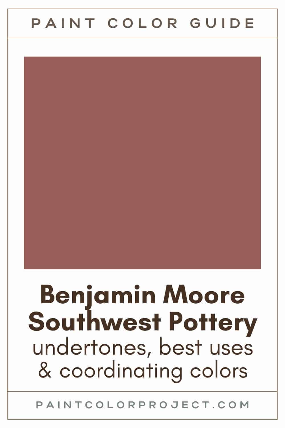
Southwest Pottery, Benjamin Moore, 048
Southwest Pottery is a soft red-brown that may remind you of clay. It adds some warmth and subtle color to a room, perfect for use as an accent color.
Click here to get a peel and stick sample of Southwest Pottery
Color Family
Southwest Pottery is in the red family.
Light Reflectance Value
17
Light Reflective Value is the measurement of how much light a color bounces around. This is on a scale of 0 to 100, with 0 being pure black and 100 being pure white.
With an LRV of 17, Southwest Pottery is one of the darkest mid-toned paint colors.
Southwest Pottery will hold its color but may still change slightly in various lighting due to its undertones.
RGB Colors
R: 151 G: 95 B: 87
RGB describes the amount of each color - red, green, and blue - present in a color. This is on a scale of 0 to 255 for each color. This is basically the color mix to make the color!
Hex Code
#975F57

Undertones
Southwest Pottery is a red paint color with brown undertones, which gives it that earthy, cozy feel.
In a south-facing room with lots of sunlight, it tends to look warmer, a little brighter, and richer overall.
But in a north-facing room where natural light is limited, Southwest Pottery can read deeper, slightly less warm, and a bit more muted.
I always say this, but swatching is a must. Light changes everything. What looks warm and inviting during the day might feel heavier at night.
It's very important to swatch colors on your wall to make sure they look good – day and night – in your actual space before committing.
Click here to get removable peel & stick paint samples to easily swatch with!
Best uses
Soft, darker colors like Southwest Pottery are perfect for adding subtle color to your space.
You can use Southwest Pottery for small pops of color that make a statement or go all out with color drenching — where you paint the walls, ceiling, and trim all in the same shade.
Southwest Pottery is also a great choice for:
- Exterior doors
- Furniture
- Lower cabinets or a kitchen island
- Creating a focal point, such as a fireplace
- Built-ins
- Shutters
- Bathrooms
- Foyers
- Other small rooms
Similar Colors
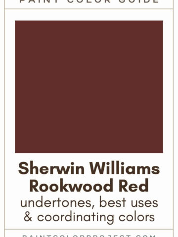
- Benjamin Moore Giant Sequoia
- Behr Red Potato
- Sherwin Williams Bold Brick
- Benjamin Moore Brindle
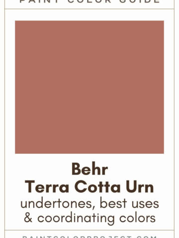
- Behr Terra Cotta Urn
- Sherwin Williams Toile Red
- Benjamin Moore Salmon Stream
Click here to get a peel and stick sample of Southwest Pottery
🤯 Too many color choices?
Download my free Paint Color Planning Quick Start Guide — it’s the exact method I use to help readers choose a color that works the first time.
📥 Grab it here!
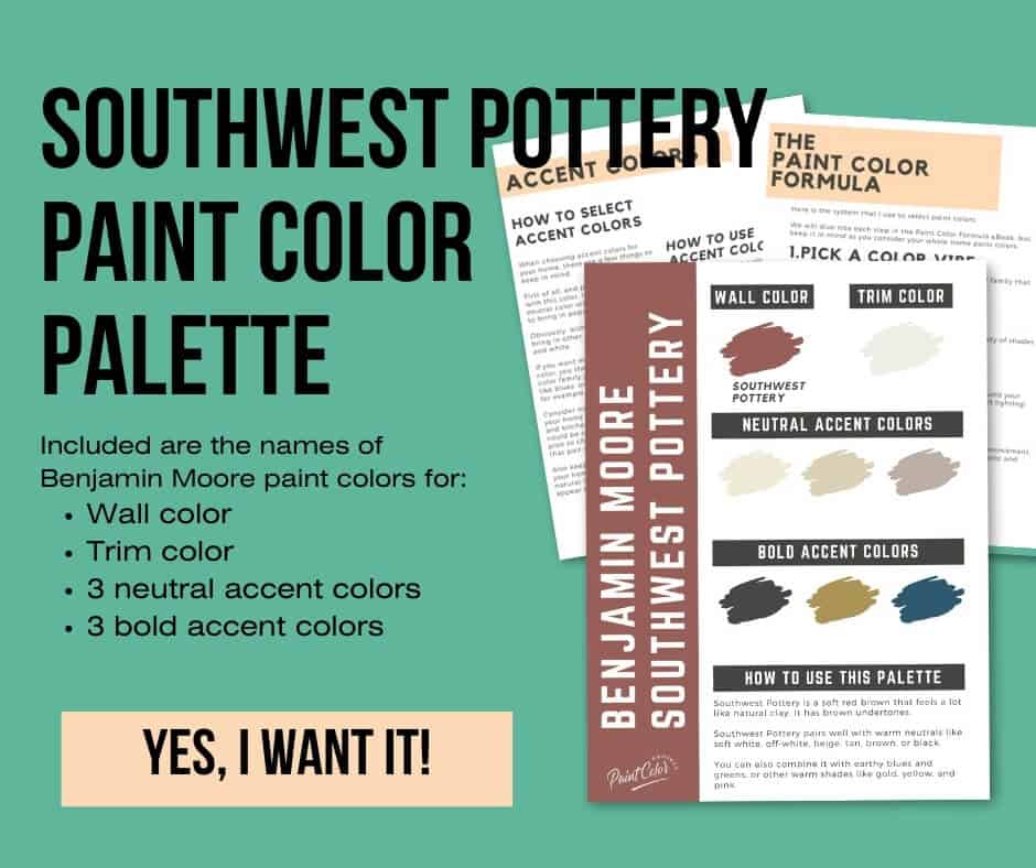
Coordinating Colors
Southwest Pottery pairs well with many other colors, including warm neutrals (soft whites, off-whites, beiges, tans, browns, blacks), earthy tones (blues and greens), and other warm colors (golds, yellows, and pinks).
Golden yellow-greens:
- Egyptian Sand
- Acorn Squash
- Fresh Olive
- Millington Gold
- Renaissance Gold
Creamy off-whites:
- Marble White
- Royal Silk
- Spanish White
- Seashell
- Timid White
Warm neutrals:
- Carrington Beige
- Delaware Putty
- Cream Fleece
- Cayman Islands
- Berber White
Trim Colors
As a warm paint color, Southwest Pottery pairs well with soft white paint colors for trim:
Southwest Pottery color palette
Want to use this paint color in your home? Instantly upgrade your home's aesthetic with our exclusive paint color palette. Unlock the perfect trim color and six stunning accent colors, a combination of neutrals and bold hues for an instantly harmonious space!
Get your perfect paint color palette by clicking here!
Click here to get a peel and stick sample of Southwest Pottery
FAQS
Here are some frequently asked questions about Southwest Pottery.
What color trim goes with Southwest Pottery?
As a warm paint color, BM Southwest Pottery pairs well with soft white paint colors for trim.
Try BM White Dove, SW Alabaster, or Behr Cameo White.
Does Southwest Pottery go with Silhouette?
Yes, Southwest Pottery pairs well with Silhouette, which was named Benjamin Moore's 2026 Color of the Year.
Swatch the two together in your home and see what you think! These two would pair nicely together in a living room, den, home office, or bedroom.
Where to use BM Southwest Pottery?
BM Southwest Pottery is a great way to add subtle color to a space.
Use it for exterior doors, furniture, lower cabinets or a kitchen island, a fireplace, built-ins, shutters, or color drench an entire room with it, such as a bathroom, foyer, or other small room.
What's the difference: BM Southwest Pottery vs Giant Sequoia?
Benjamin Moore Southwest Pottery vs Giant Sequoia are similar dusty red paint colors.
However, Southwest Pottery is slightly lighter, more muted, and more red, whereas Giant Sequoia is a bit darker, more saturated, and more orange.
If you’re torn between the two, try swatching them side by side to see which one feels right in your space.
What is the hex code for BM Southwest Pottery?
The hex code for BM Southwest Pottery is #975F57. This is helpful to have on hand if you're trying to match the color for any digital projects.
What's the difference: BM Southwest Pottery vs SW Bold Brick?
BM Southwest Pottery and SW Bold Brick share many similarities; however, no two paint colors are exactly alike.
Southwest Pottery is slightly lighter and more muted, whereas Bold Brick is a bit darker and more saturated.
Before you go...
So, you've found the perfect paint color, but here's the thing - there's another big decision you have to make: picking the right paint sheen. Seriously, the level of glossiness can totally change how your color looks on the walls and how long the paint lasts!
Check out our complete guide to understanding paint sheens.
Still unsure which paint color is right for your space?
Choosing paint doesn’t have to be stressful! My free Paint Color Planning Quick Start Guide walks you through the exact steps to confidently choose the perfect color — without the overwhelm, second-guessing, or endless swatch testing.
👉 Click here to download the free guide!
DIYing Your Paint Job? Start Here.
Choosing a paint color is only half the equation — the tools you use matter just as much. I’ve rounded up the painting supplies we rely on for clean lines, smooth finishes, and less frustration overall.

My Paint Color Formula course walks you through the painless process of expertly testing paint swatches to ensure you have the perfect color for your home.
The best way to sample paint? Samplize!
Get peel-and-stick removable and reusable paint samples here!
Thanks for reading!

Meg Hemmelgarn is a freelance writer and home decor + DIY blogger who loves to talk about paint colors. She and her husband are currently renovating their third fixer upper. You can see their projects on her blog, Green With Decor.