Looking for the perfect dusty rose paint color for your home? Let’s talk about Benjamin Moore Batik and if it might be right for your home!
If you're looking for a quiet, subtle warmth while staying semi-neutral, a dusty violet rose paint color may be a great choice for you.
These pretty hues add a soft pop of color while blending seamlessly with other neutrals. They can also pair with other soft colors for a more colorful, yet still peaceful, look.
Muted colors like this feel welcoming and cozy but not stark or boring.
Let's talk about the details of one such dusty violet rose, Batik by Benjamin Moore.
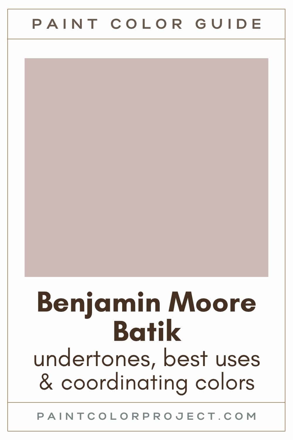
Batik, Benjamin Moore, AF-610
Batik is a dusty violet rose, perfect for adding soft, subtle color to your home.
Click here to get a peel and stick sample of Batik
Color Family
Batik is in the red family.
Light Reflectance Value
50
Light Reflective Value is the measurement of how much light a color bounces around. This is on a scale of 0 to 100 with 0 being pure black and 100 being pure white.
With an LRV of 50, Batik is a light to mid paint color. It’s not overly saturated but still provides some color.
RGB Colors
R: 204 G: 185 B: 181
RGB describes the amount of each color - red, green, and blue - present in a color. This is on a scale of 0 to 255 for each color. This is basically the color mix to make the color!
Hex Code
#CCB9B5

Undertones
Batik has violet, rose, and red undertones.
In south-facing rooms with lots of natural light, Batik will look warmer, more rose / pink, and lighter.
In north-facing rooms that lack natural light, Batik will look cooler, more violet, and darker.
It's very important to swatch colors on your wall to make sure they look good – day and night – in your actual space before committing.
Click here to get removable peel & stick paint samples to easily swatch with!
Best uses
I love using dusty colors like Batik for adding a subtle pop of color. Some of my favorite ways to use it are for:
- Accent walls
- Built-ins & cabinetry
- Interior or exterior doors
- Shutters
- Ceilings
- Furniture
- Small bedrooms
Similar Colors
- Benjamin Moore Homespun Charm
- Behr Smokey Pink
- Sherwin Williams Breathless
- Benjamin Moore Sonoma Clay
- Behr Beloved Pink
- Sherwin Williams Studio Mauve
- Benjamin Moore Victorian Mauve
Click here to get a peel and stick sample of Batik
🤯 Too many color choices?
Download my free Paint Color Planning Quick Start Guide — it’s the exact method I use to help readers choose a color that works the first time.
📥 Grab it here!
Coordinating Colors
Batik pairs beautifully with warm neutrals, such as creamy whites, off-whites, beiges, taupes, tans, greiges, grays, browns, and blacks.
It also pairs well with darker pinks and shades of blue and green.
Warm taupes / greiges:
- Ashley Gray
- River Reflections
- Rockport Gray
- River Gorge Gray
- Waynesboro Taupe
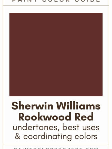
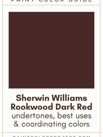
Deep brown-grays:
- Silhouette
- Midsummer Night
- Stone Brown
- Iron Mountain
- Topeka Taupe
Muted mid-toned blues:
- Van Courtland Blue
- Province Blue
- Jamestown Blue
- Water's Edge
- Amsterdam
Trim Colors
As a warm paint color, Batik pairs well with soft white paint colors for trim:
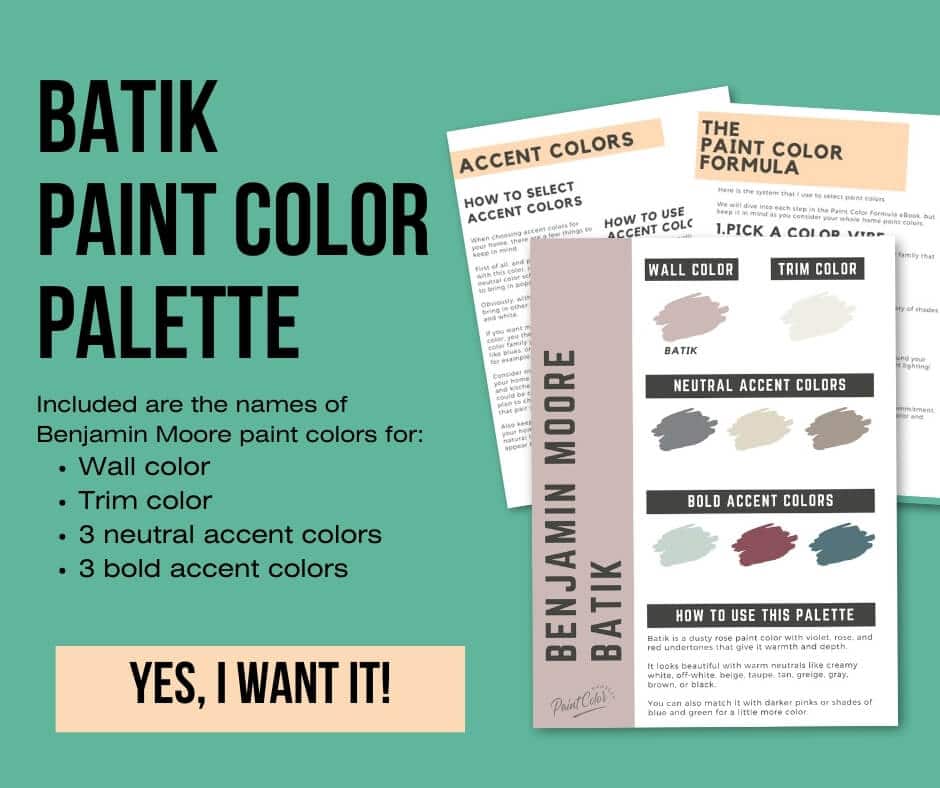
Batik color palette
Want to use this paint color in your home? Instantly upgrade your home's aesthetic with our exclusive paint color palette. Unlock the perfect trim color and six stunning accent colors, a combination of neutrals and bold hues for an instantly harmonious space!
Get your perfect paint color palette by clicking here!
Click here to get a peel and stick sample of Batik
FAQS
Here are some common frequently asked questions about Batik.
What color is Benjamin Moore's Batik?
Batik is a dusty violet rose, perfect for adding soft, subtle color to your home. It will appear more rose in brighter spaces and more violet in darker spaces.
Does Batik look purple?
Benjamin Moore Batik is a dusty violet rose. It won't look solely purple; however, it does lean more violet in darker spaces, such as north-facing rooms or interior rooms.
Give it a swatch in your home to see!
Does Batik go with Silhouette?
Yes, Batik pairs well with Silhouette, which was named Benjamin Moore's 2026 Color of the Year.
Swatch the two together in your home and see what you think! These two would pair nicely together in a living room, den, home office, or bedroom.
What are the undertones of Batik?
Benjamin Moore Batik has violet, rose, and red undertones.
In brighter spaces, such as south-facing rooms, you'll see more of those rose undertones.
In darker spaces, such as north-facing rooms, Batik's violet undertones will be more apparent.
What's the difference: BM Batik vs First Light?
While both Batik and First Light are pink hues, they are different paint colors.
Batik is a dusty violet rose (more purple / red) and First Light is a pale pink (more pink / orange).
Batik is noticeably darker (LRV 50) than First Light(LRV 76).
Both great colors but different vibes! Swatching both colors will help you see the difference and decide which one suits your style best.
What's the difference: BM Batik vs Sonoma Clay?
Batik and Sonoma Clay have very similar red-violet hues and LRVs (50 and 49), making it hard to tell which is lighter or darker.
However, no two paint colors are exactly the same, even if the differences are minor!
Sonoma Clay is a touch more saturated, and Batik is a touch more muted and more violet.
Always swatch colors in your space before making a decision—especially when two colors are this close!
Before you go...
So, you've found the perfect paint color, but here's the thing - there's another big decision you have to make: picking the right paint sheen. Seriously, the level of glossiness can totally change how your color looks on the walls and how long the paint lasts!
Check out our complete guide to understanding paint sheens.
Still unsure which paint color is right for your space?
Choosing paint doesn’t have to be stressful! My free Paint Color Planning Quick Start Guide walks you through the exact steps to confidently choose the perfect color — without the overwhelm, second-guessing, or endless swatch testing.
👉 Click here to download the free guide!
DIYing Your Paint Job? Start Here.
Choosing a paint color is only half the equation — the tools you use matter just as much. I’ve rounded up the painting supplies we rely on for clean lines, smooth finishes, and less frustration overall.

My Paint Color Formula course walks you through the painless process of expertly testing paint swatches to ensure you have the perfect color for your home.
The best way to sample paint? Samplize!
Get peel-and-stick removable and reusable paint samples here!
Thanks for reading!

Meg Hemmelgarn is a freelance writer and home decor + DIY blogger who loves to talk about paint colors. She and her husband are currently renovating their third fixer upper. You can see their projects on her blog, Green With Decor.