Looking for the perfect dark blue paint color for your home? Let me tell you about Benjamin Moore Gentleman's Gray and why it might be the perfect choice for you.
Dark blues have a way of adding just the right mix of drama and sophistication to a room.
They bring depth and a touch of elegance that's hard to beat.
I’ve always loved how versatile dark blues are. They work beautifully with so many different colors and finishes, making them a great option if you want something bold but still easy to coordinate.
So, I’ve chosen to do a review of Gentleman's Gray by Benjamin Moore. This rich, deep blue is just shy of navy blue. It'll add character and a sense of calm to any space.
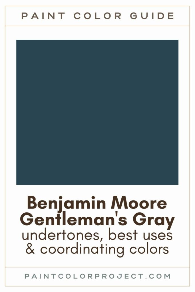
Gentleman's Gray, Benjamin Moore 2062-20
Gentleman’s Gray is a blackened teal blue that’s just shy of navy.
It’s perfect if you’re looking to add some dramatic sophistication to your space.
Click here to get a peel and stick sample of Gentleman's Gray
Color Family
This color sits in the blue family, but with its unique blend, it’s not your average blue.
Light Reflectance Value
7
Light Reflective Value (LRV) measures how much light a color reflects. It’s on a scale from 0 to 100, where 0 is pure black and 100 is pure white.
With an LRV of 7, Gentleman's Gray is an extremely dark paint color.
In my experience, it’s lighter than some of the deepest blues out there, but it still packs plenty of richness.
RGB Colors
R: 48 G: 70 B: 86
These numbers break down how much red, green, and blue make up the color. It’s the mix that creates this deep, moody blue.
Hex Code
#304656

Undertones
Gentleman's Gray is a dark teal blue with subtle charcoal undertones.
In south-facing rooms with lots of natural light, you'll notice Gentleman's Gray look a bit warmer and brighter, with more of a blue or even slight teal hue.
On the other hand, in north-facing rooms with less natural light, it tends to lean cooler and darker, sometimes appearing almost navy or even black in the corners. Occasionally, you might catch a hint of purple in those darker spaces.
Because of these shifts in color, I always recommend swatching Gentleman’s Gray in your space to see how it plays with your lighting throughout the day. You want to know exactly how it'll look in your home.
I like to use dark paint colors like Gentleman’s Gray for a variety of spaces and purposes.
It's especially good for walls of a room you want to feel cozier such as a bedroom, living room, or den. Or try just painting the trim and moldings for a quick dash of sophistication.
I also like to use dark paint colors like Gentleman's Gray for:
- Creating a focal point, like a fireplace
- Built-ins for added drama
- Cabinets or a kitchen island
- An accent wall that stands out
- Interior or exterior doors
- Shutters
- Furniture pieces that need a bold update
It could even work as a home exterior paint if you're looking to make a bold statement.
Similar Colors
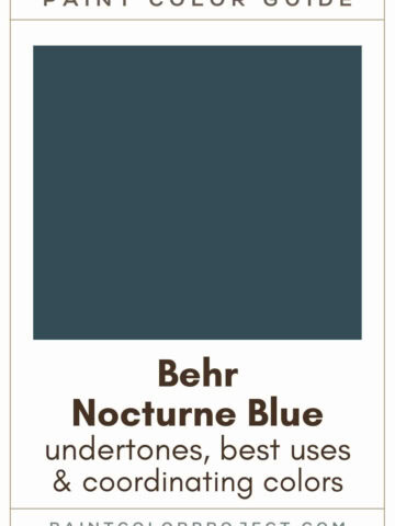
- Benjamin Moore Twilight
- Behr Midnight Dream
- Sherwin Williams Gale Force
- Benjamin Moore Blue Note
- Benjamin Moore Hudson Bay
- Behr Very Navy
- Sherwin Williams Sea Serpent
Click here to get a peel and stick sample of Gentleman's Gray
Coordinating Colors
Gentleman's Gray is so dark it can be considered a neutral – therefore it pairs well with many other colors!
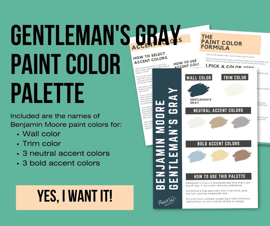
I like to pair Gentleman's Gray with crisp white, gray, and tan, creating a balanced look.
For a bit more contrast, try pairing it with soft blues, light yellows, or even a touch of pink or orange.
Mid-toned grays:
- Stormy Monday
- Silver Dollar
- Baltic Gray
- Nightingale
- Fusion
Soft blue-grays:
- Wedgewood Gray
- Smoke
- Sheer Romance
- Yarmouth Blue
- Palladian Blue
Mid-toned tans:
- Lenox Tan
- Fairway Oaks
- Coastal Path
- Oak Ridge
- Greenbrier Beige
Trim Colors
For trim, I recommend a bright, crisp white to complement the rich tones of Gentleman’s Gray.
This contrast helps the color stand out while keeping the overall look fresh and clean.
- Benjamin Moore Simply White
- Sherwin Williams Extra White
- Behr Ultra Pure White
Gentleman's Gray Paint Color Palette
Want to use this paint color in your home? Instantly upgrade your home's aesthetic with our exclusive paint color palette. Unlock the perfect trim color and six stunning accent colors, a combination of neutrals and bold hues for an instantly harmonious space!
Get your perfect paint color palette by clicking here!
Click here to get a peel and stick sample of Gentleman's Gray
FAQs
Here are some common frequently asked questions about Gentleman's Gray.
What’s the difference: BM Gentleman’s Gray vs Hale Navy?
Hale Navy is a true navy paint color with subtle gray undertones, while Gentleman’s Gray is a blackened shade of teal blue.
Hale Navy tends to look a bit grayer and more muted, whereas Gentleman’s Gray is bluer and more saturated.
Despite its name, Gentleman’s Gray has a hint of teal that makes it unique.
Both are dark paint colors, with Hale Navy having an LRV of 8 and Gentleman’s Gray slightly darker at 7.
If you’re deciding between the two, I’d recommend swatching them in your space to see which one suits your lighting and style best.

Is Gentleman’s Gray a good exterior paint choice?
Yes, deep blues like Gentleman’s Gray work wonderfully for exteriors.
I’ve seen it hold its color beautifully outside, looking dark enough to make a statement but still rich and vibrant.
Surrounded by natural light, it appears lighter and more blue, which can give your home a fresh, bold look.
Pair it with white, tan, or gray trim, or even natural wood, stone, or brick, for a versatile exterior.
But remember, it’s always a good idea to swatch it on your exterior to see how it looks in different lighting throughout the day.
What is the color code for Gentleman’s Gray?
The Benjamin Moore color code for Gentleman’s Gray is 2062-20.
Its hex code is #304656, which is perfect if you’re trying to match it for any digital project.
Does Gentleman’s Gray look gray?
Despite its name, Gentleman’s Gray is more of a very dark teal blue than a true gray.
In rooms with lots of natural light, it can even look slightly teal.
In darker spaces, it tends to lean toward a deep blue, almost black in the corners.
To really see how it behaves, I always recommend swatching the color in your room and watching how it shifts throughout the day.
What’s the difference: BM Gentleman’s Gray vs Farrow & Ball Hague Blue?
Gentleman’s Gray is definitely bluer, while Hague Blue leans greener.
Gentleman’s Gray is also more saturated, while Hague Blue has a more muted, traditional look.
Both are gorgeous dark blues with an LRV of 7, so they reflect about the same amount of light.
If you’re torn between them, I’d suggest swatching both in your space to see which one feels right.

What’s the difference: BM Gentleman’s Gray vs Newburyport Blue?
Gentleman’s Gray (LRV 7) is darker and more intense than Newburyport Blue (LRV 10).
Newburyport Blue has a bit more green in its undertones, giving it a slightly different vibe.
If you’re unsure, swatch them side by side to see how they compare in your room’s lighting.

What’s the difference: BM Gentleman’s Gray vs Twilight?
Gentleman’s Gray and Twilight are very similar dark blues, but there are subtle differences.
Gentleman’s Gray is slightly lighter with an LRV of 7.26, while Twilight is a touch darker at 6.84.
I find Gentleman’s Gray to be more saturated, while Twilight has a more muted tone.

When colors are this close, swatching them in your space is the best way to make sure you pick the right one.
Before you go...
So, you've found the perfect paint color, but here's the thing - there's another big decision you have to make: picking the right paint sheen. Seriously, the level of glossiness can totally change how your color looks on the walls and how long the paint lasts!
Check out our complete guide to understanding paint sheens.
Still unsure which paint color is right for your space?
Choosing paint doesn’t have to be stressful! My free Paint Color Planning Quick Start Guide walks you through the exact steps to confidently choose the perfect color — without the overwhelm, second-guessing, or endless swatch testing.
👉 Click here to download the free guide!
DIYing Your Paint Job? Start Here.
Choosing a paint color is only half the equation — the tools you use matter just as much. I’ve rounded up the painting supplies we rely on for clean lines, smooth finishes, and less frustration overall.

My Paint Color Formula course walks you through the painless process of expertly testing paint swatches to ensure you have the perfect color for your home.
The best way to sample paint? Samplize!
Get peel-and-stick removable and reusable paint samples here!
Thanks for reading!

Meg Hemmelgarn is a freelance writer and home decor + DIY blogger who loves to talk about paint colors. She and her husband are currently renovating their third fixer upper. You can see their projects on her blog, Green With Decor.