If you’re searching for a rich, deep green paint color, Sherwin Williams Privilege Green might just be the one you're looking for.
Deep greens usually remind me of olives, herbs, or eucalyptus leaves. They feel bold and dramatic, but also quite calm and cozy once they’re on the wall. I think it's this balance that makes them really appealing.
Privilege Green has that same inviting depth without making a room feel heavy. It’s a gorgeous choice for living rooms, foyers, dens, or any space where you want a welcoming feel.
Deep greens are also amazingly versatile. They fit right into traditional homes, but they also look great in more modern spaces.
Like all greens, Privilege Green shifts depending on its undertones. Some deep greens lean cool with a blue cast, while others feel warmer and more golden.
Because these little details can change everything, let’s take a closer look at Privilege Green and see if it’s the right shade for your space.
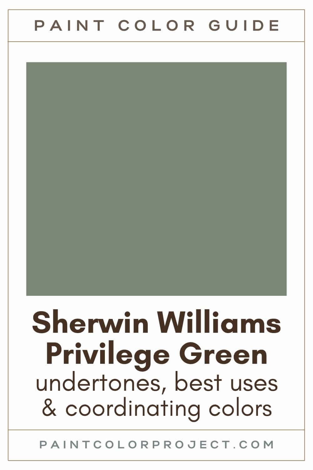
Privilege Green, Sherwin Williams, SW 6193
Privilege Green is a cool, deep green, bringing a peaceful, organic feel to any space. Privilege Green feels welcoming without being too bold.
Click here to get a peel and stick sample of Privilege Green
Color Family
Privilege Green is in the green family.
Light Reflectance Value
23
Light Reflectance Value tells you how much light a paint color reflects on a scale from 0 to 100. Zero is pure black and 100 is pure white.
With an LRV of 23, Privilege Green is a medium to dark paint color. It keeps its rich color in most rooms, but you might notice small shifts depending on the lighting.
RGB Colors
R: 122 G: 135 B: 117
RGB values show how much red, green, and blue make up a color. Each number ranges from 0 to 255 and helps give you a sense of the formula behind the shade.
Hex Code
#7A8775

Undertones
Privilege Green has slight blue-gray undertones, though is does lean a bit warmer than most other similar greens.
In south-facing rooms with lots of sunlight, Privilege Green looks a bit warmer and more green.
In north-facing rooms that don't have as much natural light, you’ll notice more of Privilege Green's blue-gray undertones coming through.
This is why it's so important to swatch colors on your wall to make sure they look good – day and night – in your actual space before committing.
Click here to get removable peel & stick paint samples to easily swatch with!
Best Uses
I like to use darker paint colors like Privilege Green for:
- Walls of a room you want to feel cozier such as a bedroom, living room, den, or home office (you can even paint the trim and moldings for a more sophisticated feel)
- Creating a focal point, such as a fireplace
- Built-ins
- Kitchen cabinets
- Interior or exterior doors
- Home exterior
- Shutters
- Accent wall
- Furniture
Similar Colors
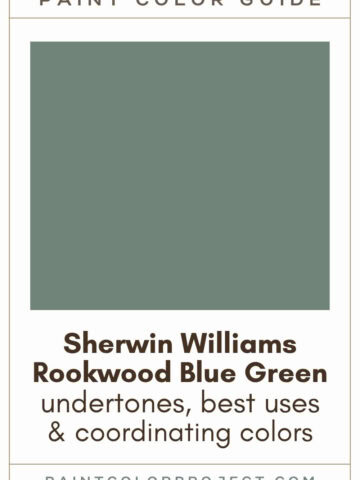
- Sherwin Williams Rookwood Blue Green
- Benjamin Moore Lush
- Behr Thai Basil
- Sherwin Williams Dried Thyme
- Benjamin Moore Cambridge Green
- Behr Sage Green
- Sherwin Williams Retreat
Click here to get a peel and stick sample of Privilege Green
🤯 Too many color choices?
Download my free Paint Color Planning Quick Start Guide — it’s the exact method I use to help readers choose a color that works the first time.
📥 Grab it here!
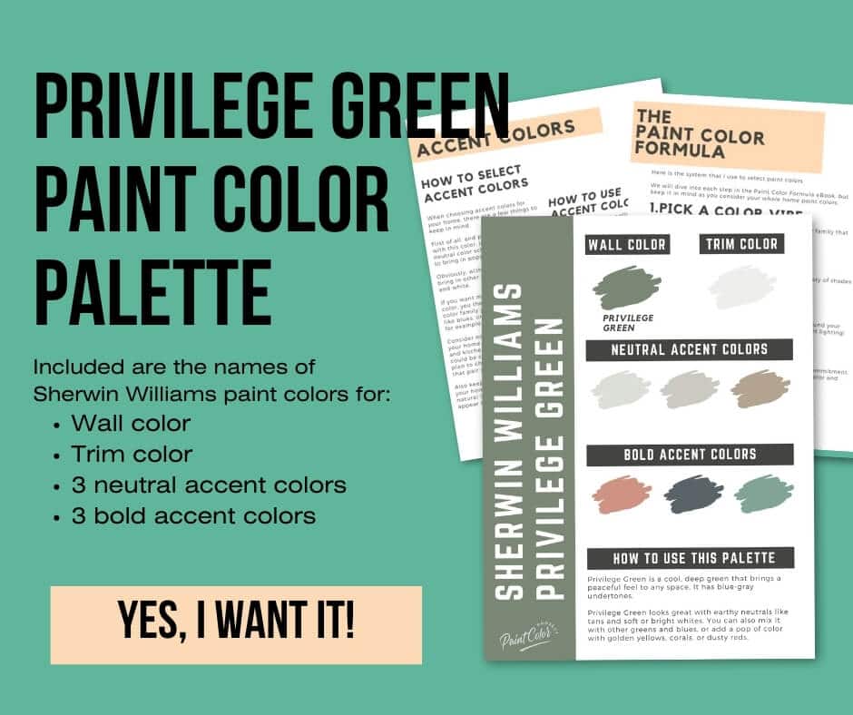
Coordinating Colors
Privilege Green pairs well with other earth tones. Pair it with neutrals such as tans or whites (bright or soft).
Privilege Green also pairs well with greens and blues. You could also pair Privilege Green with golden yellows, corals, or dusty reds.
Blue-green pastels:
- Opaline
- Glimmer
- Window Pane
- Fleeting Green
- Topsail
Warm grays:
- Repose Gray
- Agreeable Gray
- Anew Gray
- Useful Gray
- Analytical Gray
Slate blues:
- Grays Harbor
- Outerspace
- Gibraltar
- Night Out
- Granite Peak
Trim Colors
Privilege Green pairs well with most shades of white paint. Choose a warm or cool trim style depending on your decor and what feel you want for your space.
For a more earthy, organic feel, choose a soft white.
For a more crisp feel, choose a bright white.
- Benjamin Moore Simply White
- Sherwin Williams Extra White
- Behr Ultra Pure White
Privilege Green Paint Color Palette
Want to use this paint color in your home? Instantly upgrade your home's aesthetic with our exclusive paint color palette. Unlock the perfect trim color and six stunning accent colors, a combination of neutrals and bold hues for an instantly harmonious space!
Get your perfect paint color palette by clicking here!
Click here to get a peel and stick sample of Privilege Green
FAQs
Here are some common frequently asked questions about Privilege Green.
What goes with Privilege Green?
Privilege Green works beautifully with earthy tones. I love pairing it with tans, soft or bright whites, greens, or muted blues. It also plays nicely with golden yellows, corals, or dusty reds if you want a bit more personality.
If you want a few easy starting points, try sampling it next to Sherwin Williams Opaline for a soft pastel contrast, Sherwin Williams Repose Gray for a warm gray pairing, or Sherwin Williams Grays Harbor for a deep slate blue look.


What is the undertone of Privilege Green?
Privilege Green has a cool blue gray undertone. Even with that cool base, it still feels slightly warmer than many other greens in the same family.
In sunny rooms, you will see more of the green come through. In darker rooms, you'll notice the blue gray undertone more. Once you compare a few swatches in your own lighting, the shift is much easier to see.
What is the difference between Privilege Green and Evergreen Fog?
Privilege Green is darker with an LRV of 23, while Evergreen Fog is lighter with an LRV of 30.
Privilege Green is more green and more saturated. Evergreen Fog is softer, more muted, and has a stronger yellow influence.
Evergreen Fog was the Sherwin Williams Color of the Year in 2022, but popularity alone does not mean it will be the best fit for your home. Swatching both is the easiest way to see which one works with your space.

Is Privilege Green a good cabinet color?
Yes, Privilege Green can look beautiful on kitchen cabinets. It brings a warm, relaxed feel to a kitchen without feeling too heavy. I especially love it on lower cabinets or a kitchen island if you want depth without committing to a full room of dark green.
In bright kitchens, it leans warm and noticeably green. In darker kitchens, the blue gray undertone becomes stronger.
Is Privilege Green warm or cool?
Privilege Green is a cool green because of its blue gray undertones. Warm greens usually have yellow in them.
Even so, it still feels balanced enough to pair with both soft whites and crisp whites. It is one of those greens that works in a surprising number of homes, but you will see its true personality best when you compare it to other colors in your space.
What is the difference between Privilege Green and Rookwood Blue Green?
Rookwood Blue Green is darker, with an LRV of 21 compared to Privilege Green at 23. Privilege Green leans more green, and Rookwood Blue Green leans more yellow.
Both are beautiful options if you love rich, moody greens. A quick side by side swatch test will help you decide which shade feels right for your home.

Before you go...
So, you've found the perfect paint color, but here's the thing - there's another big decision you have to make: picking the right paint sheen. Seriously, the level of glossiness can totally change how your color looks on the walls and how long the paint lasts!
Check out our complete guide to understanding paint sheens.
Still unsure which paint color is right for your space?
Choosing paint doesn’t have to be stressful! My free Paint Color Planning Quick Start Guide walks you through the exact steps to confidently choose the perfect color — without the overwhelm, second-guessing, or endless swatch testing.
👉 Click here to download the free guide!
DIYing Your Paint Job? Start Here.
Choosing a paint color is only half the equation — the tools you use matter just as much. I’ve rounded up the painting supplies we rely on for clean lines, smooth finishes, and less frustration overall.

My Paint Color Formula course walks you through the painless process of expertly testing paint swatches to ensure you have the perfect color for your home.
The best way to sample paint? Samplize!
Get peel-and-stick removable and reusable paint samples here!
Thanks for reading!

Meg Hemmelgarn is a freelance writer and home decor + DIY blogger who loves to talk about paint colors. She and her husband are currently renovating their third fixer upper. You can see their projects on her blog, Green With Decor.