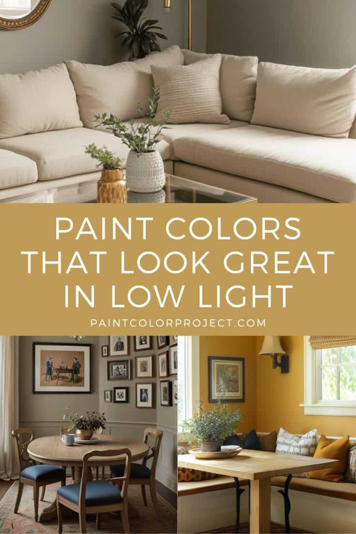
Looking for paint colors that look great in low light? These picks from Sherwin Williams, Benjamin Moore, and Behr are warm, rich, and reflective enough to bring life to darker spaces.
Not every room gets loads of sunlight, and that’s okay. A darker corner or a north-facing space doesn’t have to feel gloomy. The right paint color can turn it into something warm, cozy, and full of personality.
I’ve seen it work in all kinds of spots, small hallway, finished basements, even bedrooms that only catch a bit of morning light. The right shade makes them feel alive instead of dull.
So if you’ve got a room that struggles with natural light, don’t worry.
I’ve rounded up some of the best paint colors for low-light spaces and how they can transform your home.
What Makes a Paint Color Work in Low Light?
The trick is choosing colors that either bounce around the little light you do have or stay rich and full even in dim spaces.
Here are a few things to keep in mind:
- Warm undertones feel cozy and bright, instead of cold or shadowy.
- Mid-tones perform better than super light or super dark shades, keeping their character in any lighting.
- Muted tones with a little depth can come alive in low light, while stark, crisp whites can sometimes fall flat.
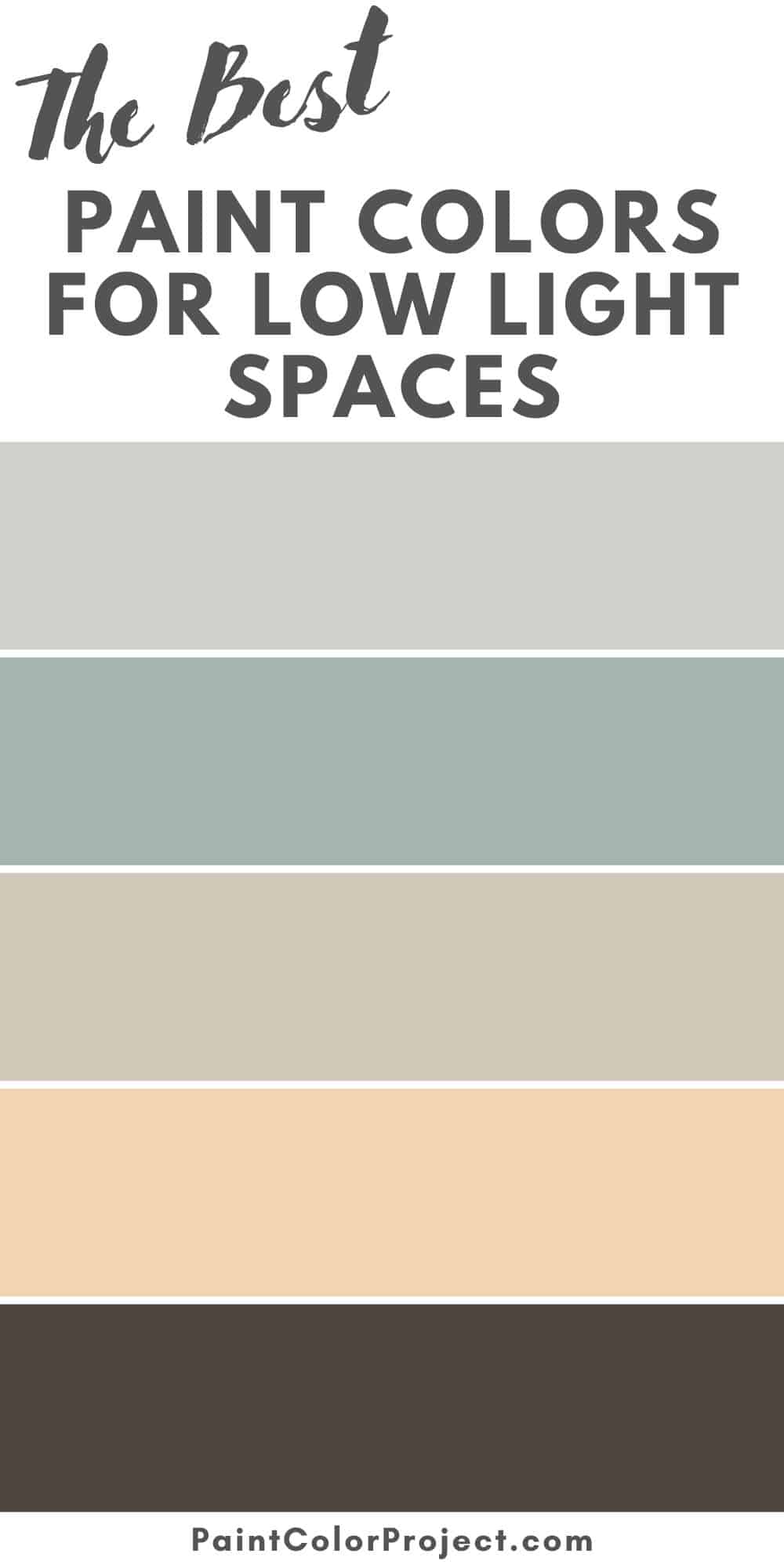
The Best Paint Colors for Low Light Spaces
Here are my top paint color picks for dark spaces, broken down by color family.
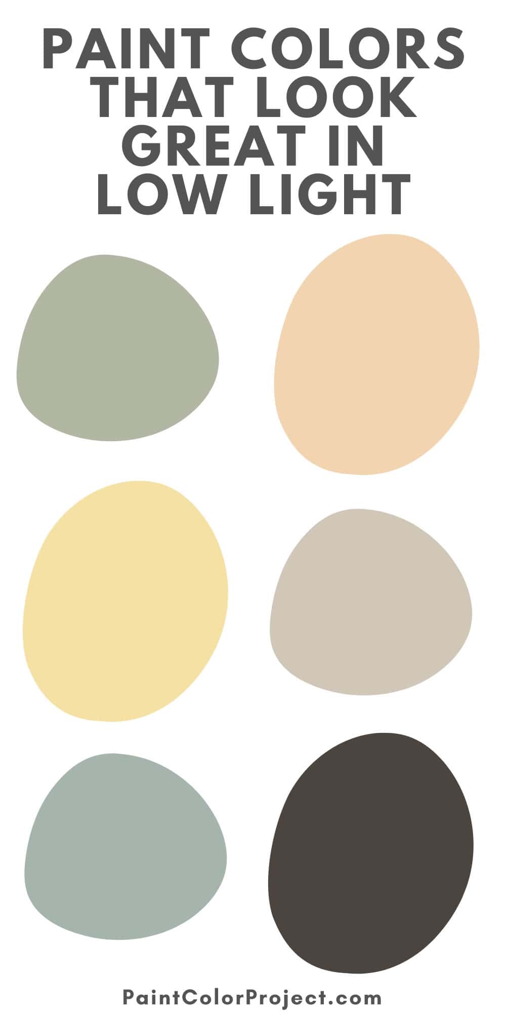
Warm Light Neutrals
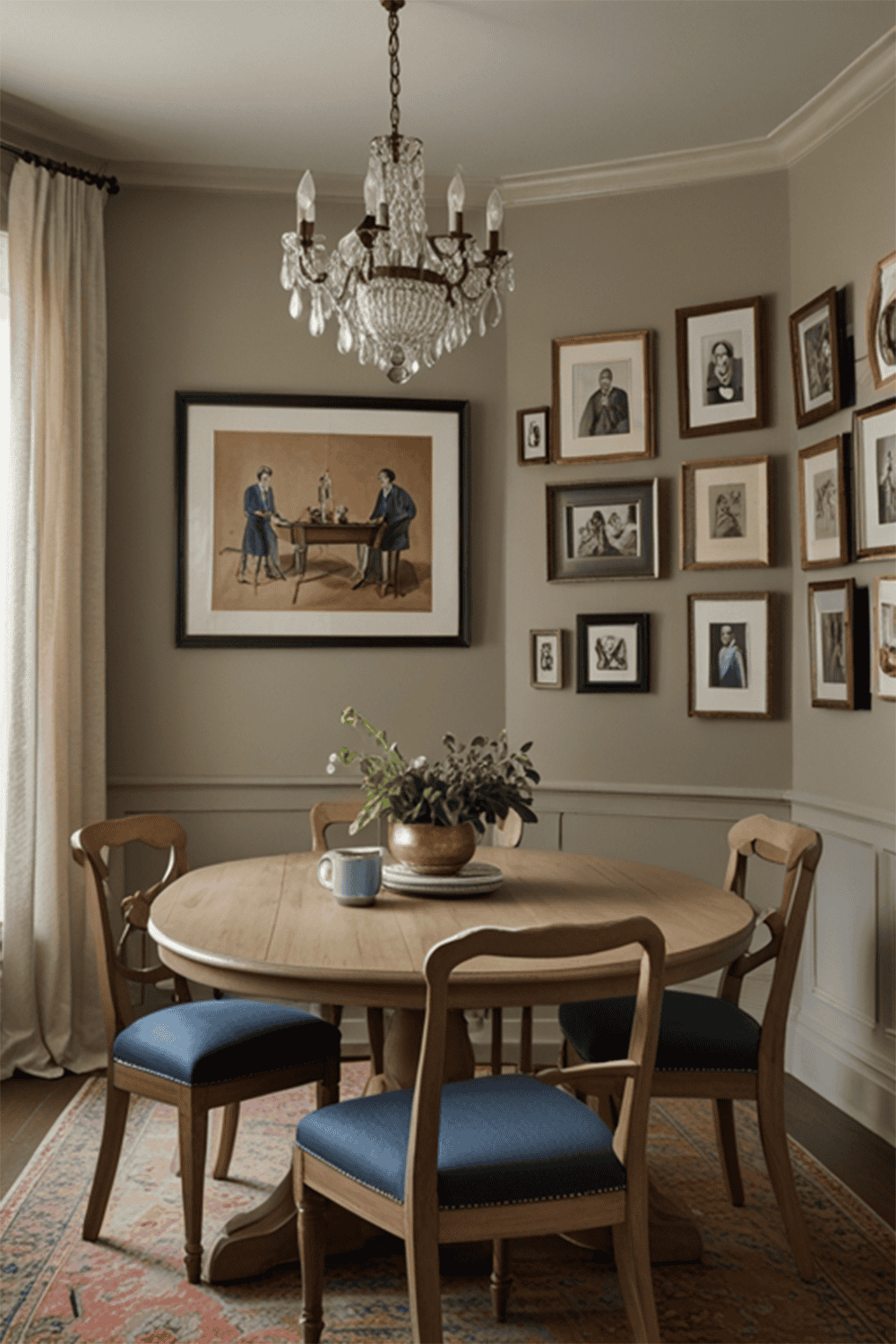
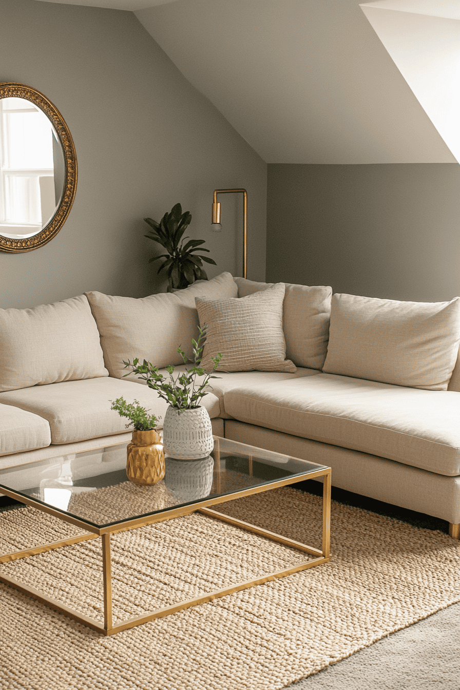
Warm neutrals are great for darker rooms. They reflect the little light that’s there and keep the space feeling cozy instead of cold.
- Accessible Beige – Sherwin Williams
A warm, cozy greige that never feels too dark or too yellow. Perfect for living rooms or bedrooms. - Pale Oak – Benjamin Moore
A soft taupe with warmth that adapts well in low light. It gives off a creamy, welcoming feel. - Wheat Bread – Behr
A light greige with warmth that stays soft and inviting even in dim spaces.


Rich, Cozy Midtones
Deeper midtones keep their color even when light is limited. They create a moodier feel while still keeping the space comfortable.
- Urbane Bronze – Sherwin Williams
A deep, earthy bronze that feels luxe and cozy. Works beautifully on accent walls or in small dens. - Revere Pewter – Benjamin Moore
A classic greige that holds its warmth and sophistication in low light. - Espresso Beans – Behr
A rich brown with red undertones that keeps its vibrancy in dim spaces. Perfect for a moody, dramatic look.


Soft Yellows & Golds
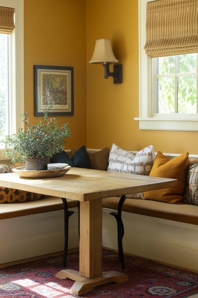
Sunny yellows and golds brighten up darker rooms and make them feel cheerful and inviting.
- Inviting Ivory – Sherwin Williams
A creamy yellow that adds warmth and light to shadowy rooms without feeling too strong. - Hawthorne Yellow – Benjamin Moore
A timeless yellow that brings energy and charm to dim spaces like hallways or kitchens. - Corn Stalk – Behr
A soft yellow-beige blend that warms up walls and pairs beautifully with natural textures.


Muted Greens & Blues
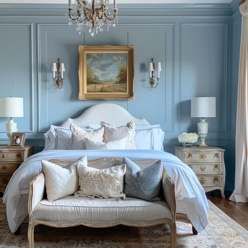
Earthy greens and blues keep their depth in low light. They bring calm and softness without ever looking washed out.
- Sea Salt – Sherwin Williams
A gentle mix of green, blue, and gray that works beautifully in bathrooms and bedrooms. - Saybrook Sage – Benjamin Moore
A muted sage green that feels grounded and rich. Perfect for adding dimension to low-light rooms. - Smoky Slate – Behr
A dusty blue-gray with a hint of green. Cozy and calming, especially for offices or dens.


Low-light rooms don’t have to feel dull. Sometimes a darker, moodier color can actually make them feel cozy and inviting, like a reading nook or a spa-style powder room.
No matter your style, there’s a paint color out there that can make your low-light space feel just right.
Need more help picking the perfect color?
The Paint Color Formula takes the guesswork out of choosing the right paint. This digital guide walks you step-by-step through picking a color that works with your lighting, furnishings, and personal style.
Still unsure which paint color is right for your space?
Choosing paint doesn’t have to be stressful! My free Paint Color Planning Quick Start Guide walks you through the exact steps to confidently choose the perfect color — without the overwhelm, second-guessing, or endless swatch testing.
👉 Click here to download the free guide!
DIYing Your Paint Job? Start Here.
Choosing a paint color is only half the equation — the tools you use matter just as much. I’ve rounded up the painting supplies we rely on for clean lines, smooth finishes, and less frustration overall.

My Paint Color Formula course walks you through the painless process of expertly testing paint swatches to ensure you have the perfect color for your home.
The best way to sample paint? Samplize!
Get peel-and-stick removable and reusable paint samples here!
Thanks for reading!

Morgan is passionate about home decor and paint colors. She has been sharing DIY home decor tips since 2012 at CharlestonCrafted.com. From there, she learned to love paint colors, and the Paint Color Project was born in 2022!