70s style paint colors are making a big comeback. Think cozy, earthy shades that feel vintage yet perfectly at home today.
I'm loving that 70s paint colors are making a comeback. They’re earthy, cozy, and bring just enough retro flair without feeling outdated.
And honestly, it’s exciting to see them trending again.
But don't panic. You don't have to bring back avocado-colored appliances or shag carpets unless that's your thing.
Today’s version of 70s style feels fresh, cozy, and perfectly modern.
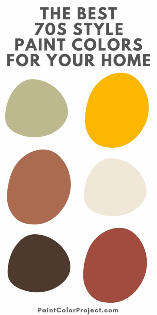
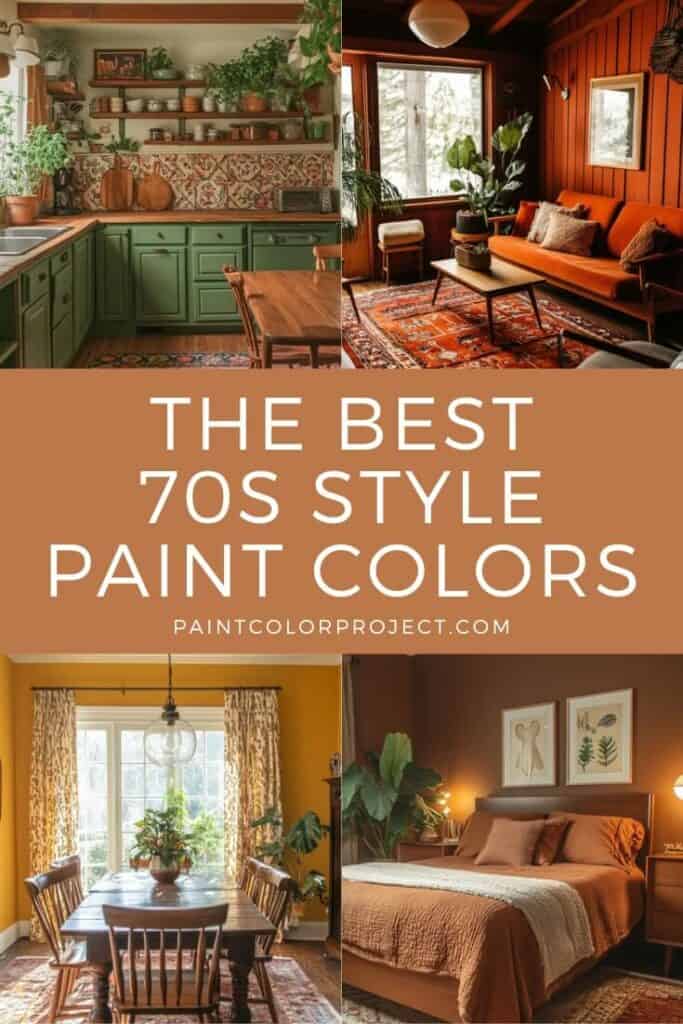
Colors like burnt orange, olive green, and golden yellow add such warmth and character. I find these colors make any space cozy and welcoming.
So whether you’re diving head-first into retro or just adding a playful touch, these 70s-inspired colors are a great place to start.
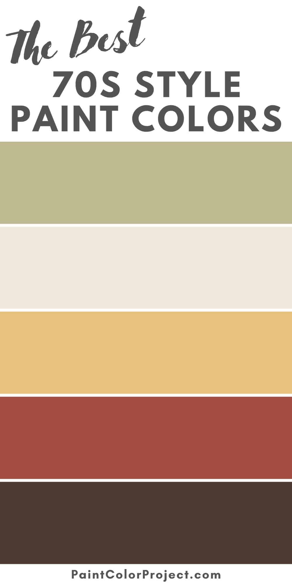
70s Style Paint Colors for Your Home
Here are the top paint colors to get the 70s look, broken down by color family.
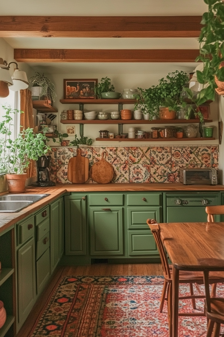
Earthy Greens & Avocado-Inspired Hues
These greens are pure 70s in the best way. They feel grounded and natural, perfect for kitchens, bathrooms, or even a bold front door.
Saguaro – Sherwin-Williams
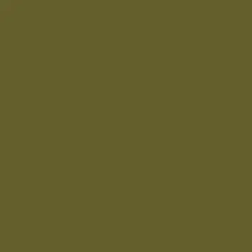
This muted green has a cozy warmth and a subtle yellow undertone. I've used Saguaro before, and it creates a charming vintage vibe.
Back to Nature – Behr

A soft olive that's calming and natural. Back to Nature feels perfect for cabinetry or for creating a relaxing atmosphere in your room.
Vintage Vogue – Benjamin Moore

Vintage Vogue is a rich, moody green with subtle gray undertones. It's bold yet timeless and perfect if you're after a sophisticated look.
Burnt Oranges & Rust Tones
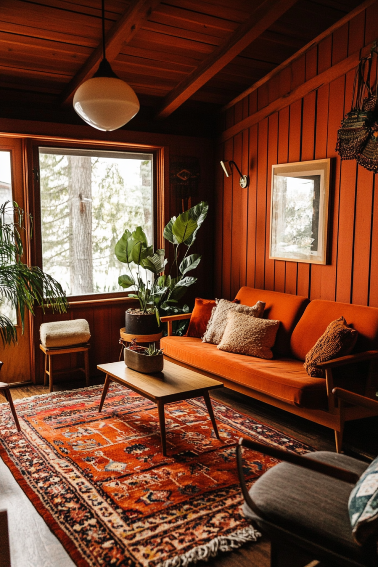
These colors remind me of a warm sunset. Burnt orange and rust bring instant energy to a room and feel so nostalgic.
I love using them in dining areas or as a bold accent wall. They're fun without being too loud.
Cavern Clay – Sherwin-Williams

This rich terracotta brings so much warmth to a space. Cavern Clay feels earthy and bold, especially in rooms with natural light or wood tones.
Amber Autumn – Behr

Amber Autumn is a deep orange-brown that adds drama without being too loud. I think it’s perfect for cozy dining rooms or bold accents.
Terra Cotta Tile – Benjamin Moore

Warm, saturated, and full of personality. Terra Cotta Tile reminds me of a vintage armchair. It’s inviting, stylish, and a little bit nostalgic.
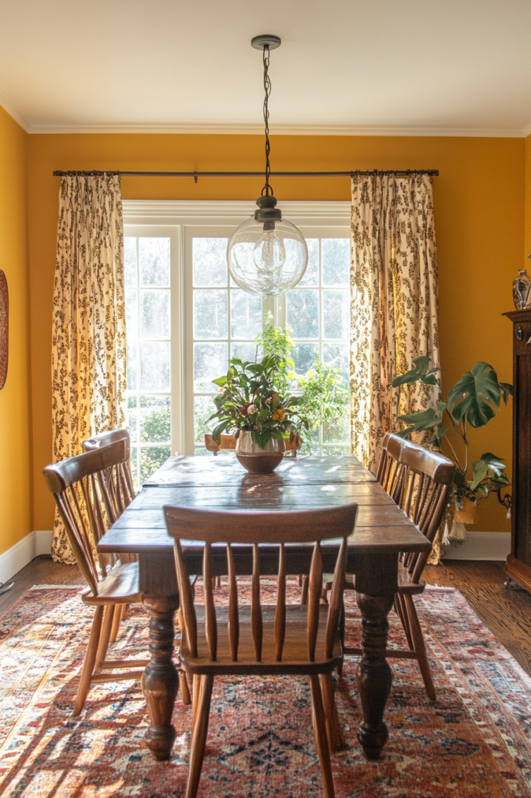
Warm Golds & Mustard Yellows
Mustard yellow always gives me that retro vibe. These warm golds bring sunshine into your space, especially next to dark wood or vintage furniture.
Goldfinch – Sherwin-Williams

Goldfinch is a rich, mustard-toned yellow that feels bold and cheerful. I love how it adds energy without being too bright or loud.
Classic Gold – Behr
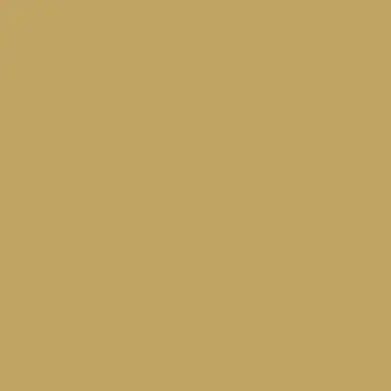
This warm mid-tone gold has a soft, vintage feel. Classic Gold works beautifully in retro spaces but still feels relaxed and easy to live with.
York Harbor Yellow – Benjamin Moore

York Harbor Yellow is soft and muted with just enough gold. It adds charm and warmth without taking over the whole room.
Cocoa Browns & Caramel Neutrals
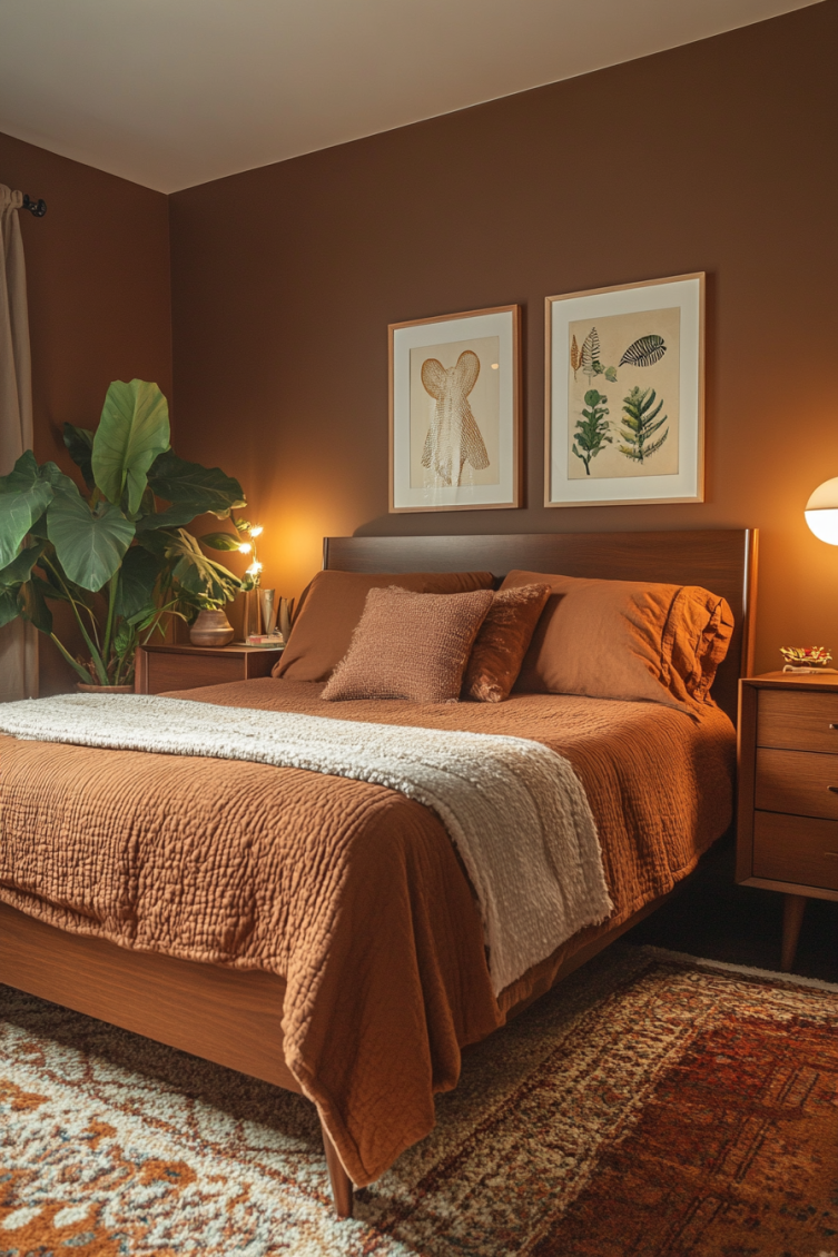
If you want something cozy and grounding, these browns are it. Cocoa and caramel tones help balance brighter colors and add depth.
Turkish Coffee – Sherwin-Williams

This deep brown feels rich and dramatic. Turkish Coffee is one of those colors that looks stunning on trim, doors, or moody furniture pieces.
Toasty Gray – Behr

Toasty Gray is a soft caramel-taupe with a warm undertone. It pairs really well with retro shades like avocado green and golden yellow.
Fairview Taupe – Benjamin Moore

Fairview Taupe is a cozy mix of brown and beige. It adds depth and warmth to a room without making the space feel too dark.
Soft Creams & Retro Off-Whites
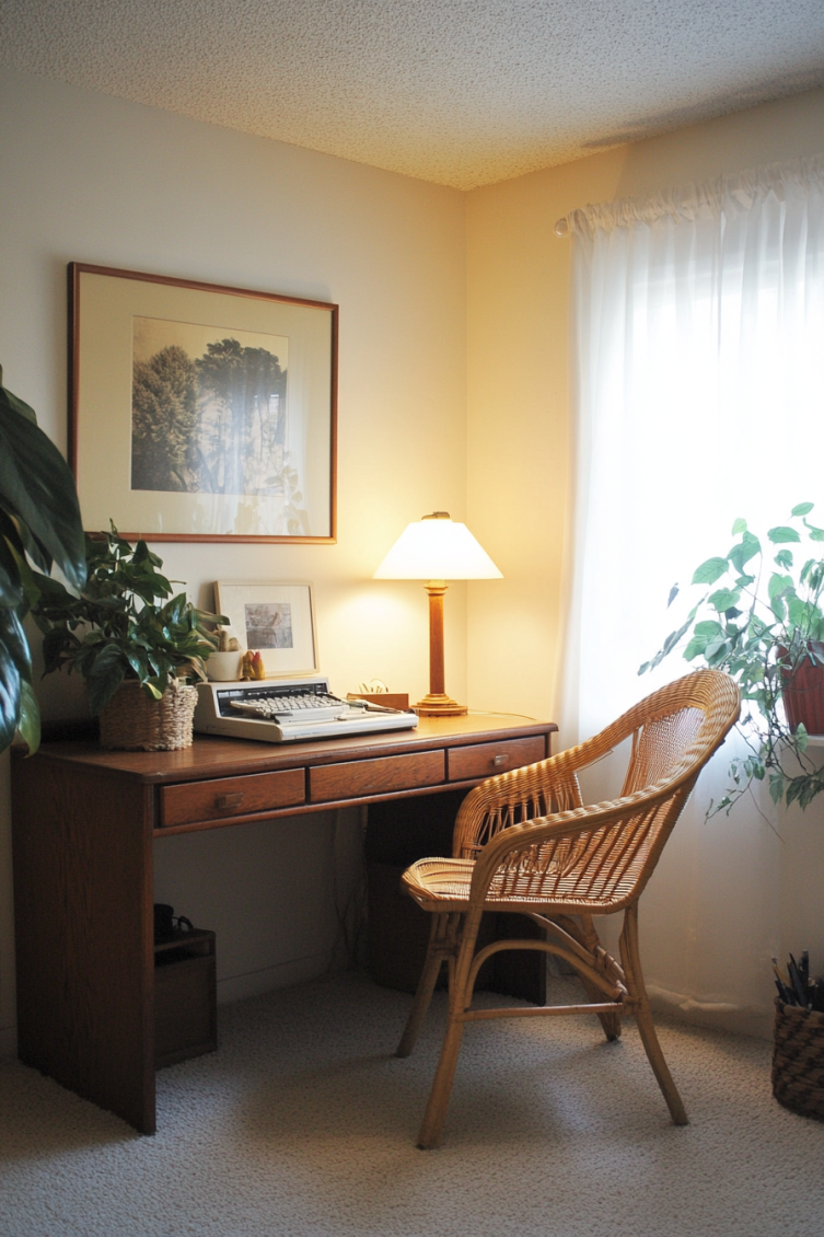
These creamy neutrals are great for softening the look of any room. They pair nicely with bolder shades and add that cozy 70s warmth.
I love using them on trim or even as a main wall color when I want something subtle but still warm.
Parchment Paper – Behr

Parchment Paper is a warm off-white with soft yellow undertones. It reminds me of vintage paper and brings a gentle, cozy feel to any room.
Creamy – Sherwin-Williams

This buttery neutral works with just about everything. Creamy adds warmth without stealing the spotlight and softens bolder 70s-inspired shades.
Navajo White – Benjamin Moore

Navajo White is a true classic. Warm, creamy, and full of charm, it still feels timeless and easy to decorate with after all these years.
Final Thoughts on 70s Paint Colors
There’s a reason these shades are back. They're warm, inviting, and full of charm. Whether you're going all-in or just trying a little retro touch, 70s paint colors add personality and comfort to any space.
I’ve used a few in my own home, and they always make the room feel more lived-in and relaxed.
Need More Help?
Check out The No-Fail Paint Color Jumpstart. It’s an easy way to stop second-guessing and feel more confident picking colors. I recommend it if you're stuck or just need a little boost.
Still unsure which paint color is right for your space?
Choosing paint doesn’t have to be stressful! My free Paint Color Planning Quick Start Guide walks you through the exact steps to confidently choose the perfect color — without the overwhelm, second-guessing, or endless swatch testing.
👉 Click here to download the free guide!

My Paint Color Formula course walks you through the painless process of expertly testing paint swatches to ensure you have the perfect color for your home.
The best way to sample paint? Samplize!
Get peel-and-stick removable and reusable paint samples here!
Thanks for reading!
Morgan is passionate about home decor and paint colors. She has been sharing DIY home decor tips since 2012 at CharlestonCrafted.com. From there, she learned to love paint colors, and the Paint Color Project was born in 2022!


