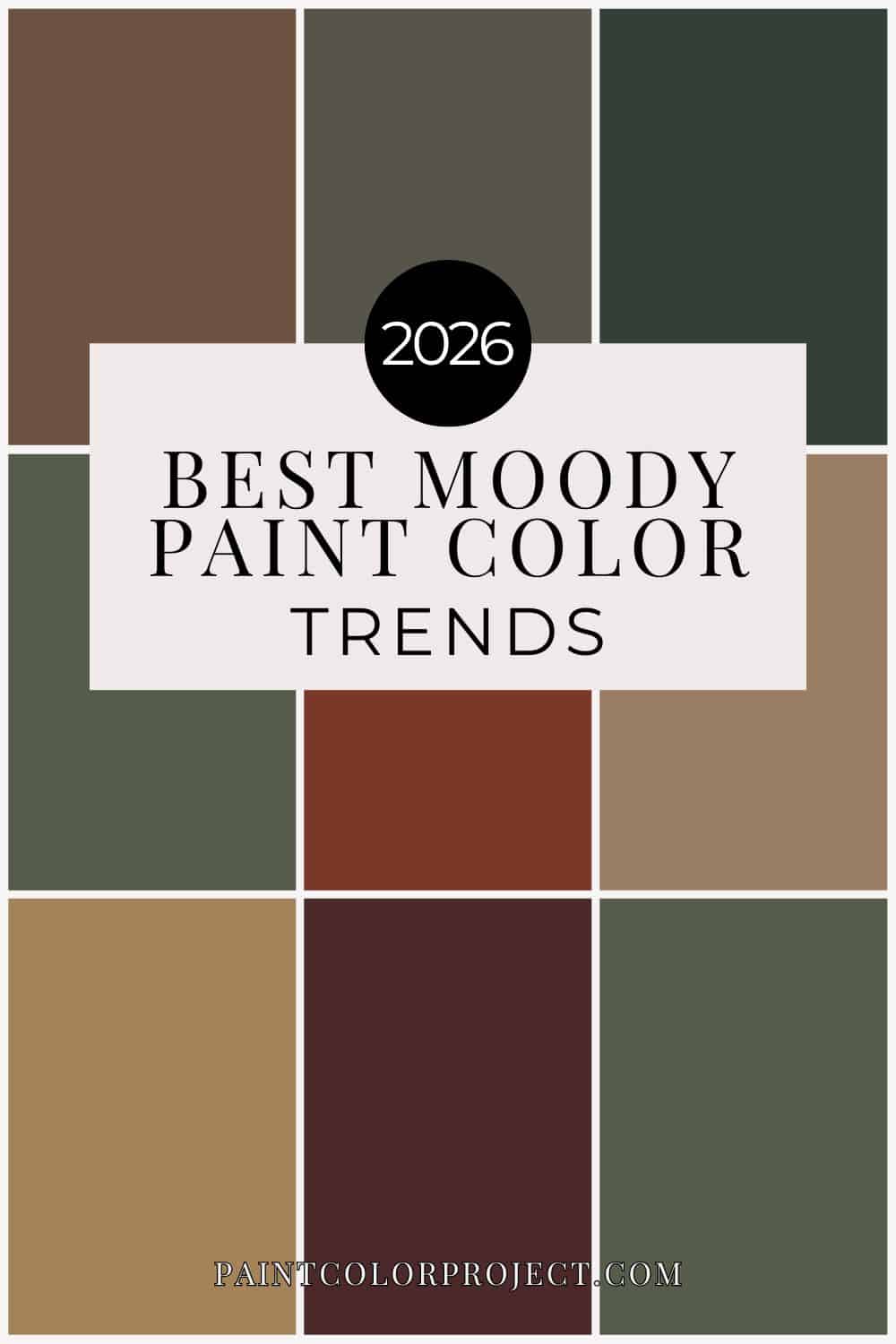
Looking for the top trending moody paint colors for 2026? These rich Sherwin-Williams greens, browns, terra cottas, and inky tones are dramatic, designer-approved, and surprisingly livable.
For years, bright whites and soft greiges dominated home decor. But lately? I’m seeing a major shift.
Homeowners are craving depth. Warmth. Saturation. Colors that feel layered and intentional - not flat.
Moody paint colors aren’t just a trend anymore. They’ve evolved into sophisticated, earthy tones that feel grounded and timeless.
And even better? Several of these historic designer shades were just added to Samplize - which means you can now easily test them in your own home before committing.
Let’s break down the top trending moody paint colors by color family to decide if one of these trending shades might be perfect for your space.
Why I Always Test Moody Colors First (And How I Do It)
Before we get into the actual color list, we need to talk about something important.
Moody paint colors are stunning. They’re dramatic. They’re rich. They feel intentional.
But they are not forgiving.
Deep greens, browns, terra cottas, and inky blues can shift wildly depending on:
- Natural light vs artificial light
- North-facing vs south-facing rooms
- Flooring undertones
- Cabinet finishes
- Even the time of day
A color that looks warm and earthy on Pinterest can look almost black on your wall if you don’t test it properly.
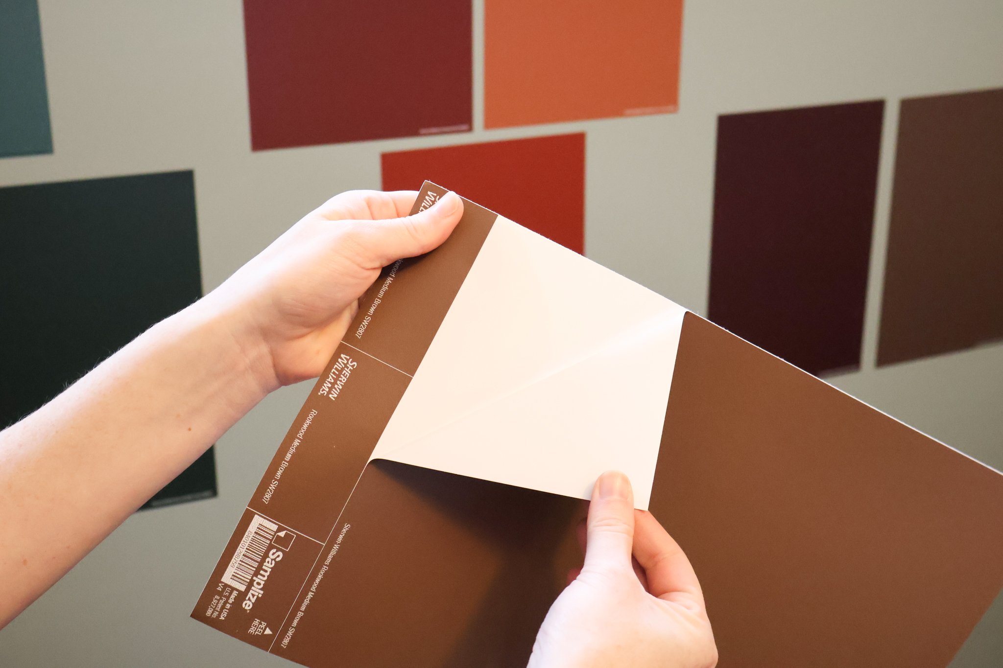
That’s why I always recommend using peel-and-stick samples from Samplize.
Their large 9"x14.75" samples are made with real paint — not printed color — and they stick directly to your wall without damaging it. No taping paper samples up. No painting messy squares. No repainting over patchy tester spots later.
And the biggest benefit? They’re completely repositionable.
You can:
- Move them around the room
- Place them next to your cabinets
- Hold them against your flooring
- Compare them beside trim
- Check them under different lighting throughout the day
With moody colors especially, being able to move the sample next to different fixtures and light sources is everything.
It takes the guesswork out of bold decisions — and saves you from repainting a room because the undertone wasn’t what you expected.
When you’re considering saturated, designer-level colors like the ones below, testing isn’t optional.
It’s the smartest step you can take.
Top Trending Moody Paint Colors for 2026
If you’re craving color that feels bold but timeless, these are the shades gaining serious traction right now. From saturated greens to warm, earthy reds, here’s what’s defining moody interiors this year.
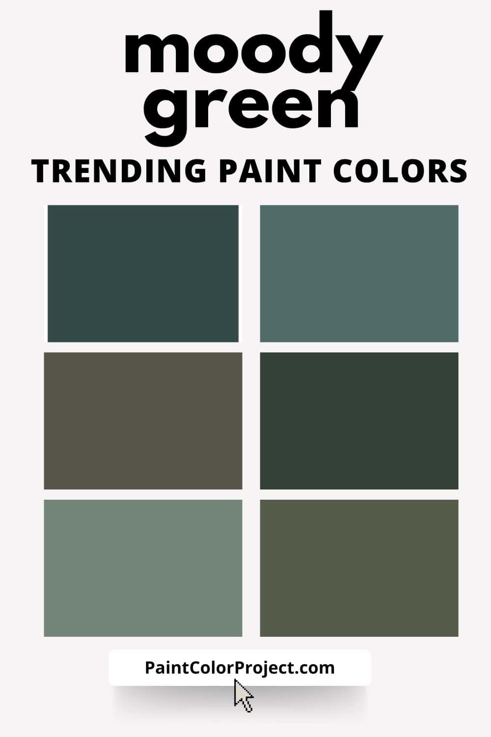
Trending Moody Green Paint Colors
Moody greens are leading the pack right now - but not emerald or jewel-toned greens. The trend has shifted toward earthy, heritage-inspired greens with warmth and depth.
These feel collected. Historic. Designer.
Top trending moody greens:
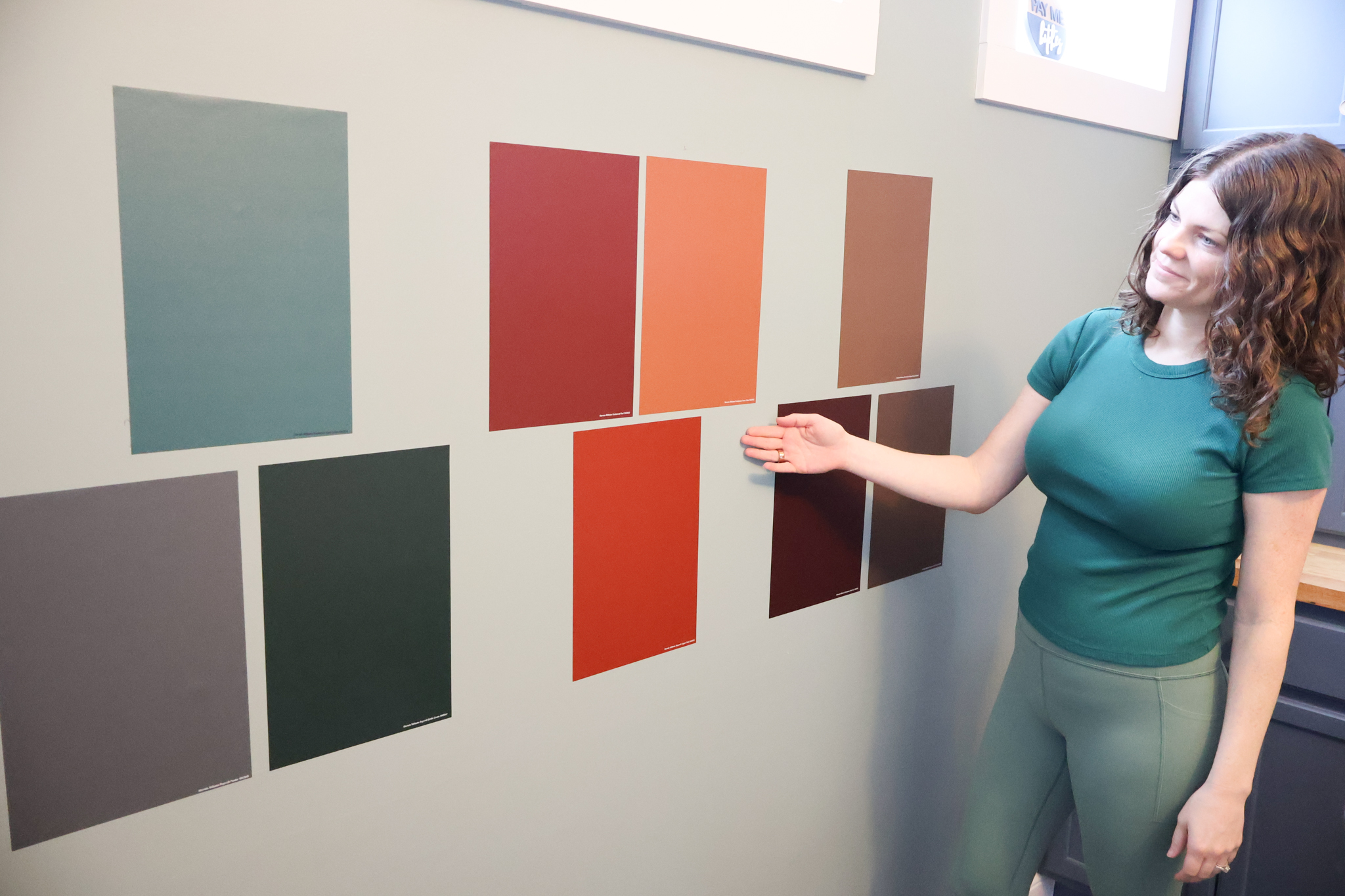
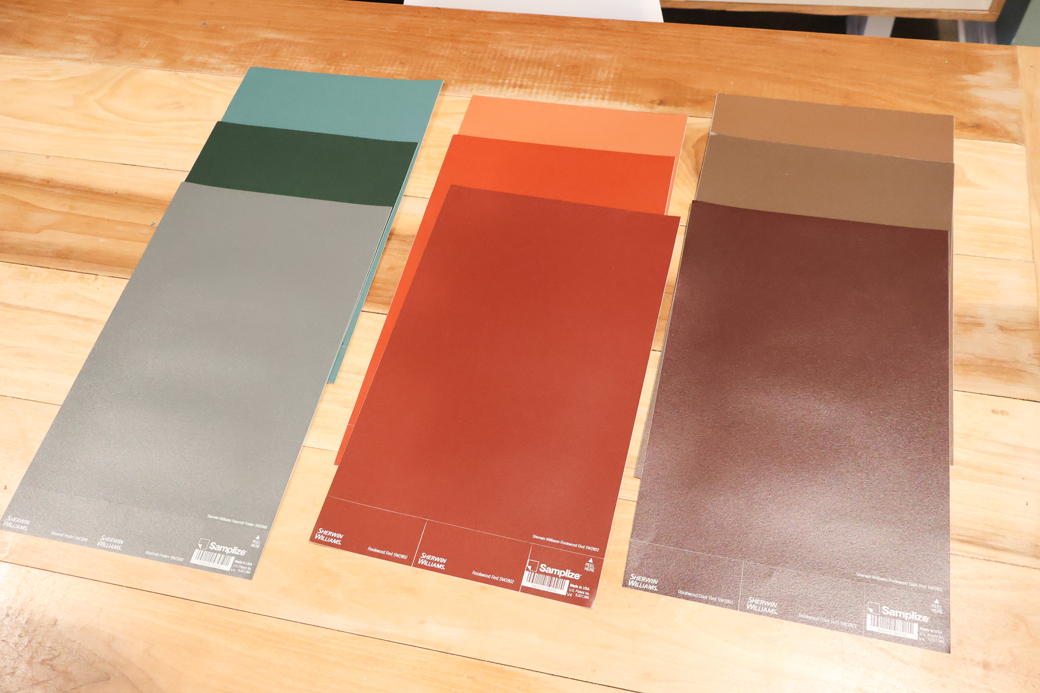
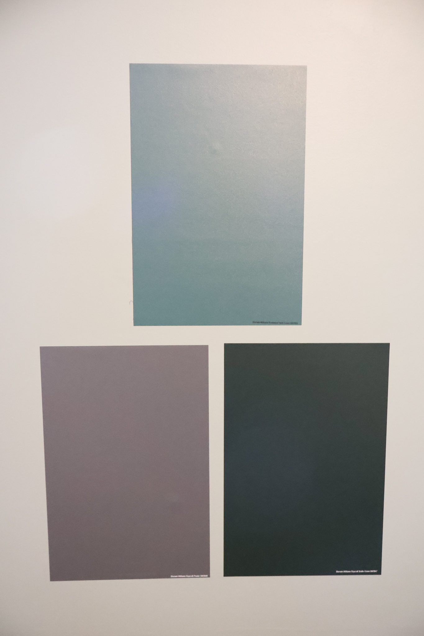
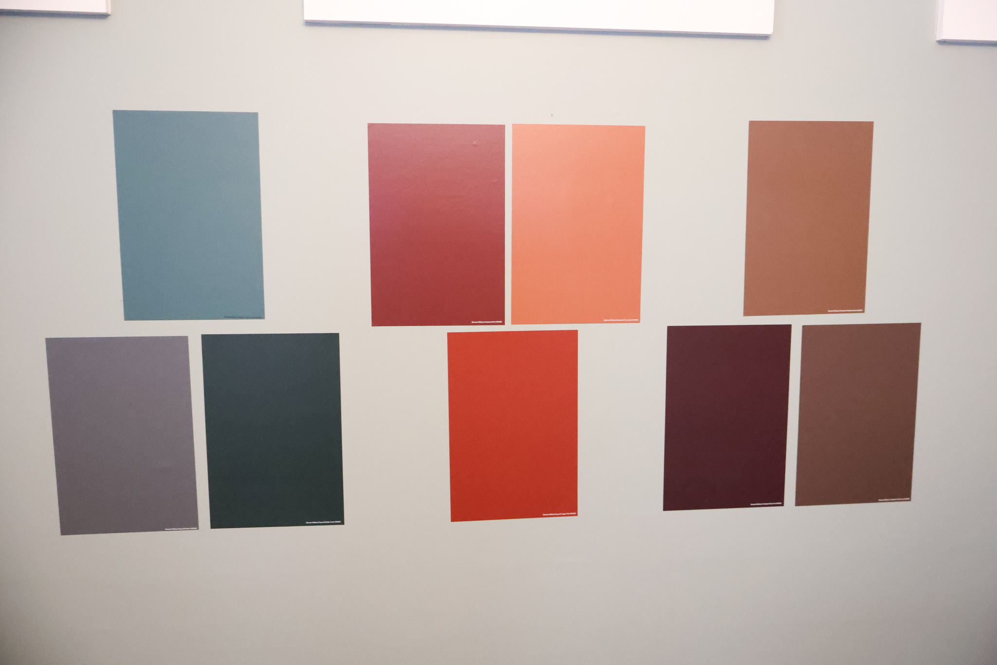
- Sherwin-Williams Roycroft Bronze Green – A deep olive-green with bronze undertones. Stunning with warm wood and brass.
- Sherwin-Williams Rookwood Dark Green – Rich and dramatic without going black.
- Sherwin-Williams Roycroft Bottle Green – Saturated and bold, but still earthy.
- Sherwin-Williams Rookwood Shutter Green – A classic historic green that feels current again.
- Sherwin-Williams Rookwood Blue Green – Perfect if you want green with a subtle blue influence.
- Sherwin-Williams Rookwood Sash Green – A slightly lighter, more versatile moody green.
- Sherwin-Williams Rookwood Jade – Warm, rich, and dramatic for cabinets or accent walls.
- Sherwin-Williams Roycroft Pewter – A moody greige-green hybrid.
Best for: offices, dining rooms, libraries, kitchen islands, powder rooms.
These greens pair beautifully with creamy whites, natural stone, walnut, and antique brass.
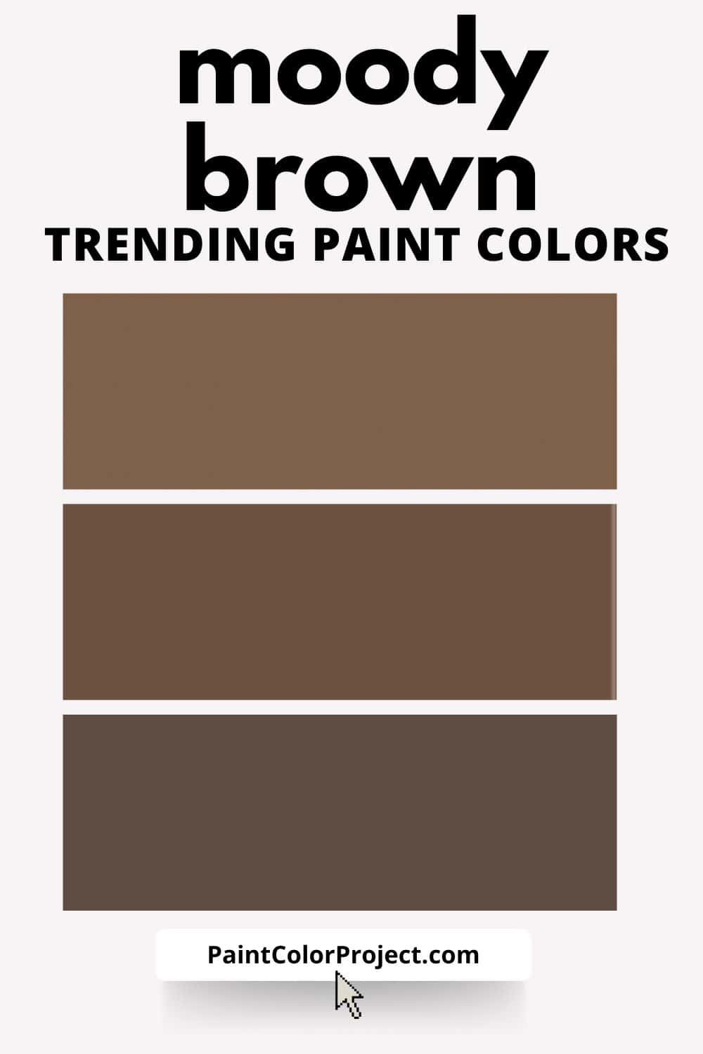
Trending Moody Brown Paint Colors
Yes, brown is officially back.
But not 1990s brown. Today’s trending browns are deep, velvety, and complex. They feel cozy and elevated.
Top trending moody browns:
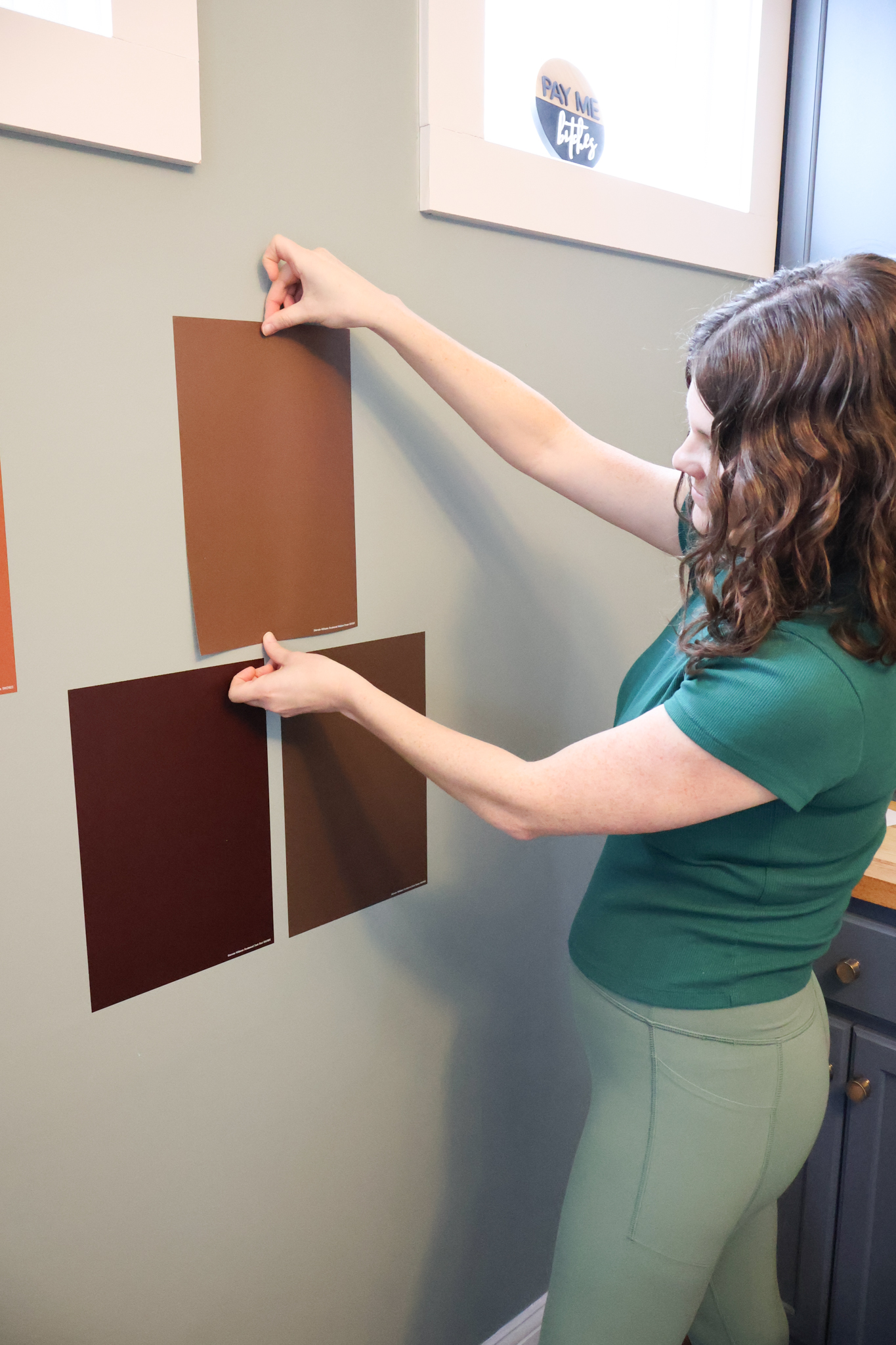
- Sherwin-Williams Rookwood Dark Brown – Chocolate depth with historic character.
- Sherwin-Williams Rookwood Medium Brown – Slightly softer, still dramatic.
- Sherwin-Williams Rookwood Brown – Classic warm brown with timeless appeal.
Best for: bedrooms, studies, media rooms, dramatic accent walls.
These look incredible with leather, textured linens, and cozy layered lighting.
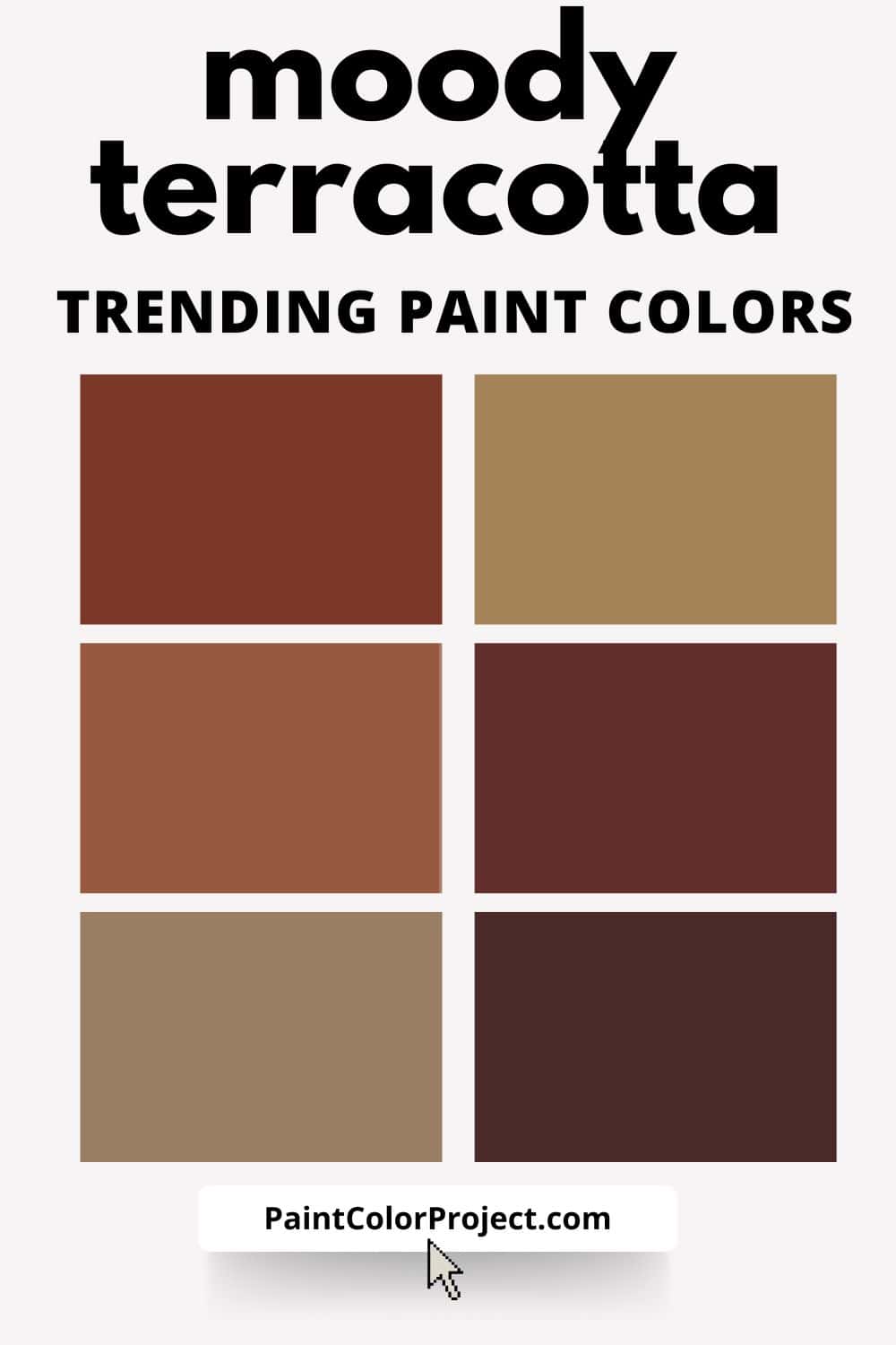
Trending Terracotta & Clay Toned Paint Colors
Earthy reds and clay tones are exploding on Pinterest, and they’re far more muted and livable than you might expect.
Top trending moody warm tones:
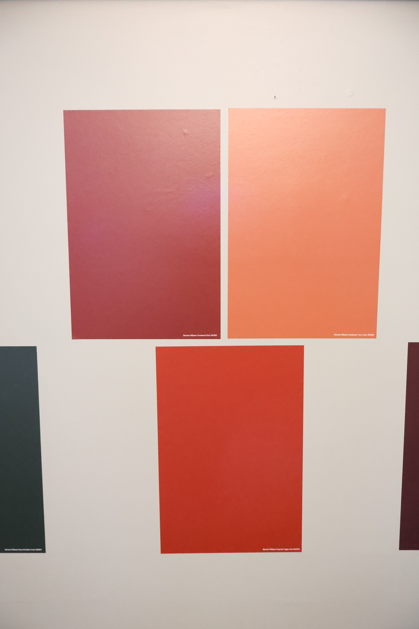
- Sherwin-Williams Rookwood Terra Cotta – Warm, earthy, and incredibly designer.
- Sherwin-Williams Rookwood Clay – Muted rust with softness.
- Sherwin-Williams Roycroft Copper Red – Deep, rich red-brown.
- Sherwin-Williams Rookwood Dark Red – Moody and dramatic.
- Sherwin-Williams Rookwood Red – Bold but historic.
- Sherwin-Williams Rookwood Amber – Warm golden-brown.
- Sherwin-Williams Rookwood Antique Gold – A deep mustard that feels sophisticated.
Best for: dining rooms, powder baths, offices, entryways.
These tones love natural textures - think jute rugs, wood beams, plaster finishes.
Why Sampling Moody Paint Is Non-Negotiable
Here’s the thing about moody paint colors:
Lighting changes everything.
What looks rich and dramatic in one home can look almost black in another.
That’s why I always recommend ordering peel-and-stick samples from Samplize. Their 9"x14.75" samples let you:
- Move the color around your room
- See it in morning, afternoon, and evening light
- Compare it next to your flooring, cabinets, and trim
- Avoid expensive paint mistakes
With colors this saturated, sampling isn’t optional — it’s essential.
Final Thoughts on Trending Moody Paint Colors
Moody doesn’t mean dark for the sake of dark.
It means intentional. Saturated. Layered. Warm.
These Sherwin-Williams historic shades feel especially relevant right now because they bring depth without feeling trendy or fleeting.
And the best part? They’re now available to test at home through Samplize, so you can confidently choose the right moody paint color for your space.
Need more help?
Need more help pulling together the right paint colors for your home?
👉 Check out my No-Fail Paint Color Jumpstart Guide to make the process stress-free.
Moody paint isn’t just for designers. With the right testing process (hello, Samplize), you can get the rich, dramatic look you love without second-guessing your decision.
Still unsure which paint color is right for your space?
Choosing paint doesn’t have to be stressful! My free Paint Color Planning Quick Start Guide walks you through the exact steps to confidently choose the perfect color — without the overwhelm, second-guessing, or endless swatch testing.
👉 Click here to download the free guide!
DIYing Your Paint Job? Start Here.
Choosing a paint color is only half the equation — the tools you use matter just as much. I’ve rounded up the painting supplies we rely on for clean lines, smooth finishes, and less frustration overall.

My Paint Color Formula course walks you through the painless process of expertly testing paint swatches to ensure you have the perfect color for your home.
The best way to sample paint? Samplize!
Get peel-and-stick removable and reusable paint samples here!
Thanks for reading!

Morgan is passionate about home decor and paint colors. She has been sharing DIY home decor tips since 2012 at CharlestonCrafted.com. From there, she learned to love paint colors, and the Paint Color Project was born in 2022!