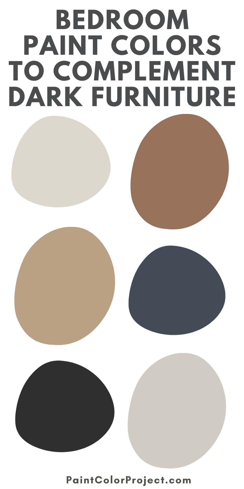
Considering new bedroom paint colors with dark furniture? Here are the best color ideas to create a sophisticated bedroom ambiance.
Despite the prevailing trend towards bright and airy spaces, dark furniture still has its place in modern and vintage design.
Dark furniture adds drama to a room and brings a sense of sophistication in a way that light-colored furniture can’t.
One of the best ways to make a room with dark furniture feel lighter is with light flooring.
Choose a lighter-toned wood floor or add a bright-colored rug to make the space feel brighter. Then, choose the right paint color for the walls.
If you’re planning to go all out with dark furniture or looking to refresh the appearance of your bedroom with a fresh coat of paint, let this article be your guide.
In this post, I’ll list some of the best bedroom paint colors with dark furniture, including tips on how to make them work.
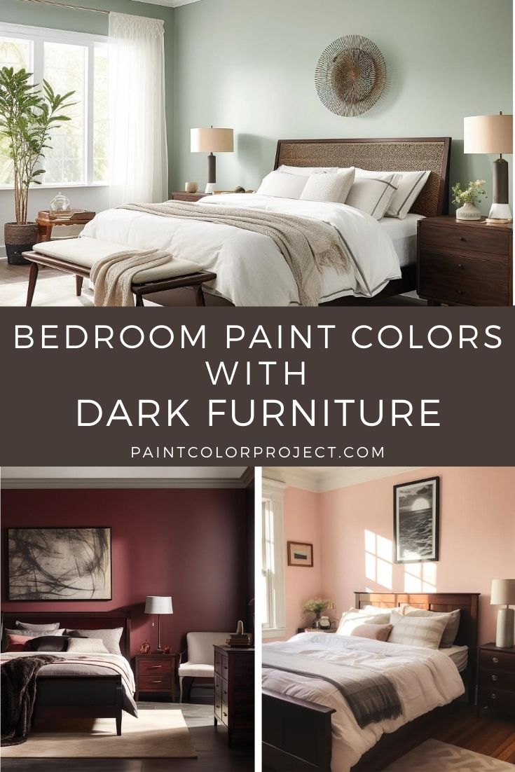
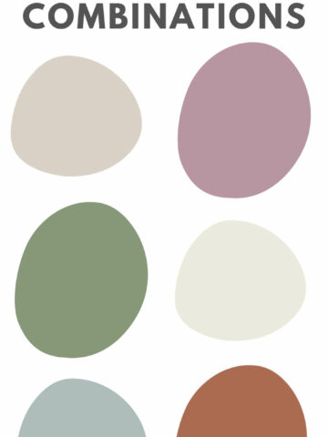
Best Bedroom Paint Colors With Dark Furniture
The best bedroom paint colors to pair with dark furniture include:
- White
- Sage Green
- Soft Pink
- Burgundy
Let’s take a look at each of these wall colors!
White
White is an excellent neutral color that works well with nearly every shade in the color wheel, including those that fall on the darker side.
It’s a versatile backdrop for various interior styles, making it a foolproof choice for creating elegant and cohesive interiors.
The beauty of white lies in its ability to amplify the visual impact of contrasting colors without making a space appear too overwhelming or overly saturated.
It serves as the perfect backdrop to showcase the richness of dark wood or the intricacy of furniture detailing, imbuing a room with a sense of sophistication and timelessness.
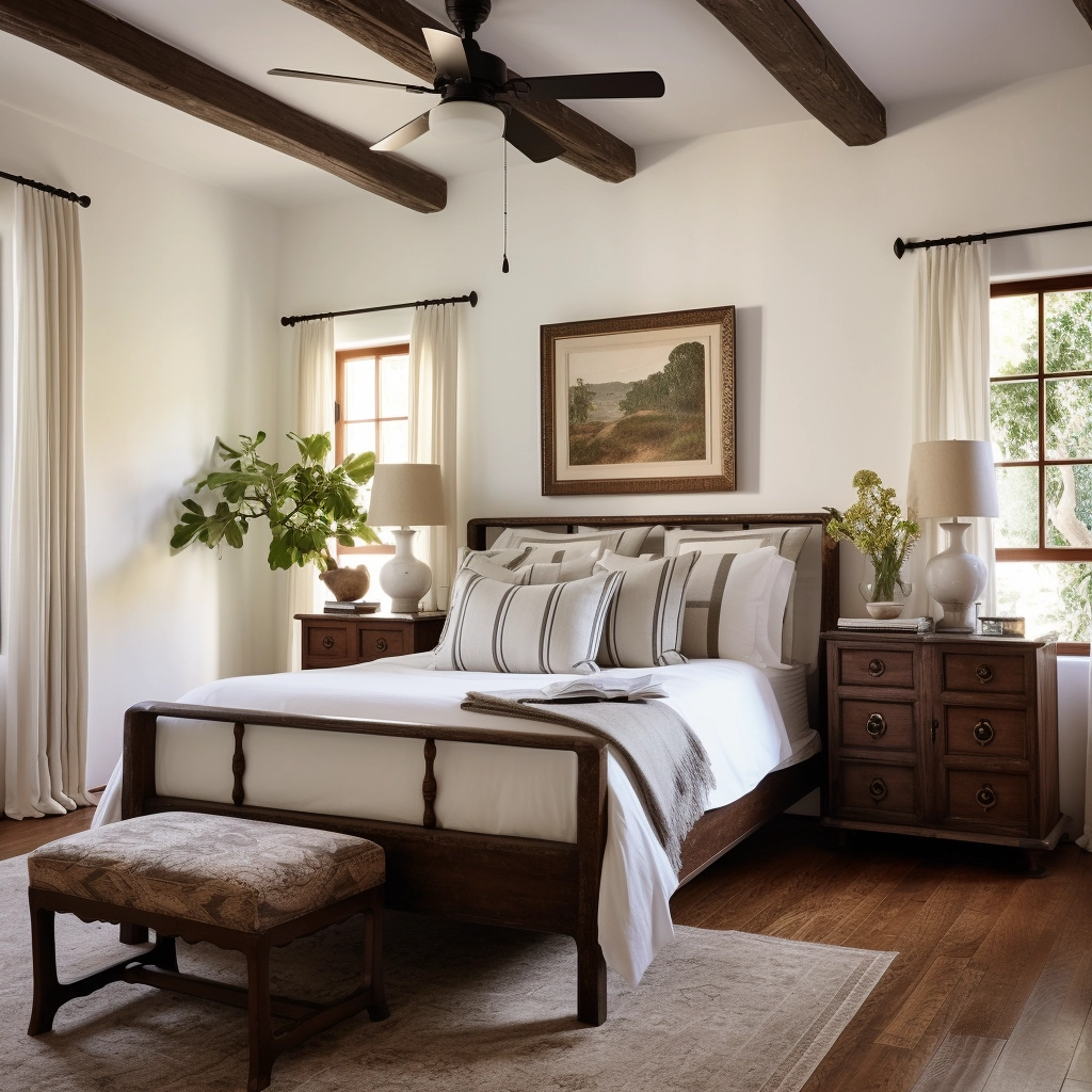
While plain white works well in most scenarios, I tend to lean more towards off-whites like cream, eggshell, ivory, and other variations with warm undertones.
These off-white tones deviate from the clinical purity of plain white, introducing a delicate warmth and character to a space.
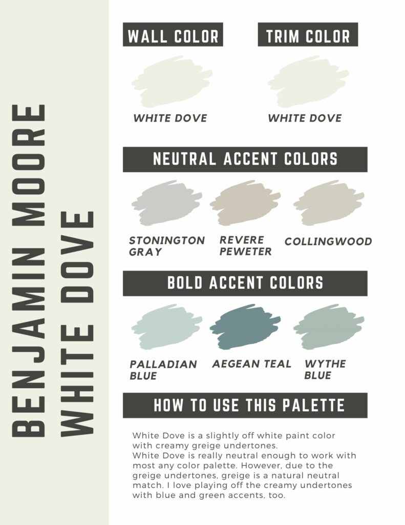
- White Dove, Benjamin Moore: A warm off-white with subtle yellow undertones, leaning towards a creamy or slight greige (gray-beige) hue. Its timeless appeal makes it a reliable choice for those seeking a versatile off-white that complements various dark furniture.
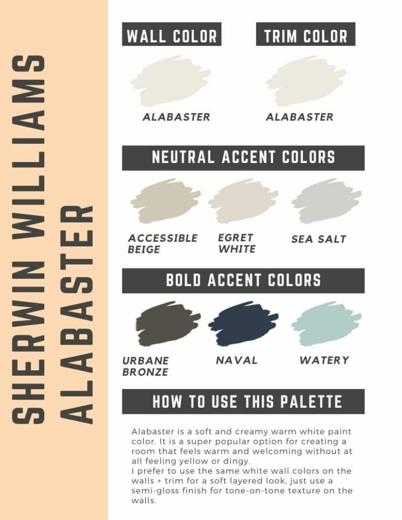
- Alabaster, Sherwin Williams: A neutral off-white with beige undertones. It pairs nicely with dark wood tones such as espresso, mahogany, and walnut, as well as black or dark metal accents. Leather furniture, whether in shades of charcoal or brown, also works well with Alabaster walls.
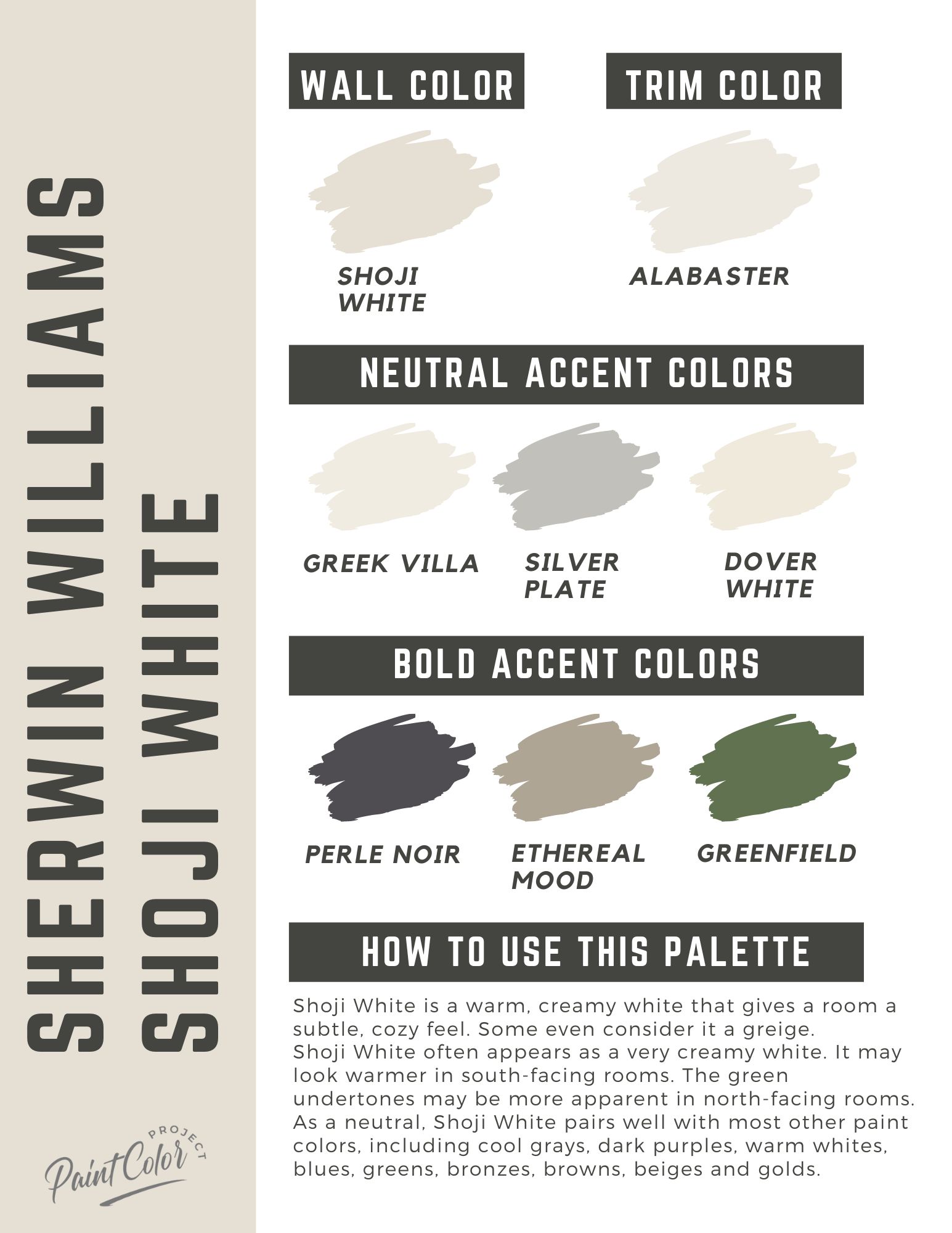
- Shoji White, Sherwin Williams: Shoji White is a gorgeous blend of cream and beige, inspired by the delicate off-white of traditional Japanese Shoji screens. It looks stunning with earthy hues like olive green, warm taupe, and terracotta, as well as various shades of dark gray, navy blue, and charcoal.
Benjamin Moore White Dove color palette
Join the (free!) PaintColorProject+ community to access this exclusive color palette! Once you join, you can right click & save the palette image!
Sherwin Williams Alabaster color palette
Join the (free!) PaintColorProject+ community to access this exclusive color palette! Once you join, you can right click & save the palette image!
Sherwin Williams Shoji White color palette
Join the (free!) PaintColorProject+ community to access this exclusive color palette! Once you join, you can right click & save the palette image!
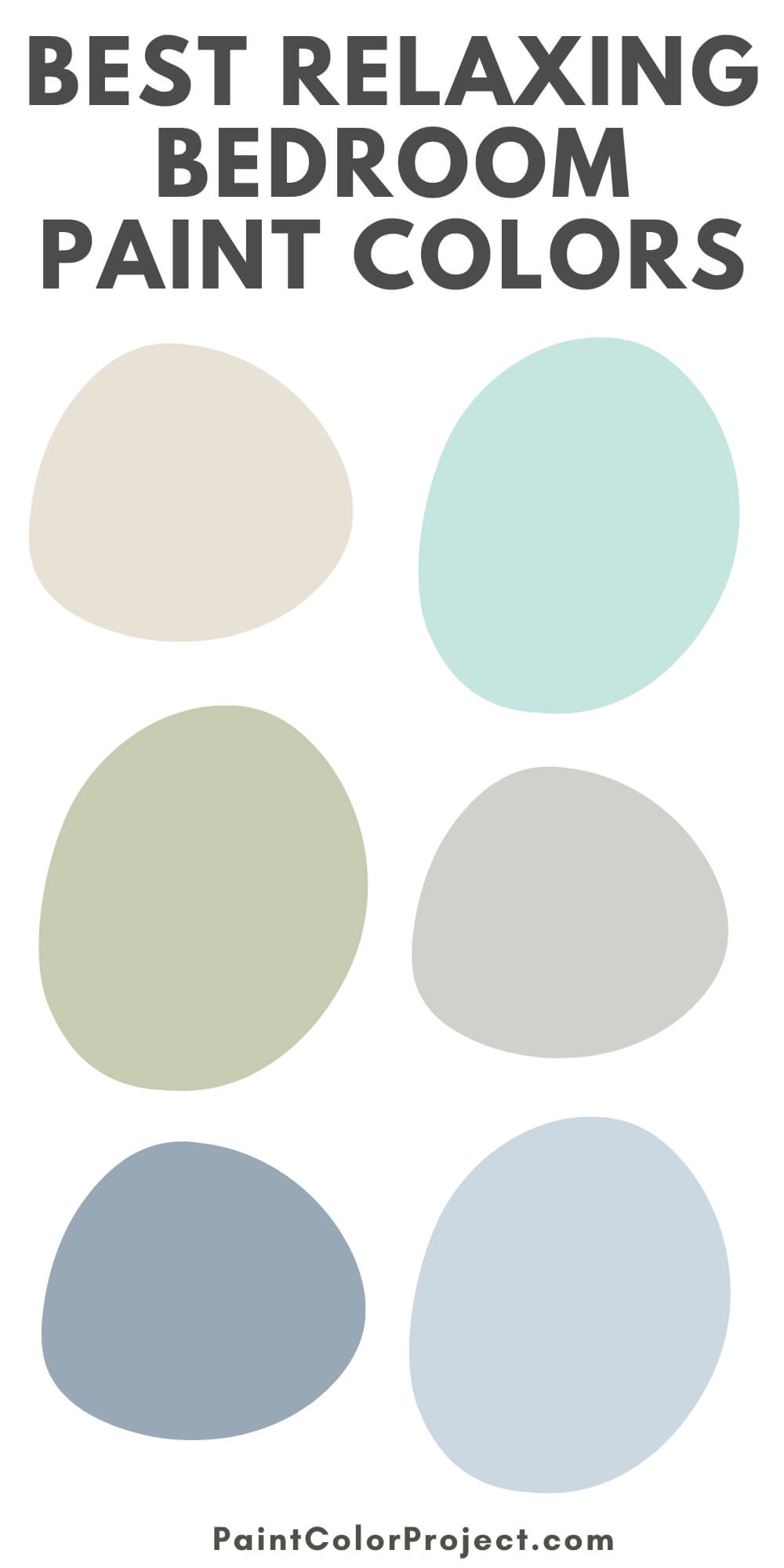
Sage Green
Sage green is one of my favorite paint colors for interior design, mostly because it’s so versatile.
Experts often dub sage green a “chameleon” color because of its remarkable ability to seamlessly blend into various design palettes and styles.
It’s a soft, soothing hue, an early grayish green that resembles the color of the culinary herb of the same name.
Sage green’s muted and earthy tones tastefully complement the richness of dark furniture, resulting in a harmonious and sophisticated aesthetic.
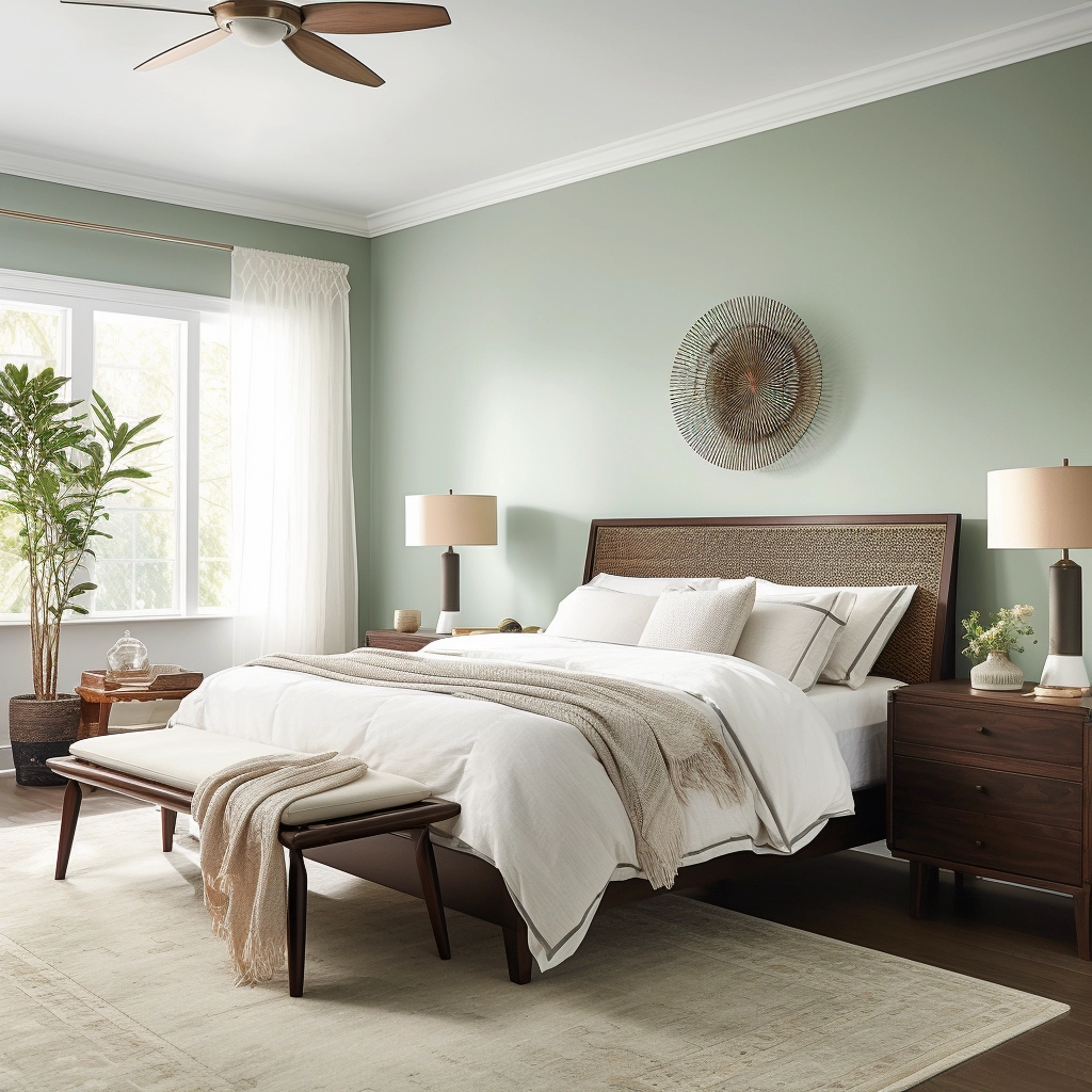
Paired with rich hardwood floors, dark brown furniture, and white accents, this color transforms any space into a haven of charm and comfort.
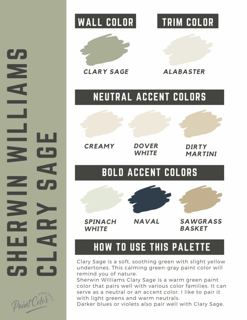
- Clary Sage, Sherwin Williams: A soft, soothing green with yellow undertones. It works particularly well with dark blue (navy, charcoal blue, cobalt, etc.), deep burgundy, and chocolate brown furniture and accents. Eggplant purple looks good, too, but it’s best used sparingly in the form of artwork, accessories, or statement pieces.
- Laurel Tree, Behr: If you’re looking for a sage that’s a bit on the brighter side, Laurel Tree is an option worth considering. Given its bright nature, it pairs well with natural materials and textures. Wooden elements, dark stone surfaces, and woven textures enhance the earthy feel of this color.
- Night Train, Benjamin Moore: A dark sage with cool gray undertones, infusing a space with an air of mystery and glamor. The smoky and sophisticated nature of this color perfectly complements gold accents, navy blue furniture, and rich plum textiles.
Sherwin Williams Clary Sage color palette
Join the (free!) PaintColorProject+ community to access this exclusive color palette! Once you join, you can right click & save the palette image!
Soft Pink
Looking to infuse your space with a romantic and feminine charm? Soft pinks are your answer.
Opt for muted hues and lighter pinks, such as rose, dusty pink, blush, and salmon, to create a calm and inviting atmosphere in a bedroom.
Pigmented colors like fuchsia, Barbie Pink, and cerise can be introduced as accents alongside dark furniture to add a pop of color.
The secret to using pink as a main color is to find a balance between the softness of pink and the richness of dark furniture.
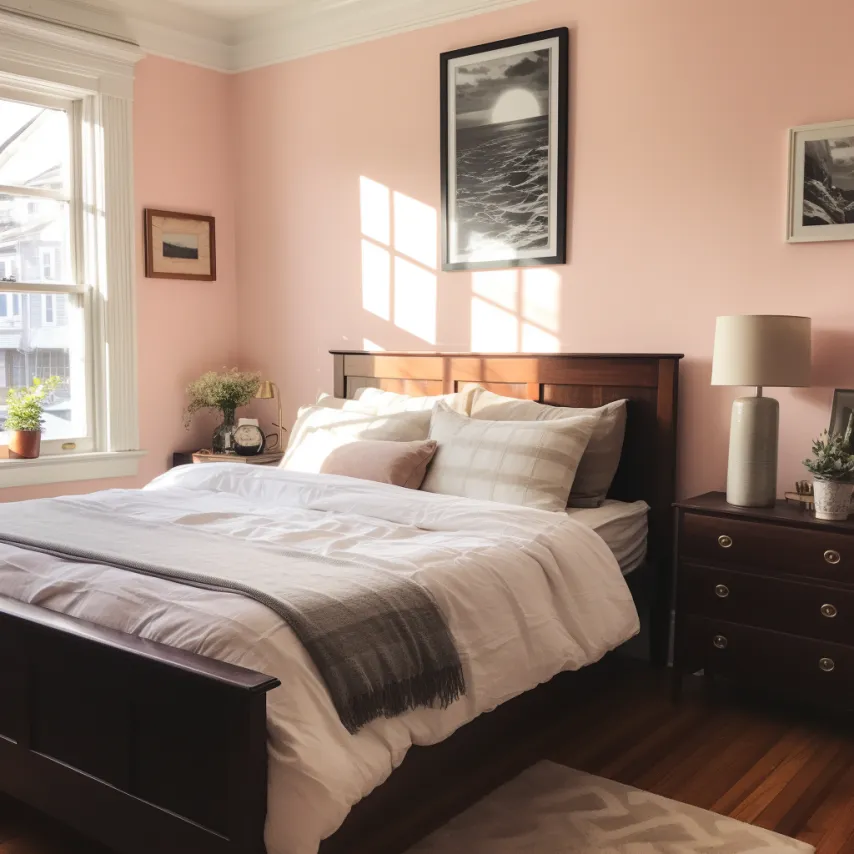
Dark brown or black furniture, such as espresso-painted wood or black lacquer, adds a touch of drama and refinement to a space.
The same is said with charcoal gray and navy blue furniture.
Meanwhile, rich wood pieces, neutral carpeting, and earthy accents create a chic and versatile color profile.
- Pressed Flower, Sherwin Williams: A deep salmon pink with slight purple undertones. It has a good amount of color to it, giving a room warmth and a touch of vibrancy. Pressed Flower works well with contrasting colors like deep greens, navy blues, and rich browns to create visual interest in a space.
- First Light, Benjamin Moore: A soft, pale pink with a clean, feminine aura. It’s an excellent alternative to white or beige, a subtle neutral that adds the perfect touch of softness to a room. Pair it with medium browns, dark grays, and deep blues.
- Angelic, Sherwin Williams: A delicate and muted pink that works best with vintage furniture and dark mahogany hardwood. Pair it with neutral accents like whites, creams, and soft grays to maintain a balanced color palette.
Burgundy
Romantic and unpredictable, burgundy is a classy choice for those going for a bold and moody bedroom.
Pairing burgundy with dark furniture may seem an unconventional choice, but it can create a stunning and luxurious bedroom that exudes drama and luxury.
The regal color of maroon seamlessly matches with the extravagance of gold accents, plush furnishings, and vintage decor.
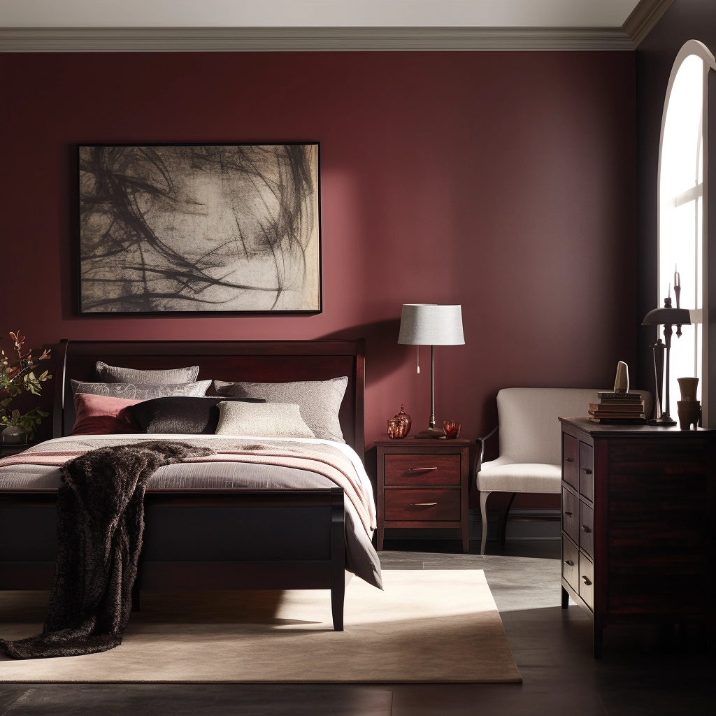
Midnight blue and maroon work great together, too; they add a cozy yet mysterious aura to a space without making it feel overly saturated.
Just make sure to break up the monotony with vintage decor, silver accents, or rustic elements.
- Bewitched, Benjamin Moore: A rich and intense burgundy that instantly infuses a space with warmth, passion, and a touch of mystery. It’s best suited as an accent wall but can be used as a main color, so long as it’s paired with complementary tones that balance its deep intensity.
- Raisin Torte, Benjamin Moore: A welcoming burgundy with a hint of brown, giving it a warm and inviting feel. For a high-contrast and dramatic look, incorporate black elements into your bedroom design. Black furniture and accents amplify the richness of this color, creating a bold and striking aesthetic.
- Cranberry Cocktail: Reminiscent of the rich berry stain of mulled wine, Cranberry Cocktail is a vibrant and lively burgundy with red undertones. For a warm and inviting feel, consider chocolate brown as a companion. Dark wooden furniture and flooring also complement this color.
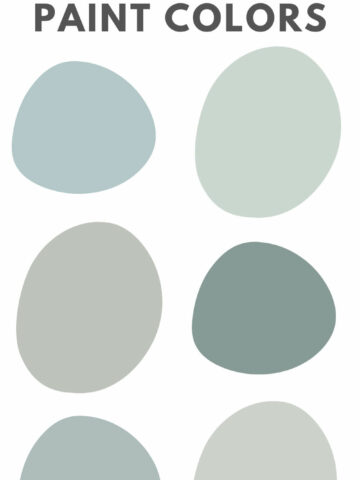
How to Choose a Paint Color that Matches Your Dark Bedroom Furniture
With thousands of colors to choose from, selecting a paint color that complements your dark bedroom furniture can be a bit of a hassle.
Here are some tips to guide you through the process:
It’s All About the Undertones
Pay attention to the undertones in your dark furniture.
If you have dark brown furniture with warm undertones, for example, you might want to consider paint colors that also have warm undertones, such as earthy tones or muted reds.
Black, gray, and silver furniture work best with cool undertones, so you can opt for paint colors like blues, greens, or icy grays.
If you’re unsure of your furniture’s undertones (or simply have a mix of warm and cool colors), choose a neutral color that complements your bedroom’s color palette.
Neutrals include whites, creams, and soft grays.
Use Color Samples
Don’t take the sample color you see online at face value.
Lighting plays a crucial role in how color appears, and the same shade can look vastly different under various lighting conditions.
This is why you should always test your paint color of choice so you don’t regret it later.
Instead of buying various small cans of paint and testing them on the wall, I encourage you to order a peel-and-stick sample.
For your convenience, I included sample links for each of the colors I’ve recommended above.
Personal Vibes Matter
Color psychology shows that the color of our walls can significantly affect our moods.
So when choosing a paint color for your room, make sure it matches the vibe you’re going for.
If you want to create a serene and tranquil atmosphere, opt for colors that are known for their calming effects. Examples include soft blues, lavenders, and greens.
Conversely, if you want to infuse your space with energy, turn to warm and bold colors.
Shades of red, yellow, and orange can evoke feelings of positivity and vibrancy.
Before you go...
I hope this post helped you find the best bedroom paint color that matches your dark furniture.
Choosing the right color is all about creating a harmonious and visually pleasing environment that aligns with your personal style.
Make sure to balance the intensity of dark furniture with the right paint color so neither element overwhelms your space.
For more tips on how to complement colors, as well as other expert advice, download my free paint planning worksheet.
Still unsure which paint color is right for your space?
Choosing paint doesn’t have to be stressful! My free Paint Color Planning Quick Start Guide walks you through the exact steps to confidently choose the perfect color — without the overwhelm, second-guessing, or endless swatch testing.
👉 Click here to download the free guide!
DIYing Your Paint Job? Start Here.
Choosing a paint color is only half the equation — the tools you use matter just as much. I’ve rounded up the painting supplies we rely on for clean lines, smooth finishes, and less frustration overall.

My Paint Color Formula course walks you through the painless process of expertly testing paint swatches to ensure you have the perfect color for your home.
The best way to sample paint? Samplize!
Get peel-and-stick removable and reusable paint samples here!
Thanks for reading!

Morgan is passionate about home decor and paint colors. She has been sharing DIY home decor tips since 2012 at CharlestonCrafted.com. From there, she learned to love paint colors, and the Paint Color Project was born in 2022!