Looking for the perfect off-white paint color for your home? Let’s talk about Sherwin Williams Sanctuary and if it might be right for your home!
With so many neutral shades out there, picking the right one can feel overwhelming.
You've got whites, off-whites, creams, and everything in between, each promising to transform your space. But here’s the deal: not all off-whites are created equal.
The creamy off-whites are perfect if you're looking for a neutral that isn't too stark. Something with a bit of warmth and comfort, while also a timeless, sophisticated look.
Off-whites often pair well with a variety of other paint colors, decor styles, wood tones and other finishes. They're really a versatile option!
So let's look at Sanctuary today. Doesn't the paint color name just sound appealing?
Sanctuary, Sherwin Williams, SW 9583
Sanctuary is a creamy, warm off-white with a touch of greige. It’s timeless and adaptable, the kind of color that feels natural in almost any room.
Click here to get a peel and stick sample of Sanctuary
Color Family
Sanctuary is in the white family.
Light Reflectance Value
76
Light Reflective Value is the measurement of how much light a color bounces around. This is on a scale of 0 to 100 with 0 being pure black and 100 being pure white.
With an LRV of 76, Sanctuary is a light and bright paint color. However, it is not a true, bright white.
Generally, anything with an LRV from 72-82 is considered off-white, with anything higher than 82 being true white.
Sanctuary is right in the middle of the off-white category, so it's a creamy, not too light, not too dark off-white.
RGB Colors
R: 230 G: 226 B: 217
RGB describes the amount of each color - red, green, and blue - present in a color.
This is on a scale of 0 to 255 for each color. This is basically the color mix to make the color!
Hex Code
#E6E2D9

Undertones
Sanctuary has beige, sometimes a slight hint of yellow and gray undertones.
In a bright, south-facing room, Sanctuary feels warm and creamy, bringing out more of those soft beige and yellow notes.
In darker spaces, such as interior rooms or north-facing rooms, it leans a little cooler, with subtle gray undertones that keep it neutral.
It's very important to swatch colors on your wall to make sure they look good – day and night – in your actual space before committing.
Click here to get removable peel & stick paint samples to easily swatch with!
Best uses
Sanctuary is neutral enough to work as a whole house paint color. Use it for:
- Living rooms
- Bedrooms
- Kitchens
- Bathrooms
- Home exterior
- Interior doors
- Cabinets
- Furniture
Similar Colors
- Benjamin Moore Classic Gray
- Behr Painter's White
- Sherwin Williams Heron Plume
- Sherwin Williams Origami White
- Benjamin Moore Grandma's China
- Behr Smoky White
- Sherwin Williams Pearly White
Click here to get a peel and stick sample of Sanctuary
Coordinating Colors
Sanctuary is a versatile off-white that pairs well with virtually any other paint color, including warm grays, reds, greens, blues, blacks, warm whites, bronzes, browns, beiges, and golds.
Slate / stone warm grays:
- Carriage Stone
- Anonymous
- Solitary Slate
- Settlement
- Foothills
Dark reds:
- Beetroot
- Stolen Kiss
- Salute
- Wild Currant
- Red Bay
Dark blacks:
- Tricorn Black
- Caviar
- Black Magic
- Black of Night
- Domino
Trim Colors
When it comes to white and off-white paints like Sanctuary, a great approach is to use the same color for both the walls and the trim.
This keeps things cohesive and elegant while creating subtle contrast through different finishes.
For example, try Sanctuary in an eggshell finish for your walls and Sanctuary in a semi-gloss finish for your trim. The difference in sheen adds depth and creates a polished, seamless look.
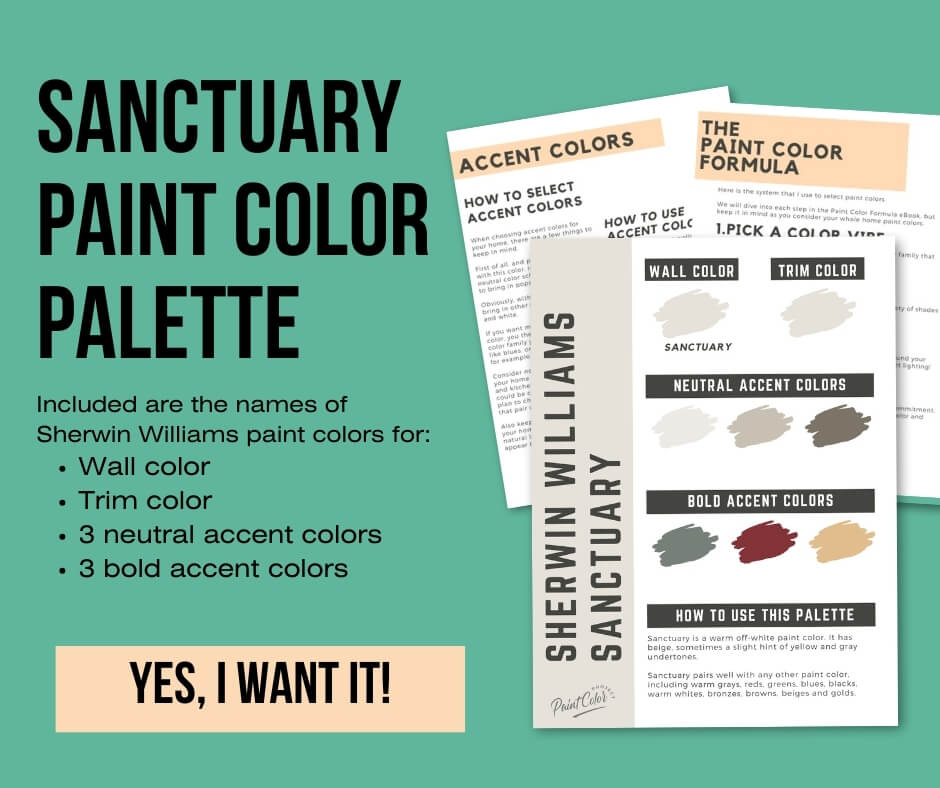
Sanctuary Paint Color Palette
Want to use this paint color in your home? Instantly upgrade your home's aesthetic with our exclusive paint color palette. Unlock the perfect trim color and six stunning accent colors, a combination of neutrals and bold hues for an instantly harmonious space!
Get your perfect paint color palette by clicking here!
Click here to get a peel and stick sample of Sanctuary
FAQS
Here are some common frequently asked questions about Sanctuary.
Is SW Sanctuary too dark?
Not at all! Sanctuary is a light and bright off-white.
However, if you’re looking for a true white, Sanctuary will probably be too dark for you. The best way to know? Swatch it in your space before committing.
Is SW Sanctuary warm or cool?
Sanctuary is definitely on the warm side of the spectrum. It’s a cozy, creamy off-white with just enough warmth to feel inviting.
What are the undertones in Sherwin-Williams Sanctuary?
SW Sanctuary has beige as well as slight yellow and gray undertones.
In a south-facing room with lots of sunlight, it will lean warmer and more beige.
In a north-facing room or spaces with less natural light, it can look a bit more neutral or even pick up a slight gray tone.
Always swatch it in your home and check it at different times of day to see how it behaves in your lighting.
What's the difference: SW Sanctuary vs Alabaster?
Both are off-whites, but they’re definitely not identical:
- Sanctuary (LRV 76) is slightly darker and more neutral.
- Alabaster (LRV 82) is lighter, brighter, and closer to a true white.
Alabaster is also a bit creamier, while Sanctuary feels more muted and understated. Swatching them side by side is the best way to see the difference.

What's the difference: SW Sanctuary vs Greek Villa?
Sanctuary and Greek Villa are quite different in brightness:
- Greek Villa (LRV 84) is much lighter and is considered a true white.
- Sanctuary (LRV 76) sits firmly in the off-white range.
Both have beige and yellow undertones, but Greek Villa is a little warmer and more saturated, while Sanctuary feels softer and more neutral.
As always, swatch both in your space to see which fits your vibe.

What's the difference: SW Sanctuary vs Shoji White?
Sanctuary and Shoji White are very similar in tone, but here’s where they differ:
- Sanctuary (LRV 76) is slightly lighter and a touch more neutral.
- Shoji White (LRV 74) is a bit deeper and more saturated, giving it a slightly richer greige quality.
If you love the warmth of Shoji White but want something just a tad lighter and softer, Sanctuary could be the one.

Before you go...
So, you've found the perfect paint color, but here's the thing - there's another big decision you have to make: picking the right paint sheen. Seriously, the level of glossiness can totally change how your color looks on the walls and how long the paint lasts!
Check out our complete guide to understanding paint sheens.
Still unsure which paint color is right for your space?
Choosing paint doesn’t have to be stressful! My free Paint Color Planning Quick Start Guide walks you through the exact steps to confidently choose the perfect color — without the overwhelm, second-guessing, or endless swatch testing.
👉 Click here to download the free guide!

My Paint Color Formula course walks you through the painless process of expertly testing paint swatches to ensure you have the perfect color for your home.
The best way to sample paint? Samplize!
Get peel-and-stick removable and reusable paint samples here!
Thanks for reading!

Meg Hemmelgarn is a freelance writer and home decor + DIY blogger who loves to talk about paint colors. She and her husband are currently renovating their third fixer upper. You can see their projects on her blog, Green With Decor.