Looking for the perfect gray paint color for your home? Let's compare Passive vs Repose Gray to see if one might be perfect for your space!
Gray paint colors have been popular for years. As a neutral color, gray is a good backdrop for a variety of decor styles and finishes.
However, there is a big difference between warm grays and cool grays.
Depending on lighting in a room, grays can skew blue, purple, green, pink, or beige, which is why it's important to pay attention to undertones and lighting in a space throughout the day!
Today I want to compare two super popular shades of gray paint – Passive and Repose Gray.
Let's talk about the difference between these two popular shades.
Read my full review of Passive
Read my full review of Repose Gray
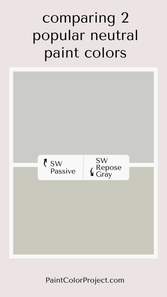
Passive vs Repose Gray
Passive and Repose Gray are both fairly neutral gray colors that are light and bright enough to work well in a lot of homes.
But, they are very different colors! Passive is cooler, and Repose Gray is warmer.
What is similar about Passive vs Repose Gray?
Passive and Repose Gray are both mid-toned gray paint colors. They're neutral enough to work as whole house paint colors.
Their LRVs are similar (60 and 58), which means Repose Gray is only a bit darker than Passive.
Both have blue undertones, but Repose Gray's are a bit stronger.
What is different about Passive vs Repose Gray?
Passive is a bit lighter and cooler than Repose Gray. Passive has cool blue undertones with just the slightest hint of purple undertones.
Repose Gray is a bit darker and warmer than Passive. Repose Gray has green and blue undertones.
Passive looks great with bright whites for trim, and Repose Gray looks great with warmer whites.
| Passive | Repose Gray | |
| LRV | 60 | 58 |
| RBG | R: 203 G: 204 B: 201 | R:201 G:201 B:192 |
| Undertones | cool blue with a touch of purple | warm green and blue |
Light Reflectance Value
Light Reflective Value is the measurement of how much light a color bounces around. This is on a scale of 0 to 100, with 0 being pure black and 100 being pure white.
These are both mid-toned gray colors, but they are not equal in color depth.
With an LRV of 60, Passive is a bit lighter and brighter compared to Repose Gray (LRV 58).


Undertones
While both Passive and Repose Gray have some blue undertones, they come across differently.
Passive has cool blue undertones with the slightest touch of purple as well. The purple stops the color from looking too cool.
If your room has north-facing light, that cool light will make Passive look more blue. If your room has a south-facing light, that warm light will make Passive feel more neutral.
Repose Gray's undertones are stronger. It has blue and green undertones. You will especially see these undertones in a north-facing room without much natural light.
It's very important to swatch colors on your wall to make sure they look good – day and night – in your actual space before committing.
Click here to get removable peel & stick paint samples to easily swatch with!
How do I decide between these two colors?
The biggest difference here is a warm gray (Repose Gray) versus a cool gray (Passive).
If you prefer a warm cozy feeling, go with Repose Gray. If you want more of a cool neutral, go with Passive.
Think about your existing fixtures and the undertones that they have, as well as how that tone will play with each of these.
You may want to test these two gray colors to see how the very different undertones look and feel in your space.
Lastly, if your room has a north-facing light, Passive often looks blue, so you may want to go with Repose Gray.
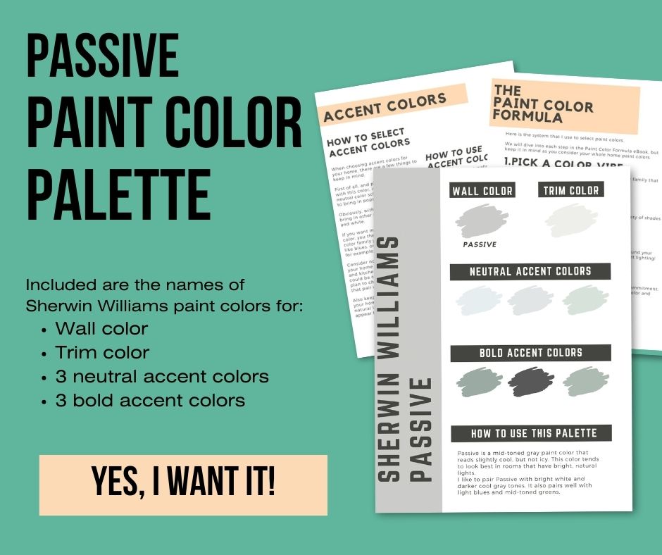
Sherwin Williams Passive color palette
Want to use this paint color in your home? Instantly upgrade your home's aesthetic with our exclusive paint color palette. Unlock the perfect trim color and six stunning accent colors, a combination of neutrals and bold hues for an instantly harmonious space!
Get your perfect paint color palette by clicking here!
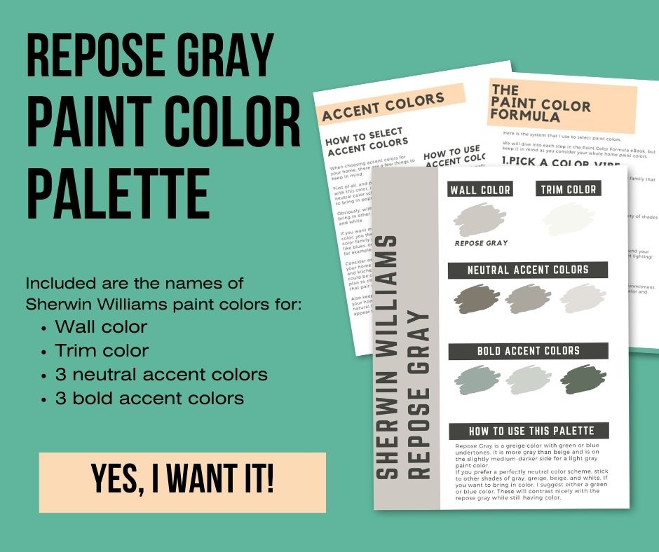
Sherwin Williams Repose Gray Color Palette
Want to use this paint color in your home? Instantly upgrade your home's aesthetic with our exclusive paint color palette. Unlock the perfect trim color and six stunning accent colors, a combination of neutrals and bold hues for an instantly harmonious space!
Get your perfect paint color palette by clicking here!
Before you go...
Once you pick your paint color, you want to get the best possible price on it! Check out our guide on when house paint goes on sale!
Still unsure which paint color is right for your space?
Choosing paint doesn’t have to be stressful! My free Paint Color Planning Quick Start Guide walks you through the exact steps to confidently choose the perfect color — without the overwhelm, second-guessing, or endless swatch testing.
👉 Click here to download the free guide!
DIYing Your Paint Job? Start Here.
Choosing a paint color is only half the equation — the tools you use matter just as much. I’ve rounded up the painting supplies we rely on for clean lines, smooth finishes, and less frustration overall.

My Paint Color Formula course walks you through the painless process of expertly testing paint swatches to ensure you have the perfect color for your home.
The best way to sample paint? Samplize!
Get peel-and-stick removable and reusable paint samples here!
Thanks for reading!

Meg Hemmelgarn is a freelance writer and home decor + DIY blogger who loves to talk about paint colors. She and her husband are currently renovating their third fixer upper. You can see their projects on her blog, Green With Decor.