Looking for the perfect deep yellow paint color for your home? Let’s talk about Sherwin Williams Bosc Pear and if it might be right for your home!
Earthy colors are having a big moment, and I’m all for it.
There’s just something about those natural, grounded tones that make a space feel warm and inviting. And no, it’s not just about greens and blues!
Lately, I’ve been loving the cozy mix of yellows, beiges, and caramel browns.
They add just the right amount of warmth—classic, timeless, but still fresh. It’s like bringing a little bit of nature inside, but in the most effortless way.
So today, let’s talk about Sherwin Williams Bosc Pear and why it deserves a spot in your home.
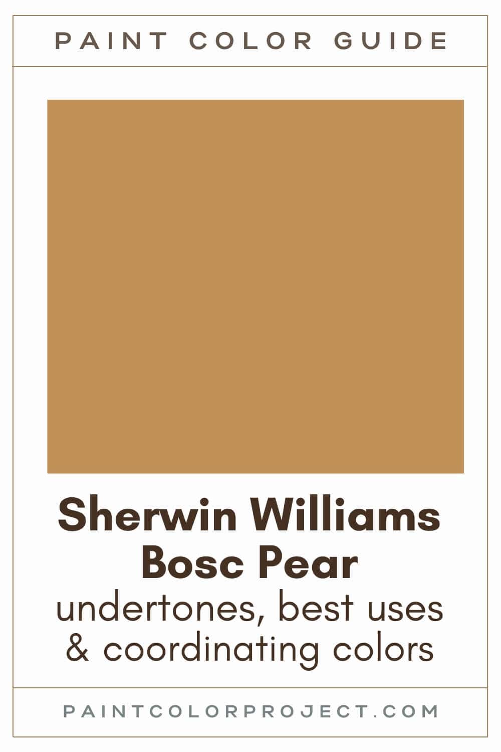
Bosc Pear, Sherwin Williams, SW 6390
Bosc Pear is a rich, deep golden beige with a mix of yellow and caramel brown.
It’s warm, organic, and effortlessly sophisticated—perfect if you want a color that feels both bold and timeless.
Click here to get a peel and stick sample of Bosc Pear
Color Family
Bosc Pear is in the yellow family.
Light Reflectance Value
32
Light Reflective Value is the measurement of how much light a color bounces around. This is on a scale of 0 to 100 with 0 being pure black and 100 being pure white.
At 32, Bosc Pear is a mid-tone, meaning it shifts depending on the lighting. In bright rooms, it looks lighter and warmer. In dim spaces, it deepens into a cozy, rich tone.
RGB Colors
R: 192 G: 144 B: 86
RGB describes the amount of each color - red, green, and blue - present in a color. This is on a scale of 0 to 255 for each color.
In this case, Bosc Pear leans warm with more red and yellow tones.
Hex Code
#C09056

Undertones
Bosc Pear is a deep golden yellow with warm beige and caramel brown undertones. Some even say it has a hint of burnt orange, depending on the light.
In darker, north-facing rooms, it appears deeper and slightly cooler, though it always stays warm.
In bright, south-facing rooms, it softens into a warm caramel beige.
It's very important to swatch colors on your wall to make sure they look good – day and night – in your actual space before committing.
Click here to get removable peel & stick paint samples to easily swatch with!
Best uses
I love how versatile this color is! You can use it in big spaces or small accents, and it always adds warmth and depth.
Here are some of my favorite places to use Bosc Pear:
- Living room – Makes the space feel inviting and cozy.
- Bedroom – Perfect if you want a restful, relaxing feel.
- Kitchen – Adds warmth without overwhelming the space.
- Small Powder Room – Try it on the ceiling, too!
- Built-ins – A subtle way to add character.
- Accent Wall or Fireplace – Bold, but not too loud.
- Furniture – Works beautifully on a dresser, bookshelf, or coffee table.
- Interior Doors – A fun way to bring in color without committing to a whole room.
- Front Door or Shutters – Adds charm with a hint of warmth.
Similar Colors
If you like Bosc Pear, you might also love:
- Sherwin Williams Golden Rule
- Benjamin Moore Golden Retriever
- Behr Lone Star
- Sherwin Williams Mannered Gold
- Benjamin Moore Massicot
- Behr Radiance
- Sherwin Williams Butternut
Click here to get a peel and stick sample of Bosc Pear
Coordinating Colors
Bosc Pear pairs well with warm neutrals, deep earth tones, and muted shades. It’s easy to work with and looks amazing next to both light and dark colors.
Warm, cozy colors:
- Warm Stone
- Persimmon
- Borscht
- French Roast
- Tres Naturale
Muted blues and greens:
- Outerspace
- Granite Peak
- Gallery Green
- Privilege Green
- Basil
Warm / creamy whites:
Trim Colors
As a warm paint color, Bosc Pear pairs well with soft, creamy whites for a cozy, welcoming look.
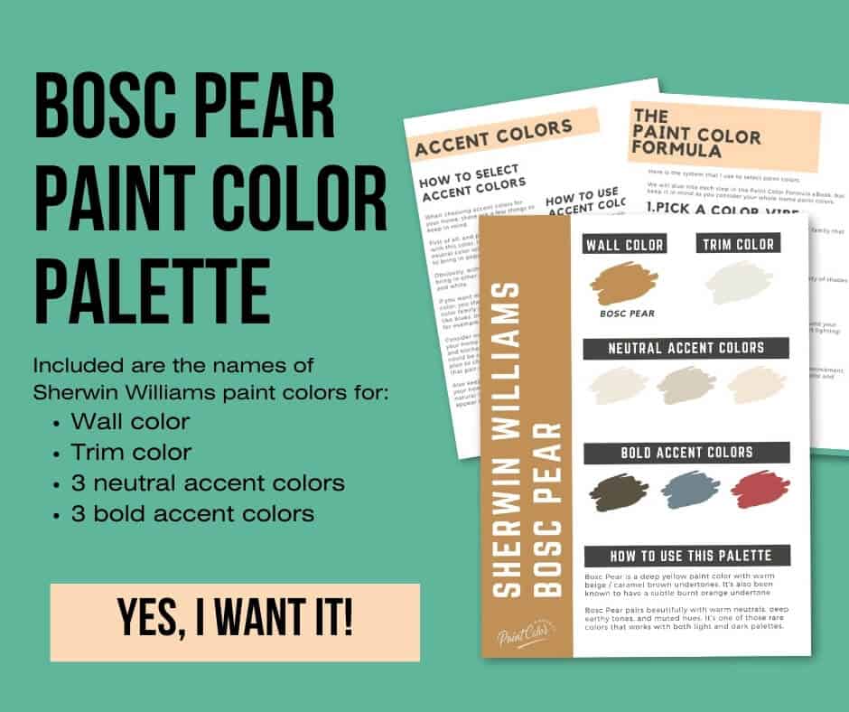
Sherwin Williams Bosc Pear Color Palette
Want to use this paint color in your home? Instantly upgrade your home's aesthetic with our exclusive paint color palette. Unlock the perfect trim color and six stunning accent colors, a combination of neutrals and bold hues for an instantly harmonious space!
Get your perfect paint color palette by clicking here!
Click here to get a peel and stick sample of Bosc Pear
FAQS
Here are some common frequently asked questions about Bosc Pear.
Is Bosc Pear yellow or orange?
Bosc Pear is officially part of Sherwin-Williams’ yellow family, but it’s not a bright yellow. It has beige and caramel brown undertones, giving it a golden caramel beige look.
Is Bosc Pear warm or cool?
Bosc Pear is a warm paint color with yellow and caramel undertones. It has a cozy, earthy feel, making it a great choice if you want a space to feel warm and inviting.
What is the hex code for Sherwin Williams Bosc Pear?
The hex code for Sherwin Williams Bosc Pear is #C09056.
If you’re trying to match this color for a digital project, this code gives you an exact shade.
What's the difference: SW Bosc Pear vs Butternut?
Bosc Pear and Butternut are very similar golden caramel tones—no surprise since they’re on the same paint strip! But there are a few key differences:
- Bosc Pear (LRV 32) is darker than Butternut (LRV 37).
- Bosc Pear leans slightly more brown and muted.
- Butternut is a touch brighter and more yellow.
If you can’t decide, I always recommend swatching them side by side in your space!

Is SW Bosc Pear too dark?
Not really! With an LRV of 32, Bosc Pear is a mid-toned shade—rich and warm but not super dark.
- In bright rooms, it softens into a golden beige.
- In darker spaces, it deepens into a cozy, caramel brown.
If you want something lighter and brighter, try Dakota Wheat or Compatible Cream (both are higher up on the same paint strip). But if you’re looking for a warm, grounded color with some depth, Bosc Pear is a great pick.
What's the difference: SW Bosc Pear vs Accessible Beige?
These two colors may seem similar, but they have very different vibes:
- Bosc Pear (LRV 32) is a golden caramel beige with strong yellow and brown tones.
- Accessible Beige (LRV 58) is a soft beige with gray undertones, making it more neutral and muted.
- Bosc Pear is richer and more saturated, while Accessible Beige is subtle and understated.
If you want earthy warmth with a bit of drama, go for Bosc Pear. If you prefer a soft, neutral backdrop, Accessible Beige might be the better choice.
As always, swatching both in your space will give you the best idea.

Before you go...
So, you've found the perfect paint color, but here's the thing - there's another big decision you have to make: picking the right paint sheen. Seriously, the level of glossiness can totally change how your color looks on the walls and how long the paint lasts!
Check out our complete guide to understanding paint sheens.
Still unsure which paint color is right for your space?
Choosing paint doesn’t have to be stressful! My free Paint Color Planning Quick Start Guide walks you through the exact steps to confidently choose the perfect color — without the overwhelm, second-guessing, or endless swatch testing.
👉 Click here to download the free guide!

My Paint Color Formula course walks you through the painless process of expertly testing paint swatches to ensure you have the perfect color for your home.
The best way to sample paint? Samplize!
Get peel-and-stick removable and reusable paint samples here!
Thanks for reading!

Meg Hemmelgarn is a freelance writer and home decor + DIY blogger who loves to talk about paint colors. She and her husband are currently renovating their third fixer upper. You can see their projects on her blog, Green With Decor.