Looking for the perfect gray-blue paint color for your home? Then maybe Benjamin Moore Quiet Moments is the perfect color for you!
Are you stuck between choosing a neutral shade or a shade with a bit more color? Then gray-blue-green paint shades might just be what you need.
These amazing "chameleon colors" shift with the lighting, making your space feel fresh and dynamic.
One such great option is Quiet Moments. It's a versatile and intriguing choice for any space.
In our thorough review, we dig into what makes this color special. Keep reading to learn if Quiet Moments will fit your space.
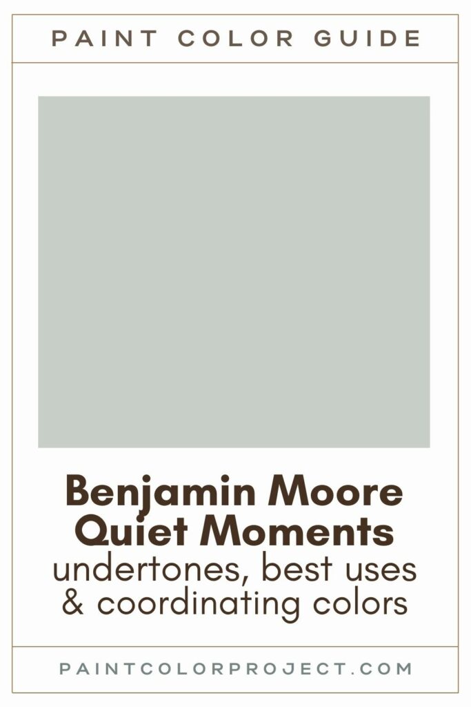
Quiet Moments, Benjamin Moore, 1563
Quiet Moments blends gray, blue, and green for a serene, calming effect. Perfect for bedrooms and bathrooms, this color works magic.
Click here to get a peel and stick sample of Quiet Moments
Color Family
Quiet Moments is in the neutral family.
Light Reflectance Value (LRV)
61
LRV tells you how much light a color reflects, from 0 (black) to 100 (white).
At 61, Quiet Moments hits that sweet spot — not too light, not too dark.
RGB Colors
R: 199 G: 207 B: 200
RGB describes the amount of each color – red, green, and blue – present in a color on a scale of 0 to 255.
Hex Code
#c7cfc8

Undertones
Quiet Moments is a cool gray-blue-green that shifts with the light — a so-called “chameleon color”.
Moreover, it's a neutral gray with soft blue-green undertones. And depending on your lighting, these undertones can change.
Typically, Quiet Moments leans more blue than green:
- In south-facing rooms with lots of natural light, Quiet Moments might look a touch more green.
- In north-facing rooms without much natural light, Quiet Moments will lean cooler and more gray and blue.
It's very important to swatch colors on your wall to make sure they look good – day and night – in your actual space before committing.
Click here to get removable peel & stick paint samples to easily swatch with!
Best Uses
Quiet Moments looks great in just about any room:
- Living rooms
- Bedrooms
- Kitchens
- Bathrooms
- Home exterior
- Interior doors
- Cabinets
- Furniture
Moreover, Quiet Moments is versatile enough to work as a whole house paint color.
Similar Colors
- Benjamin Moore Arctic Gray
- Benjamin Moore Silver Marlin
- Benjamin Moore Gray Cashmere
- Benjamin Moore Crystalline
- Behr Silver Setting
- Sherwin Williams Sea Spray
- Sherwin Williams Sea Salt
Click here to get a peel and stick sample of Quiet Moments
Coordinating Colors
Quiet Moments pairs beautifully with a range of colors, from neutrals to bolder shades.
If you really want to highlight the tones within Quiet Moments, pair it with neutrals like white or gray.
It also works as a subtle backdrop when paired with bold colors like navy or black, adding a touch of elegance and depth to your space.
Dark grays:
- Gray Mountain
- Granite
- Stone
- Cinder
- Dolphin
Dark blues / navys:
- Mysterious
- Hale Navy
- Blue Note
- Evening Sky
- Evening Dove
Warm light to mid grays:
- Balboa Mist
- Athena
- Light Pewter
- Olympic Mountains
- Wind's Breath
Trim Colors
I love pairing Quiet Moments with a creamy white that has warm undertones. I think crisp, cool whites can create too much contrast.
Some of my favorites include:
- Sherwin Williams Alabaster
- Benjamin Moore White Dove
- Behr Cameo White
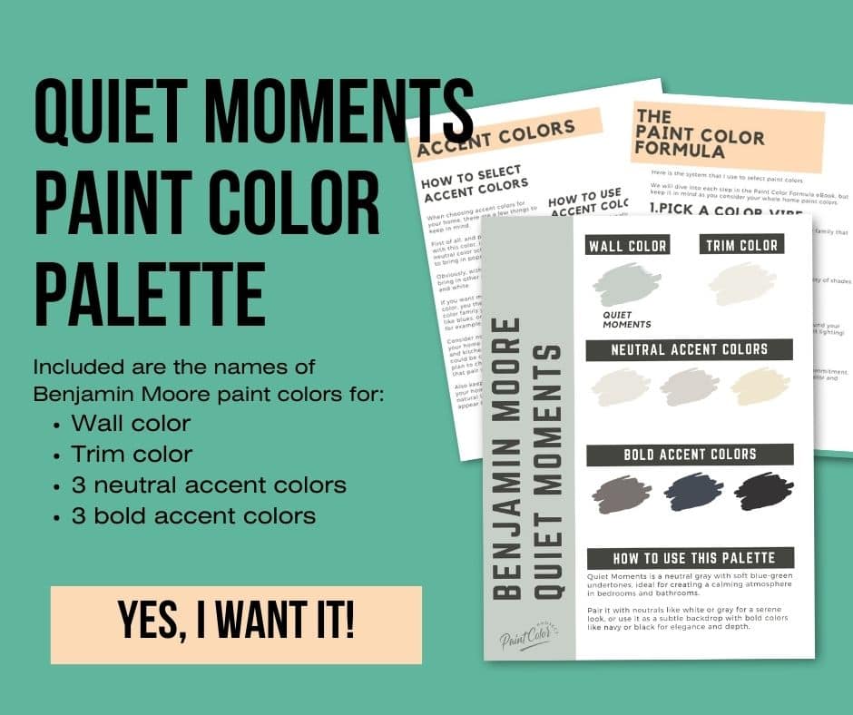
Benjamin Moore Quiet Moments Paint Color Palette
Want to use this paint color in your home? Instantly upgrade your home's aesthetic with our exclusive paint color palette. Unlock the perfect trim color and six stunning accent colors, a combination of neutrals and bold hues for an instantly harmonious space!
Get your perfect paint color palette by clicking here!
FAQs
Got some questions about Quiet Moments? I've got answers!
Is BM Quiet Moments a good exterior color?
Quiet Moments might not be your best bet for an exterior. It can get a bit washed out in all that natural light.
A better idea could be something a bit darker and bluer, such as Woodlawn or Palladian Blue.
And hey, always swatch before you commit!
What's the difference: BM Quiet Moments vs SW Sea Salt?
BM Quiet Moments and SW Sea Salt — so similar, yet so different! Quiet Moments leans more blue, while Sea Salt leans more green.
Quiet Moments is a gray with blue-green vibes, while Sea Salt is a green with gray-blue undertones.
Sea Salt is a bit lighter, with an LRV of 63 versus Quiet Moments' 61.
Despite their similarities, Sea Salt is generally more popular.
Just remember to swatch colors in your space first to see how they truly look!

What's the difference: BM Quiet Moments vs Palladian Blue?
Quiet Moments and Palladian Blue are both blue-green-gray shades, but they bring different moods. Quiet Moments is a chill neutral, while Palladian Blue is vibrant and blue.
Palladian Blue has less gray, making it pop more. Quiet Moments is more muted and serene.
Both have similar LRVs (60.73 and 60.4), so they reflect light similarly.
For a calming, peaceful vibe, pick Quiet Moments. For a brighter, beachy feel, go with Palladian Blue.
And yes, swatch them first in your space to see how they truly look!

Is Quiet Moments more blue or green?
Quiet Moments leans more blue, but it's a total chameleon. It can shift between blue, green, and gray.
Swatch it in your space to see how it plays with your light!
What is one shade darker than BM Quiet Moments?
BM Beach Glass is one shade darker than Quiet Moments. If you love Quiet Moments but want something more saturated, Beach Glass is a great choice.
As always, swatch it in your space before you decide!
What's the difference: BM Quiet Moments vs SW Rainwashed?
BM Quiet Moments is a neutral blue-green-gray, while Rainwashed leans green with blue undertones.
Quiet Moments is more muted, while Rainwashed is more saturated.
Both colors change with the lighting. Rainwashed is a tad darker with an LRV of 59 compared to Quiet Moments' 61.

Before you go...
So, you've found the perfect paint color, but here's the thing – there's another big decision you have to make: picking the right paint sheen. Seriously, the level of glossiness can totally change how your color looks on the walls and how long the paint lasts!
Check out our complete guide to understanding paint sheens.
Still unsure which paint color is right for your space?
Choosing paint doesn’t have to be stressful! My free Paint Color Planning Quick Start Guide walks you through the exact steps to confidently choose the perfect color — without the overwhelm, second-guessing, or endless swatch testing.
👉 Click here to download the free guide!
DIYing Your Paint Job? Start Here.
Choosing a paint color is only half the equation — the tools you use matter just as much. I’ve rounded up the painting supplies we rely on for clean lines, smooth finishes, and less frustration overall.

My Paint Color Formula course walks you through the painless process of expertly testing paint swatches to ensure you have the perfect color for your home.
The best way to sample paint? Samplize!
Get peel-and-stick removable and reusable paint samples here!
Thanks for reading!

Meg Hemmelgarn is a freelance writer and home decor + DIY blogger who loves to talk about paint colors. She and her husband are currently renovating their third fixer upper. You can see their projects on her blog, Green With Decor.