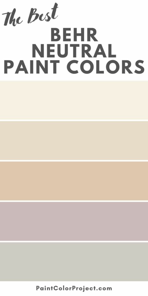
On the hunt for the best Behr neutral paint colors? Behr's got you covered with a fantastic range of neutrals, from cozy warm shades to chic cool tones, ideal for any room makeover.
Looking to elevate your space with a fresh coat of neutral paint? You’re come to the right place!
Neutral paints are the best canvas for creating a timeless and versatile atmosphere in a room.
They’re a no-brainer choice for those who value both comfort and style, as they fit with practically any decor theme or design.
From off-whites to cozy beiges and calming taupes, this article lists some of the best Behr neutral paint colors that’ll transform your room into a sophisticated haven!
Why Choose Behr Over Sherwin Williams or Benjamin Moore
Behr isn’t as popular as Sherwin Williams or Benjamin Moore, but it’s often the preferred choice for homeowners looking to balance cost and quality.
It’s readily available at Home Depot and similar home improvement stores, making it ideal for those who prioritize convenience in their home improvement projects.
It’s also much cheaper than Sherwin Williams and Benjamin Moore.
For example, a gallon of premium Behr paint costs around $30 to $40, while premium paints from Sherwin Williams or Benjamin Moore range from $50 to $70 or more per gallon.
It’s a cost-effective solution for basic painting needs, such as furniture touch-ups and exterior trim work.
Overall, Behr is a great budget-friendly alternative to Sherwin Williams and Benjamin Moore.
It has a solid line-up of basic and neutral paint colors, so it’s perfect for homeowners tackling straightforward and practical painting projects!
Top 12 Behr Neutral Paint Colors to Try Now
Here are some of the best neutral paint colors by Behr, tried and tested by yours truly:
Antique White
- LRV: 73
Antique White is one of Behr’s most popular beige paints. It’s a soft, timeless color that exudes just the right amount of warmth, perfectly counterbalancing pure white accents and cool tones.
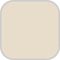
It’s ideal for open-concept spaces, bedrooms, and kitchens, adding a contemporary and elegant feel to a space.
Pair it with mid-tans, dark browns, and navy blues for a sophisticated and timeless look.
Dove
- LRV: 67
Comparable to Benjamin Moore’s Balboa Mist, Dove is a warm greige with subtle orange and red undertones.
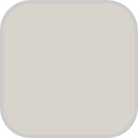
It’s a versatile hue that works just about anywhere, from living rooms to bedrooms to kitchens.
Thanks to its warm undertones, it pairs especially well with warmer accents, such as pinks, yellows, and purples.
Mocha Foam
- LRV: 38
Reminiscent of the warm drink of the same name, Mocha Foam envelops a space in cozy elegance. Its rich pigment adds sophistication without overwhelming a space.
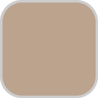
Ideal for living rooms and bedrooms, Mocha Foam looks gorgeous when paired with soft greens or deep browns.
Even Better Beige
- LRV: 60
Even Better Beige is a true beige with subtle yellow undertones.
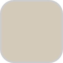
It works exceptionally well with other neutrals, particularly grays, browns, and off-whites.
It also looks good when paired with earthy yellows, orange-golds, and mid-tone greens and blues.
When used as a backdrop for architectural elements, such as exposed beams, fireplaces, and board-and-batten paneling, Even Better Beige creates a canvas that enhances their beauty.
Chic Gray
- LRV: 60
Chic Gray is a sophisticated silvery gray that adds a lot of depth and body to a space while still feeling neutral.
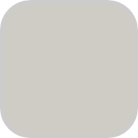
It looks amazing on modern-style homes, especially when paired with light wood tones, matte black metals, live greenery, and organic textures.
Creamy Mushroom
- LRV: 51
Behr’s Creamy Mushroom perfectly encapsulates the comforting essence of its culinary namesake.
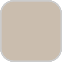
It carries a gentle beige undertone, creating a canvas that’s both inviting and adaptable to various design aesthetics.
Its subtle warmth effortlessly pairs with other neutrals, but it wouldn’t say no to bold colors like forest green, mustard yellows, maroons, and burnt oranges.
White Veil
- LRV: 88
Inspired by the lace of a vintage wedding gown, White Veil is an amiable off-white hue with subtle orange and red undertones.
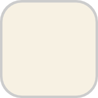
It pairs strikingly well with nearly any decor and furniture, but it shows off its true colors when used with strong accents of the same undertones.
Adorn your sofa or bed with burnt orange throw pillows, arrange terracotta vases or pottery on shelves or side tables, or anchor the room with a warm-toned area rug featuring hues of orange and red.
Almond Latte
- LRV: 59
Similar to its namesake, this warm neutral paint color is comforting yet energizing.
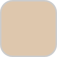
Ideal for living rooms and bedrooms, it creates an inviting atmosphere that radiates warmth and tranquility.
Pair it with rich wood tones for a classic and timeless aesthetic, or introduce metallic accents for a hint of modern sophistication.
Silver Drop
- LRV: 70
Silver Drop is a cool gray paint with blue undertones.
Thanks to its high LRV, it’s suitable for rooms with limited natural lighting, creating a fresh and open atmosphere.
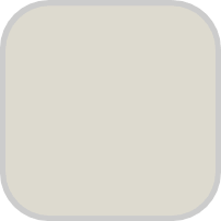
It pairs well with light- to mid-tone pinks, blues, greens, and purples.
For a casual, organic vibe, incorporate natural materials and textures such as wooden furniture, woven textiles, leather accents, and linen fabrics.
Jojoba
- LRV: 46
With an LRV of 46, Jojoba is one of the darker neutrals on this list.

It’s a gorgeous shade of sage with just a touch of blue, making it suitable for homes with a penchant for deeper, earthy tones.
To enhance its beauty, pair it with complementary colors like warm browns, muted greens, or soft creams. It also works well with wooden furniture and stone accents.
In the Moment
- LRV: 30
In the Moment is another sage green hue, but this time with undertones leaning towards green rather than blue.
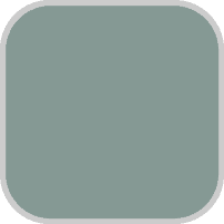
It’s ideal for homeowners looking to infuse their indoor space with a touch of outdoors, as it brings in a sense of tranquility reminiscent of lush greenery.
It’s an excellent companion to natural materials and textures, such as wooden furniture, rattan accents, and wooden textiles.
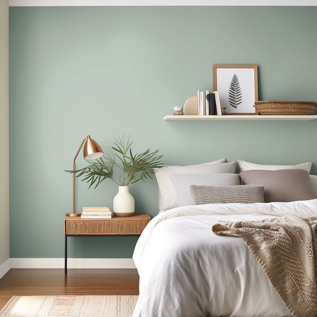
Mauve It
- LRV: 52
Mauve It is a gentle, plum-toned hue that infuses a space with an air of elegance and sophistication.
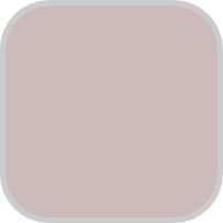
It can be an excellent choice for accent walls or as a complementary color in living areas, as it adds a subtle yet impactful visual appeal to a space.
When using this color, pair it with neutral tones like gray, whites, and creams to enhance its elegance.
It’s also a good idea to add metallic accents in gold or silver to introduce a touch of glamor to a room.
Before you go
There you have it; my top 10 list of the best Nehr neutral paint colors you can get your hands on!
The colors I’ve mentioned above have a timeless and classic quality that never go out of style.
They’re versatile backdrops that adapt to changing design trends, allowing you to switch your color palettes around without sacrificing aesthetic appeal.
If you want extra tips and tricks on using these paint colors, sign up for my free Paint Color Planning Guide, where I show you how to pick the perfect color for your home and more!
Still unsure which paint color is right for your space?
Choosing paint doesn’t have to be stressful! My free Paint Color Planning Quick Start Guide walks you through the exact steps to confidently choose the perfect color — without the overwhelm, second-guessing, or endless swatch testing.
👉 Click here to download the free guide!

My Paint Color Formula course walks you through the painless process of expertly testing paint swatches to ensure you have the perfect color for your home.
The best way to sample paint? Samplize!
Get peel-and-stick removable and reusable paint samples here!
Thanks for reading!
Morgan is passionate about home decor and paint colors. She has been sharing DIY home decor tips since 2012 at CharlestonCrafted.com. From there, she learned to love paint colors, and the Paint Color Project was born in 2022!

