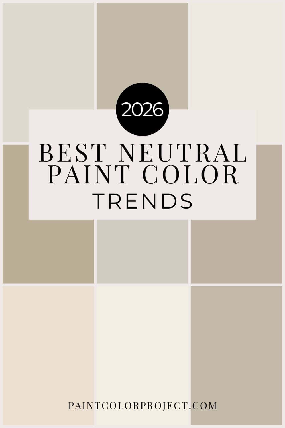
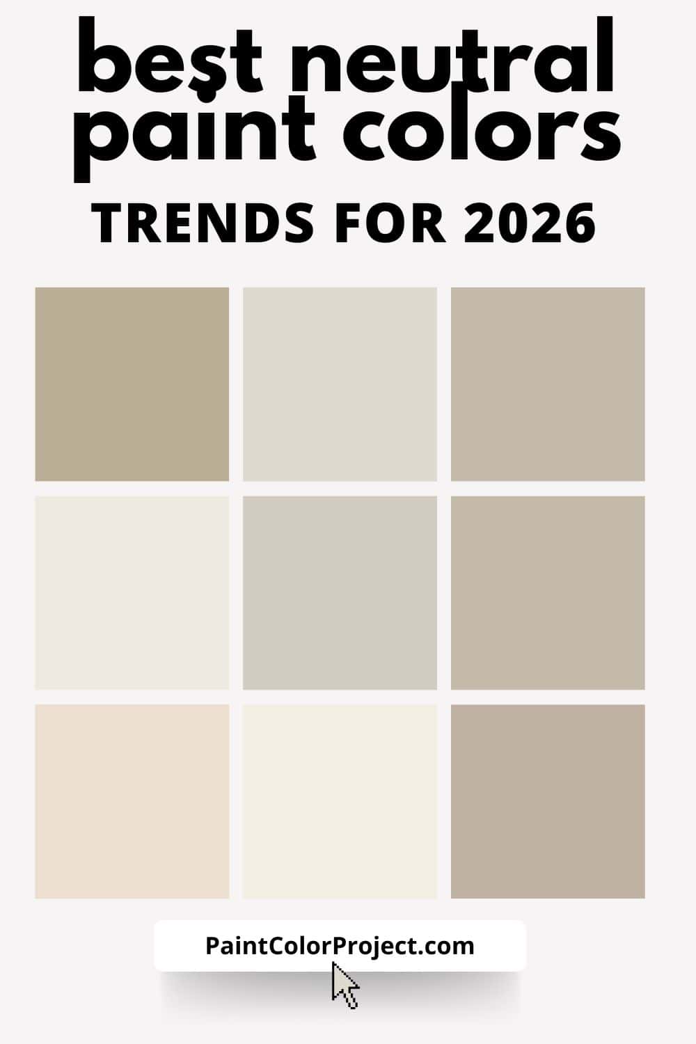
Here are the Trending Neutral Paint Colors homeowners are choosing for warmer, softer, and more timeless interiors. See the neutral paint shades shaping homes in 2026.
If you’re planning to repaint in 2026 and want something timeless (not trendy-for-five-minutes), neutrals are where the real story is happening.
Neutral paint colors for 2026 are warmer, softer, and more grounded than what we’ve seen in recent years. Cool grays are officially taking a back seat, and in their place we’re seeing earthy, livable neutrals that feel calm, cozy, and easy to decorate with.
These are the neutral paint color trends shaping homes in 2026 — and why they work so well long-term.
The Top Trending Neutrals in 2026
Neutrals aren’t disappearing — they’re evolving.
Instead of stark whites and flat greiges, 2026 neutrals are:
- Warmer and more natural
- Slightly deeper and more complex
- Designed to work across an entire home
- Easier to layer with wood, stone, and texture
Paint brands are clearly responding to one thing: people want homes that feel comfortable, not cold or overly designed.
Warm Khaki & Soft Taupe Neutrals
Khaki-inspired neutrals are having a big moment in 2026, thanks in part to Sherwin-Williams naming Universal Khaki its Color of the Year.
These shades sit beautifully between beige and taupe — warm without being yellow, neutral without feeling flat.
Why they’re trending:
- They pair effortlessly with warm wood tones
- They work in both traditional and modern homes
- They’re ideal for open-concept layouts
This is a great option if you’ve been stuck between beige and greige and want something that feels more current.
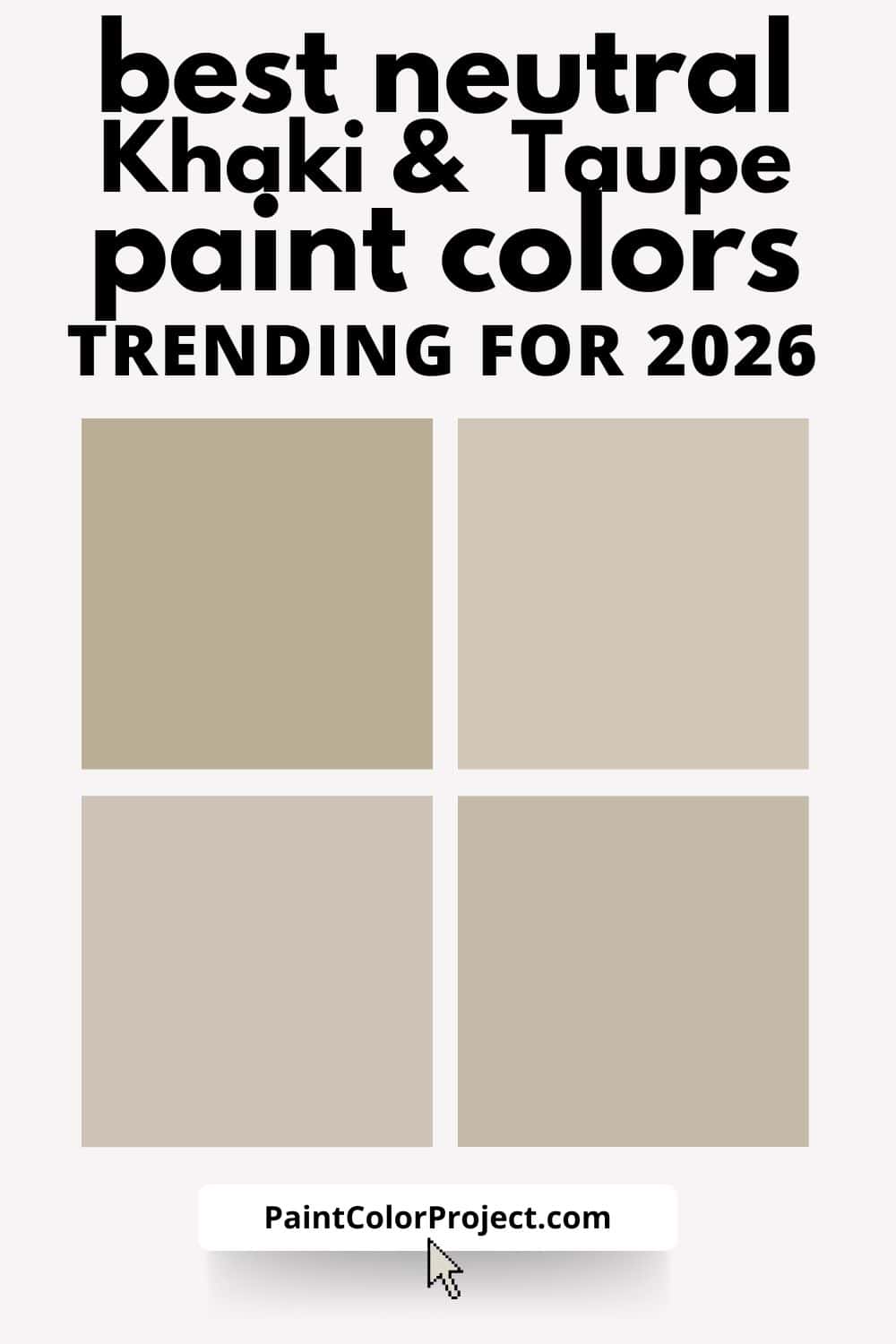
Consider decorating with:
- Sherwin-Williams Universal Khaki
- Sherwin-Williams Accessible Beige
- Benjamin Moore Sherwood Tan
- Benjamin Moore Stone Hearth
- Behr Wheat Bread
- Behr Rodeo Tan
These all live in that warm, grounded, “not gray, not yellow” sweet spot.
Creamy Whites (Warm, Not Stark)
White is still very much in style — but the version of white we’re seeing in 2026 is noticeably softer.
Creamy whites with subtle warmth are replacing crisp, cool whites. These shades feel more forgiving in real-life lighting and pair better with natural materials.
Why creamy whites work so well:
- Less harsh in north-facing rooms
- Better with brass, wood, and stone
- Easier to layer with warm accent colors
They’re especially popular for trim, cabinets, and whole-home palettes where continuity matters.
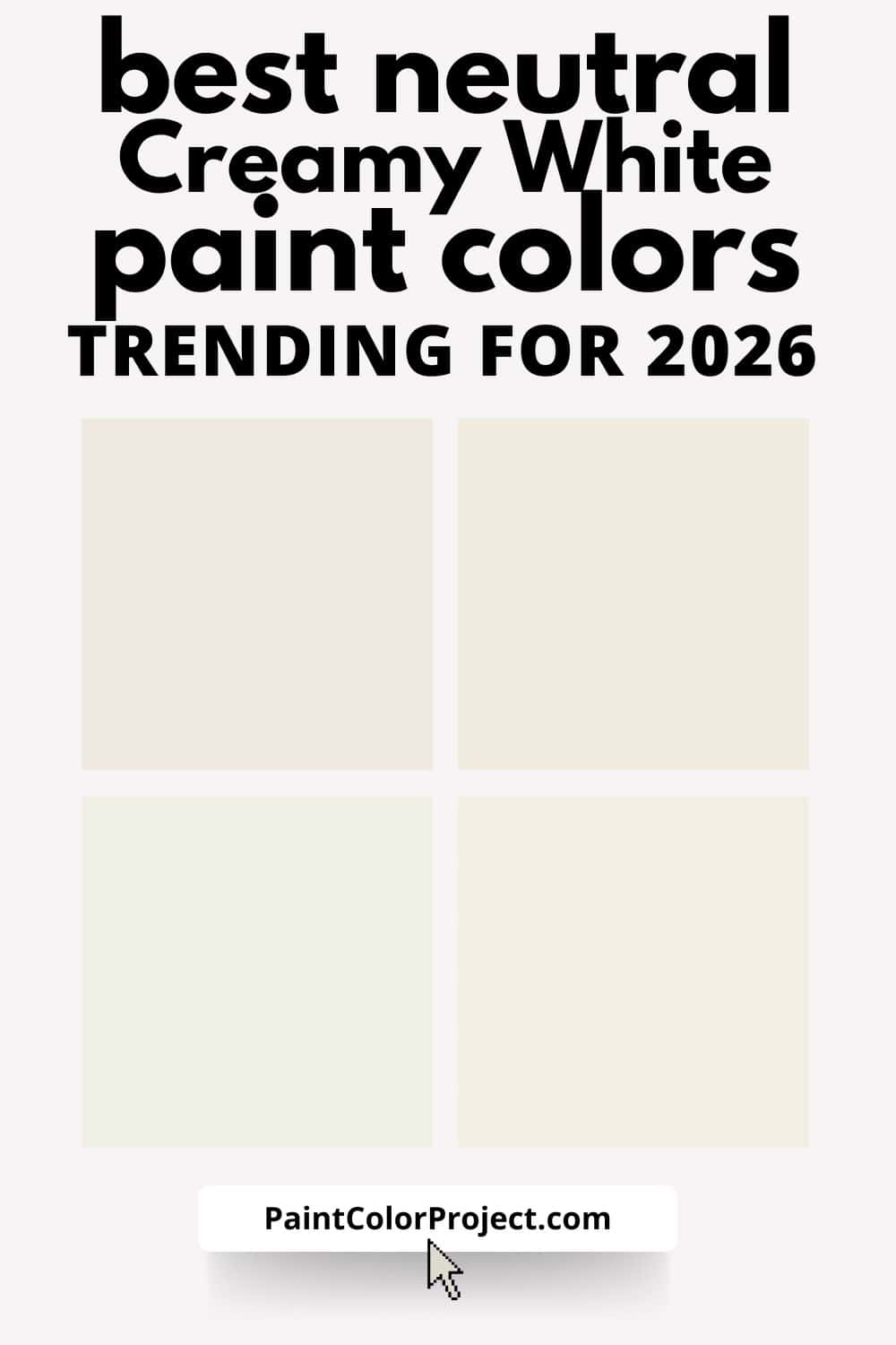
Consider decorating with:
- Sherwin-Williams Cream and Sugar
- Sherwin-Williams Alabaster
- Benjamin Moore Swiss Coffee
- Benjamin Moore White Dove
- Behr Blank Canvas
- Behr Dainty Lace
Soft, forgiving whites that layer beautifully with warm woods and earthy accents.
Earthy Beiges & Natural Linen Tones
Beige is officially back — but not the flat, dated beige of the early 2000s.
The 2026 version of beige leans earthy and natural, often inspired by sand, clay, or linen. These colors feel organic and grounded, which makes them incredibly versatile.
You’ll see these tones used:
- Throughout entire homes
- In living rooms and bedrooms
- Paired with soft greens, muted blues, and warm browns
If you want a neutral that doesn’t read gray or yellow, this is a great direction to explore.
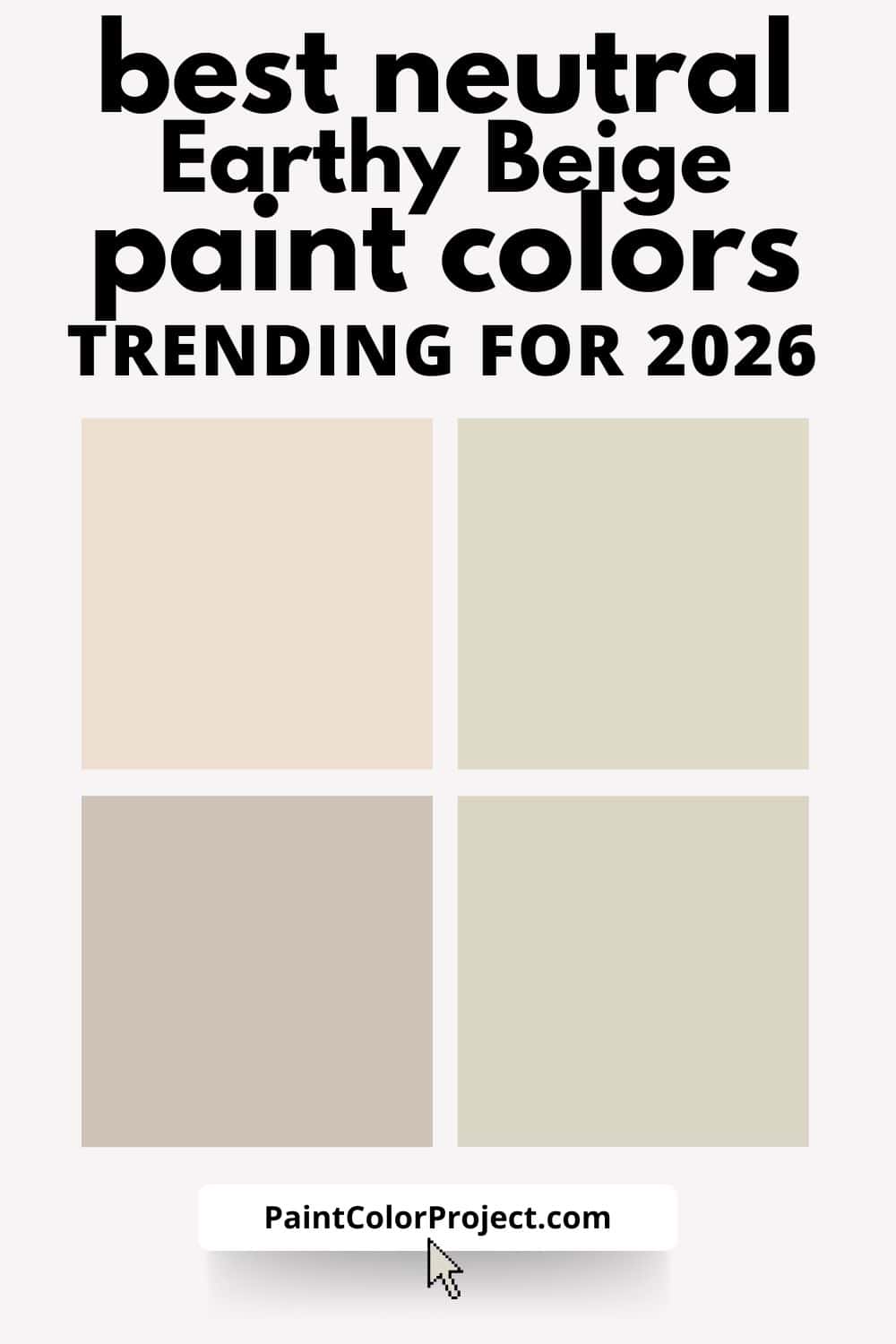
Consider decorating with:
- Sherwin-Williams Natural Linen
- Sherwin-Williams Neutral Ground
- Benjamin Moore Muslin
- Benjamin Moore Edgecomb Gray
- Behr Sandstone Cove
- Behr Wheat Bread
These read calm and organic — perfect for whole-home use.
Soft Brown-Infused Neutrals
One of the biggest neutral shifts for 2026 is the return of brown — subtly.
We’re seeing neutrals with a brown or mushroom undertone that add warmth and depth without feeling dark.
These shades:
- Feel cozy and elevated
- Work beautifully with darker wood finishes
- Add contrast without going bold
They’re a smart choice if you want your neutral walls to feel intentional rather than just “safe.”
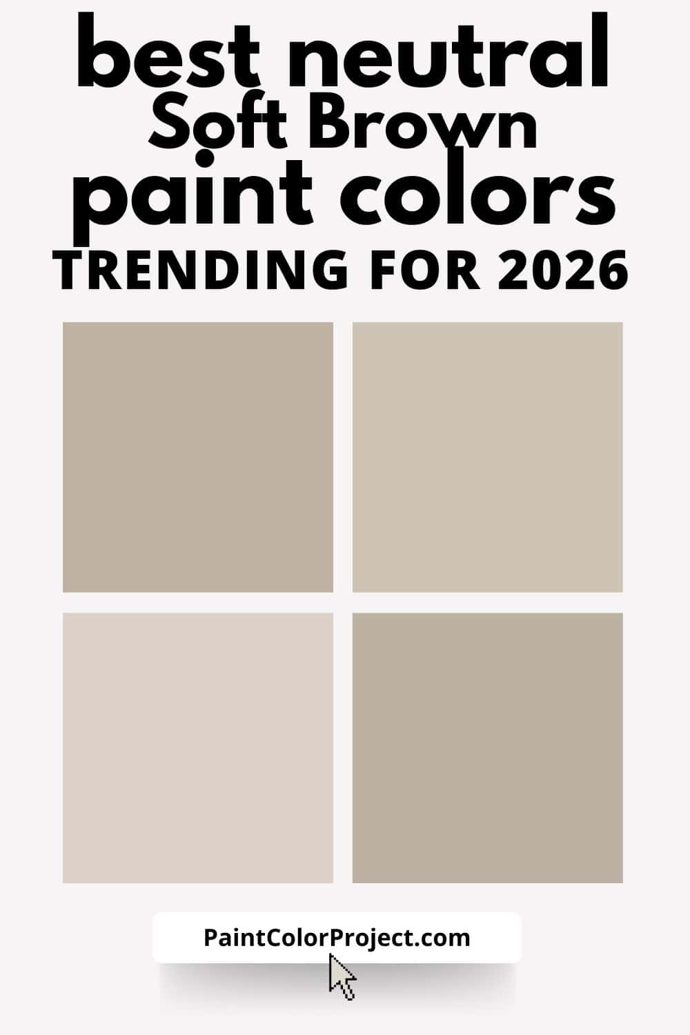
Consider decorating with:
- Sherwin-Williams Balanced Beige
- Sherwin-Williams Studio Taupe
- Benjamin Moore Pashmina
- Benjamin Moore Stone Hearth
- Behr Smoked Tan
- Behr Mocha Ice
These are the “quietly rich” neutrals that feel elevated but still livable.
Mushroom & Greige-Adjacent Neutrals
If you still love the idea of greige but feel like traditional gray is starting to look dated, this is the category to pay attention to in 2026.
For years, gray was the default “safe” choice. But many homeowners are now realizing it can feel cold, dull, or hard to warm up — especially in spaces without great natural light.
Mushroom and greige-adjacent neutrals are evolving into something warmer, softer, and far more livable. These shades sit right between beige and gray, but lean earthy rather than cool — which makes them much easier to decorate with long term.
Instead of icy undertones, 2026 greiges have subtle warmth, a touch of brown or taupe, and softer contrast in natural light.
They’re neutral without feeling flat, and they work especially well in homes with mixed finishes or open layouts.
Mushroom neutrals solve that problem by offering:
- More depth than gray
- Better compatibility with warm wood tones
- A softer backdrop for layered decor
These shades feel calm and collected rather than trendy, which is exactly why they’re gaining traction in 2026.
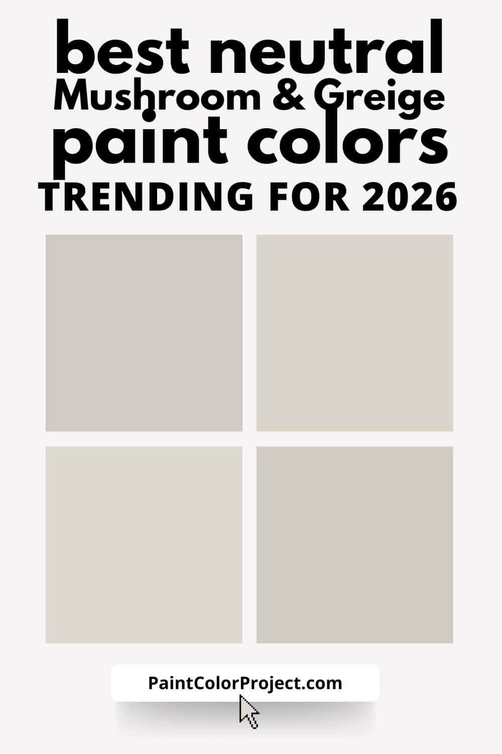
Consider decorating with:
- Sherwin-Williams Agreeable Gray
- Sherwin-Williams Repose Gray
- Benjamin Moore Balboa Mist
- Benjamin Moore Pale Oak
- Behr Silver Drop
- Behr Sculptor Clay
What these all have in common is balance — they don’t skew too gray, too beige, or too warm. They simply adapt.
Why These Neutrals Work for Real Homes
The reason these neutral paint colors are trending isn’t because they’re flashy — it’s because they’re easy to live with.
They:
- Adapt to changing decor
- Work across multiple rooms
- Age well as trends shift
- Create a calm backdrop for daily life
That’s why brands are leaning into neutrals that feel warm, soft, and layered instead of stark or trendy.
Should You Choose a Trending Neutral?
Trending doesn’t mean temporary — especially when it comes to neutrals.
If a color:
- Works with your lighting
- Complements your floors and finishes
- Makes your home feel calm and welcoming
…it’s probably a good choice, trend or not.
If you want help narrowing down which neutral works best specifically for your home, I can help.
Need more help?
Need more help pulling together the right paint colors for your home?
👉 Check out my No-Fail Paint Color Jumpstart Guide to make the process stress-free.
Still unsure which paint color is right for your space?
Choosing paint doesn’t have to be stressful! My free Paint Color Planning Quick Start Guide walks you through the exact steps to confidently choose the perfect color — without the overwhelm, second-guessing, or endless swatch testing.
👉 Click here to download the free guide!
DIYing Your Paint Job? Start Here.
Choosing a paint color is only half the equation — the tools you use matter just as much. I’ve rounded up the painting supplies we rely on for clean lines, smooth finishes, and less frustration overall.

My Paint Color Formula course walks you through the painless process of expertly testing paint swatches to ensure you have the perfect color for your home.
The best way to sample paint? Samplize!
Get peel-and-stick removable and reusable paint samples here!
Thanks for reading!

Morgan is passionate about home decor and paint colors. She has been sharing DIY home decor tips since 2012 at CharlestonCrafted.com. From there, she learned to love paint colors, and the Paint Color Project was born in 2022!