Golden oak can look dated fast—but with the right paint colors and decor, it feels warm, timeless, and fresh again. See how to style golden oak trim or cabinets with this modern neutral palette.
One of the most important factors to consider when picking paint colors for your home is the fixtures.
Fixtures, in this case, are anything that will not be changing in the room.
Often, floors or cabinets are included in that (unless you are doing a new build or gut job!)
Golden oak is very beautiful wood, but it can quickly become overwhelming in a room.
Let's take a look at some ways to style around golden oak for a modern but timeless look!
How to Style Golden Oak
Golden Oak is tricky to design around because of it's orange undertones. The wrong complimentary colors can make it feel very dated.
The secret is balance: pair oak’s warmth with soft, neutral colors and textures that keep it feeling intentional.
Keep balance in mind when selecting wall colors, fabrics, and metal accents to keep the space feeling fresh.
For even more color ideas, check out my full guide to paint colors that go with oak cabinets.
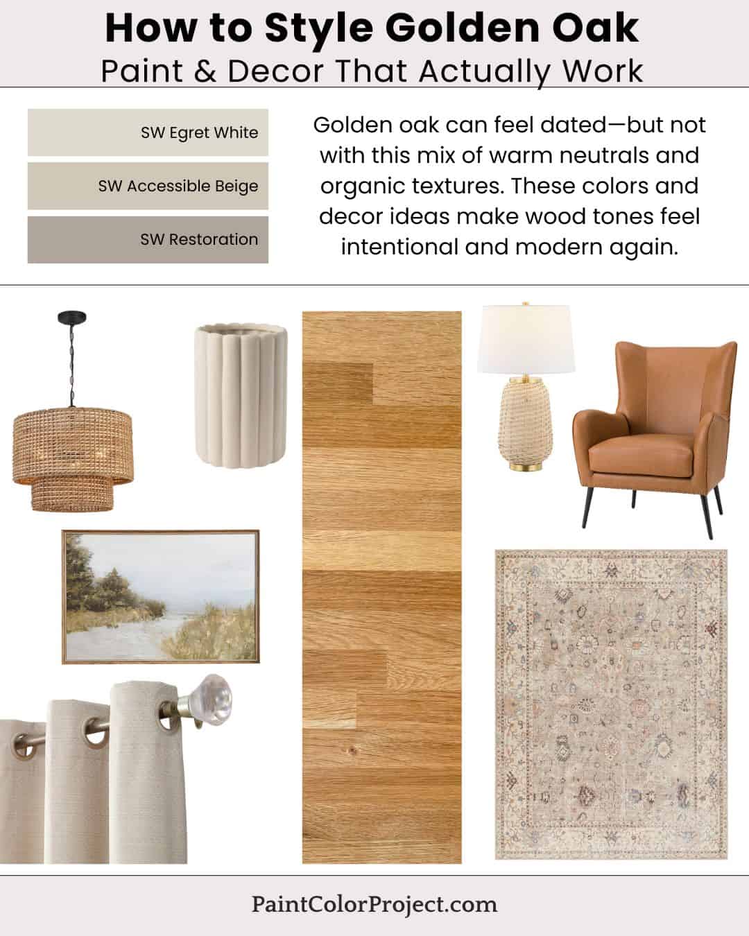
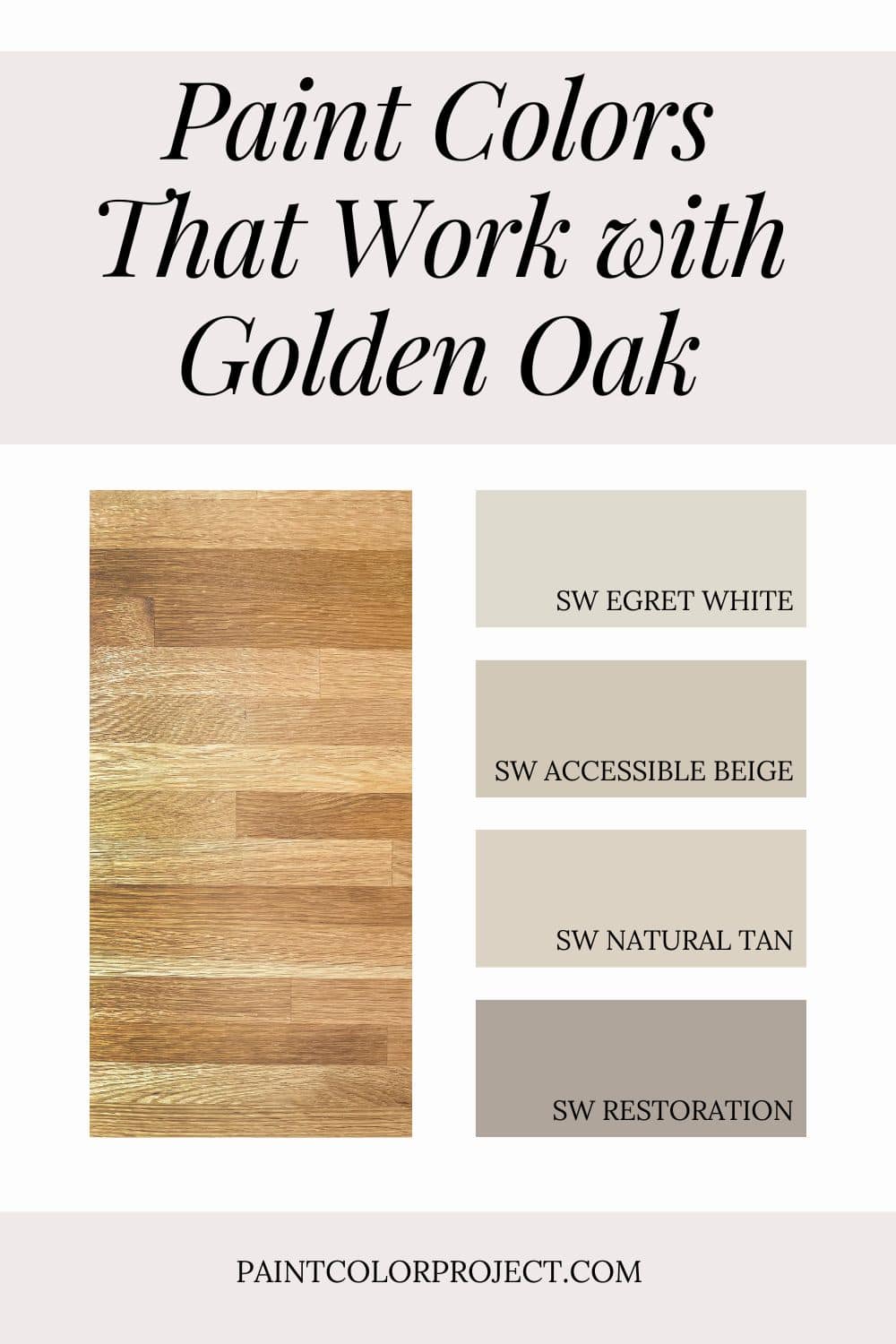
Paint Colors That Work with Golden Oak
These warm, balanced neutrals from Sherwin-Williams create harmony with oak’s golden tones without feeling too yellow or too gray.
- Egret White – soft creamy off-white for walls or trim
- Accessible Beige – warm greige for main living spaces
- Natural Tan – midtone beige with distinct warmth and depth
- Restoration – deeper taupe-brown for accents, cabinetry, or contrast
💡 Tip: If you want to test before committing, use peel-and-stick samples! See my Samplize review for my top tips on how to try colors the easy way.
How to Decorate with This Palette
Paint alone can’t do all the work—decor is where the magic happens. Choose textures and tones that echo the warmth of the wood and your paint palette.
Accessory ideas:
- Woven pendant light or rattan chandelier for texture
- Neutral area rug in ivory, jute, or heathered beige
- Camel leather accent chair or sofa for warmth
- Linen curtains in oatmeal or natural tones
- Brass table lamp or wall sconces with a soft patina finish
- Textured vases in taupe, white, or sand
- Muted landscape wall art with beige and green undertones
Stick with a mix of warm neutrals, cozy fabrics, and organic shapes. Even if your cabinets stay oak, everything else will feel intentionally styled.
Why This Palette Works
Golden oak’s warmth pairs best with neutrals that share its undertones but add modern softness.
These colors bridge orange wood and contemporary finishes, creating a calm, cohesive look.
Add layers of texture—linen, rattan, leather—and the result feels warm, grounded, and effortlessly up to date.
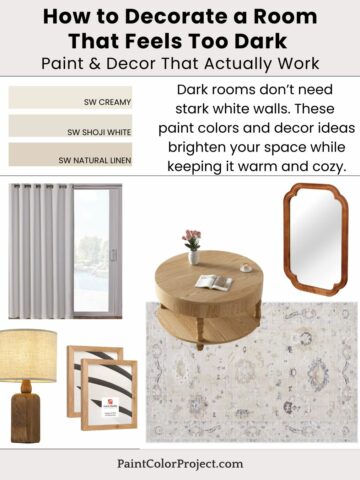
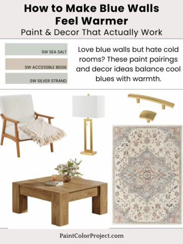
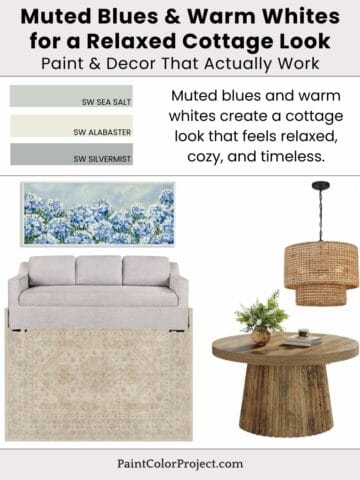
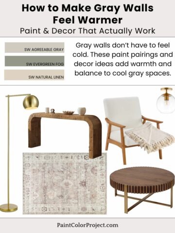
More Paint & Decor Inspiration
Need more help?
Need more help pulling together the right paint colors for your home?
👉 Check out my No-Fail Paint Color Jumpstart Guide to make the process stress-free.
Still unsure which paint color is right for your space?
Choosing paint doesn’t have to be stressful! My free Paint Color Planning Quick Start Guide walks you through the exact steps to confidently choose the perfect color — without the overwhelm, second-guessing, or endless swatch testing.
👉 Click here to download the free guide!
DIYing Your Paint Job? Start Here.
Choosing a paint color is only half the equation — the tools you use matter just as much. I’ve rounded up the painting supplies we rely on for clean lines, smooth finishes, and less frustration overall.

My Paint Color Formula course walks you through the painless process of expertly testing paint swatches to ensure you have the perfect color for your home.
The best way to sample paint? Samplize!
Get peel-and-stick removable and reusable paint samples here!
Thanks for reading!

Morgan is passionate about home decor and paint colors. She has been sharing DIY home decor tips since 2012 at CharlestonCrafted.com. From there, she learned to love paint colors, and the Paint Color Project was born in 2022!