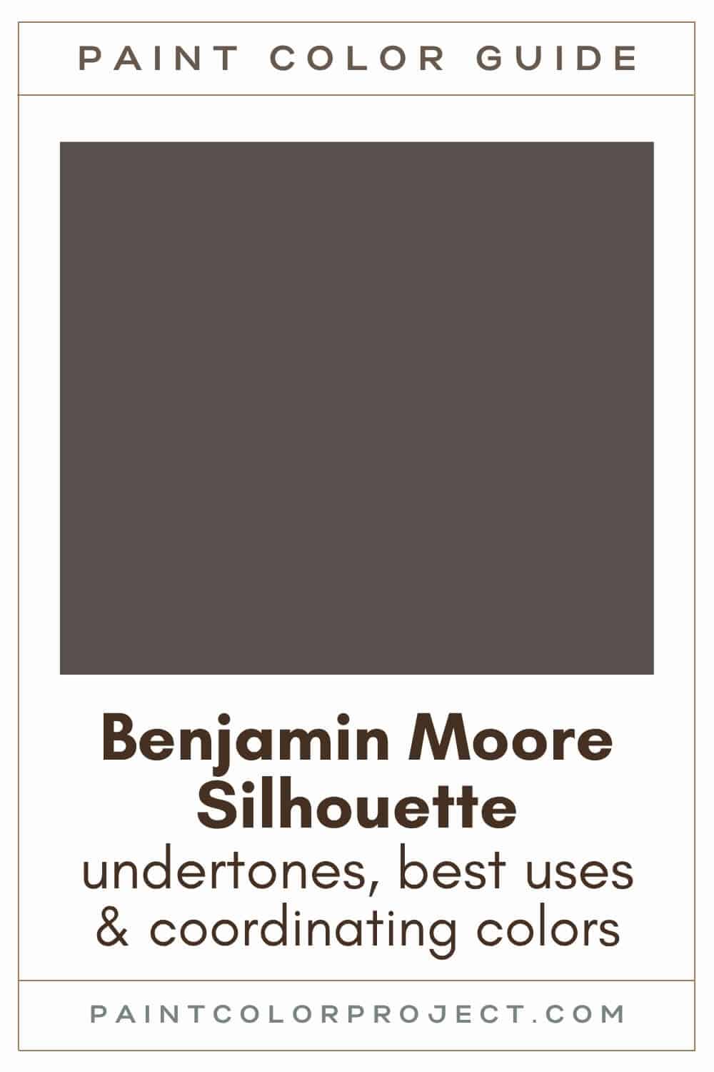
If you’re looking for a rich and stylish neutral, Benjamin Moore Silhouette could be the perfect choice for your home.
Silhouette was named Benjamin Moore’s 2026 Color of the Year, and that’s easy to understand. Dark, moody colors are quite popular now, and this shade balances drama with a classic feel.
What I like about Silhouette is its blend of espresso brown and soft charcoal gray. It comes off as neutral, yet it has enough color to give it character. It’s bold without being excessive, making it versatile for many rooms.
If you want a color that makes a statement while still feeling calm and elegant, Silhouette is an excellent option.
Let’s take a closer look at this beautiful shade and discuss how you can use it.
Silhouette, Benjamin Moore, AF-655
Silhouette is quite the sophisticated, deep neutral. It combines the best of espresso and charcoal hues to form an elegant brown-gray.
Click here to get a peel and stick sample of Silhouette
Color Family
Silhouette is in the neutral family.
Light Reflectance Value
10
Light Reflectance Value (LRV) tells you how much light a paint color reflects. The scale goes from 0 (pure black) to 100 (pure white).
With an LRV of 10, Silhouette is definitely a dark shade of brown. This means it brings a lot of depth and mood to a room.
That said, it isn’t so dark that it will look black in low-light spaces. It keeps just enough softness to still read as a deep neutral, even in a dim room.
RGB Colors
R: 87 G: 80 B: 76
RGB describes how much red, green, and blue are mixed together to create the final color. It’s the breakdown of what goes into the shade you see on the wall.
Hex Code
#57504C

Undertones
Silhouette is a mix of charcoal and espresso with warm red undertones and a hint of violet. It has a lot of depth, which is why it changes so much with the light.
In a bright south-facing room, Silhouette appears lighter and warmer, revealing more of its brown side.
In a darker north-facing room, it looks deeper and cooler, leaning toward neutral or gray. Here, you might catch a small hint of the violet undertone.
Since this color varies so much from room to room, I always suggest swatching it first. Seeing it on your own walls, both day and night, makes the decision much easier.
Click here to get removable peel & stick paint samples to easily swatch with!
Best uses
Silhouette works wonderfully as a rich, sophisticated neutral or as a bold accent color.
It’s a graeat choice if you want a room to feel cozy, intimate, and slightly luxurious without going completely black.
Try using Silhouette for:
- Front door (or interior doors!)
- Kitchen island cabinets or bathroom vanity
- Cozy bedroom walls
- Living rooms, dens, or home offices
- Hallways
- Feature wall
- Home exterior (bright light will lighten how the color looks)
- Shutters
- Furniture piece
Similar Colors
- Benjamin Moore Midsummer Night
- Behr Willow Wood
- Sherwin Williams Urbane Bronze
- Benjamin Moore Stone Brown
- Behr Dark Cavern
- Sherwin Williams Metropolis
- Benjamin Moore Iron Mountain
Click here to get a peel and stick sample of Silhouette
🤯 Too many color choices?
Download my free Paint Color Planning Quick Start Guide — it’s the exact method I use to help readers choose a color that works the first time.
📥 Grab it here!
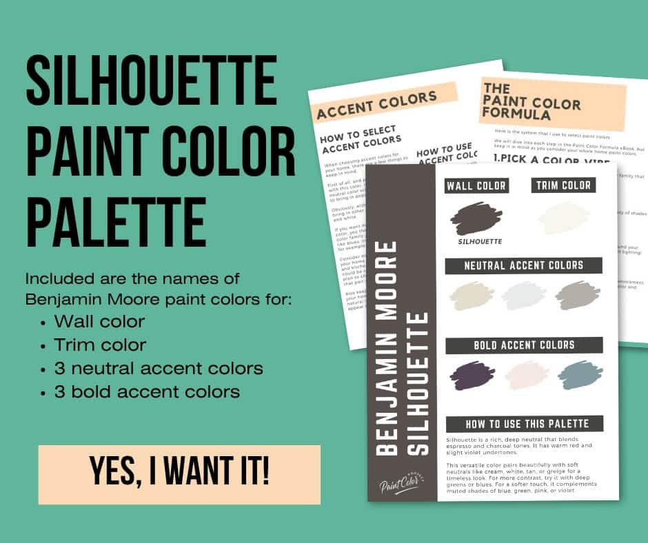
Coordinating Colors
As a deep neutral, Silhouette can pairs really well with so many colors.
For a classic look, try using it with soft neutrals like creams, soft whites, tans, or greiges.
For a bolder feel, pair Silhouette with deep greens or blues.
For a softer, subtle color, Silhouette works well with muted blues, greens, pinks, or violets.
Balanced neutrals:
- Pashmina
- Plymouth Rock
- Baja Dunes
- Northern Cliffs
- Thunder
Muted mid-toned blues:
- Van Courtland Blue
- Province Blue
- Jamestown Blue
- Water's Edge
- Amsterdam
Soft pinks:
- Gentle Butterfly
- Mellow Pink
- Hint of Pink
- Cream Puff
- Frosted Petal
Trim Colors
Silhouette can actually work well with both bright white or a soft white trim. It depends how much contrast you're going for.
For higher contrast, go with a crisp, bright trim.
- Benjamin Moore Simply White
- Sherwin Williams Extra White
- Behr Ultra Pure White
For a softer, nice-and-cozy vibe, go with a soft white for trim.
Silhouette Paint Color Palette
Want to use this paint color in your home? Instantly upgrade your home's aesthetic with our exclusive paint color palette. Unlock the perfect trim color and six stunning accent colors, a combination of neutrals and bold hues for an instantly harmonious space!
Get your perfect paint color palette by clicking here!
Click here to get a peel and stick sample of Silhouette
FAQS
Here are some common frequently asked questions about Silhouette.
What color is Benjamin Moore Silhouette?
Benjamin Moore Silhouette is a deep, rich neutral that combines espresso and charcoal. It feels dramatic but still acts like a neutral, which is why it fits well in many different rooms.
I appreciate that it has a luxurious feel without appearing flat or muddy. It has enough complexity to remain interesting in every type of lighting.
Is Silhouette warm or cool?
Silhouette leans warm due to its red undertones, although it also has hints of charcoal and a slight violet note. This combination gives it a cozy, elegant feel instead of a sharp or cold look. You notice this even more once you see it on your own walls.
What are the undertones of Benjamin Moore Silhouette?
Silhouette has warm red undertones with a hint of violet layered into its espresso and charcoal base. This mix provides a lot of depth.
In a bright room, it appears warmer and a bit more brown. In darker spaces, it shifts to a deeper, more neutral tone, and you might see a soft violet cast.
Lighting is crucial with a color like this, so testing samples in your room helps you understand how it will look.
What is Benjamin Moore's 2026 Color of the Year?
Benjamin Moore selected Silhouette as the 2026 Color of the Year, which makes perfect sense. The color feels bold, elegant, and very grounded.
It is dark and dramatic but still neutral enough to fit in many styles. It adds character without overpowering a space.
Where should I use Silhouette, Color of the Year?
You can use Silhouette in various ways. It works beautifully on bedroom or living room walls if you want a cozy, intimate atmosphere.
It also looks stunning on a front door, shutters, or even the exterior of a home. If you prefer something lighter indoors, try it as an accent on a kitchen island, a vanity, or a hallway feature wall.
What’s the difference: Benjamin Moore Silhouette vs Sherwin Williams Urbane Bronze?
Silhouette and Urbane Bronze have a similar blend of brown and gray, but they lean in different directions. Silhouette has more red and violet, while Urbane Bronze feels more like a greige.
Urbane Bronze is slightly darker with an LRV of 8 compared to Silhouette’s 10. Overall, Silhouette feels bolder and more saturated.

What’s the difference: Benjamin Moore Silhouette vs Midsummer Night?
Silhouette is a deep espresso-charcoal, while Midsummer Night is closer to black with violet and brown undertones.
Silhouette is a bit lighter with an LRV of 10. Midsummer Night has an LRV of 8, so it will appear deeper and moodier.

Their undertones change with the light, so placing swatches next to each other in your home can simplify your decision.
What’s the difference: Benjamin Moore Silhouette vs Stone Brown?
Silhouette and Stone Brown are both deep neutrals with an LRV of 10, so they are quite similar in depth.
Stone Brown leans more brown and has a bit more red, while Silhouette appears slightly more neutral. Silhouette also feels a bit more muted, whereas Stone Brown looks richer and more saturated.

Since the colors are so alike, comparing them in your lighting will help you determine which tone best suits your home and style.
Before you go...
So, you've found the perfect paint color, but here's the thing - there's another big decision you have to make: picking the right paint sheen. Seriously, the level of glossiness can totally change how your color looks on the walls and how long the paint lasts!
Check out our complete guide to understanding paint sheens.
Still unsure which paint color is right for your space?
Choosing paint doesn’t have to be stressful! My free Paint Color Planning Quick Start Guide walks you through the exact steps to confidently choose the perfect color — without the overwhelm, second-guessing, or endless swatch testing.
👉 Click here to download the free guide!
DIYing Your Paint Job? Start Here.
Choosing a paint color is only half the equation — the tools you use matter just as much. I’ve rounded up the painting supplies we rely on for clean lines, smooth finishes, and less frustration overall.

My Paint Color Formula course walks you through the painless process of expertly testing paint swatches to ensure you have the perfect color for your home.
The best way to sample paint? Samplize!
Get peel-and-stick removable and reusable paint samples here!
Thanks for reading!

Meg Hemmelgarn is a freelance writer and home decor + DIY blogger who loves to talk about paint colors. She and her husband are currently renovating their third fixer upper. You can see their projects on her blog, Green With Decor.