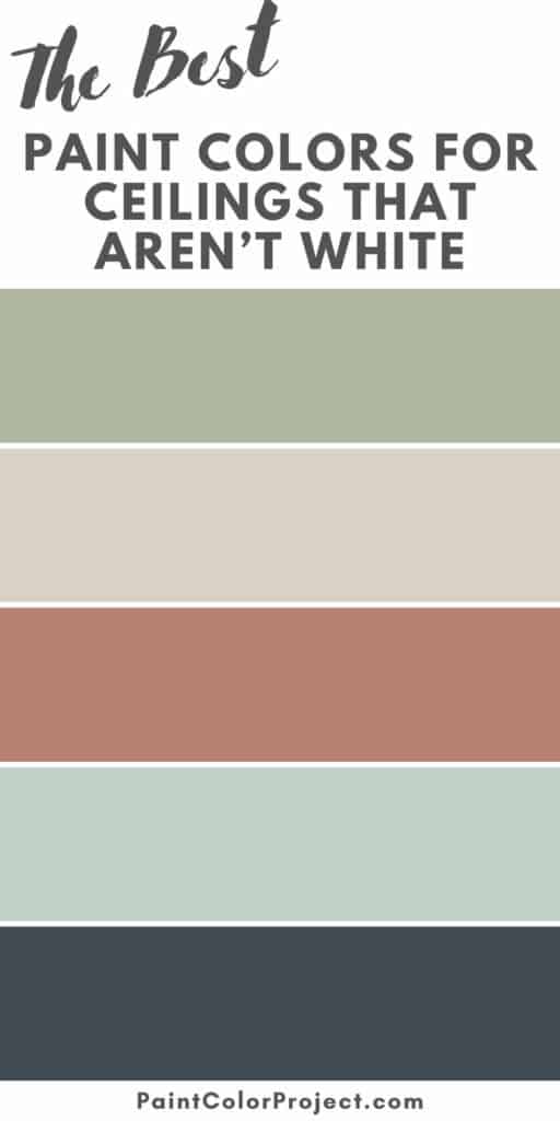
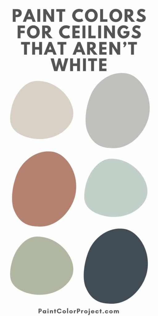
Looking for paint colors for ceilings that aren’t white? From soft neutrals to dramatic darks, these designer-approved shades can completely change how a room feels.
Most of us reach for white paint when doing ceilings. I’ve done it too. But if your room ever feels a little flat, adding some color overhead might be just what it needs.
A ceiling color that isn’t white can bring depth, warmth, and personality without overpowering your walls. It’s a little trick that makes your space look a bit more intentional.
Painted ceilings can also shift the feel of a room. Darker tones make large spaces feel cozier, while lighter neutrals can make smaller rooms feel taller and airier.

The Best Ceiling Paint Colors - That Aren't White!
Let’s take a look at some of the best options for painted ceilings and why they work so well.
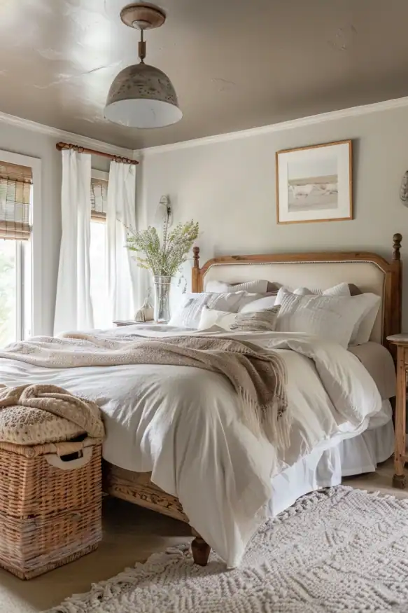
Soft Neutrals
A soft neutral ceiling is a simple way to move beyond basic white while keeping your space nice and light. Warm beige, greige, or taupe tones add that cozy feel without making the room feel smaller.
They also help tone down bright white walls or balance bolder colors. I’ve used this trick in bedrooms before, and it instantly made the space feel calmer.
Designers recommend:
- Taupe of the Morning – Sherwin-Williams
- Edgecomb Gray – Benjamin Moore
- Wheat Bread – Behr


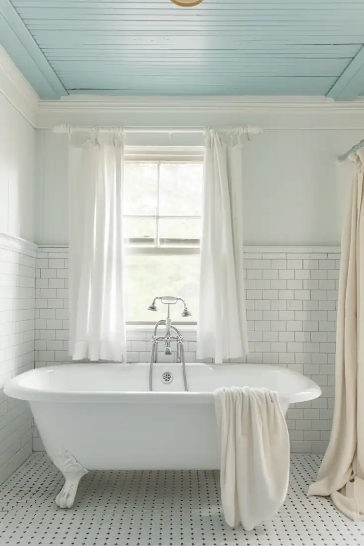
Sky Blues
Painting your ceiling a light blue has a long tradition. Many southern porches are famously done in “haint blue,” and for good reason. It instantly opens up a space.
They’re perfect for bathrooms and kitchens, but also add a playful, cheerful touch to kids’ rooms or sunrooms.
I’ve used pale blue on a ceiling with lots of natural light before, and it made the whole room glow.
Designers recommend:
- Sea Salt – Sherwin-Williams
- Palladian Blue – Benjamin Moore
- Light French Gray – Behr


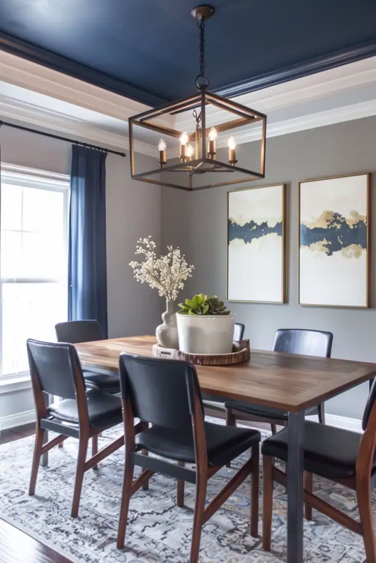
Dramatic Dark Tones
If you want to make a statement, a dark ceiling is the way to go. Deep charcoal, navy, or even black can bring drama and intimacy to a space.
In large rooms with tall ceilings, dark paint overhead helps the space feel cozier and more grounded. In smaller rooms, using the same dark shade on both the walls and ceiling creates a bold, “wrapped-in” look.
Dining rooms, media rooms, and bedrooms are perfect for this moody, dramatic style.
Designers recommend:
- Tricorn Black – Sherwin-Williams
- Hale Navy – Benjamin Moore
- Carbon Copy – Behr


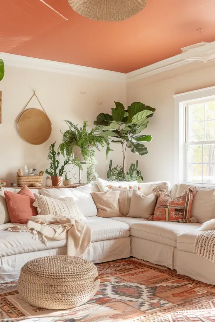
Warm Earth Tones
Terracotta, clay, and warm brown tones on the ceiling add a natural, grounded feel to your home. These colors echo the earthy shades of stone and wood, bringing warmth and depth to your space.
They look beautiful in living rooms and dining areas, especially when you want to highlight natural textures.
I’ve seen them work wonders in rustic and Mediterranean-inspired homes, adding that cozy, sun-soaked charm.
Designers recommend:
- Cavern Clay – Sherwin-Williams
- Terra Cotta Tile – Benjamin Moore
- Auburn Glaze – Behr


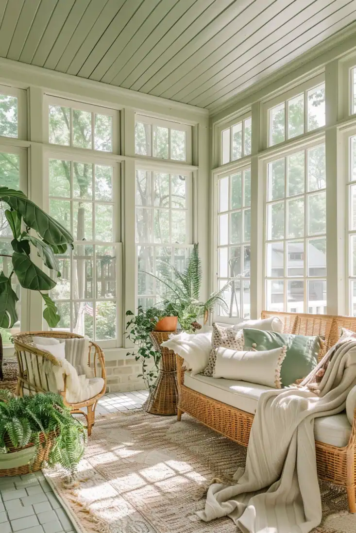
Soft Greens
Muted green ceilings bring a fresh, natural feel that instantly connects your home to the outdoors. They add calm and serenity to spaces like kitchens, bathrooms, and sunrooms.
Paired with wood accents or houseplants, a green ceiling feels warm and balanced. I love using soft greens when I want a hint of color that still feels relaxing and easy to live with.
Designers recommend:
- Rainwashed – Sherwin-Williams
- Saybrook Sage – Benjamin Moore
- Misty Moss – Behr


Choosing a ceiling color that isn’t white is such an easy way to give your home a designer look.
I’ve done this a few times now, and it always surprises me how much it transforms a space.
Whether you keep it soft with a neutral, go airy with a pale blue, or lean dramatic with a deep tone, the ceiling sets the mood in a whole new way.
The trick is to pick a color that works with your walls and captures the feeling you want to live with every day.
Still unsure which paint color is right for your space?
Choosing paint doesn’t have to be stressful! My free Paint Color Planning Quick Start Guide walks you through the exact steps to confidently choose the perfect color — without the overwhelm, second-guessing, or endless swatch testing.
👉 Click here to download the free guide!
DIYing Your Paint Job? Start Here.
Choosing a paint color is only half the equation — the tools you use matter just as much. I’ve rounded up the painting supplies we rely on for clean lines, smooth finishes, and less frustration overall.

My Paint Color Formula course walks you through the painless process of expertly testing paint swatches to ensure you have the perfect color for your home.
The best way to sample paint? Samplize!
Get peel-and-stick removable and reusable paint samples here!
Thanks for reading!

Morgan is passionate about home decor and paint colors. She has been sharing DIY home decor tips since 2012 at CharlestonCrafted.com. From there, she learned to love paint colors, and the Paint Color Project was born in 2022!