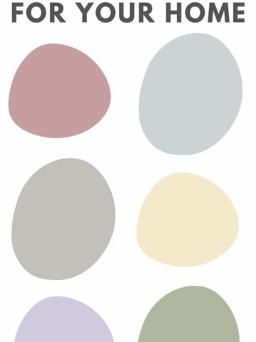
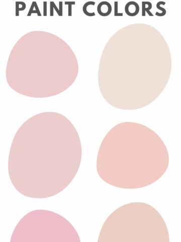
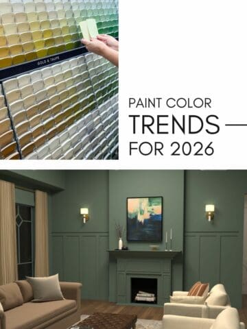
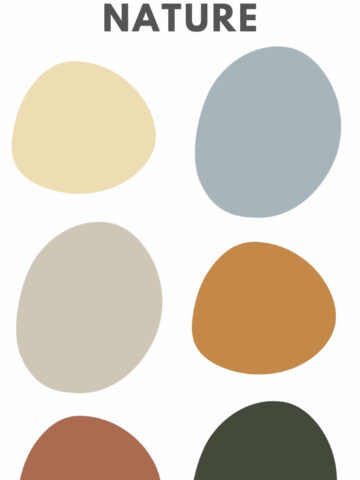
Looking for the perfect paint colors to boost your mood? Explore the top mood-boosting paint colors and how to use them in your home.
Did you know the color on your walls can actually change how you feel? I’ve seen it happen in my own home.
Color isn’t just about style. It sets the mood of a space and affects your emotions every single day. The right shade can make a room feel peaceful, cozy, energizing, or even more focused.
But picking that perfect color? I know it’s not always easy. You want something that looks great but also makes your home feel amazing.
Good news: you don’t have to stick to just neutrals or super bold shades. There are plenty of mood-boosting colors that work in real homes, and I’m breaking them down for you today.
So whether you want a calming retreat, a motivating workspace, or a welcoming living area, these colors can help set the tone. Let’s learn more!
How Color Affects Your Mood
Have you ever walked into a room and instantly felt more relaxed? Or maybe you’ve been in a space that made you feel restless without knowing why? I’ve definitely felt it. That’s the power of color.
Colors impact how we feel. Some shades help you unwind, while others boost your energy.
And while personal taste matters, I’ve noticed certain patterns. Cool colors like blues and greens tend to be soothing, while warm tones like reds and oranges bring energy.
Knowing this makes it easier for you to choose colors that don’t just look good but actually make you feel good. The goal? To create a home that feels just as amazing as it looks.
How to Choose a Mood-Boosting Paint Color
Start by thinking about how you want the space to feel. Do you want it to be relaxing? Energizing? Cozy? I always ask myself this before picking a color.
Here’s what helps me, and it’ll help you too:
- Consider the function of the room. A bedroom should feel peaceful, while a kitchen might need a fresh, uplifting vibe.
- Test paint samples. I’ve learned the hard way that colors can look totally different depending on lighting, furniture, and even window direction.
- Go bold (but balance it out). Love bright colors? Try them on an accent wall or in a smaller space. I do this when I want a pop of color without overwhelming the room.
Now, let’s talk about some of the best paint colors to boost your mood!
Best Paint Colors for a Mood Boost
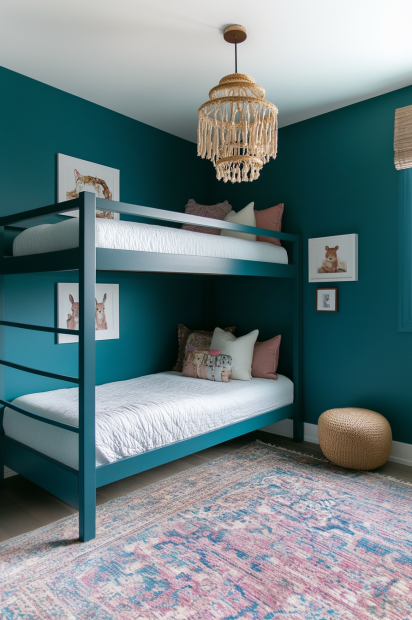
Serene Teal for a Relaxing Retreat
If you want a color that instantly makes you exhale, try teal.
I love how this blue-green blend feels calm but not cold, making it a great pick for bedrooms, bathrooms, or a cozy reading nook.
Teal pairs beautifully with crisp whites, natural wood tones, and soft grays, so it’s easy to work into your style.
Great options:
- Sherwin-Williams: Oceanside (SW 6496)
- Benjamin Moore: Aegean Teal (2136-40)
- Behr: Peacock Tail (PPU13-02)
Energizing Tangerine for a Creativity Boost
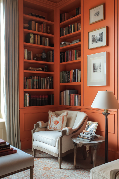
Orange might not be the first color you think of, but it’s an amazing way to add warmth and energy to a space.
A soft tangerine can liven up a kitchen or home office without feeling too bold.
The trick is balance. Pair it with warm grays or creamy whites to keep it from feeling overwhelming. I’ve done this in my workspace, and it’s made such a difference.
Great options:
- Sherwin-Williams: Navel (SW 6887)
- Benjamin Moore: Tangerine Dream (2012-30)
- Behr: Sizzling Sunset (S-G-240)
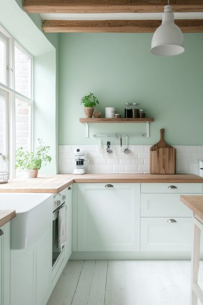
Fresh Mint Green for a Light and Airy Feel
I love how mint-green makes a space feel fresh and inviting. It works beautifully in kitchens, bathrooms, and even living rooms if you want a soft, cheerful vibe.
Pair it with white cabinets and light wood tones for a clean, modern look. If you want something refreshing but not too bold, this is a great choice.
Great options:
- Sherwin-Williams: Softened Green (SW 6177)
- Benjamin Moore: Palladian Blue (HC-144)
- Behr: Spearmint Stick (M420-2)
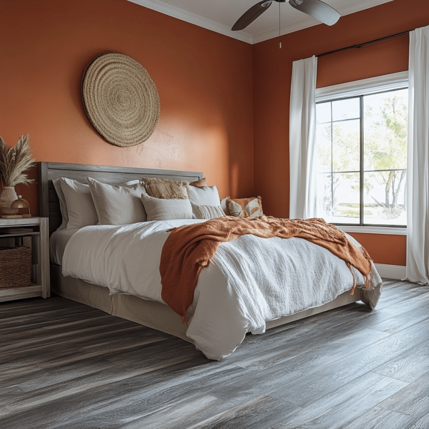
Cozy Terracotta for a Warm, Grounded Space
If you want a color that makes a room feel instantly inviting, go for terracotta. This earthy shade brings warmth without feeling too dark, making it a great choice for living rooms, dining spaces, or even a home office.
I’ve seen it work beautifully in my friend’s home, and now I want to try it too!
Pair it with soft neutrals like beige and cream, or go bold with deep blues.
Great options:
- Sherwin-Williams: Cavern Clay (SW 7701)
- Benjamin Moore: Spanish Red (1301)
- Behr: Maple Glaze (S210-5)
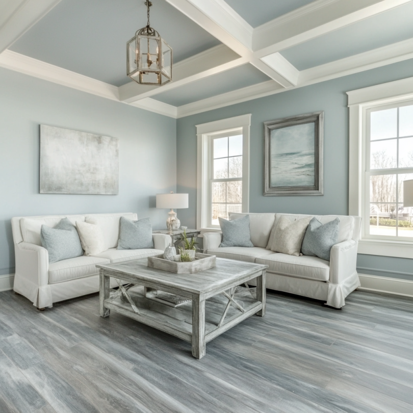
Soft Sky Blue for a Peaceful Escape
Sky blue has such a calming effect. I’ve used it in bedrooms and bathrooms, and it makes the space feel like a breath of fresh air. It’s light enough to keep things airy but still adds a touch of color.
Pair it with crisp white trim for a fresh, classic look.
Great options:
- Sherwin-Williams: Upward (SW 6239)
- Benjamin Moore: Breath of Fresh Air (806)
- Behr: Clear Pond (M460-1)
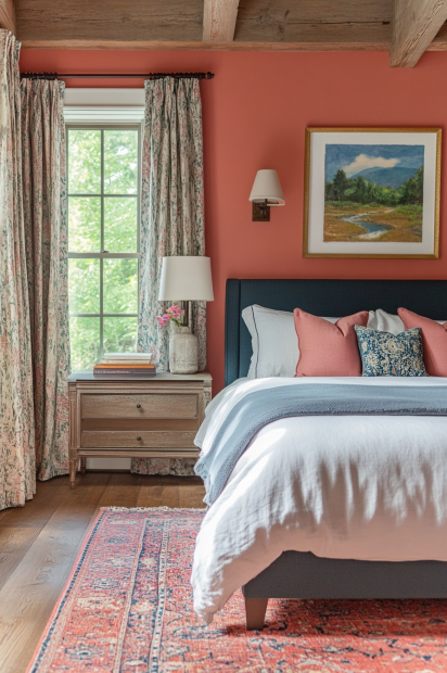
Cheerful Coral for a Happy, Welcoming Space
Coral is such a fun color! It adds warmth and personality without being too overwhelming.
I’ve seen it used beautifully in dining rooms and entryways. Perfect for making guests feel welcome.
For a balanced look, pair coral with navy, deep greens, or warm wood tones.
Great options:
- Sherwin-Williams: Coral Reef (SW 6606)
- Benjamin Moore: Coral Gables (2010-40)
- Behr: Sunset Strip (S160-5)
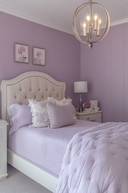
Soft Lavender for a Relaxing and Restful Space
Lavender is my go-to when I want a color that’s calming but not boring. It’s perfect for bedrooms and home offices, giving a peaceful feel without looking dull.
Try pairing it with grays or muted greens for a sophisticated, timeless look.
Great options:
- Sherwin-Williams: Lite Lavender (SW 6554)
- Benjamin Moore: Spring Lilac (1388)
- Behr: Hush (N570-3)
Need More Help Choosing the Perfect Paint Color?
Choosing a paint color can feel overwhelming. I’ve been there! Undertones, lighting, and room flow all change how a color actually looks on your walls.
If you’ve ever picked up a sample that looked totally different at home than in the store, you know what I mean!
That’s why I created The Paint Color Formula, a step-by-step system to help you confidently choose the perfect color. No more second-guessing or endless repainting! Inside, you'll learn:
- How to identify undertones so you never end up with an unexpected color shift
- How lighting impacts paint colors and what to consider in each room
- The secret to creating a cohesive color palette that flows beautifully through your home
- A simple, repeatable process for picking colors that work every time
Ready to stop stressing over paint swatches and start loving your home’s colors? Click here to check out The Paint Color Formula and get started today!
Still unsure which paint color is right for your space?
Choosing paint doesn’t have to be stressful! My free Paint Color Planning Quick Start Guide walks you through the exact steps to confidently choose the perfect color — without the overwhelm, second-guessing, or endless swatch testing.
👉 Click here to download the free guide!

My Paint Color Formula course walks you through the painless process of expertly testing paint swatches to ensure you have the perfect color for your home.
The best way to sample paint? Samplize!
Get peel-and-stick removable and reusable paint samples here!
Thanks for reading!
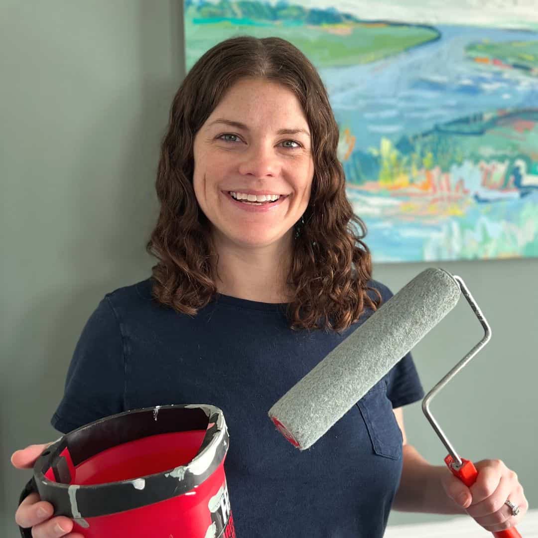
Morgan is passionate about home decor and paint colors. She has been sharing DIY home decor tips since 2012 at CharlestonCrafted.com. From there, she learned to love paint colors, and the Paint Color Project was born in 2022!


